Skip to content
KONIGI

Dashboards / Page layout / Resizable card grid

3 of 5

Resizable card grid

Different viewers care about different numbers and want to arrange them.

Updated September 10, 2026

Problem

Six people use this page and each of them wants a different panel at the top. Every request to reorder it is reasonable, and satisfying any one of them makes the page worse for the other five.

Solution

Let viewers arrange it themselves. Panels become cards that can be dragged, resized, added and removed, with the arrangement saved per person.

The appeal is obvious and the pattern is more often a mistake than not, so the honest version of this entry is mostly about when it goes wrong.

The first cost is that a personalised page cannot be talked about. “It’s the panel in the top right” stops meaning anything, which matters most during incidents, when a shared vocabulary is worth more than any individual’s preferred arrangement. A team looking at six different dashboards while calling it “the dashboard” is a real and specific failure.

The second is that most people never customise, so the default layout is still what almost everyone sees, and it now receives less design attention because customisation is the answer to any complaint about it. The feature quietly lowers the quality of the thing 90% of people use.

The third is that arrangements fossilise. Someone lays out a page in March, the system changes in June, and their saved layout still has the old panels in the old order with no prompt to reconsider. Nothing in the product knows their arrangement has stopped describing the system, so the staleness is invisible to everyone including them.

Where it genuinely fits is a page serving genuinely different jobs with no shared reading, and where the arrangement is the only difference. If the differences run deeper than layout—different metrics, different scope—separate dashboards or saved views serve better and keep each one designed.

Use when

The audience is genuinely heterogeneous, the panel set is stable, and no shared reading of the page is required.

Don’t use when

The page is used collaboratively, especially in incidents. Also don’t use it as a way to avoid deciding what the page is for; customisation is not a substitute for editorial judgement, and it is frequently deployed as one.

Trade-offs

Drag-and-drop layout is expensive to build well and worse than useless when built badly, since a page that reflows unexpectedly during a drag loses trust immediately. Layouts made on one screen size rarely work on another. Per-viewer state has to be stored, migrated and eventually deprecated. And an editable page invites accidental edits: dashboards get rearranged by people who meant to scroll, and the undo path is usually missing.

Checklist

  • Does anyone need to talk about this page with someone else looking at it?
  • What proportion of viewers actually customise, and how do you know?
  • Is the default layout still receiving design attention?
  • Does a customised layout survive a change to the panel set?
  • Is a viewer prompted when their saved layout references something removed?
  • Can a viewer reset to the default in one action?
  • Does layout editing require an explicit edit mode, or can it happen by accident?
  • Is there an undo?
  • Does a layout made on a wide screen work on a laptop?
  • Would saved views or separate dashboards serve these audiences better?

Compare

Grafana makes every dashboard editable by anyone with permission, so the arrangement is shared rather than personal and edits are changes to a common artefact, which trades personalisation for a shared vocabulary. Datadog offers both editable dashboards and personal starred views, keeping the shared page canonical while letting individuals collect what they need elsewhere. Kibana leans furthest into free arrangement of cards, each carrying its own query, which is flexible and puts all coherence on the author. Public status pages are the deliberate opposite, with no customisation at all, because a page read by strangers must look the same to everyone.

Panel grid is the underlying layout system, and the entry that covers why a fixed grid encodes priority. Saved view is usually the better answer to the same need. Dashboard builder is the authoring pattern this is a subset of. Semantic grouping is the editorial work customisation is often used to avoid. Multi-page dashboard is the alternative when the audiences differ by more than arrangement.
Resizable card grid anatomy A card with a drag handle, a remove control and a resize grip, sitting on the snap grid it moves against. Below, two people's saved arrangements of the same five cards, where the panel in the top right is a different panel for each of them. Anatomy of one card P95 by service 1 2 3 4 1 DRAG HANDLE A grip, not the whole header. A card you move by grabbing anywhere moves when somebody meant to select a label. 2 REMOVE Needs an undo. Nothing else on the page deletes on a single click. 3 RESIZE GRIP Resizing changes what the panel can show, so the chart inside has to have an opinion about being small. 4 THE SNAP GRID Free positioning produces pages nobody can align. Columns do the tidying. "It's the panel in the top right" Priya's layout Sam's layout
Wireframe — the pattern's anatomy, not any one product's version of it

Implementation

Readers arranging their own panels. Edit mode has to be a mode, visibly, because a grid where a stray drag silently reorders someone's dashboard trains people not to touch it.

shadcn
npx shadcn@latest add card button
npm
lucide-react
Tokens
--card--card-foreground--muted-foreground--border--chart-1
P95 by service

CardGrid.tsxA CSS grid with a snap, a grip to move by, a corner to resize by, and an edit mode that is a required prop. Remove is delegated so the caller can undo it.

import { useRef, type PointerEvent, type ReactNode } from "react";
import { GripVertical, X } from "lucide-react";
import { Card } from "@/components/ui/card";

/** Where a card sits, in grid units. Free pixels produce pages nobody can
 *  align; the columns do the tidying. */
export type Placement = { id: string; x: number; y: number; w: number; h: number };

type Props = {
  layout: Placement[];
  columns: number;
  rowHeight: number;
  /** Editing is a mode, and it is required. A grid that reorders on a stray
   *  drag trains people not to touch it. */
  editing: boolean;
  onChange: (layout: Placement[]) => void;
  /** Nothing else on the page deletes on one click, so the caller owns the undo. */
  onRemove: (id: string) => void;
  title: (id: string) => string;
  render: (id: string, size: { w: number; h: number }) => ReactNode;
};

export function CardGrid({ layout, columns, rowHeight, editing, onChange, onRemove, title, render }: Props) {
  const ref = useRef<HTMLDivElement>(null);

  /** One handler for move and resize: both are "this many cells from where
   *  the pointer went down", snapped, clamped to the grid. */
  const start = (e: PointerEvent<HTMLElement>, id: string, mode: "move" | "size") => {
    if (!editing || !ref.current) return;
    e.preventDefault();
    const colWidth = ref.current.clientWidth / columns;
    const from = layout.find((p) => p.id === id)!;
    const x0 = e.clientX, y0 = e.clientY;
    const el = e.currentTarget;
    el.setPointerCapture(e.pointerId);
    const move = (ev: globalThis.PointerEvent) => {
      const dx = Math.round((ev.clientX - x0) / colWidth);
      const dy = Math.round((ev.clientY - y0) / rowHeight);
      const next = mode === "move"
        ? { ...from, x: Math.min(Math.max(0, from.x + dx), columns - from.w), y: Math.max(0, from.y + dy) }
        : { ...from, w: Math.min(Math.max(1, from.w + dx), columns - from.x), h: Math.max(1, from.h + dy) };
      onChange(layout.map((p) => (p.id === id ? next : p)));
    };
    const up = () => { el.removeEventListener("pointermove", move); el.removeEventListener("pointerup", up); };
    el.addEventListener("pointermove", move);
    el.addEventListener("pointerup", up);
  };

  const rows = Math.max(3, ...layout.map((p) => p.y + p.h));
  return (
    <div
      ref={ref}
      className="relative grid gap-0"
      style={{
        gridTemplateColumns: `repeat(${columns}, minmax(0, 1fr))`,
        gridAutoRows: `${rowHeight}px`,
        minHeight: rows * rowHeight,
        // The snap grid, drawn only while it can be used.
        backgroundImage: editing
          ? `repeating-linear-gradient(to right, hsl(var(--border)) 0 1px, transparent 1px ${100 / columns}%), repeating-linear-gradient(to bottom, hsl(var(--border)) 0 1px, transparent 1px ${rowHeight}px)`
          : undefined,
      }}
    >
      {layout.map((p) => (
        <Card
          key={p.id}
          className="relative m-1 flex flex-col p-3"
          style={{ gridColumn: `${p.x + 1} / span ${p.w}`, gridRow: `${p.y + 1} / span ${p.h}` }}
        >
          <div className="flex items-center gap-2">
            {/* A grip, never the whole header. */}
            {editing && (
              <button type="button" onPointerDown={(e) => start(e, p.id, "move")} className="cursor-grab touch-none text-muted-foreground" aria-label={`move ${title(p.id)}`}>
                <GripVertical className="size-3.5" />
              </button>
            )}
            <span className="text-[11px] text-card-foreground">{title(p.id)}</span>
            {editing && (
              <button type="button" onClick={() => onRemove(p.id)} className="ml-auto text-muted-foreground" aria-label={`remove ${title(p.id)}`}>
                <X className="size-3.5" />
              </button>
            )}
          </div>
          <div className="mt-2 min-h-0 flex-1">{render(p.id, { w: p.w, h: p.h })}</div>
          {editing && (
            <span
              onPointerDown={(e) => start(e, p.id, "size")}
              className="absolute bottom-1 right-1 size-2 cursor-nwse-resize touch-none border-b-2 border-r-2 border-muted-foreground"
              role="separator" aria-label={`resize ${title(p.id)}`}
            />
          )}
        </Card>
      ))}
    </div>
  );
}

demo.tsxHow it is called: one card on four columns, editing on, with an undo stack for remove.

import { useState } from "react";
import { Button } from "@/components/ui/button";
import { Sparkline } from "../sparkline/Sparkline";
import { CardGrid, type Placement } from "./CardGrid";

/**
 * One card on a four-column grid, in edit mode. Drag the grip to move it a
 * cell at a time, the corner to resize. Remove keeps the card in a stack so
 * the same button puts it back.
 */
const START: Placement[] = [{ id: "p95", x: 0, y: 0, w: 3, h: 2 }];
const TITLES: Record<string, string> = { p95: "P95 by service" };

export default function Demo() {
  const [layout, setLayout] = useState(START);
  const [removed, setRemoved] = useState<Placement[]>([]);
  const [editing, setEditing] = useState(true);

  const remove = (id: string) => {
    const card = layout.find((p) => p.id === id);
    if (!card) return;
    setRemoved([...removed, card]);
    setLayout(layout.filter((p) => p.id !== id));
  };
  const undo = () => {
    const last = removed[removed.length - 1];
    if (!last) return;
    setRemoved(removed.slice(0, -1));
    setLayout([...layout, last]);
  };

  return (
    <div className="w-[320px]">
      <CardGrid
        layout={layout}
        columns={4}
        rowHeight={60}
        editing={editing}
        onChange={setLayout}
        onRemove={remove}
        title={(id) => TITLES[id]}
        render={(_, size) => (
          <div className="text-chart-1">
            <Sparkline values={[28, 38, 30, 50, 44, 60, 56]} width={size.w * 80 - 32} height={size.h * 60 - 60} />
          </div>
        )}
      />
      <div className="mt-3 flex gap-2">
        <Button variant="outline" size="sm" onClick={() => setEditing(!editing)}>{editing ? "done" : "edit layout"}</Button>
        {removed.length > 0 && <Button variant="ghost" size="sm" onClick={undo}>undo remove</Button>}
      </div>
    </div>
  );
}
What it renders. Identical markup in both panes, with only the token values changing.

Examples

Captures whose hotspots reference this pattern, grouped by product and dated. The dashed boxes are this pattern; hover any box for the note.

Home Assistant

A card grid people genuinely rearrange, on a wall tablet, which is where resizable layouts either work or quietly stop describing the house.

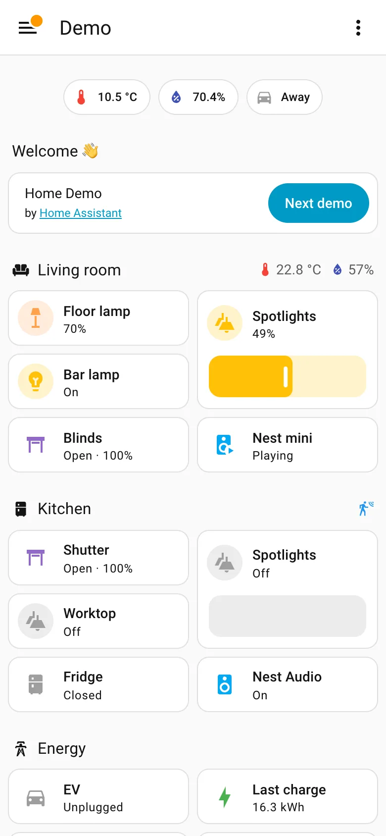
Demo dashboard at phone width September 10, 2026 Home Assistant public demo (signed out, 390px viewport) medium · light · mobile
The same dashboard as the desktop capture at 390 pixels. It is a reflow rather than a designed phone page, and for this content that is defensible—a list of things with states doesn't need width the way a chart does, sections stay intact, nothing is dropped, and the slider becomes a much better touch target than it was with a mouse. What doesn't survive is the order. On desktop the sections sit in three columns and each column reads down: Welcome, Energy, Outdoor on the left. On the phone they come out row by row instead, so Energy falls from second in its column to fourth on the page and Kitchen climbs from the far right to third. Nothing about the desktop layout expressed which of those mattered more, so the reflow had nothing to preserve and picked an order from the source. The rail is the other casualty and goes exactly where these always go, into a hamburger.
  • Mobile adaptation Reflowed, not rebuilt. Section order comes out row-major here and column-major on desktop, so priority shifts.
  • Sidebar and canvas The rail is gone. Everything it held is now behind one button, which is the usual and unavoidable trade.
  • Resizable card grid Two columns of cards inside each section rather than a single stack, so the page stays short enough to scroll.
  • Header KPI strip The three chips survive the switch intact, which is what a strip of four to six is for.
Show 1 more example Hide the rest

Home Assistant

A card grid people genuinely rearrange, on a wall tablet, which is where resizable layouts either work or quietly stop describing the house.

Home Assistant — Demo dashboard
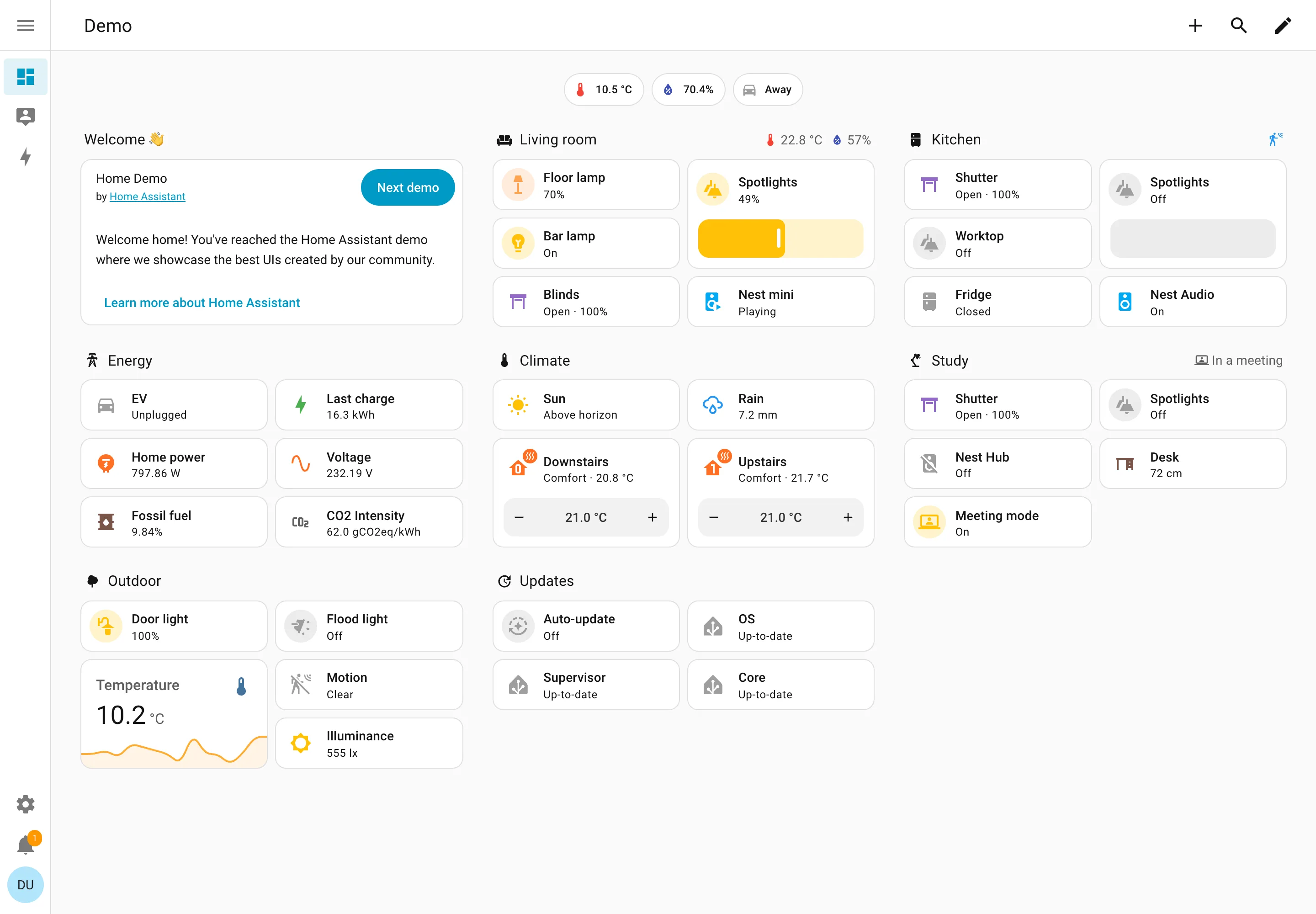
Resizable card grid. Cards a household arranges itself, grouped by room. Sections are one column each rather than a free canvas. Semantic grouping. Grouped by where the thing physically is, and the group header carries that room's temperature and humidity. Sidebar and canvas. Collapsed to icons by default, because on a wall tablet the canvas is worth more than the labels. Sparkline. One card carrying a number and the shape behind it, with no axis and no legend. Semantic status color. Amber means on, and the card says 49% anyway. Colour repeats the word instead of replacing it. Header KPI strip. Three chips above everything: outside temperature, humidity, and whether anyone is home. Dashboard builder. A pencil in the corner. Editing is one click from reading, which is why these pages actually get rearranged.
Demo dashboard September 10, 2026 Home Assistant public demo (signed out) medium · light · desktop-web
The grouping axis here is physical space—Living room, Kitchen, Study, Outdoor—which nothing else in this gallery uses, and it works for the same reason process mimics work: the viewer already holds the model. The thing worth stealing is the state labelling. Every entity says its state in words: Open · 100%, Off, Closed, Playing, Up-to-date, Unplugged. The amber tint on an icon repeats what the word already said rather than replacing it, so the page is readable with no colour at all. That isn't accessibility diligence so much as an audience constraint—you cannot train a household on a colour key the way you can train an on-call rota, so the words have to carry. Each section header also doubles as a summary: Living room reports 22.8°C and 57% humidity beside its own name, and Study reports "In a meeting". And this is a control surface as much as a display—the Spotlights card is a slider you drag, the thermostats have plus and minus.
  • Resizable card grid Cards a household arranges itself, grouped by room. Sections are one column each rather than a free canvas.
  • Semantic grouping Grouped by where the thing physically is, and the group header carries that room's temperature and humidity.
  • Semantic status color Amber means on, and the card says 49% anyway. Colour repeats the word instead of replacing it.
  • Header KPI strip Three chips above everything: outside temperature, humidity, and whether anyone is home.
  • Sidebar and canvas Collapsed to icons by default, because on a wall tablet the canvas is worth more than the labels.
  • Sparkline One card carrying a number and the shape behind it, with no axis and no legend.
  • Dashboard builder A pencil in the corner. Editing is one click from reading, which is why these pages actually get rearranged.