Skip to content
KONIGI

Dashboards / Screenspace / Multi-page dashboard

4 of 6

Multi-page dashboard

One page can't hold it and the sections have different audiences.

Updated September 10, 2026

Problem

The dashboard has outgrown its screen and collapsing sections is no longer enough. What is left is not one long page but several genuinely different pages that happen to share a subject.

Solution

Split into named pages, linked as a set, sharing the state that should be shared. Each page answers a different question about the same thing.

The distinction from a hierarchy is worth being firm about, because conflating the two produces navigation nobody can hold. Overview then detail is vertical: each level is the same subject narrowed. Multi-page is horizontal: the pages are peers, at the same scope, differing in what they show rather than in how much. Traffic, Errors, Latency, Cost for one service are peers. Fleet, Node, Process are levels.

What must be shared is time range and scope. If a viewer sets a range on the Traffic page and moves to Errors to find a default six hours, they are comparing two different windows and will not notice. This is the single most common defect in the pattern and it is invisible in review because each page looks correct alone.

What must not be shared is layout convention. Every page in the set should look like a member of the set—same header, same filter placement, same time control—because the value of a set is that learning one teaches you all of them.

The other question is the landing page. A set with no obvious entry is a menu, and viewers pick whichever they used last. One of the pages should be an overview that says which of the others to open, which quietly turns the horizontal set back into a shallow hierarchy at the top.

Use when

The content genuinely divides into parallel questions, each substantial enough to fill a screen, and different roles or occasions call for different ones.

Don’t use when

The pages are sequential steps of one investigation, where a hierarchy is honest and tabs will mislead. Also don’t split when the real problem is that one page has forty panels nobody pruned; the fix is deletion, not filing.

Trade-offs

Splitting hides content behind navigation, and NN/g’s warning holds: people ignore what they cannot see, so a page nobody lands on decays without anyone noticing. State synchronisation is genuinely hard, and every product gets some of it wrong. Cross-page comparison becomes impossible—two things that were adjacent are now a click apart, and the eye cannot hold a chart across a page load. And sets grow, because adding a page is easier than arguing about what to remove.

Checklist

  • Are these pages peers, or are they actually levels of a hierarchy?
  • Does the time range carry across pages?
  • Do filters and scope carry across pages?
  • Do all pages share header, control placement and layout conventions?
  • Is there a landing page that says which of the others to open?
  • Can a viewer tell which page they are on without reading the title?
  • Do links from alerts land on the right page, with scope intact?
  • What happens to a page nobody has opened in six months?
  • Is anything on two pages, and do the copies agree?
  • Would deleting panels remove the need to split at all?

Compare

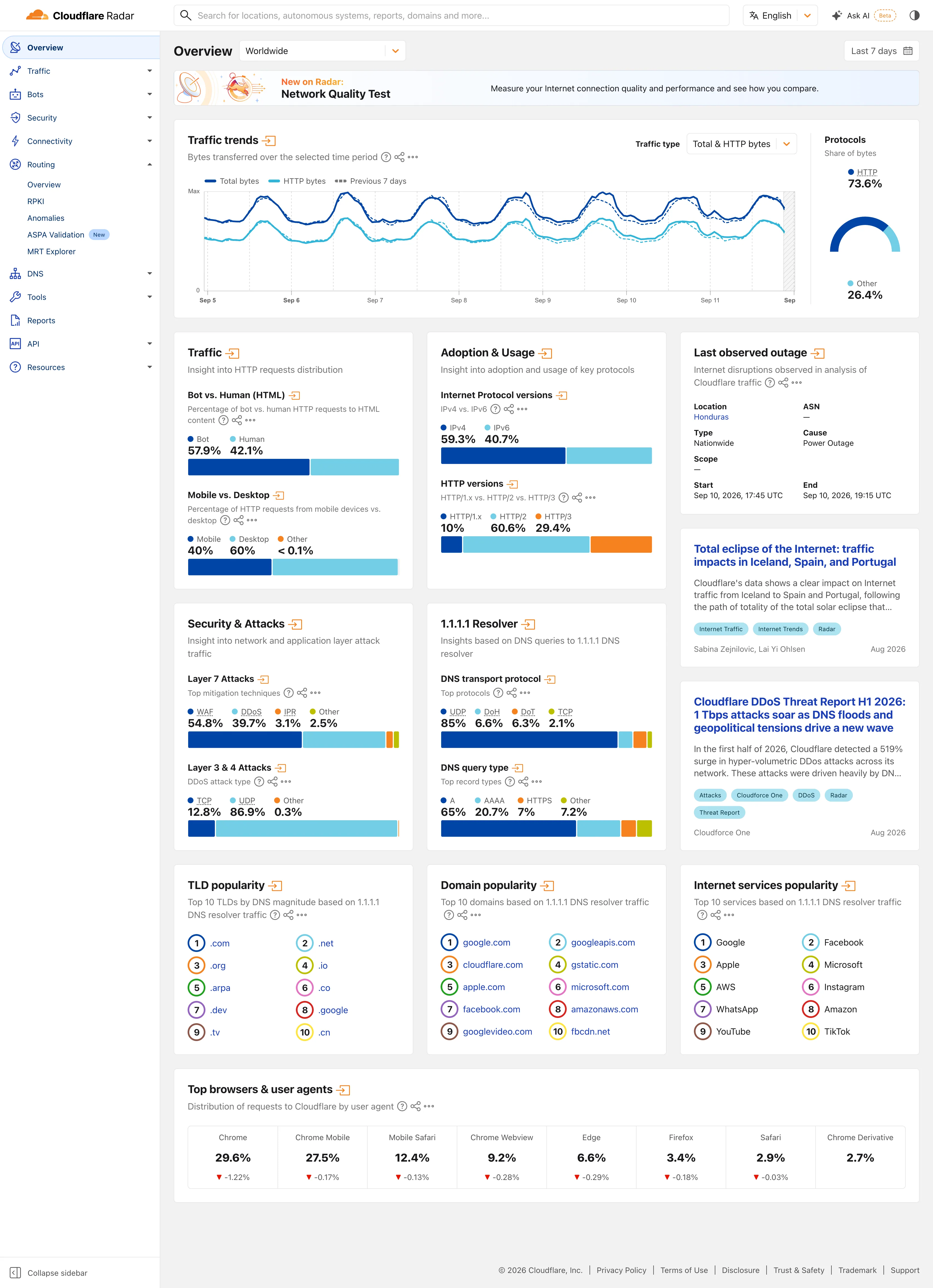
Grafana has no built-in page set: multi-page is separate dashboards in a folder, linked by dashboard links or a variable, so state sharing is whatever the author wired through the URL. That flexibility is why Grafana estates sprawl and why search becomes the navigation. Datadog scopes pages by tags at the page level, so moving between dashboards in the same scope keeps the filter, which solves the defect Grafana leaves to the author. Sentry organises horizontally by concern—Issues, Performance, Releases—with project scope carried across, which is the pattern working as product structure rather than as dashboard configuration. Honeycomb collects saved queries into boards, so a “page” is a curated set of questions and the sharing problem is smaller because each query carries its own parameters. Cloudflare Radar is this pattern with no state to share: eleven sections behind one rail, no account, and two page-level controls in the entire product. Moving between pages costs nothing because there was almost nothing scoped to carry, which is the version of the problem every tool above is solving the hard way.

Tabs as genres is the specific case where the pages correspond to different kinds of question. Collapsible row is the lighter answer to try before splitting. Sidebar and canvas is how a set stays navigable. Overview then detail is the vertical alternative and the thing this is most often confused with. Saved view is what people build when the set does not match how they actually work.
Multi-page dashboard anatomy Four peer pages at the same scope, sharing a header that carries the time range and the filters. Beside them, a hierarchy for contrast: three levels of the same subject narrowing, which is a different pattern wearing similar clothes. Peers, not levels last 6h checkout Service · checkout Traffic Errors Latency Cost Overview · which of the four to open 1 2 3 For contrast Fleet Node Process Levels, not peers 1 SHARED STATE Time range and scope carry across. Set a range on one page, find a default six hours on the next, and nobody notices. 2 SHARED CHROME Same header, same filter placement, same time control. The value of a set is that learning one teaches you all of them. 3 THE LANDING PAGE A set with no obvious entry is a menu, and viewers open whichever they used last. One page says which of the others to open. Traffic and Errors are peers. Fleet and Node are levels. Conflating them makes navigation nobody can hold.
Wireframe — the pattern's anatomy, not any one product's version of it

Implementation

One page cannot hold it and the sections have different readers. Each page needs its own answer to is-it-okay at the top, because a reader who lands on page three never saw page one.

shadcn
npx shadcn@latest add tabs button dropdown-menu
npm
lucide-react
Tokens
--card--card-foreground--muted--muted-foreground--border--status-nominal--status-warn--status-critical

Service · checkout

MultiPageDashboard.tsxOne header and one range for every page, a status and headline every page has to supply, and a built-in overview that lays those answers side by side.

import type { ReactNode } from "react";
import { ChevronDown } from "lucide-react";
import { Button } from "@/components/ui/button";
import { DropdownMenu, DropdownMenuContent, DropdownMenuItem, DropdownMenuTrigger } from "@/components/ui/dropdown-menu";
import { Tabs, TabsList, TabsTrigger } from "@/components/ui/tabs";
import { cn } from "@/lib/utils";

/** Closed. Every page answers is-it-okay in one of three words, so the
 *  overview can put the answers side by side. */
export type Status = "nominal" | "warn" | "critical";
const STATUS = { nominal: "text-status-nominal", warn: "text-status-warn", critical: "text-status-critical" };

/** What every page receives. A page cannot hold its own range, which is how
 *  two pages end up comparing different windows without anyone noticing. */
export type Shared = { range: string; scope: string };

export type Page = {
  id: string;
  title: string;
  status: Status;
  /** One line on whether it is okay. Printed at the top of the page and on
   *  its overview tile, so a reader landing here never needs page one. */
  headline: string;
  body?: (shared: Shared) => ReactNode;
};

export const RANGES = ["1h", "6h", "24h", "7d"] as const;

export function MultiPageDashboard({ subject, pages, shared, onShared, onScope, page, onNavigate }: {
  subject: string;
  /** Peers at one scope, differing in what they show. Levels of one subject
   *  narrowing are a different pattern. */
  pages: Page[];
  shared: Shared;
  onShared: (next: Shared) => void;
  /** Opens the app's scope picker. */
  onScope: () => void;
  /** "overview" or a page id. Lift it into the URL with the shared state, so
   *  an alert can link to the right page with the scope intact. */
  page: string;
  onNavigate: (id: string) => void;
}) {
  const current = pages.find((p) => p.id === page);

  return (
    <div className="rounded-lg border bg-card">
      {/* One header on every page: same title, same controls, same places. */}
      <div className="flex flex-wrap items-center gap-2 border-b px-4 py-2.5">
        <p className="text-sm text-card-foreground">{subject} · {shared.scope}</p>
        <DropdownMenu modal={false}>
          <DropdownMenuTrigger asChild>
            <Button variant="outline" size="sm" className="ml-auto h-6 px-2 text-[11px]">last {shared.range} <ChevronDown className="size-3" /></Button>
          </DropdownMenuTrigger>
          <DropdownMenuContent align="end" className="min-w-24">
            {RANGES.map((r) => <DropdownMenuItem key={r} className="text-xs" onSelect={() => onShared({ ...shared, range: r })}>last {r}</DropdownMenuItem>)}
          </DropdownMenuContent>
        </DropdownMenu>
        <Button variant="outline" size="sm" className="h-6 px-2 text-[11px]" onClick={onScope}>{shared.scope}</Button>
      </div>

      <Tabs value={page} onValueChange={onNavigate}>
        <TabsList className="h-9 w-full justify-start rounded-none border-b bg-transparent px-2">
          <TabsTrigger value="overview" className="text-xs data-[state=active]:shadow-none">Overview</TabsTrigger>
          {pages.map((p) => (
            <TabsTrigger key={p.id} value={p.id} className="gap-1.5 text-xs data-[state=active]:shadow-none">
              <span className={cn("text-[9px]", STATUS[p.status])} aria-hidden="true">●</span>{p.title}
            </TabsTrigger>
          ))}
        </TabsList>
      </Tabs>

      <div className="p-4">
        {current ? (
          <>
            <p className={cn("text-xs font-medium", STATUS[current.status])}>{current.status} · <span className="font-normal text-card-foreground">{current.headline}</span></p>
            <div className="mt-3">{current.body?.(shared)}</div>
          </>
        ) : (
          // The landing page. Its job is to say which of the others to open.
          <div className="grid gap-2" style={{ gridTemplateColumns: `repeat(${pages.length}, minmax(0, 1fr))` }}>
            {pages.map((p) => (
              <button key={p.id} type="button" onClick={() => onNavigate(p.id)} className="rounded border bg-muted p-3 text-left hover:border-foreground/40">
                <p className={cn("text-[10px] font-medium", STATUS[p.status])}>● {p.status}</p>
                <p className="mt-1 text-sm text-card-foreground">{p.title}</p>
                <p className="mt-1 text-[11px] leading-snug text-muted-foreground">{p.headline}</p>
              </button>
            ))}
          </div>
        )}
      </div>
    </div>
  );
}

demo.tsxHow it is called: Traffic, Errors, Latency and Cost for the checkout service, landing on the overview. Change the range and open any page.

import { useState } from "react";
import { MultiPageDashboard, type Page, type Shared } from "./MultiPageDashboard";

const figure = (label: string, value: string) => (
  <div className="rounded border bg-muted px-3 py-2">
    <p className="text-[10px] uppercase tracking-wide text-muted-foreground">{label}</p>
    <p className="text-lg tabular-nums text-card-foreground">{value}</p>
  </div>
);

/** Four peer pages about one service. Every body prints the range it was
 *  given, which is the only range there is. */
const PAGES: Page[] = [
  { id: "traffic", title: "Traffic", status: "nominal", headline: "1,080 req/s, up 3% on the window before.", body: (s) => <div className="grid grid-cols-2 gap-2">{figure(`requests, last ${s.range}`, "22.4M")}{figure("peak req/s", "1,112")}</div> },
  { id: "errors", title: "Errors", status: "nominal", headline: "0.04%, within the 0.5% budget.", body: (s) => <div className="grid grid-cols-2 gap-2">{figure(`5xx, last ${s.range}`, "8,960")}{figure("budget used", "8%")}</div> },
  { id: "latency", title: "Latency", status: "warn", headline: "p95 at 312ms after a 24ms rise; the 400ms page threshold is close.", body: (s) => <div className="grid grid-cols-2 gap-2">{figure(`p95, last ${s.range}`, "312ms")}{figure("p50", "88ms")}</div> },
  { id: "cost", title: "Cost", status: "nominal", headline: "£1,420 for the window, on the forecast line.", body: (s) => <div className="grid grid-cols-2 gap-2">{figure(`spend, last ${s.range}`, "£1,420")}{figure("forecast", "£1,400")}</div> },
];

/** Lands on the overview. The range you pick in the header is the range on
 *  every page, because there is only one. */
export default function Demo() {
  const [shared, setShared] = useState<Shared>({ range: "6h", scope: "checkout" });
  const [page, setPage] = useState("overview");
  return (
    <MultiPageDashboard
      subject="Service"
      pages={PAGES}
      shared={shared}
      onShared={setShared}
      onScope={() => {}}
      page={page}
      onNavigate={setPage}
    />
  );
}
What it renders. Identical markup in both panes, with only the token values changing.

Examples

Captures whose hotspots reference this pattern, grouped by product and dated. The dashed boxes are this pattern; hover any box for the note.

Cloudflare Radar

A public dashboard with no account, no filters worth the name, and an audience of journalists. Designed for people who will read one number and leave.

Cloudflare Radar — Worldwide Overview
Multi-page dashboard. Eleven sections behind one rail, with the open one expanded in place. Radar is a site of dashboards, not a dashboard. Compare periods. The dotted series is the previous seven days, drawn on the same axis rather than beside it. Delta indicator. Eight shares with their change under them, all of them fractions of a point, which tells you how still this data is. Overview then detail. Two summaries and an arrow each. The panel exists to tell you whether the full page is worth opening. Ratio and rate. Shares only, never counts, and both sides of the split are named so the denominator is never in doubt. Stacked composition. Four mitigation techniques to 100%. The bar is almost redundant next to the printed figures, which is the point. Ranked list. A top ten with no magnitudes at all. The rank is the whole finding.
Worldwide Overview September 11, 2026 Public site, signed out; no version string exposed medium · light · desktop-web
Radar is a dashboard for people who did not come to use a dashboard. The audience is journalists, researchers and the merely curious, nobody has an account, and the design follows from that in two ways worth copying. Two controls scope the whole page—where, and when—and neither is a filter in the sense the rest of this gallery means it; the only other selector on the page sits inside the traffic panel. Everything else that looks like a control is a link. Each panel is a standing summary of a section that has its own full page behind the arrow in its heading, so the overview works as a table of contents rather than a filtered view of one dataset. And almost every value is printed as text above the chart that encodes it: "Bot 57.9%, Human 42.1%" sits over the bar rather than inside it. You can read the number without reading the chart, which is the right trade when most of your readers will take one figure and leave.
  • Multi-page dashboard Eleven sections behind one rail, with the open one expanded in place. Radar is a site of dashboards, not a dashboard.
  • Compare periods The dotted series is the previous seven days, drawn on the same axis rather than beside it.
  • Overview then detail Two summaries and an arrow each. The panel exists to tell you whether the full page is worth opening.
  • Ratio and rate Shares only, never counts, and both sides of the split are named so the denominator is never in doubt.
  • Stacked composition Four mitigation techniques to 100%. The bar is almost redundant next to the printed figures, which is the point.
  • Ranked list A top ten with no magnitudes at all. The rank is the whole finding.
  • Delta indicator Eight shares with their change under them, all of them fractions of a point, which tells you how still this data is.
Show 1 more example Hide the rest

Kibana

Query-first rather than panel-first: the search bar is the primary control and the charts are downstream of it, which inverts Grafana's arrangement.

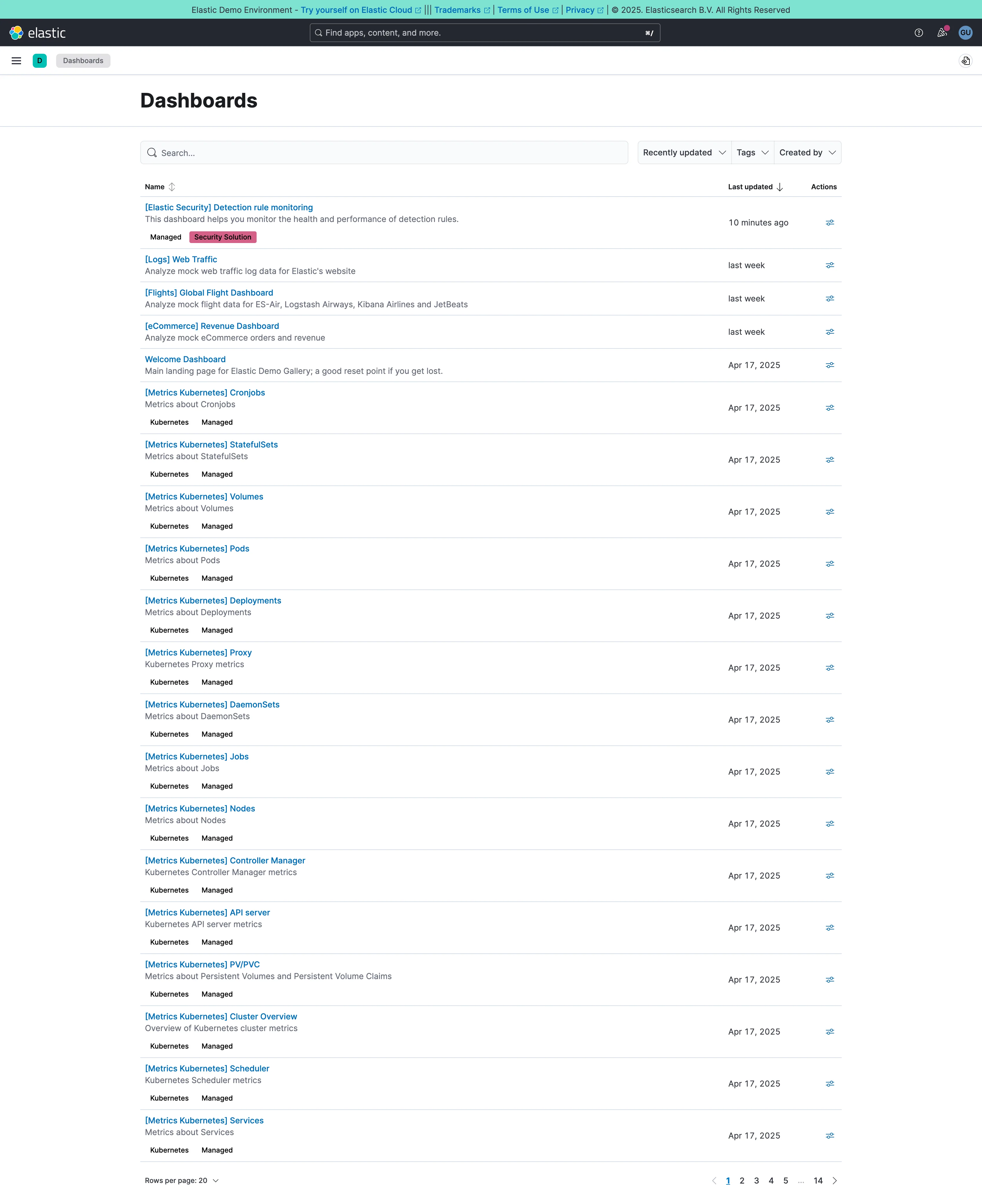
Dashboards / list September 10, 2026 Elastic demo environment (guest session) medium · light · desktop-web
The estate, rather than a dashboard. Twenty rows a page and fourteen pages, so something close to 280 dashboards, and sixteen of the twenty on this first page are called "[Metrics Kubernetes] something"—Cronjobs, StatefulSets, Volumes, Pods, Deployments, Proxy, DaemonSets, Jobs, Nodes. They were generated by an integration rather than designed, they all landed on the same day, and they will sit in this list forever. That's the shape every mature dashboard estate takes, and it's why search stops being a convenience at this scale: nobody is browsing to page nine. The list does two things well. Each row carries a one-line description under the title, which is the difference between a name and an answer. And the bracket prefix is doing the work a folder would, so the generated ones sort together and stay out of the way of the four a person actually made.
  • Multi-page dashboard A set of peers with no landing page. Fourteen pages of them, and nothing says which is the one the team uses.
  • Search across panels Past about fifty dashboards this is the navigation and the list below it is a filing system nobody browses.
  • Semantic grouping Tags and a bracket prefix standing in for folders, which is what keeps 250 generated pages out of the way.
  • Data table Name, description, last updated, actions. The description column is what makes this a list you can read rather than scan.