Skip to content
KONIGI

Dashboards / Structure / Sidebar and canvas

3 of 4

Sidebar and canvas

Navigation between many dashboards needs to be persistent without stealing the canvas.

Updated September 10, 2026

Problem

There are two hundred dashboards. The viewer needs to move between them constantly, needs to know where they currently are, and needs the data itself to get almost all of the screen.

Solution

A persistent rail down one side carrying navigation and current position; everything else is canvas. The rail is narrow, always present, and never scrolls with the content.

The value is orientation as much as travel. A rail that highlights the current item answers “where am I” continuously, for free, which a breadcrumb only answers when someone reads it. That matters most for the person who arrived from an alert link and has no idea what else exists.

Three decisions do most of the work.

What the rail contains. Global sections, or the contents of the current section, or both stacked. Both is the most useful and the most likely to overflow. A rail that tries to hold a two-hundred-item tree becomes a scrolling list inside a page that also scrolls, which is the single most common way this pattern goes wrong.

Whether it collapses. On a data-dense page the rail is competing with the thing people came for. A collapse control reclaims the width, and then the orientation benefit disappears exactly when the page is densest.

What happens when the window narrows. The rail is the first thing to go, and if it held the only navigation, the narrow layout has no navigation. That has to be designed rather than discovered.

Use when

There are many destinations, viewers move between them often, and the page needs a persistent sense of place. Products rather than single dashboards.

Don’t use when

There are four destinations. A rail holding four links is a horizontal nav rotated ninety degrees and costing more width. Also avoid it on anything going on a wall, where nobody is navigating and the rail is pure loss.

Trade-offs

The rail costs 200 to 300 pixels forever, which on a dense grid is a column of panels. Deep trees inside a fixed-width rail truncate labels, and truncated labels are close to useless for distinguishing similarly-named dashboards. Two scroll regions on one page is a persistent small annoyance that nobody reports and everybody feels. And a rail invites growth: every team wants an entry, and the list becomes the thing you need navigation for.

Checklist

  • What is in the rail: global sections, current-section contents, or both?
  • Does it show current position clearly enough to orient someone who arrived from a link?
  • What happens at two hundred items, and is there search?
  • Do labels truncate, and are truncated labels still distinguishable?
  • Does the rail scroll independently, and does that fight the page scroll?
  • Can it collapse, and does anything break when it does?
  • What replaces it below the mobile breakpoint?
  • How much horizontal space does it take from the canvas, and is that trade stated?
  • Does it survive being on a wallboard, or should it be hidden there?
  • Who decides what gets an entry, and what stops the list growing?

Compare

Grafana runs a collapsible left nav for products and sections with dashboard search as the real navigation, an admission that at real scale a tree stops working and a search box is the honest answer. Netdata puts a node and section tree in the rail and uses it as the page’s table of contents as well as its navigation, so the rail scrolls the canvas rather than replacing it. Kibana splits the difference with a collapsible rail for apps and in-page controls for everything within an app, which keeps the rail short at the cost of two different navigation models to learn. Sentry keeps a thin fixed rail for top-level areas and pushes all narrowing into the content, which suits a product where the work is a queue rather than a library.

Overview then detail is the hierarchy the rail exposes. Multi-page dashboard is the alternative when the destinations are few and parallel. Tabs as genres is the horizontal version for a small, fixed set. Two-pane list and detail is the same split applied to items rather than destinations. Mobile adaptation is where the rail has to become something else entirely.
Sidebar and canvas anatomy A wide screen with a persistent rail down the left, one item highlighted as the current position, and the rest of the width given to the canvas. Beside it, the same screen narrowed, where the rail has collapsed and taken the navigation with it. Anatomy Rail plus canvas Rail gone 1 2 3 4 1 THE RAIL Narrow, always there, and it does not scroll with the canvas. 2 CURRENT POSITION Answers "where am I" continuously and for free. A breadcrumb waits to be read. 3 THE CANVAS Everything else. On a dense page the rail is competing with what people came for. 4 WHEN IT NARROWS The rail goes first. If it held the only route anywhere, the narrow layout has none.
Wireframe — the pattern's anatomy, not any one product's version of it

Implementation

Persistent navigation across many dashboards without stealing the canvas. A sidebar earns its 240px by showing where you are in a set of fifty, and stops earning it the moment the set is six.

shadcn
npx shadcn@latest add scroll-area button
npm
lucide-react
Tokens
--card--foreground--muted--muted-foreground--border--chart-1
Checkout

Requests per second

312

p95 latency, ms

158

Error rate

0.7

Shell.tsxA rail that scrolls on its own, highlights the current item, collapses on request, and becomes a menu below the breakpoint so the narrow layout keeps its navigation.

import { useState, type ReactNode } from "react";
import { Menu, PanelLeftClose } from "lucide-react";
import { Button } from "@/components/ui/button";
import { ScrollArea } from "@/components/ui/scroll-area";
import { cn } from "@/lib/utils";

export type NavItem = { id: string; label: string };
export type NavSection = { label: string; items: NavItem[] };

/**
 * A rail and a canvas. The rail is narrow, always present, and scrolls on
 * its own rather than with the page. It highlights the current item, which
 * is the whole reason it earns its width: "where am I" answered continuously,
 * for someone who arrived from an alert link and has no idea what else exists.
 *
 * Two things are decided here rather than discovered later. Collapse reclaims
 * the width on a dense page. Below the breakpoint the rail hides, and the menu
 * button that replaces it opens the same list, so the narrow layout still has
 * a route everywhere.
 */
export function Shell({ workspace, sections, current, onNavigate, children, railWidth = 240 }: {
  workspace: string;
  sections: NavSection[];
  /** The id of the item the canvas is showing. Required: a rail without a
   *  current position is a list of links, and a breadcrumb does that. */
  current: string;
  onNavigate: (id: string) => void;
  children: ReactNode;
  railWidth?: number;
}) {
  const [collapsed, setCollapsed] = useState(false);
  const [open, setOpen] = useState(false); // the narrow layout's overlay

  const rail = (
    <nav aria-label="Dashboards" className="flex h-full flex-col">
      <div className="flex items-center justify-between px-3 py-2">
        <span className="truncate text-sm font-medium">{workspace}</span>
        <Button variant="ghost" size="sm" className="h-7 w-7 p-0 md:inline-flex hidden" aria-label="Collapse the rail" onClick={() => setCollapsed(true)}>
          <PanelLeftClose />
        </Button>
      </div>
      <ScrollArea className="flex-1">
        {sections.map((s) => (
          <div key={s.label} className="px-1.5 pb-2">
            <p className="px-1.5 pt-2 pb-1 text-[11px] uppercase tracking-wide text-muted-foreground">{s.label}</p>
            {s.items.map((it) => (
              <button
                key={it.id}
                type="button"
                aria-current={it.id === current ? "page" : undefined}
                onClick={() => { onNavigate(it.id); setOpen(false); }}
                title={it.label}
                className={cn(
                  "block w-full truncate rounded px-1.5 py-1 text-left text-xs",
                  it.id === current ? "bg-chart-1/20 text-foreground" : "text-muted-foreground hover:bg-muted",
                )}
              >
                {it.label}
              </button>
            ))}
          </div>
        ))}
      </ScrollArea>
    </nav>
  );

  return (
    <div className="flex h-[260px] overflow-hidden rounded-lg border bg-card">
      {/* Wide: the rail is a column. It never scrolls with the canvas. */}
      {!collapsed && (
        <aside className="hidden shrink-0 border-r md:block" style={{ width: railWidth }}>{rail}</aside>
      )}

      <div className="relative flex min-w-0 flex-1 flex-col">
        <div className="flex items-center gap-1 border-b px-2 py-1">
          <Button variant="ghost" size="sm" className="h-7 w-7 p-0 md:hidden" aria-label="Open navigation" onClick={() => setOpen(true)}>
            <Menu />
          </Button>
          {collapsed && (
            <Button variant="ghost" size="sm" className="hidden h-7 w-7 p-0 md:inline-flex" aria-label="Expand the rail" onClick={() => setCollapsed(false)}>
              <Menu />
            </Button>
          )}
          <span className="truncate text-xs text-muted-foreground">
            {sections.flatMap((s) => s.items).find((it) => it.id === current)?.label}
          </span>
        </div>
        <ScrollArea className="flex-1 p-3">{children}</ScrollArea>

        {/* Narrow: the same list, as an overlay the menu button opens. */}
        {open && (
          <aside className="absolute inset-y-0 left-0 z-10 w-[240px] border-r bg-card shadow-md md:hidden">
            <Button variant="ghost" size="sm" className="absolute right-1 top-1 h-7 w-7 p-0" aria-label="Close navigation" onClick={() => setOpen(false)}>
              <PanelLeftClose />
            </Button>
            {rail}
          </aside>
        )}
      </div>
    </div>
  );
}

demo.tsxHow it is called: two sections, checkout as the current page, three panels on the canvas.

import { useState } from "react";
import { Shell, type NavSection } from "./Shell";

/**
 * Two sections in the rail, checkout as the current position, and three
 * panels of requests per second on the canvas. Narrow the window and the
 * rail becomes a menu button that opens the same list.
 */
const SECTIONS: NavSection[] = [
  { label: "Services", items: [
    { id: "gateway", label: "API gateway" },
    { id: "checkout", label: "Checkout" },
    { id: "search", label: "Search" },
    { id: "cart", label: "Cart" },
    { id: "users", label: "Users" },
    { id: "feed", label: "Feed" },
  ] },
  { label: "Infrastructure", items: [
    { id: "k8s", label: "Kubernetes" },
    { id: "postgres", label: "Postgres" },
    { id: "redis", label: "Redis" },
    { id: "cdn", label: "CDN" },
  ] },
];

const PANELS = [
  { title: "Requests per second", values: [220, 236, 226, 268, 258, 292, 312] },
  { title: "p95 latency, ms", values: [180, 172, 190, 168, 175, 162, 158] },
  { title: "Error rate", values: [1.2, 1.1, 1.4, 0.9, 1.0, 0.8, 0.7] },
];

const Spark = ({ values }: { values: number[] }) => {
  const max = Math.max(...values), min = Math.min(...values);
  const pts = values.map((v, i) => `${(i / (values.length - 1)) * 120},${28 - ((v - min) / (max - min || 1)) * 24}`);
  return (
    <svg viewBox="0 0 120 32" className="mt-2 h-8 w-full" aria-hidden="true">
      <polyline points={pts.join(" ")} fill="none" className="stroke-chart-1" strokeWidth={1.5} />
    </svg>
  );
};

export default function Demo() {
  const [current, setCurrent] = useState("checkout");
  return (
    <Shell workspace="Storefront" sections={SECTIONS} current={current} onNavigate={setCurrent}>
      <div className="grid gap-3 sm:grid-cols-2">
        {PANELS.map((p, i) => (
          <div key={p.title} className={i === 2 ? "rounded border p-3 sm:col-span-2" : "rounded border p-3"}>
            <p className="text-[11px] text-muted-foreground">{p.title}</p>
            <p className="text-lg font-semibold tabular-nums">{p.values.at(-1)}</p>
            <Spark values={p.values} />
          </div>
        ))}
      </div>
    </Shell>
  );
}
What it renders. Identical markup in both panes, with only the token values changing.

Examples

Captures whose hotspots reference this pattern, grouped by product and dated. The dashed boxes are this pattern; hover any box for the note.

Home Assistant

A card grid people genuinely rearrange, on a wall tablet, which is where resizable layouts either work or quietly stop describing the house.

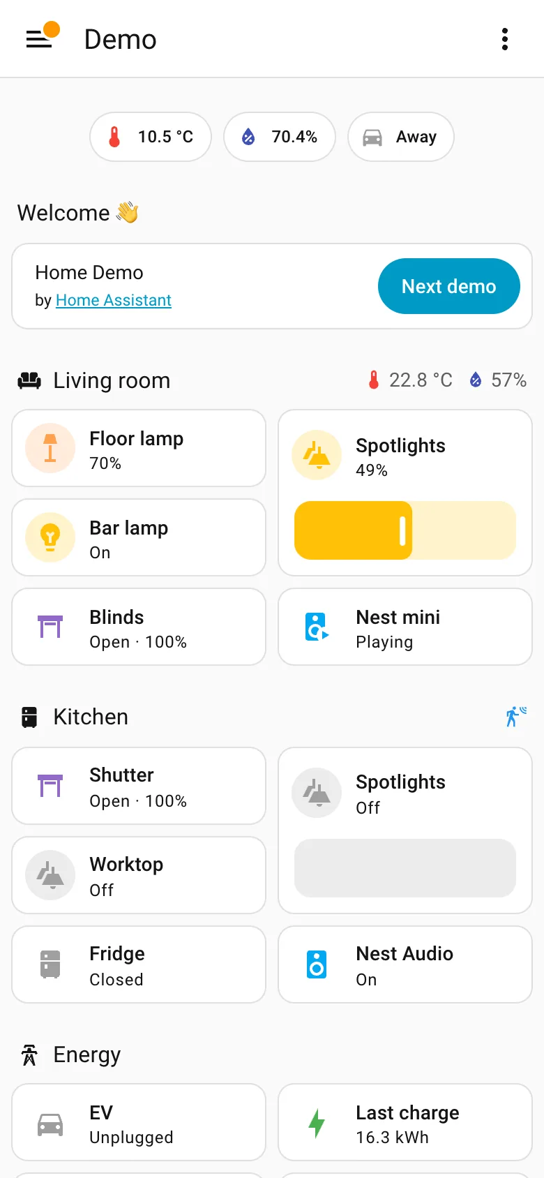
Demo dashboard at phone width September 10, 2026 Home Assistant public demo (signed out, 390px viewport) medium · light · mobile
The same dashboard as the desktop capture at 390 pixels. It is a reflow rather than a designed phone page, and for this content that is defensible—a list of things with states doesn't need width the way a chart does, sections stay intact, nothing is dropped, and the slider becomes a much better touch target than it was with a mouse. What doesn't survive is the order. On desktop the sections sit in three columns and each column reads down: Welcome, Energy, Outdoor on the left. On the phone they come out row by row instead, so Energy falls from second in its column to fourth on the page and Kitchen climbs from the far right to third. Nothing about the desktop layout expressed which of those mattered more, so the reflow had nothing to preserve and picked an order from the source. The rail is the other casualty and goes exactly where these always go, into a hamburger.
  • Mobile adaptation Reflowed, not rebuilt. Section order comes out row-major here and column-major on desktop, so priority shifts.
  • Sidebar and canvas The rail is gone. Everything it held is now behind one button, which is the usual and unavoidable trade.
  • Resizable card grid Two columns of cards inside each section rather than a single stack, so the page stays short enough to scroll.
  • Header KPI strip The three chips survive the switch intact, which is what a strip of four to six is for.
Show 2 more examples Hide the rest

Home Assistant

A card grid people genuinely rearrange, on a wall tablet, which is where resizable layouts either work or quietly stop describing the house.

Home Assistant — Demo dashboard
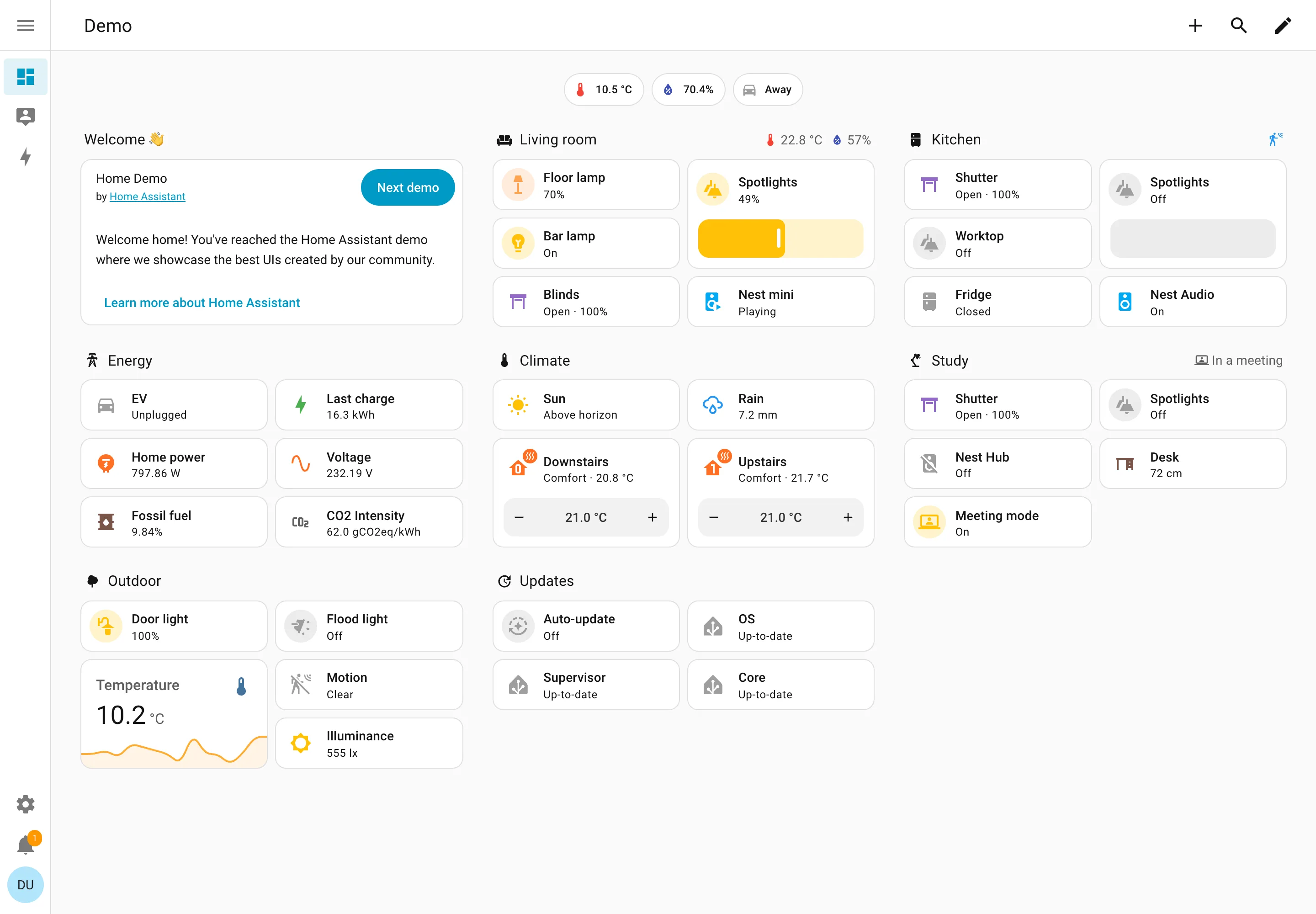
Resizable card grid. Cards a household arranges itself, grouped by room. Sections are one column each rather than a free canvas. Semantic grouping. Grouped by where the thing physically is, and the group header carries that room's temperature and humidity. Sidebar and canvas. Collapsed to icons by default, because on a wall tablet the canvas is worth more than the labels. Sparkline. One card carrying a number and the shape behind it, with no axis and no legend. Semantic status color. Amber means on, and the card says 49% anyway. Colour repeats the word instead of replacing it. Header KPI strip. Three chips above everything: outside temperature, humidity, and whether anyone is home. Dashboard builder. A pencil in the corner. Editing is one click from reading, which is why these pages actually get rearranged.
Demo dashboard September 10, 2026 Home Assistant public demo (signed out) medium · light · desktop-web
The grouping axis here is physical space—Living room, Kitchen, Study, Outdoor—which nothing else in this gallery uses, and it works for the same reason process mimics work: the viewer already holds the model. The thing worth stealing is the state labelling. Every entity says its state in words: Open · 100%, Off, Closed, Playing, Up-to-date, Unplugged. The amber tint on an icon repeats what the word already said rather than replacing it, so the page is readable with no colour at all. That isn't accessibility diligence so much as an audience constraint—you cannot train a household on a colour key the way you can train an on-call rota, so the words have to carry. Each section header also doubles as a summary: Living room reports 22.8°C and 57% humidity beside its own name, and Study reports "In a meeting". And this is a control surface as much as a display—the Spotlights card is a slider you drag, the thermostats have plus and minus.
  • Resizable card grid Cards a household arranges itself, grouped by room. Sections are one column each rather than a free canvas.
  • Semantic grouping Grouped by where the thing physically is, and the group header carries that room's temperature and humidity.
  • Semantic status color Amber means on, and the card says 49% anyway. Colour repeats the word instead of replacing it.
  • Header KPI strip Three chips above everything: outside temperature, humidity, and whether anyone is home.
  • Sidebar and canvas Collapsed to icons by default, because on a wall tablet the canvas is worth more than the labels.
  • Sparkline One card carrying a number and the shape behind it, with no axis and no legend.
  • Dashboard builder A pencil in the corner. Editing is one click from reading, which is why these pages actually get rearranged.

Netdata

Per-second charts, hundreds per node, with a per-chart anomaly ribbon instead of a band on the series.

Netdata — Metrics / System
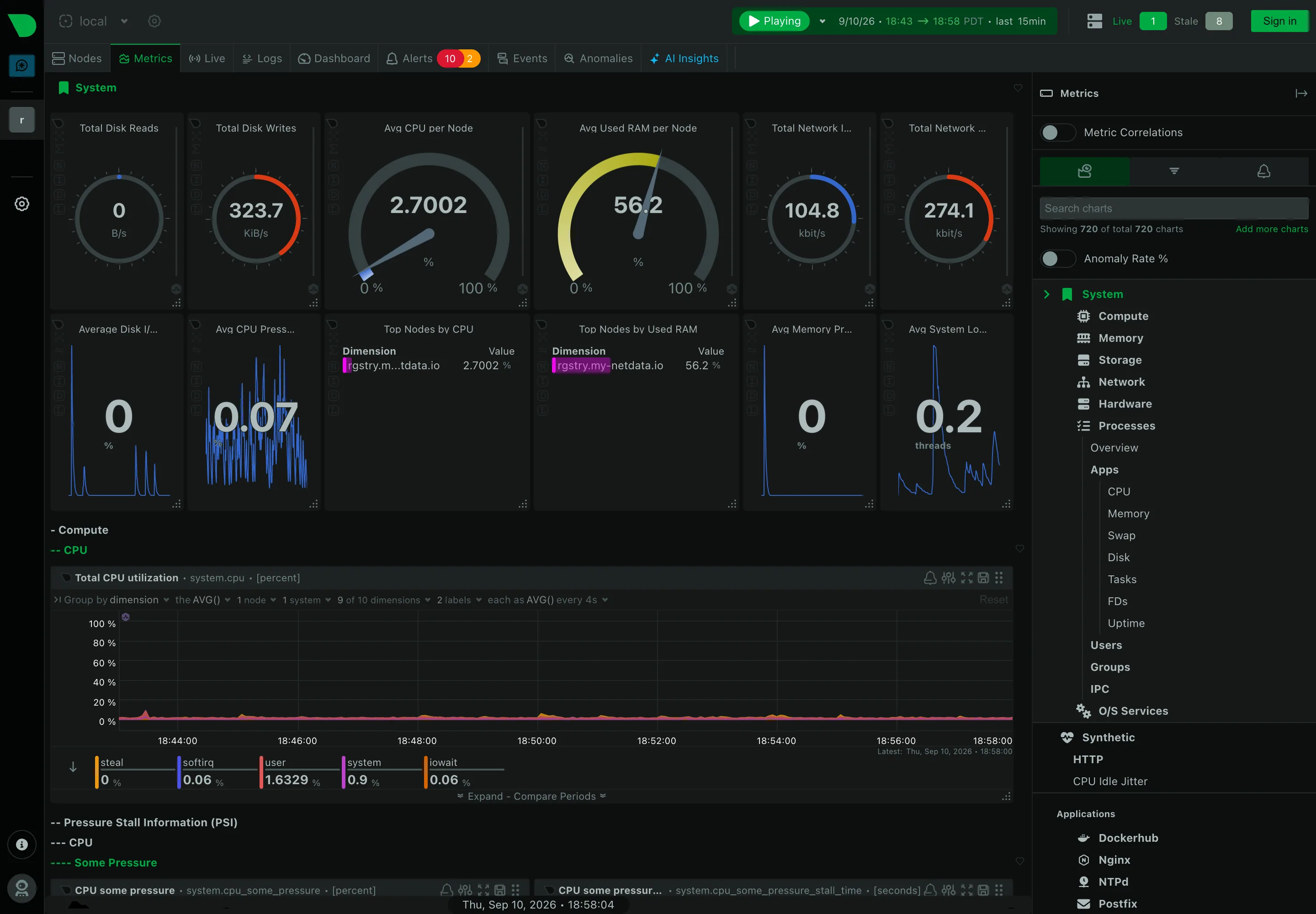
Header KPI strip. Twelve tiles in two rows, in four different layouts. It reads as twelve things rather than one strip. Sidebar and canvas. The rail is the dashboard. A generated tree of every metric family the agent found. Gauge and dial. Arcs for disk reads and writes, where the maximum is invented—this is a rate, not a capacity. Dashboard builder. A query builder inline in the panel header: group by, aggregation, node and dimension count. Search across panels. 720 charts, so search is the navigation and the tree is the filing system nobody browses. Semantic grouping. Sections generated by the collector rather than chosen. Consistent, and about nothing in particular. Compare periods. Offered per chart rather than per dashboard, which is the scoping trap: one panel shifted, the rest not. Freshness indicator. Live 1, Stale 8. Most products would have drawn all nine and said nothing.
Metrics / System September 10, 2026 Netdata Agent v2.10.0-686-nightly (public registry node, signed out) dense · dark · desktop-web
Structurally the opposite of Grafana, and worth the comparison. Nobody built this page. The right rail says "showing 720 of total 720 charts" and the tree beneath it—System, Compute, Memory, Storage, Network, Hardware, Processes, then Apps, Users, Groups, O/S Services, and every application it found—is generated from what the agent collects. The canvas is the same hierarchy rendered downward, four levels deep, headings prefixed with dashes: System, then Compute, then CPU, then the chart. There is no editorial layer at all, which means nothing is missing and nothing is prioritised. The header also does something most products won't: it reports "Live 1, Stale 8" beside the node count, so eight of the nine machines behind this view are not currently reporting and the page says so rather than drawing their last known values.
  • Sidebar and canvas The rail is the dashboard. A generated tree of every metric family the agent found.
  • Search across panels 720 charts, so search is the navigation and the tree is the filing system nobody browses.
  • Header KPI strip Twelve tiles in two rows, in four different layouts. It reads as twelve things rather than one strip.
  • Gauge and dial Arcs for disk reads and writes, where the maximum is invented—this is a rate, not a capacity.
  • Semantic grouping Sections generated by the collector rather than chosen. Consistent, and about nothing in particular.
  • Freshness indicator Live 1, Stale 8. Most products would have drawn all nine and said nothing.
  • Dashboard builder A query builder inline in the panel header: group by, aggregation, node and dimension count.
  • Compare periods Offered per chart rather than per dashboard, which is the scoping trap: one panel shifted, the rest not.