Home Assistant
A card grid people genuinely rearrange, on a wall tablet, which is where resizable layouts either work or quietly stop describing the house.
home-assistant.io , opens in a new tab Live demo , opens in a new tab
Patterns seen here 8
Captures
2 captures, newest first. Hover any box for the pattern and the note.
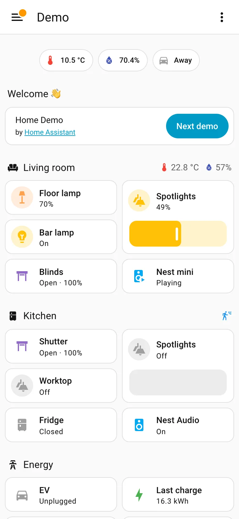
Mobile adaptation. Reflowed, not rebuilt. Section order comes out row-major here and column-major on desktop, so priority shifts. Resizable card grid. Two columns of cards inside each section rather than a single stack, so the page stays short enough to scroll. Header KPI strip. The three chips survive the switch intact, which is what a strip of four to six is for. Sidebar and canvas. The rail is gone. Everything it held is now behind one button, which is the usual and unavoidable trade.
- Mobile adaptation Reflowed, not rebuilt. Section order comes out row-major here and column-major on desktop, so priority shifts.
- Sidebar and canvas The rail is gone. Everything it held is now behind one button, which is the usual and unavoidable trade.
- Resizable card grid Two columns of cards inside each section rather than a single stack, so the page stays short enough to scroll.
- Header KPI strip The three chips survive the switch intact, which is what a strip of four to six is for.
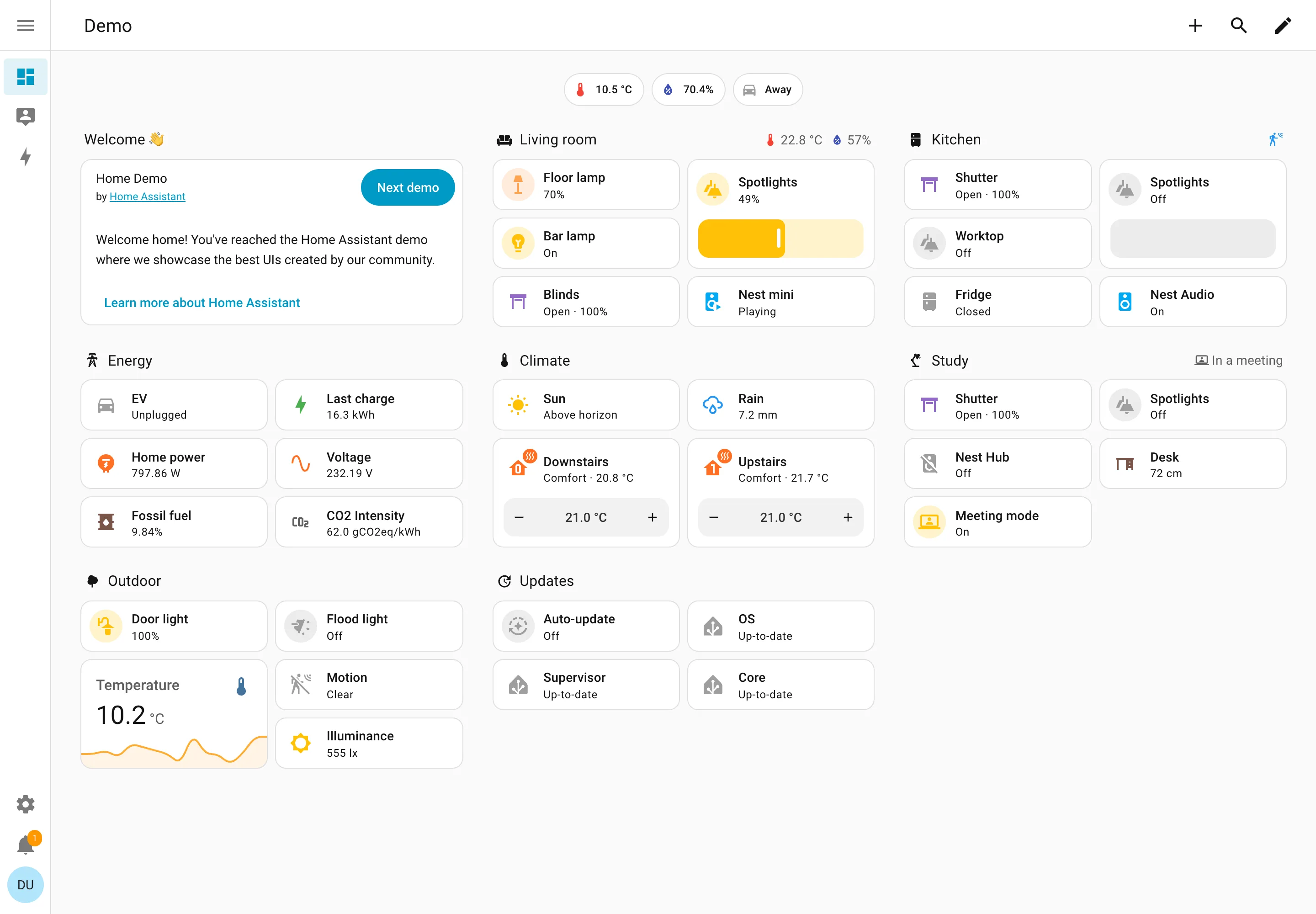
Resizable card grid. Cards a household arranges itself, grouped by room. Sections are one column each rather than a free canvas. Semantic grouping. Grouped by where the thing physically is, and the group header carries that room's temperature and humidity. Sidebar and canvas. Collapsed to icons by default, because on a wall tablet the canvas is worth more than the labels. Sparkline. One card carrying a number and the shape behind it, with no axis and no legend. Semantic status color. Amber means on, and the card says 49% anyway. Colour repeats the word instead of replacing it. Header KPI strip. Three chips above everything: outside temperature, humidity, and whether anyone is home. Dashboard builder. A pencil in the corner. Editing is one click from reading, which is why these pages actually get rearranged.
- Resizable card grid Cards a household arranges itself, grouped by room. Sections are one column each rather than a free canvas.
- Semantic grouping Grouped by where the thing physically is, and the group header carries that room's temperature and humidity.
- Semantic status color Amber means on, and the card says 49% anyway. Colour repeats the word instead of replacing it.
- Header KPI strip Three chips above everything: outside temperature, humidity, and whether anyone is home.
- Sidebar and canvas Collapsed to icons by default, because on a wall tablet the canvas is worth more than the labels.
- Sparkline One card carrying a number and the shape behind it, with no axis and no legend.
- Dashboard builder A pencil in the corner. Editing is one click from reading, which is why these pages actually get rearranged.