The reference implementation for panel grids, template variables, and stat panels; most other tools are defined by how they differ from it.
Observability · Infrastructure and FinOps · IoT and energyIoT and energy
Readings from equipment in the physical world, often laid out the way the equipment itself is.
Products 3
A card grid people genuinely rearrange, on a wall tablet, which is where resizable layouts either work or quietly stop describing the house.
IoT and energyA public SCADA demo running live simulated plant data, with a runtime toggle between simple and photorealistic pump and pipe rendering—the ISA-101 argument as a setting.
IoT and energyPatterns seen in this domain 48
- Alert rule attached to panel
- Annotation
- Categorical series palette
- Dark-first data palette
- Dashboard builder
- Data source badge
- Data table
- Delta indicator
- Dense small-multiple layout
- Drill-down
- Empty state
- Error and stale state
- Explain this metric
- Filter bar
- Freshness indicator
- Gauge and dial
- Geo map with markers
- Grayscale with alerts
- Header KPI strip
- Heatmap
- Histogram and distribution
- Host map
- KPI tile
- Legend and series toggle
- Loading and skeleton state
- Log tail
- Metric targets
- Mobile adaptation
- Panel grid
- Process mimic
- Ranked list
- Resizable card grid
- Semantic grouping
- Semantic status color
- Sequential and diverging scales
- Service map
- Sidebar and canvas
- Small multiples
- Sparkline
- Stacked composition
- Status history
- Target and progress
- Template variable
- Threshold line and region
- Time series
- Time-range picker
- Wallboard mode
- Zoom and pan on time
Captures
Newest first within each product.
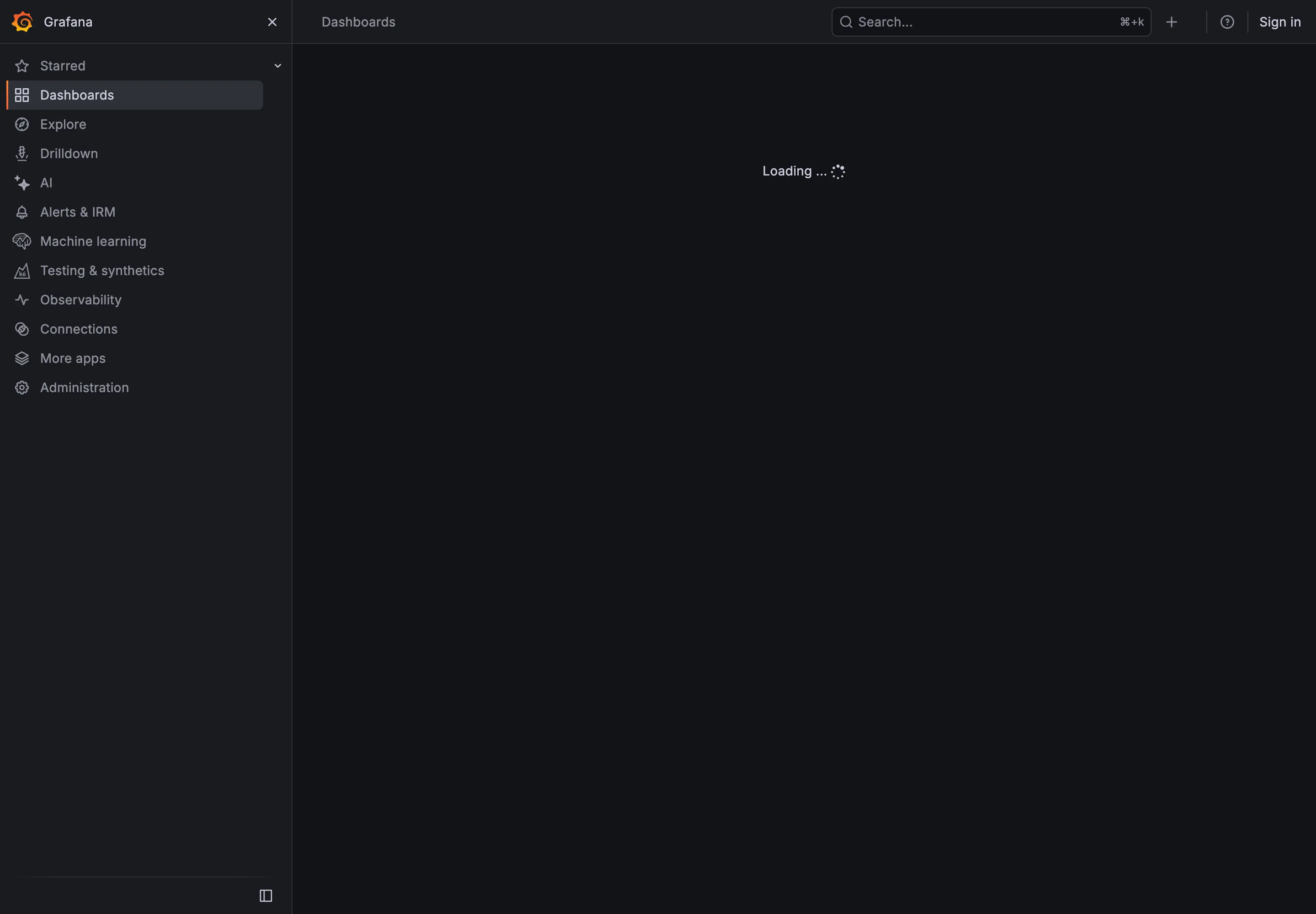
- Loading and skeleton state A spinner and the word Loading. Correct that work is happening, silent about what is arriving or how much.
- Loading and skeleton state The space twenty-eight rows are about to fill, holding nothing. When they land, everything below them moves.
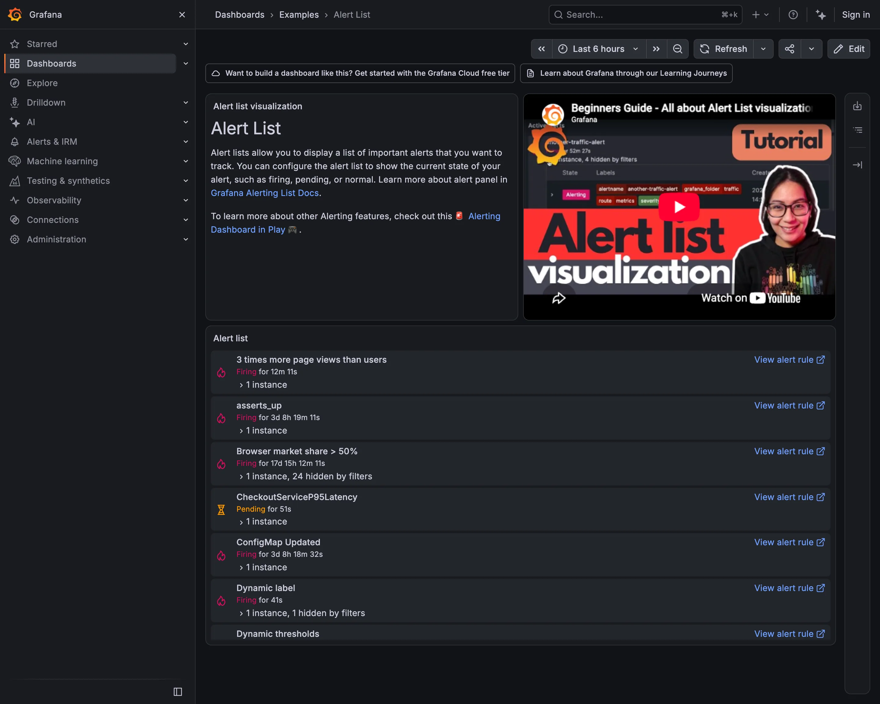
Alert rule attached to panel. Seven rules in six naming conventions. Nothing in the list conveys severity or subject. Alert rule attached to panel. Firing for 17 days. Still actionable, in principle; nobody has acted for two and a half weeks. Semantic status color. Pending rather than firing: the threshold is met and the duration isn't. Two states, both named. Drill-down. The route from an alert back to the rule that defined it, on every row. Filter bar. "1 instance, 24 hidden by filters"—the list saying what it is not showing you.
- Alert rule attached to panel Seven rules in six naming conventions. Nothing in the list conveys severity or subject.
- Alert rule attached to panel Firing for 17 days. Still actionable, in principle; nobody has acted for two and a half weeks.
- Semantic status color Pending rather than firing: the threshold is met and the duration isn't. Two states, both named.
- Filter bar "1 instance, 24 hidden by filters"—the list saying what it is not showing you.
- Drill-down The route from an alert back to the rule that defined it, on every row.
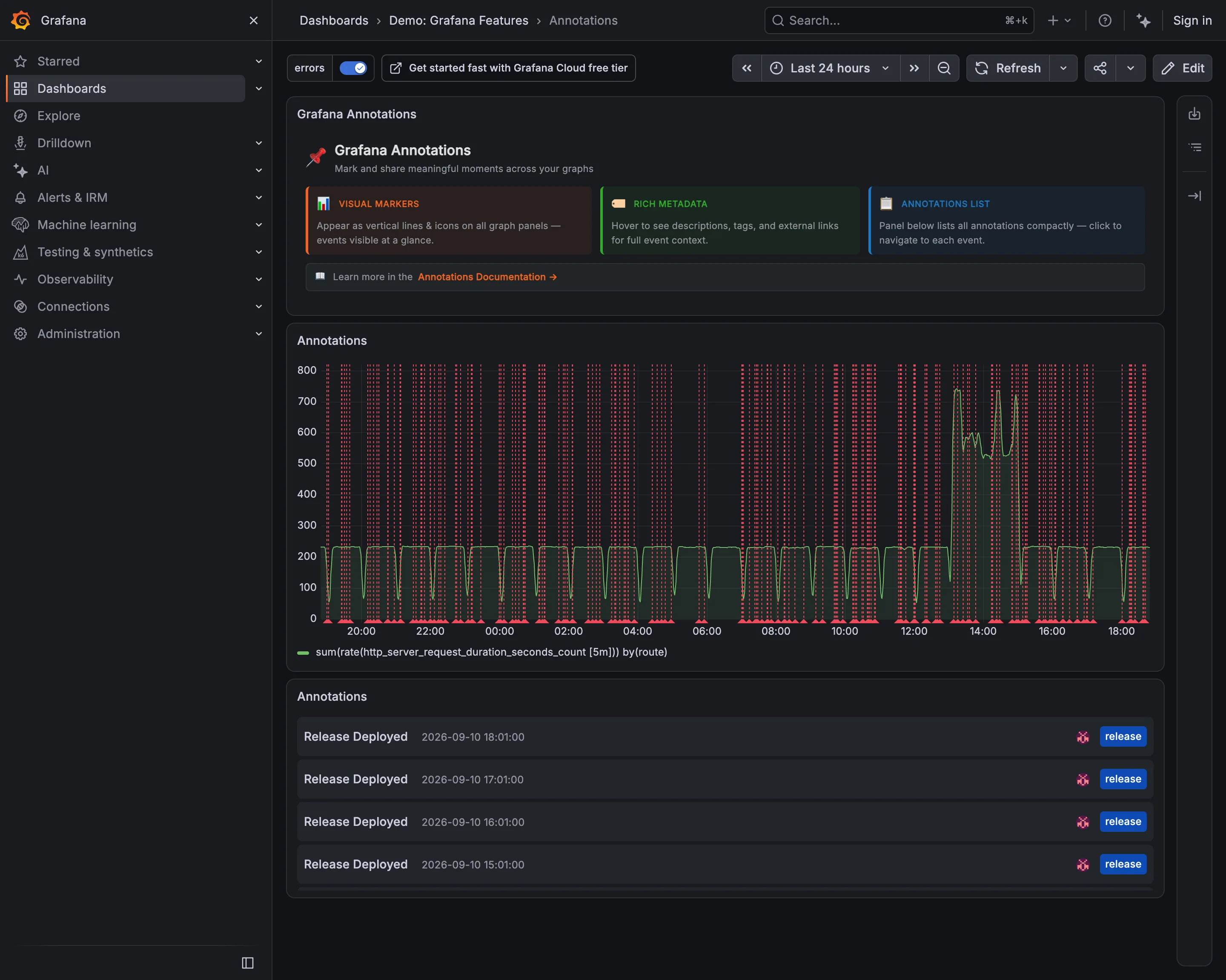
Annotation. Fifty deploy markers on a 24-hour chart. Each one is correct and together they are a picket fence. Annotation. The same events as a list, tagged release and timestamped. Readable in a way the chart is not. Time-range picker. Twenty-four hours, which is what sets the marker density. An hour here would be three lines. Filter bar. The tag filter that makes this survivable, already on. The chart above is the filtered version.
- Annotation Fifty deploy markers on a 24-hour chart. Each one is correct and together they are a picket fence.
- Annotation The same events as a list, tagged release and timestamped. Readable in a way the chart is not.
- Filter bar The tag filter that makes this survivable, already on. The chart above is the filtered version.
- Time-range picker Twenty-four hours, which is what sets the marker density. An hour here would be three lines.
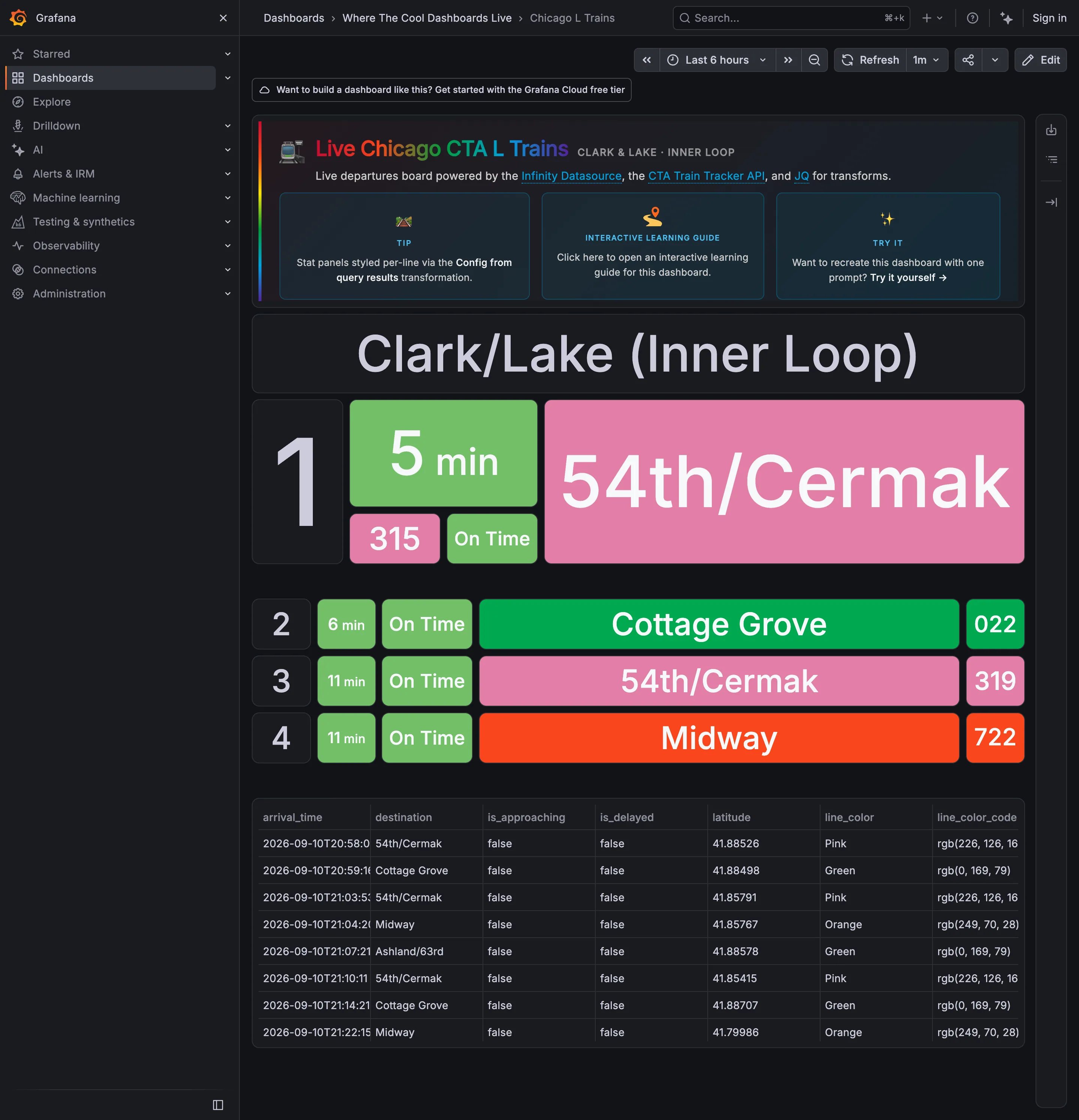
Data table. The raw feed under the board, including the rgb string each line colour came from. Wallboard mode. The next train, three times the height of the rest. Readable at ten feet with no pointer. Panel grid. Rows two to four at a third the size. Panel size is carrying the priority. Freshness indicator. A countdown rather than a clock time, which is the right call and hides how old the feed is. Semantic status color. Green for on time, next to green for the Green Line. One hue, two unrelated jobs, one row.
- Wallboard mode The next train, three times the height of the rest. Readable at ten feet with no pointer.
- Panel grid Rows two to four at a third the size. Panel size is carrying the priority.
- Semantic status color Green for on time, next to green for the Green Line. One hue, two unrelated jobs, one row.
- Freshness indicator A countdown rather than a clock time, which is the right call and hides how old the feed is.
- Data table The raw feed under the board, including the rgb string each line colour came from.
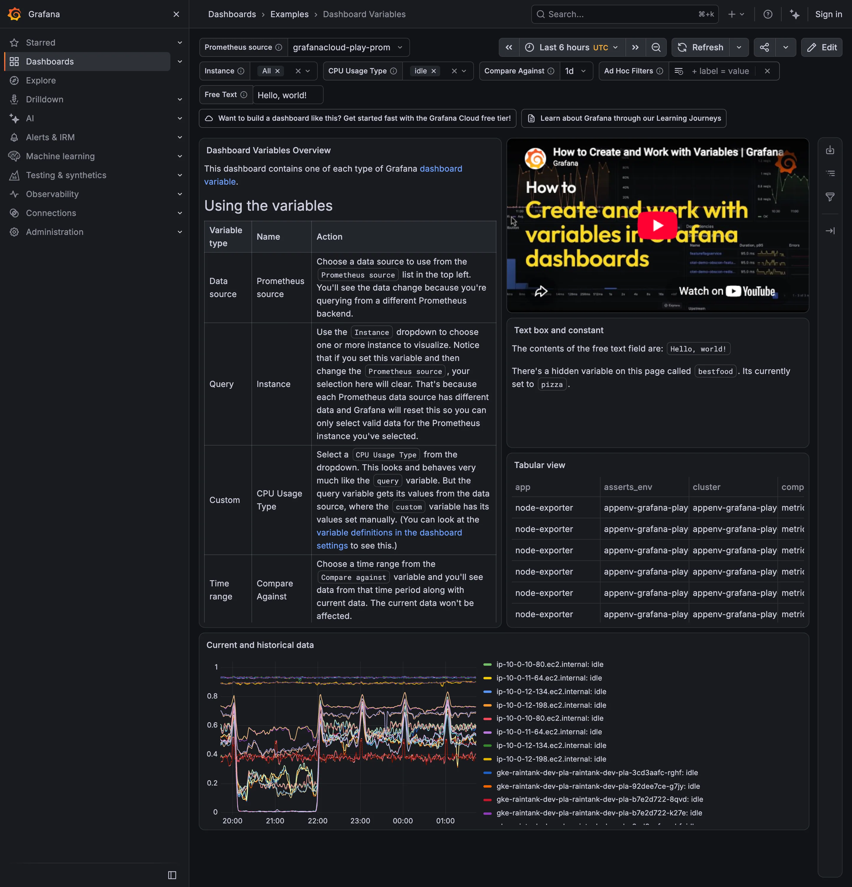
Categorical series palette. Twelve-plus hostnames differing only in the middle digits, with twelve-plus colours to match. Data table. Four columns visible, the fourth cut mid-word, with no horizontal scroll offered. Template variable. Six selectors bound to every panel's query, with the chosen values carried in the URL. Explain this metric. Names a hidden variable set to pizza. Prose is doing the work a control should. Filter bar. Values as removable chips rather than a dropdown saying Instance (3).
- Template variable Six selectors bound to every panel's query, with the chosen values carried in the URL.
- Filter bar Values as removable chips rather than a dropdown saying Instance (3).
- Explain this metric Names a hidden variable set to pizza. Prose is doing the work a control should.
- Categorical series palette Twelve-plus hostnames differing only in the middle digits, with twelve-plus colours to match.
- Data table Four columns visible, the fourth cut mid-word, with no horizontal scroll offered.
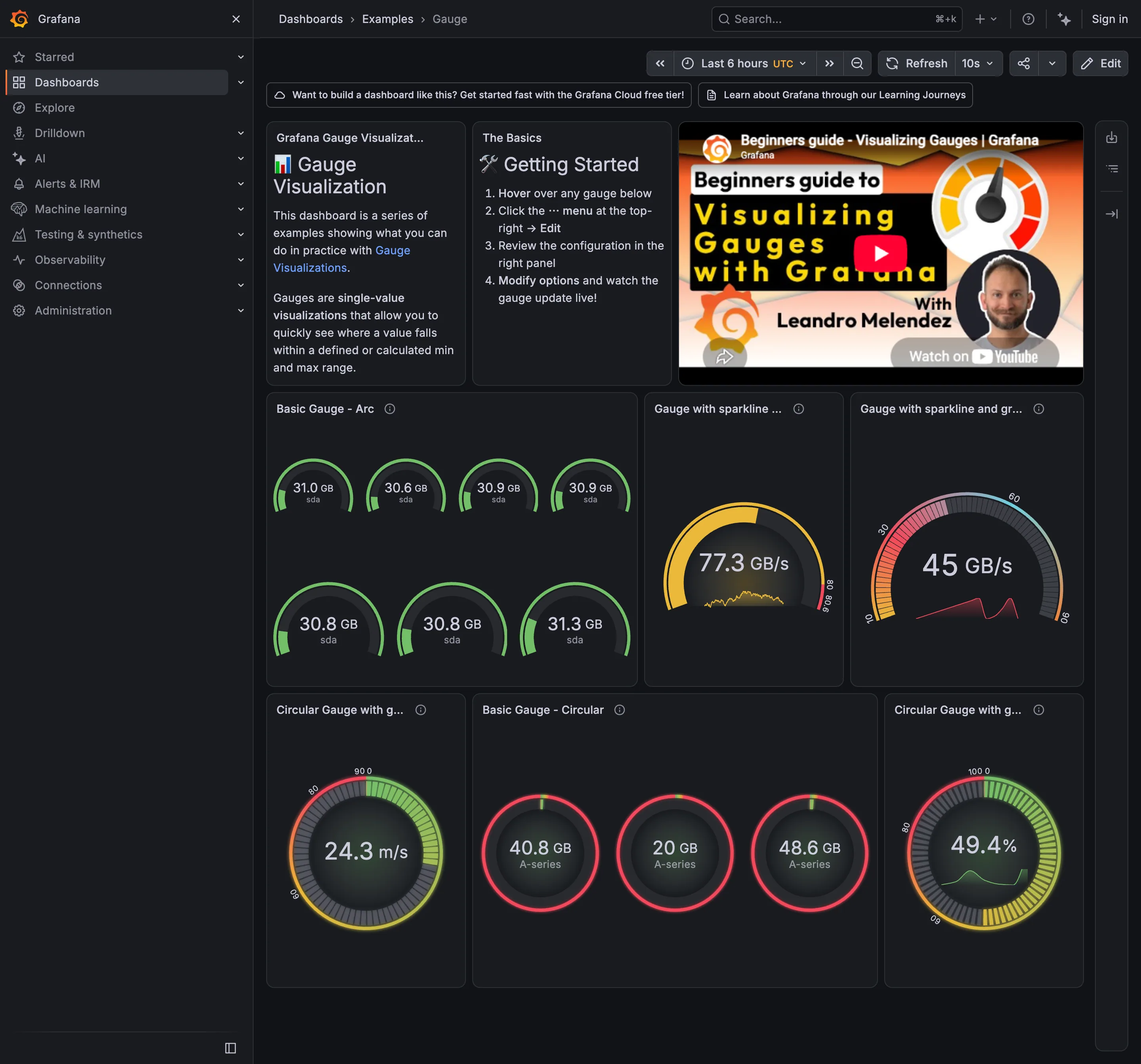
Semantic status color. 40.8, 20 and 48.6 all arc red. The threshold fires for everything, so it says nothing. Gauge and dial. Seven arcs to report that seven disks agree. This is the area argument in one panel. Sequential and diverging scales. The arc runs pink through green with no perceptual order, so position on it means nothing without the number. Sparkline. A sparkline inside the arc: the same series encoded twice in one square. Threshold line and region. The coloured band around the rim is the threshold, drawn as a region rather than a line.
- Gauge and dial Seven arcs to report that seven disks agree. This is the area argument in one panel.
- Sparkline A sparkline inside the arc: the same series encoded twice in one square.
- Sequential and diverging scales The arc runs pink through green with no perceptual order, so position on it means nothing without the number.
- Semantic status color 40.8, 20 and 48.6 all arc red. The threshold fires for everything, so it says nothing.
- Threshold line and region The coloured band around the rim is the threshold, drawn as a region rather than a line.
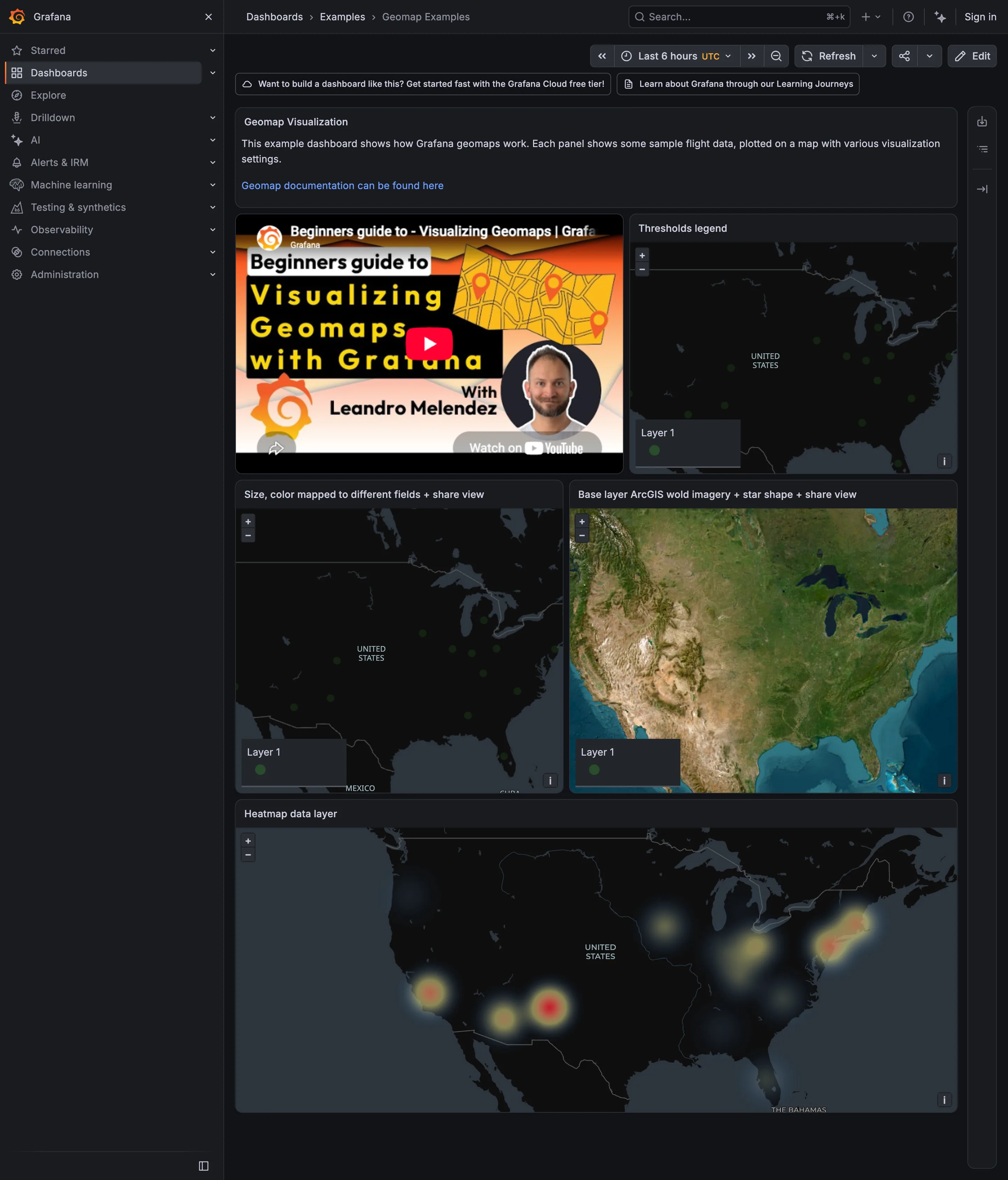
Sequential and diverging scales. Density, with a ramp whose radius parameter changes the apparent story and isn't shown. Geo map with markers. Satellite imagery under the same markers, competing with the data instead of receding. Legend and series toggle. A legend reading 'Layer 1'. It holds a corner of the panel and identifies nothing. Geo map with markers. Markers as small dots. Green on dark grey at four pixels is near the contrast floor.
- Geo map with markers Markers as small dots. Green on dark grey at four pixels is near the contrast floor.
- Geo map with markers Satellite imagery under the same markers, competing with the data instead of receding.
- Sequential and diverging scales Density, with a ramp whose radius parameter changes the apparent story and isn't shown.
- Legend and series toggle A legend reading 'Layer 1'. It holds a corner of the panel and identifies nothing.
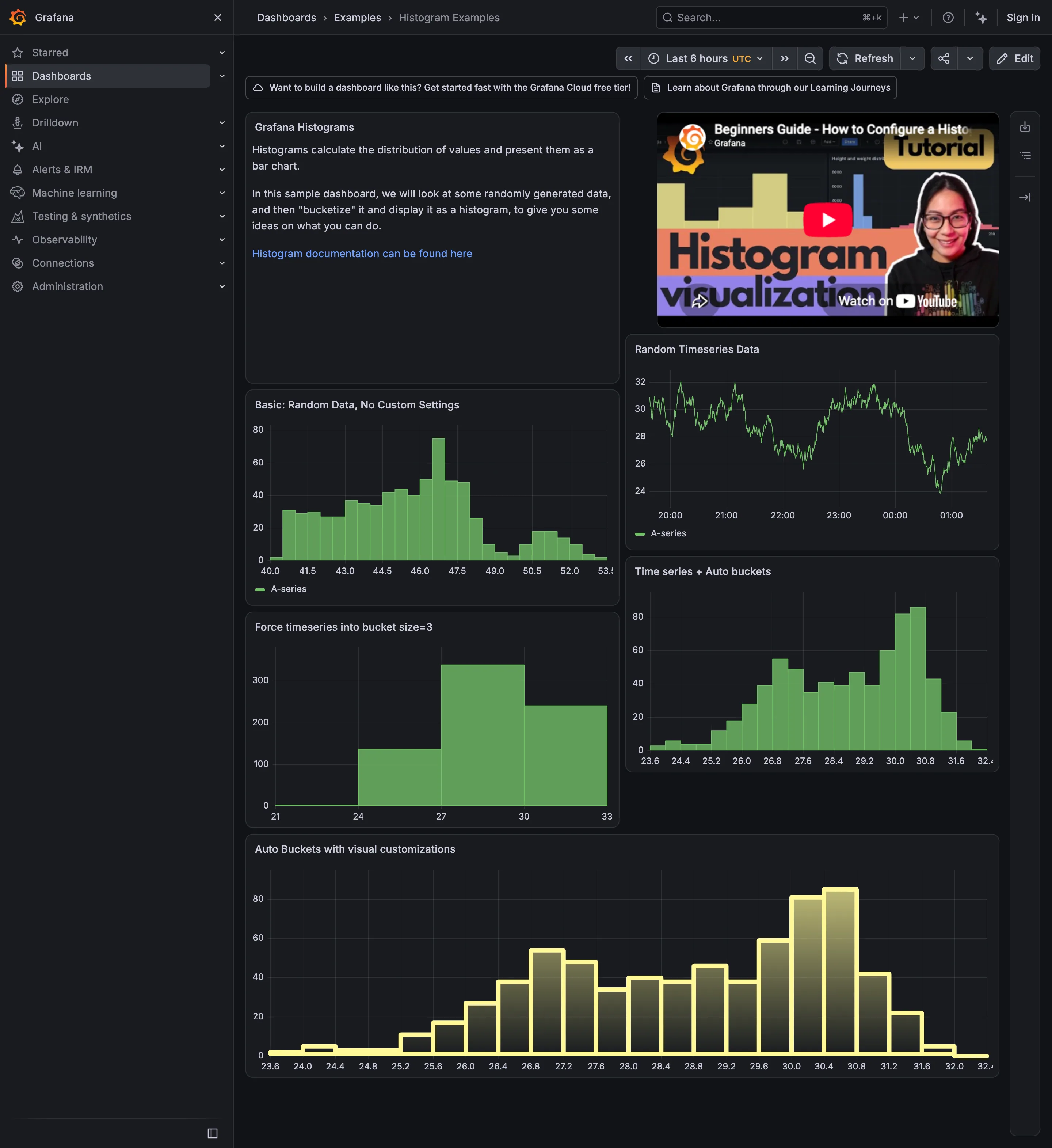
Sequential and diverging scales. A gradient fill down each bar, encoding nothing. The height already carried the count. Time series. The source series, before any bucketing. Two modes are not visible here either. Histogram and distribution. Automatic buckets on that series: clearly bimodal, humps at roughly 27 and 30.4. Histogram and distribution. The same data at bucket size 3. Four bars, one hump, and no sign that anything was lost. Histogram and distribution. A different series at the default count, showing a long left shoulder and a small second mode at 50.5.
- Time series The source series, before any bucketing. Two modes are not visible here either.
- Histogram and distribution Automatic buckets on that series: clearly bimodal, humps at roughly 27 and 30.4.
- Histogram and distribution The same data at bucket size 3. Four bars, one hump, and no sign that anything was lost.
- Histogram and distribution A different series at the default count, showing a long left shoulder and a small second mode at 50.5.
- Sequential and diverging scales A gradient fill down each bar, encoding nothing. The height already carried the count.
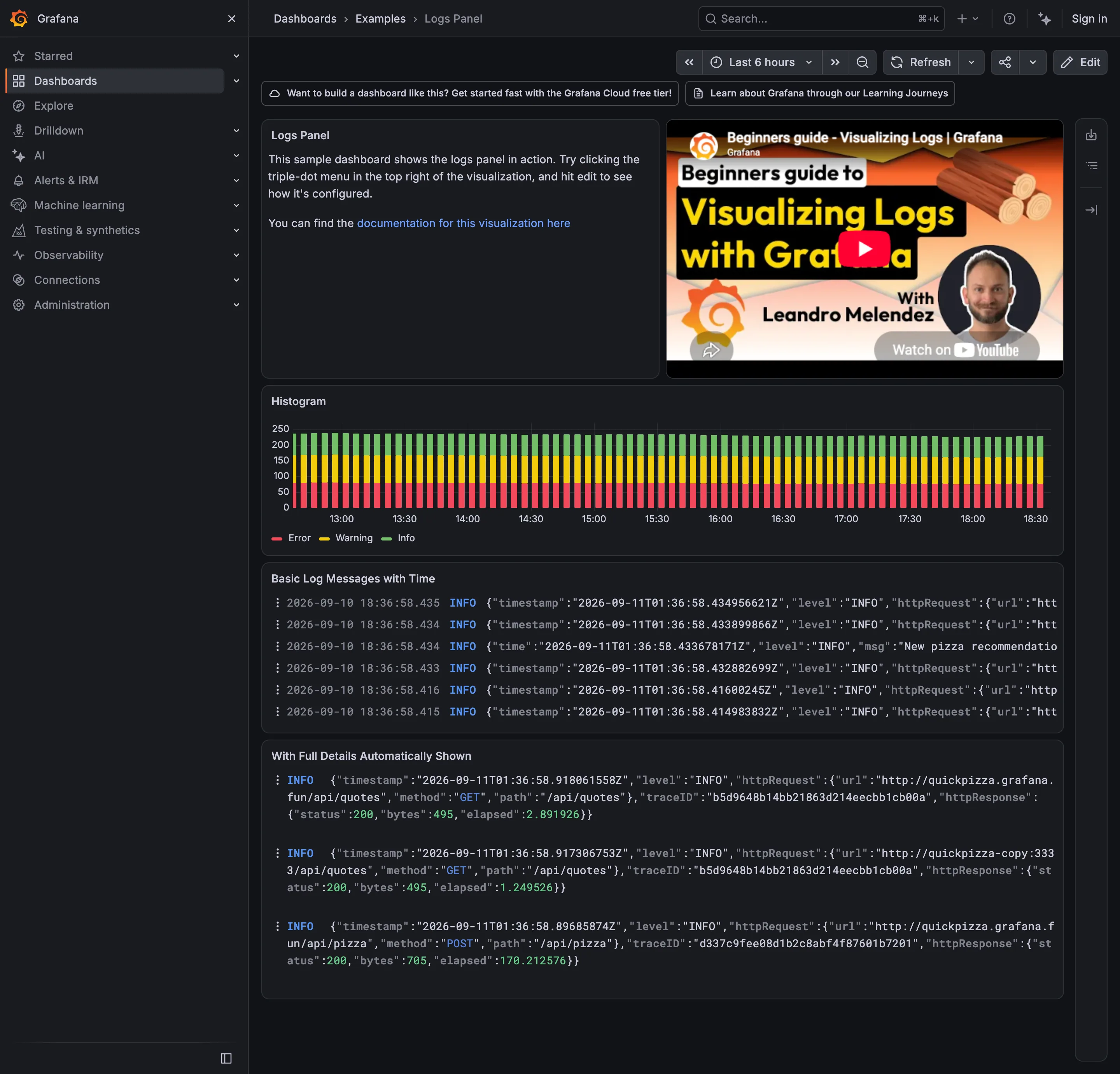
Drill-down. The trace ID: the route out of the wall of text and into the request that produced it. Stacked composition. Volume by level over time. The bottom band sits on a flat baseline; the two above it are approximate. Log tail. Raw lines, truncated at the right edge, with two timestamps in two timezones on every row.
- Stacked composition Volume by level over time. The bottom band sits on a flat baseline; the two above it are approximate.
- Log tail Raw lines, truncated at the right edge, with two timestamps in two timezones on every row.
- Drill-down The trace ID: the route out of the wall of text and into the request that produced it.
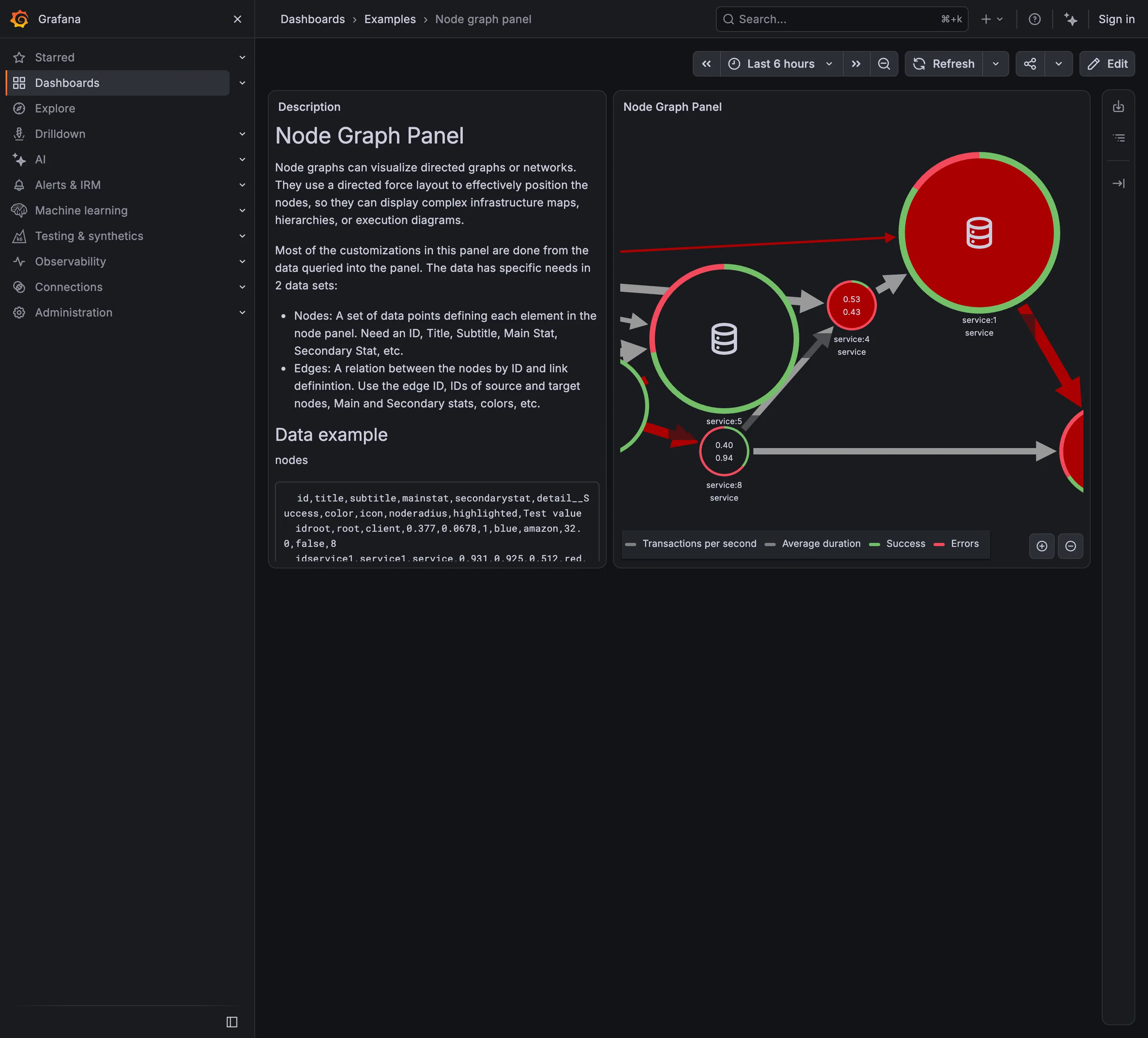
Service map. Nodes for services, edges for calls, both from instrumentation rather than from a diagram. Semantic status color. One node: two numbers inside and a success/error ring around it. Four measures, no verdict. Legend and series toggle. Four series named for a graph with seven nodes, which is the legend doing more work than the map. Zoom and pan on time. The only route to the nodes pushed off the right edge, and it doesn't move the rest of the page.
- Service map Nodes for services, edges for calls, both from instrumentation rather than from a diagram.
- Semantic status color One node: two numbers inside and a success/error ring around it. Four measures, no verdict.
- Legend and series toggle Four series named for a graph with seven nodes, which is the legend doing more work than the map.
- Zoom and pan on time The only route to the nodes pushed off the right edge, and it doesn't move the rest of the page.
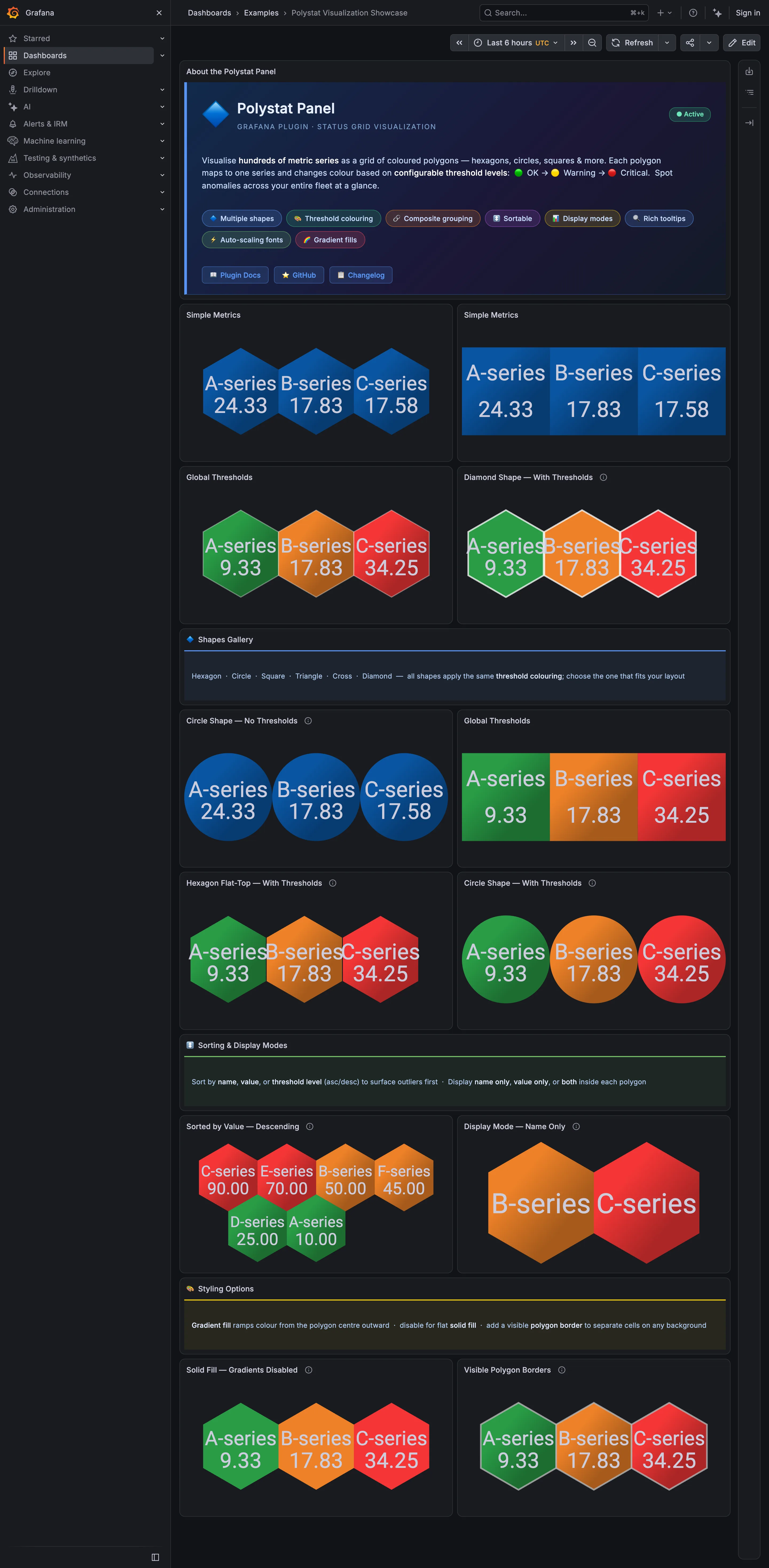
Host map. Hexagons sharing edges. Adjacent unhealthy cells merge into one shape, which is the point of the tiling. Host map. The same data as circles: a gap around every cell, so nothing clusters. Semantic status color. A closed set of three—OK, warning, critical—applied as the whole cell fill. Ranked list. Sorted descending so the worst cell lands where the eye starts. No share of total, and no row for the rest. KPI tile. Name-only mode: two cells carrying a label, a colour and no number at all.
- Host map Hexagons sharing edges. Adjacent unhealthy cells merge into one shape, which is the point of the tiling.
- Host map The same data as circles: a gap around every cell, so nothing clusters.
- Semantic status color A closed set of three—OK, warning, critical—applied as the whole cell fill.
- Ranked list Sorted descending so the worst cell lands where the eye starts. No share of total, and no row for the rest.
- KPI tile Name-only mode: two cells carrying a label, a colour and no number at all.
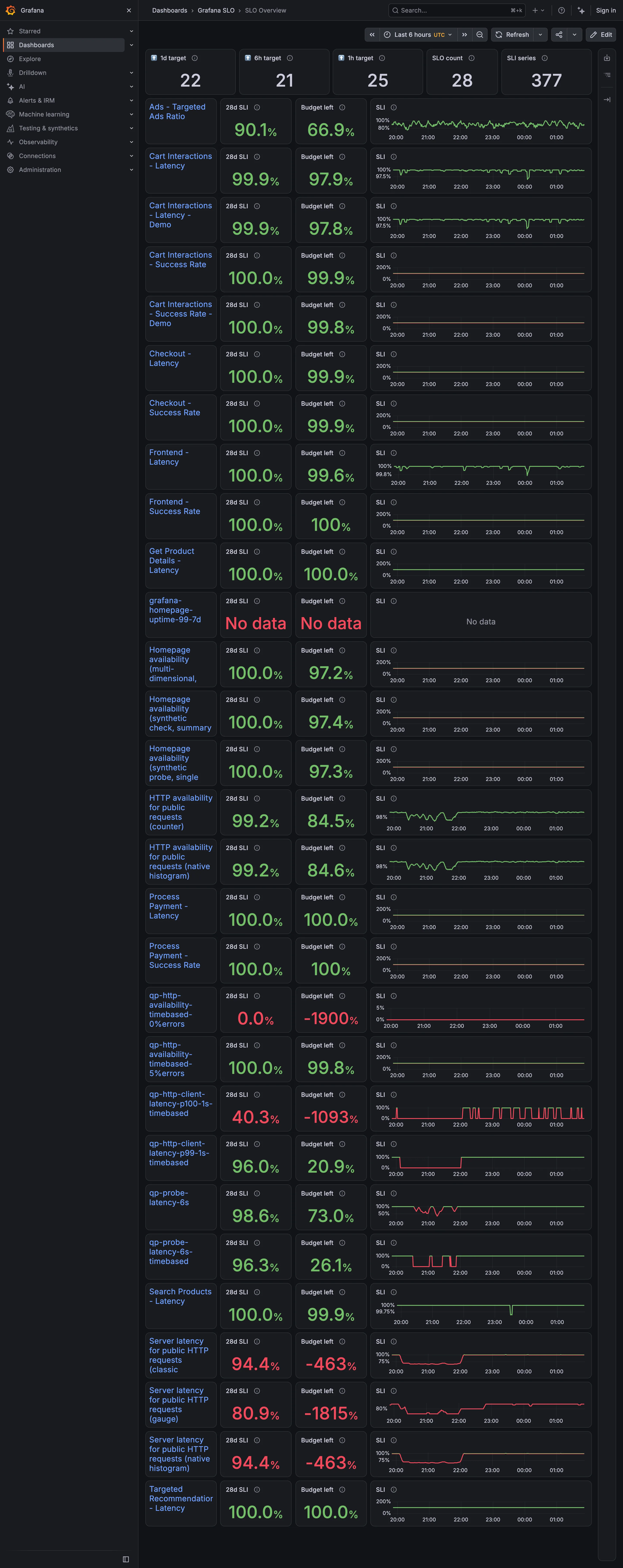
Small multiples. A column of sparklines, each on its own axis. One runs 0–200%, the next 96–100%. Metric targets. The budget column: the derived quantity that turns a target from a binary into a rate. Error and stale state. No data, in the same red as a breach. A third state wearing the second one's colour. Target and progress. Budget left, −1900%. Past −100% the number is measuring the objective, not the service. Header KPI strip. Five tiles counting targets, objectives and series. None of them says whether any of it is met.
- Metric targets The budget column: the derived quantity that turns a target from a binary into a rate.
- Target and progress Budget left, −1900%. Past −100% the number is measuring the objective, not the service.
- Error and stale state No data, in the same red as a breach. A third state wearing the second one's colour.
- Small multiples A column of sparklines, each on its own axis. One runs 0–200%, the next 96–100%.
- Header KPI strip Five tiles counting targets, objectives and series. None of them says whether any of it is met.
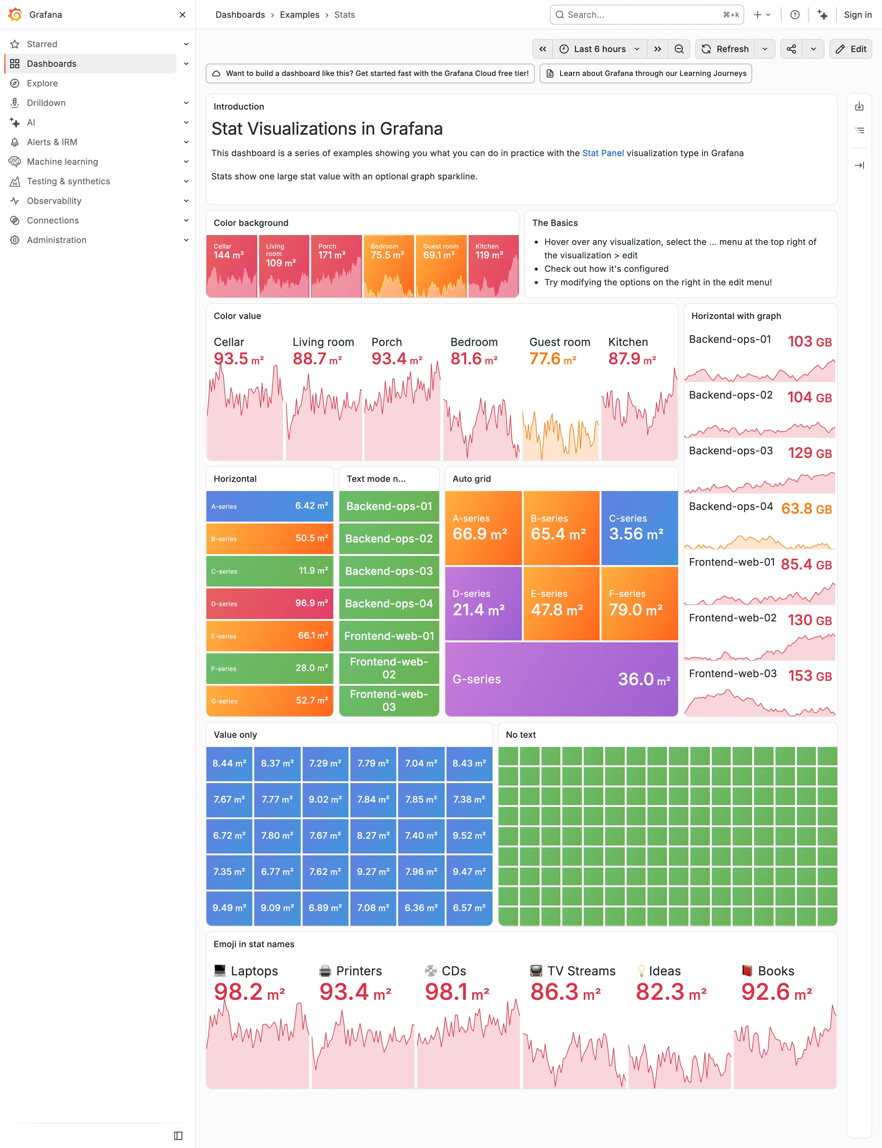
Sparkline. The area fills under each value drop to near-white here, so the shape that was legible on charcoal is a smudge. Dark-first data palette. The same six values as the dark capture. Bright-on-charcoal became pale-on-white, and the contrast went with it. Grayscale with alerts. Ninety green rectangles, identical in both themes. Nothing here can read as abnormal on either ground. Dark-first data palette. 63.8 GB in pale orange on white. On the dark version the identical colour was the readable one. Semantic status color. Whole-tile fills survive the switch, because the text sits on the colour rather than being the colour.
- Dark-first data palette The same six values as the dark capture. Bright-on-charcoal became pale-on-white, and the contrast went with it.
- Dark-first data palette 63.8 GB in pale orange on white. On the dark version the identical colour was the readable one.
- Semantic status color Whole-tile fills survive the switch, because the text sits on the colour rather than being the colour.
- Grayscale with alerts Ninety green rectangles, identical in both themes. Nothing here can read as abnormal on either ground.
- Sparkline The area fills under each value drop to near-white here, so the shape that was legible on charcoal is a smudge.
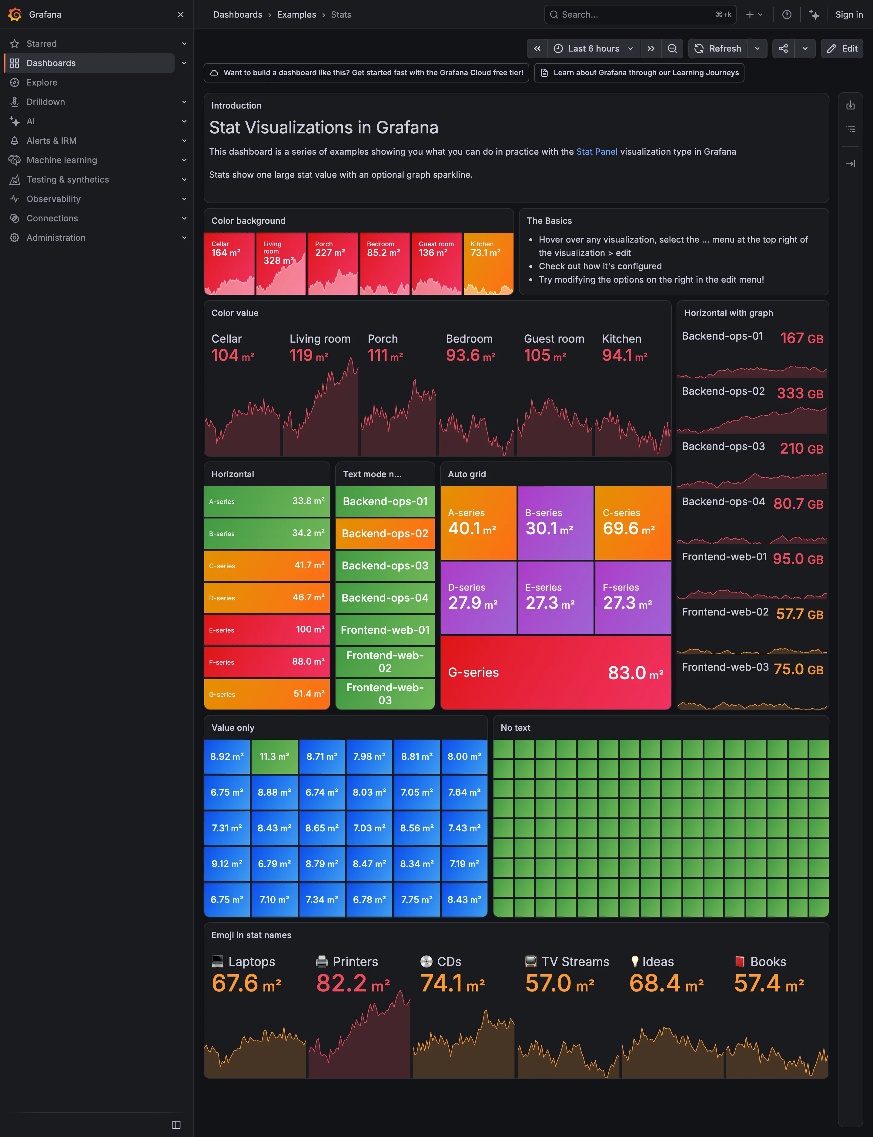
Header KPI strip. Six tiles sharing one anatomy, which is the arrangement that reads as a row rather than as six things. KPI tile. Label, value, unit and a sparkline behind it. No delta, no base, no window. Dark-first data palette. The dark half of the pair. The same six values in the light capture arrive as pale pink on white. Semantic status color. No text at all. Colour is the only carrier, which is the WCAG failure stated as a feature. Sparkline. A column of them, each scaled to its own series, which is the comparison Tufte warns the arrangement invites. KPI tile. Thirty numbers with no labels—the value with nothing attached to it. Grayscale with alerts. Seven rows, seven different colours, no resting state. Nothing here can read as abnormal. Semantic status color. Whole-tile background colour: the loudest channel available, spent on all six.
- KPI tile Label, value, unit and a sparkline behind it. No delta, no base, no window.
- Dark-first data palette The dark half of the pair. The same six values in the light capture arrive as pale pink on white.
- Sparkline A column of them, each scaled to its own series, which is the comparison Tufte warns the arrangement invites.
- Semantic status color Whole-tile background colour: the loudest channel available, spent on all six.
- Grayscale with alerts Seven rows, seven different colours, no resting state. Nothing here can read as abnormal.
- KPI tile Thirty numbers with no labels—the value with nothing attached to it.
- Semantic status color No text at all. Colour is the only carrier, which is the WCAG failure stated as a feature.
- Header KPI strip Six tiles sharing one anatomy, which is the arrangement that reads as a row rather than as six things.
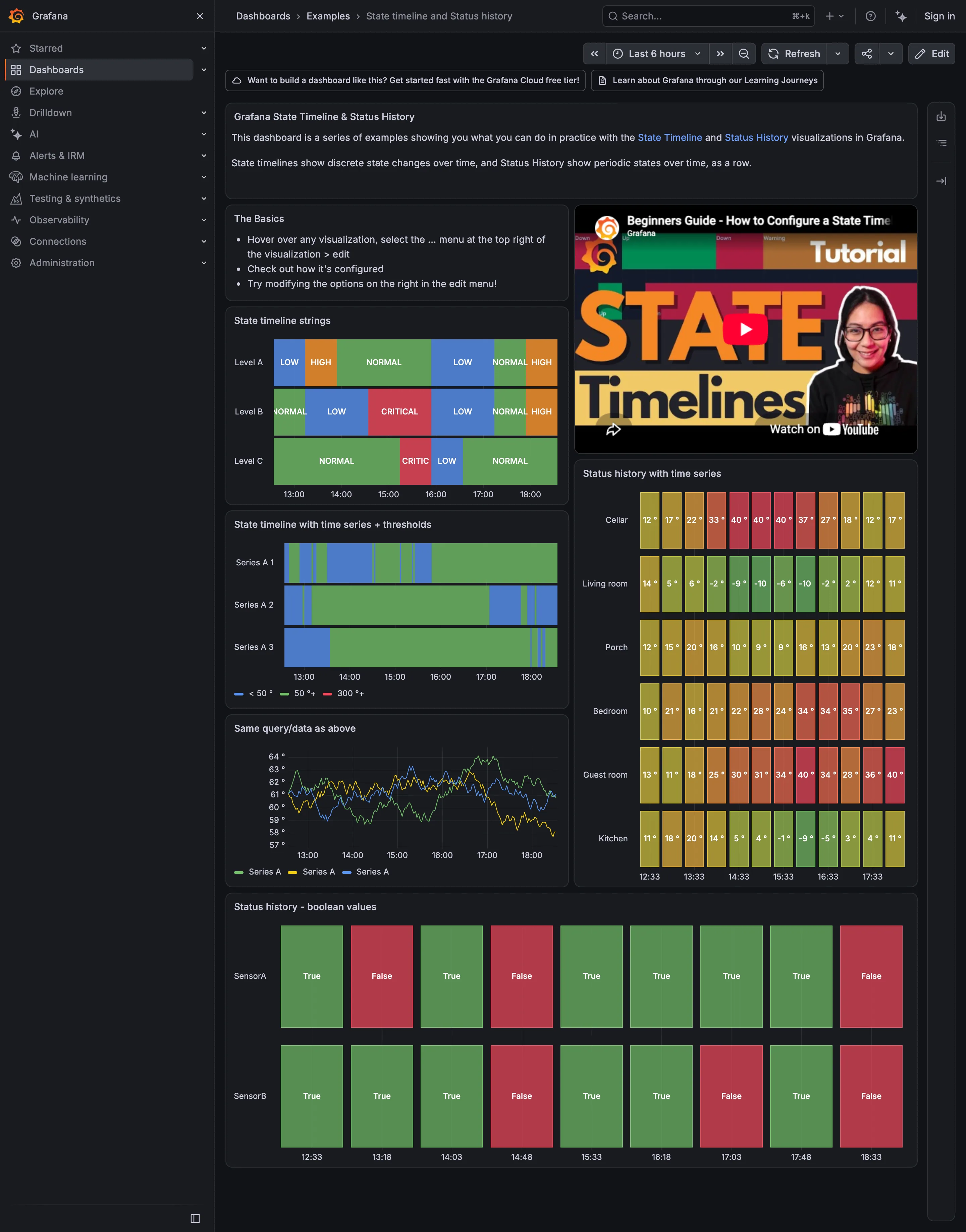
Semantic status color. A closed set of two, both labelled. The clearest case on the page of colour plus a word. Sequential and diverging scales. One mark per sample, green through red by temperature—so green here means cold, not good. Status history. Continuous regions with the state name written inside each one. Threshold line and region. Thresholds turning a numeric series into discrete bands: under 50, 50, 300. Time series. The same query as the panel above, untranslated. Three traces you have to threshold yourself.
- Status history Continuous regions with the state name written inside each one.
- Threshold line and region Thresholds turning a numeric series into discrete bands: under 50, 50, 300.
- Time series The same query as the panel above, untranslated. Three traces you have to threshold yourself.
- Sequential and diverging scales One mark per sample, green through red by temperature—so green here means cold, not good.
- Semantic status color A closed set of two, both labelled. The clearest case on the page of colour plus a word.
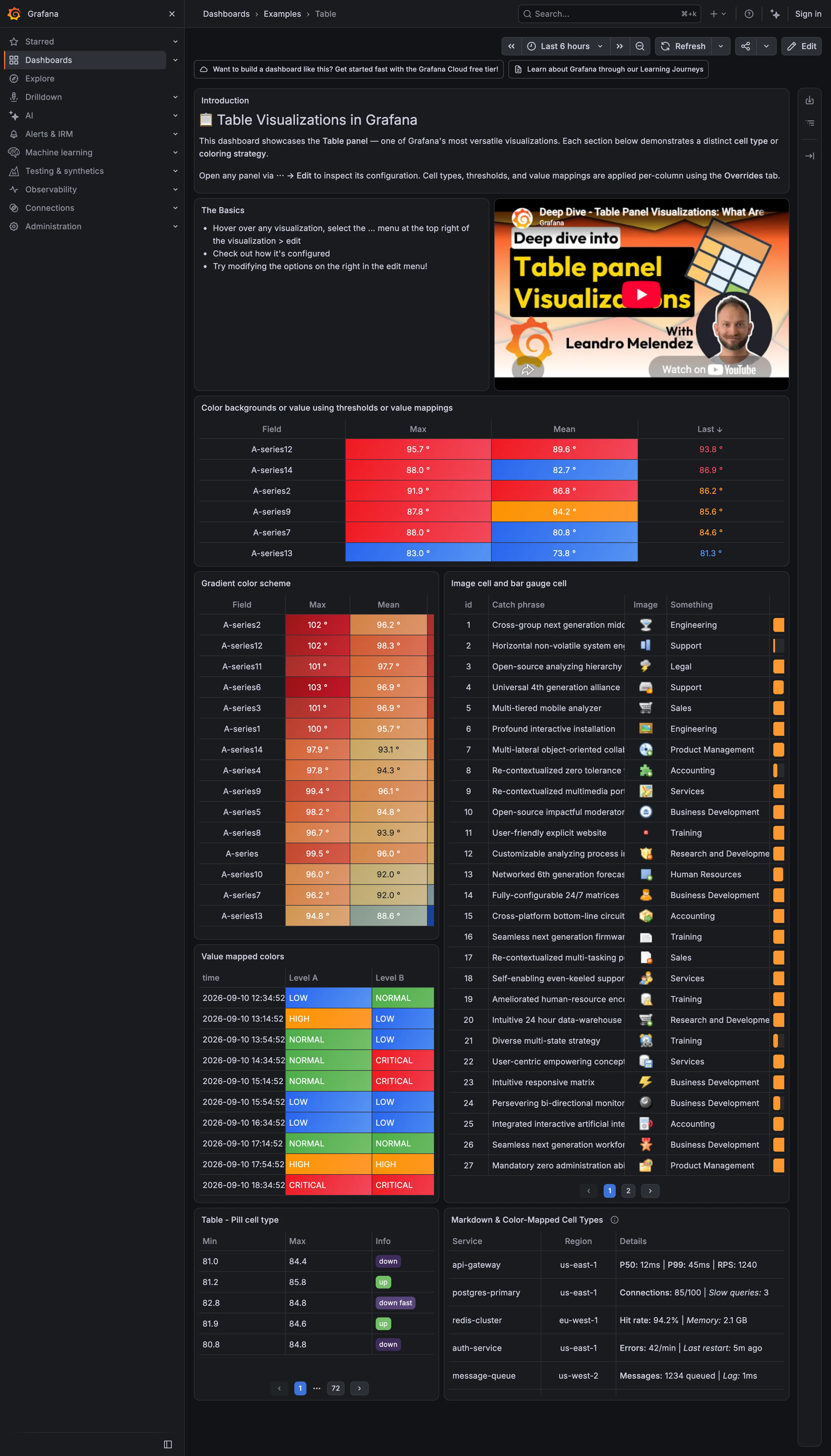
Data table. In-cell bar gauge clipped to a sliver, and text truncated mid-word with no escape to the full value. Data table. Threshold colour filling the cell, which makes a column scannable without being read. Sequential and diverging scales. A continuous ramp down a sorted column: the table doing a heatmap's job. Semantic status color. Value mappings turning raw levels into a closed set, each with its word in the cell. Delta indicator. Pills reading up, down and down fast: direction with no magnitude and no base. Also page 1 of 72.
- Data table Threshold colour filling the cell, which makes a column scannable without being read.
- Sequential and diverging scales A continuous ramp down a sorted column: the table doing a heatmap's job.
- Data table In-cell bar gauge clipped to a sliver, and text truncated mid-word with no escape to the full value.
- Semantic status color Value mappings turning raw levels into a closed set, each with its word in the cell.
- Delta indicator Pills reading up, down and down fast: direction with no magnitude and no base. Also page 1 of 72.
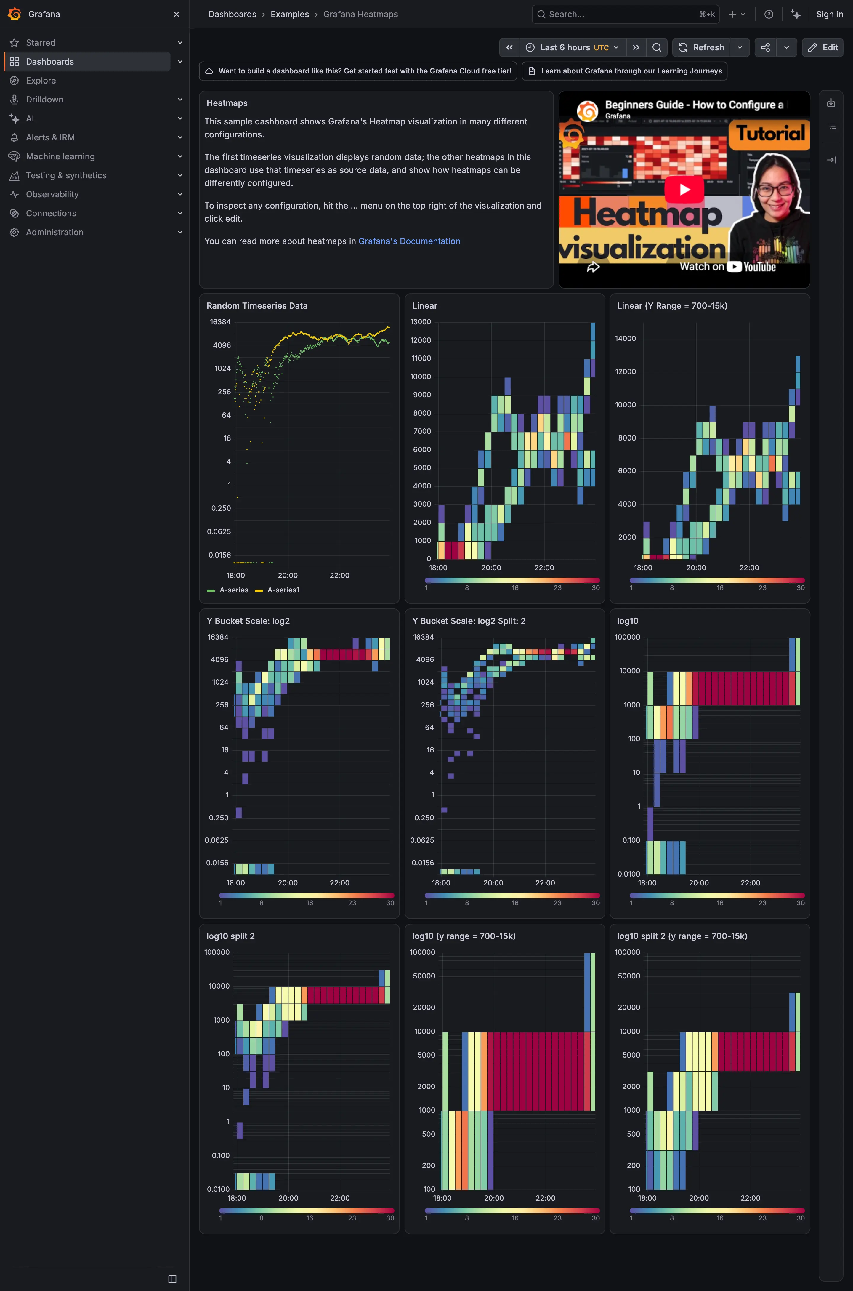
Small multiples. Nine panels, one variable changed. The comparison is the content. Time series. The source series. Every heatmap on the page is built from this. Heatmap. Linear y buckets, which is the default and the one that hides the low end. Sequential and diverging scales. Every panel carries its own ramp legend, 1 to 30, so the colour is readable per panel but not across them.
- Time series The source series. Every heatmap on the page is built from this.
- Heatmap Linear y buckets, which is the default and the one that hides the low end.
- Small multiples Nine panels, one variable changed. The comparison is the content.
- Sequential and diverging scales Every panel carries its own ramp legend, 1 to 30, so the colour is readable per panel but not across them.
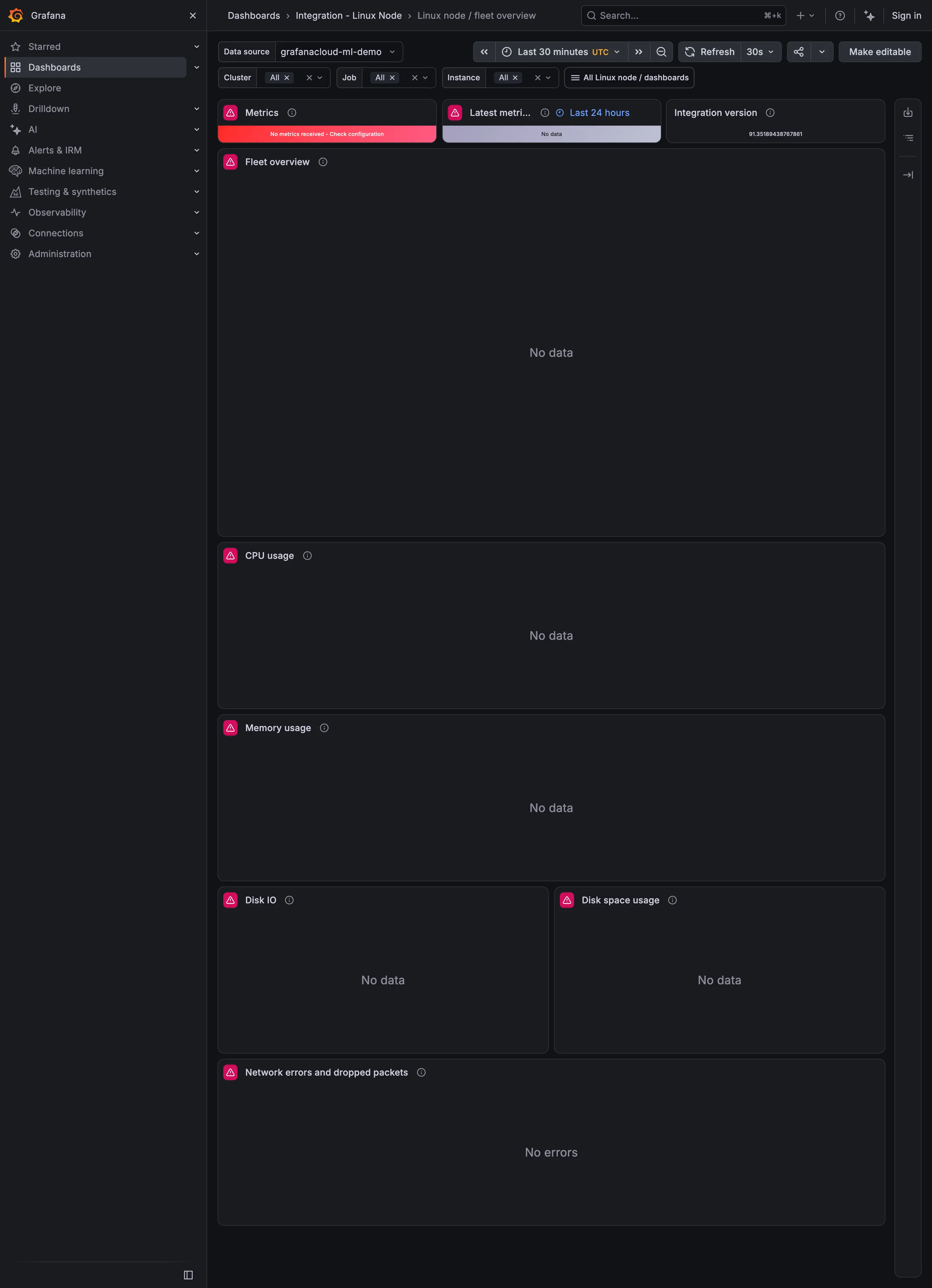
Empty state. No data, centred, with no distinction from a genuine zero. Header KPI strip. Three status tiles across the top, before any chart. Error and stale state. Red, and it names the cause: no metrics received, check configuration. Freshness indicator. The tile whose job is 'as of when', reporting No data instead. Data source badge. Integration version, the only tile on the row still able to answer.
- Header KPI strip Three status tiles across the top, before any chart.
- Error and stale state Red, and it names the cause: no metrics received, check configuration.
- Freshness indicator The tile whose job is 'as of when', reporting No data instead.
- Data source badge Integration version, the only tile on the row still able to answer.
- Empty state No data, centred, with no distinction from a genuine zero.
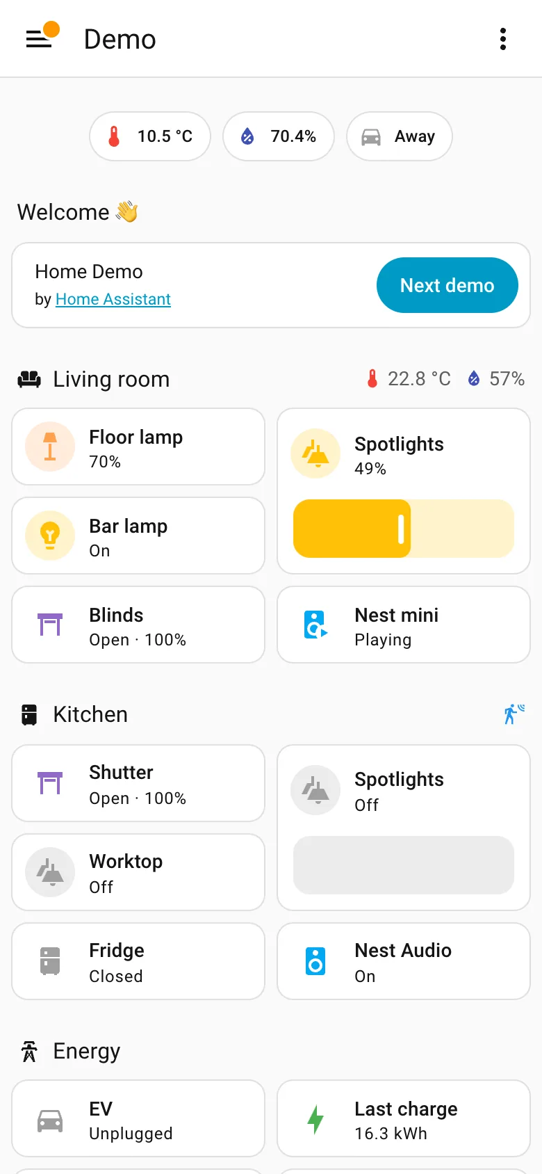
Mobile adaptation. Reflowed, not rebuilt. Section order comes out row-major here and column-major on desktop, so priority shifts. Resizable card grid. Two columns of cards inside each section rather than a single stack, so the page stays short enough to scroll. Header KPI strip. The three chips survive the switch intact, which is what a strip of four to six is for. Sidebar and canvas. The rail is gone. Everything it held is now behind one button, which is the usual and unavoidable trade.
- Mobile adaptation Reflowed, not rebuilt. Section order comes out row-major here and column-major on desktop, so priority shifts.
- Sidebar and canvas The rail is gone. Everything it held is now behind one button, which is the usual and unavoidable trade.
- Resizable card grid Two columns of cards inside each section rather than a single stack, so the page stays short enough to scroll.
- Header KPI strip The three chips survive the switch intact, which is what a strip of four to six is for.
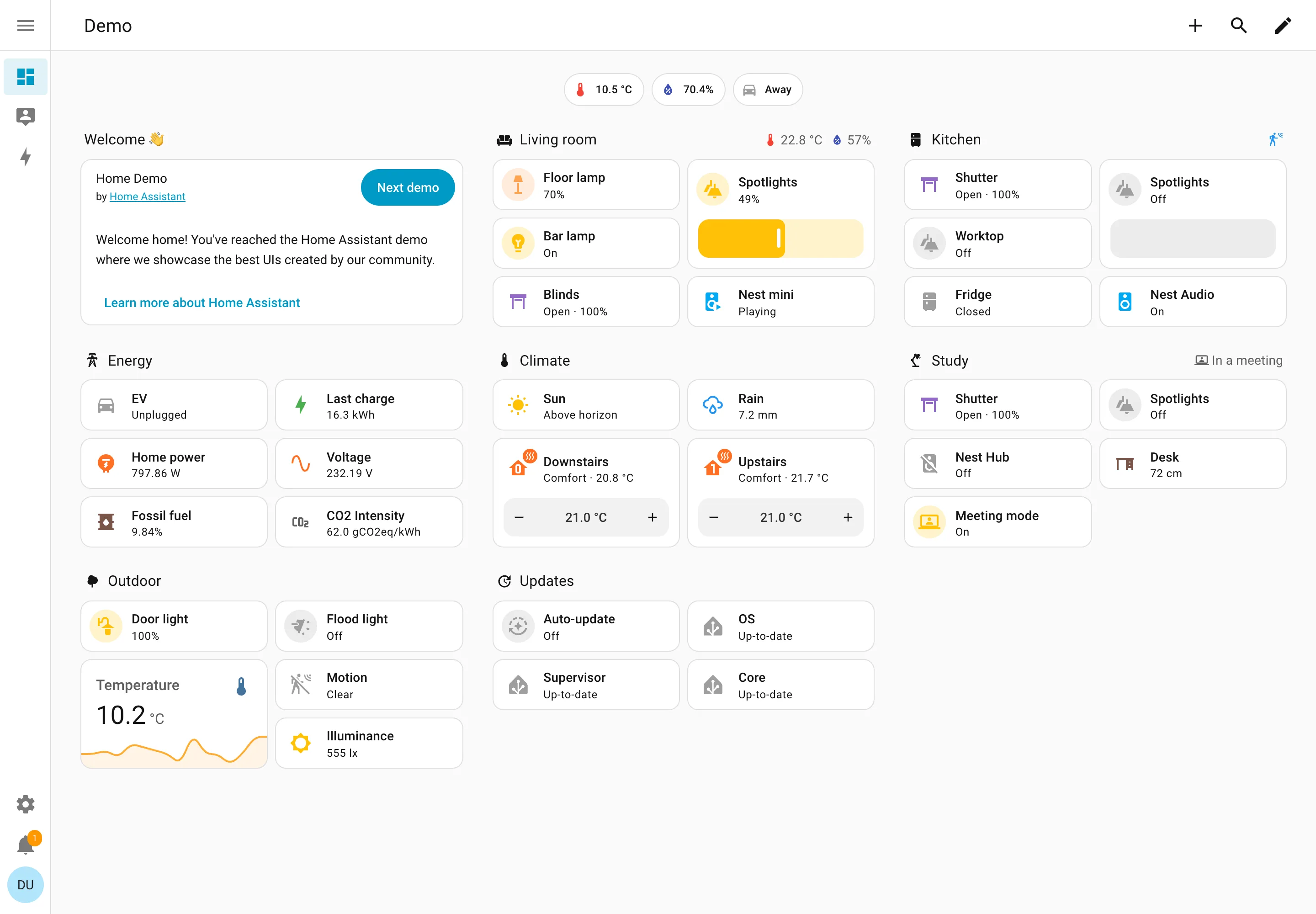
Resizable card grid. Cards a household arranges itself, grouped by room. Sections are one column each rather than a free canvas. Semantic grouping. Grouped by where the thing physically is, and the group header carries that room's temperature and humidity. Sidebar and canvas. Collapsed to icons by default, because on a wall tablet the canvas is worth more than the labels. Sparkline. One card carrying a number and the shape behind it, with no axis and no legend. Semantic status color. Amber means on, and the card says 49% anyway. Colour repeats the word instead of replacing it. Header KPI strip. Three chips above everything: outside temperature, humidity, and whether anyone is home. Dashboard builder. A pencil in the corner. Editing is one click from reading, which is why these pages actually get rearranged.
- Resizable card grid Cards a household arranges itself, grouped by room. Sections are one column each rather than a free canvas.
- Semantic grouping Grouped by where the thing physically is, and the group header carries that room's temperature and humidity.
- Semantic status color Amber means on, and the card says 49% anyway. Colour repeats the word instead of replacing it.
- Header KPI strip Three chips above everything: outside temperature, humidity, and whether anyone is home.
- Sidebar and canvas Collapsed to icons by default, because on a wall tablet the canvas is worth more than the labels.
- Sparkline One card carrying a number and the shape behind it, with no axis and no legend.
- Dashboard builder A pencil in the corner. Editing is one click from reading, which is why these pages actually get rearranged.
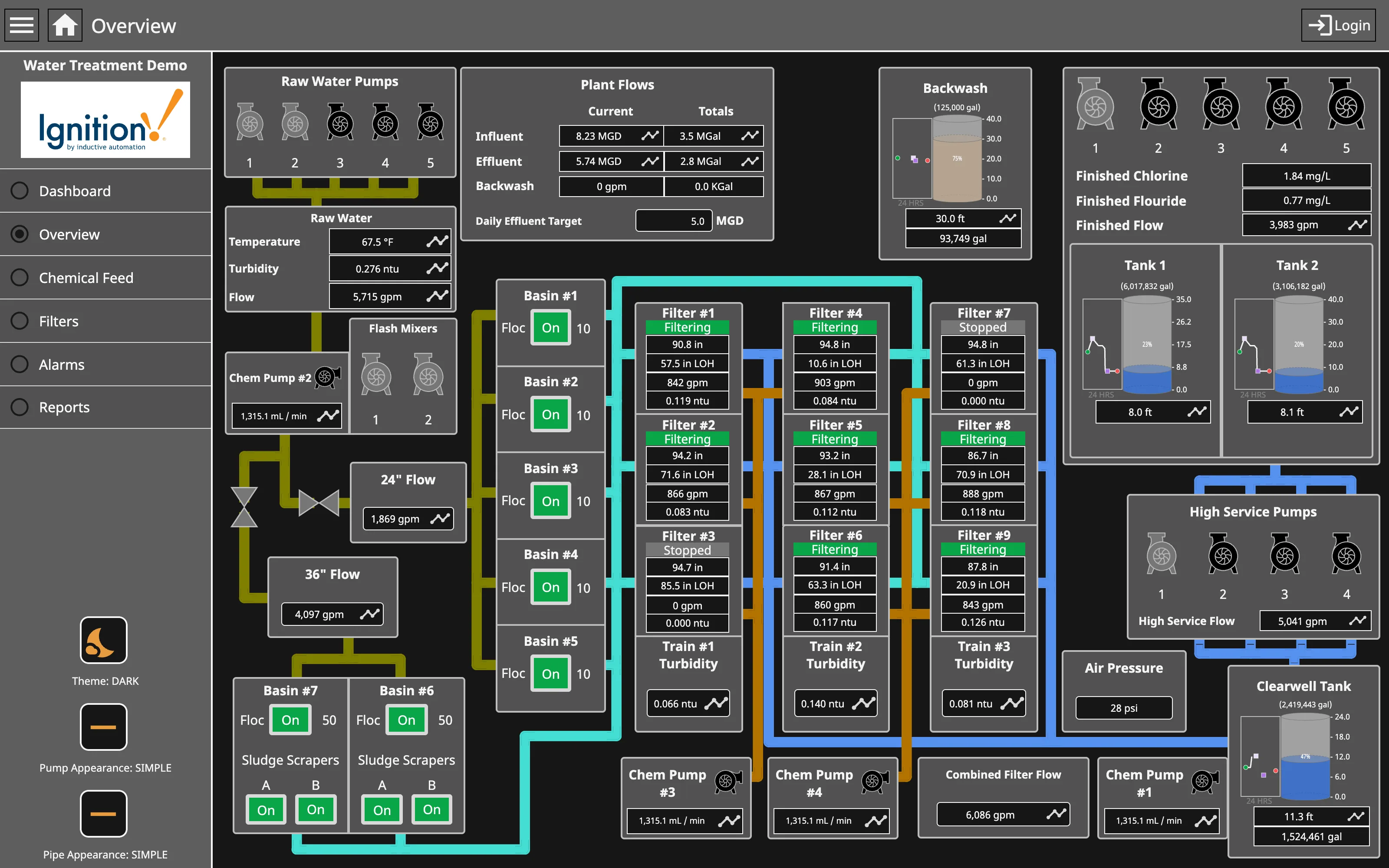
Process mimic. Flat two-dimensional shapes, values placed where the instrument is, and the flow ordered by process rather than by geography. Dense small-multiple layout. Nine filters, identical four-value panels. Reading one teaches you all nine, and the two stopped ones are found by shape. Gauge and dial. Tank level as a filled vertical scale—a bounded range where the endpoints are the physical tank, which is the case the gauge survives. Grayscale with alerts. Green for running, on every unit. The opposite of grey-at-rest, and it works only while stopped is the rare case. Process mimic. Pump and pipe appearance switchable between simple and photorealistic. The whole ISA-101 argument, shipped as a setting. Semantic status color. Stopped is grey and says Stopped. Colour and word together, so the state survives a monochrome screen.
- Process mimic Flat two-dimensional shapes, values placed where the instrument is, and the flow ordered by process rather than by geography.
- Grayscale with alerts Green for running, on every unit. The opposite of grey-at-rest, and it works only while stopped is the rare case.
- Dense small-multiple layout Nine filters, identical four-value panels. Reading one teaches you all nine, and the two stopped ones are found by shape.
- Semantic status color Stopped is grey and says Stopped. Colour and word together, so the state survives a monochrome screen.
- Gauge and dial Tank level as a filled vertical scale—a bounded range where the endpoints are the physical tank, which is the case the gauge survives.
- Process mimic Pump and pipe appearance switchable between simple and photorealistic. The whole ISA-101 argument, shipped as a setting.