Skip to content
KONIGI

Dashboards / Visual representation / Stacked composition

18 of 22

Stacked composition

A total is made of parts, and the viewer needs both the total and the mix over time.

Updated September 10, 2026

Problem

Total spend is climbing. The viewer needs to know both that it is climbing and which of the eight services is responsible, and two separate panels make them do the correlation by eye.

Solution

Stack the series. The outline is the total, the bands are the parts, and one chart answers both questions.

The important thing to understand is that stacking is not symmetric in what it communicates. The bottom series sits on a flat baseline and its shape is perfectly readable. Every series above it sits on a wobbling baseline made of everything below, and human perception is poor at judging the thickness of a band whose bottom edge is moving. So the bottom band and the total outline are accurate; everything in between is approximate.

That asymmetry has a direct consequence: the series you most want to scrutinise belongs at the bottom, and the ordering is a design decision rather than whatever the query returned.

Grafana exposes stacking with three settings that are worth naming because the third changes the question entirely. Off puts series side by side. Normal stacks to show cumulative values. 100% stacks to fill the height, showing each series’ relative proportion. Normal answers “how much and of what”. 100% answers “what share”, and deliberately discards the total—which is right when composition is the question and actively misleading when someone reads a stable 100% chart as a stable business.

Use when

The parts genuinely sum to a meaningful whole, the total matters as much as the split, and there are few enough categories that bands stay thick enough to see.

Don’t use when

The viewer needs to compare middle series against each other, or the categories don’t actually sum—stacking overlapping or double-counted quantities produces a total that means nothing. Above roughly six or seven categories, bands become slivers and the chart is a colour test.

Trade-offs

Only the bottom series and the total are read accurately, which means most of the chart is approximate by construction. Stacked areas over time are especially prone to misreading, because a band that looks like it is growing may just be riding a rising baseline. Category order is rarely stable when it comes from a query, so the same chart reorders between refreshes and the colours move. And 100% stacking hides the total so completely that a chart can look reassuringly unchanged while the underlying volume halves.

Checklist

  • Do these parts genuinely sum to the whole, with no overlap or double counting?
  • Which series is at the bottom, and is it the one that most needs accurate reading?
  • Is category order stable between refreshes and between viewers?
  • How many categories, and is the thinnest band still visible?
  • Is there an “other” bucket, and does it carry a count?
  • Normal or 100%, and does the choice match the question being asked?
  • If 100%, is the total available anywhere on the page?
  • Do colours stay assigned to the same category across every panel?
  • Could a viewer mistake a rising baseline for a growing band?
  • Would small multiples let them compare the middle series properly?

Compare

Grafana offers stacking as Off, Normal and 100% across its time series, bar chart and histogram panels, which keeps the vocabulary consistent and makes the 100% mode easy to reach without its caveat attached. Datadog defaults many of its resource breakdowns to stacked areas, which suits infrastructure spend where the parts genuinely conserve and totals matter. Netdata stacks per-dimension charts heavily by default, which works because the dimensions are usually a true decomposition of a bounded resource. Amplitude leans on 100% stacking for composition over time, which is the honest use of that mode and still routinely gets screenshotted without the total anywhere in frame. Cloudflare Radar defuses the 100% caveat by printing every segment’s figure above the bar, so the chart can lose the total without the reader losing it. The bar ends up nearly redundant, which is a fair trade when the numbers were the point and the picture was only ever the index to them.

Time series is what a stacked area is built on, and the entry that covers the axis questions. Ranked list answers “which parts dominate” without the reading problems. Ratio and rate is what 100% stacking is really computing. Categorical series palette determines whether the bands can be told apart. Small multiples is the alternative when comparing the parts matters more than seeing the total.
Stacked composition anatomy A stacked area chart where the bottom band and the outer outline sit on steady edges and are readable, while the bands between them sit on a moving baseline and are only approximate. Below, the same data stacked normally and stacked to 100 percent, where a falling total reads as stable. What stacking can and can't tell you 1 2 3 1 THE MIDDLE BANDS Their bottom edge moves, and people judge the thickness of a band with a moving baseline badly. These are approximate. 2 THE BOTTOM BAND Flat baseline, so its shape is exactly readable. Put the series you most want to scrutinise here, on purpose. 3 THE OUTLINE Also exact. It is the total, and it is the other question the chart is answering. Normal, then 100% Same three series. The total is falling by a third. Normal · the total is visible 100% · the total is gone
Wireframe — the pattern's anatomy, not any one product's version of it

Implementation

Only the bottom band has a straight baseline, so only the bottom band is comparable across columns. Every band above it is being read off a moving floor, which is why a stack answers share and not trend.

shadcn
npx shadcn@latest add toggle-group
npm
recharts
Tokens
--card--muted--muted-foreground--border--chart-1--chart-2
MarAprMayJunJulAugSep
  • egress
  • storage
  • compute

StackedArea.tsxSeries order is the stacking order, bottom first. Mode is normal or 100%, and 100% prints the total it would otherwise hide.

import { Area, AreaChart, Tooltip, XAxis } from "recharts";
import { ToggleGroup, ToggleGroupItem } from "@/components/ui/toggle-group";

/**
 * Stacking is not symmetric. The bottom band sits on a flat baseline and is
 * exactly readable; the outline is the total and is exact too; every band
 * between them is read off a moving floor and is approximate. So the order
 * of `series` is a decision: the first one is the bottom, and it should be
 * the series that most needs scrutiny, never whatever the query returned.
 *
 * `mode` is a closed pair because the two answer different questions. Normal
 * answers "how much and of what". 100% answers "what share" and discards the
 * total, so in that mode the total is printed beneath the chart instead.
 */
export type Mode = "normal" | "percent";

export type Series = {
  key: string;
  label: string;
  values: number[];
  /** Assigned by key by the caller, so the same series is the same colour on every panel. */
  color: string;
};

const TICK = { fontSize: 10, fill: "hsl(var(--muted-foreground))" };

export function StackedArea({ labels, series, mode, unit, onModeChange, width = 400, height = 190 }: {
  labels: string[];
  /** Bottom first. */
  series: Series[];
  mode: Mode;
  unit: string;
  onModeChange?: (mode: Mode) => void;
  width?: number;
  height?: number;
}) {
  const data = labels.map((label, i) => Object.fromEntries([["label", label], ...series.map((s) => [s.key, s.values[i]])]));
  const totals = labels.map((_, i) => series.reduce((n, s) => n + s.values[i], 0));
  const first = totals[0], last = totals[totals.length - 1];
  const change = Math.round(((last - first) / first) * 100);

  return (
    <div>
      <div className="overflow-x-auto">
        <AreaChart width={width} height={height} data={data} stackOffset={mode === "percent" ? "expand" : "none"} margin={{ top: 8, right: 8, bottom: 0, left: 8 }}>
          <XAxis interval={0} dataKey="label" tick={TICK} stroke="hsl(var(--border))" tickLine={false} />
          <Tooltip formatter={(v, name) => [`${v} ${unit}`, series.find((s) => s.key === name)?.label ?? name]} />
          {series.map((s, i) => (
            <Area
              key={s.key}
              type="linear"
              dataKey={s.key}
              stackId="stack"
              fill={s.color}
              fillOpacity={0.6}
              // The outline is the total, and it is the other exact edge.
              stroke={mode === "normal" && i === series.length - 1 ? s.color : "none"}
              strokeWidth={2}
              isAnimationActive={false}
            />
          ))}
        </AreaChart>
      </div>

      <div className="mt-2 flex flex-wrap items-center gap-3 text-[11px] text-muted-foreground">
        <ul className="flex gap-3">
          {series.map((s) => (
            <li key={s.key} className="flex items-center gap-1.5">
              <span className="size-2 rounded-[2px]" style={{ background: s.color }} aria-hidden="true" />
              {s.label}
            </li>
          ))}
        </ul>
        {/* 100% hides the total so completely that a halving looks like nothing happened. Print it. */}
        {mode === "percent" && (
          <p className="tabular-nums">
            total {first}{last} {unit}, {change === 0 ? "unchanged" : `${change > 0 ? "up" : "down"} ${Math.abs(change)}%`}
          </p>
        )}
        {onModeChange && (
          <ToggleGroup type="single" value={mode} onValueChange={(m) => m && onModeChange(m as Mode)} className="ml-auto gap-1" aria-label="stacking">
            <ToggleGroupItem value="normal" size="sm" className="h-6 rounded-full border px-2 text-[10px] data-[state=on]:bg-muted">Normal</ToggleGroupItem>
            <ToggleGroupItem value="percent" size="sm" className="h-6 rounded-full border px-2 text-[10px] data-[state=on]:bg-muted">100%</ToggleGroupItem>
          </ToggleGroup>
        )}
      </div>
    </div>
  );
}

demo.tsxHow it is called: three spend lines with the growing one at the bottom, and a toggle between normal and 100%.

import { useState } from "react";
import { StackedArea, type Mode } from "./StackedArea";

/**
 * Cloud spend by line over seven months. Egress is the smallest series and
 * the one growing, so it goes at the bottom where its shape can be read.
 * Switching to 100% keeps the total in a line beneath the chart.
 */
export default function Demo() {
  const [mode, setMode] = useState<Mode>("normal");
  return (
    <div className="w-fit rounded-lg border bg-card p-4">
      <StackedArea
        labels={["Mar", "Apr", "May", "Jun", "Jul", "Aug", "Sep"]}
        series={[
          { key: "egress", label: "egress", values: [4, 8, 12, 10, 16, 14, 18], color: "hsl(var(--muted-foreground))" },
          { key: "storage", label: "storage", values: [56, 44, 56, 32, 50, 32, 40], color: "hsl(var(--chart-2))" },
          { key: "compute", label: "compute", values: [54, 48, 56, 44, 54, 46, 50], color: "hsl(var(--chart-1))" },
        ]}
        mode={mode}
        unit="k$"
        onModeChange={setMode}
      />
    </div>
  );
}
What it renders. Identical markup in both panes, with only the token values changing.

Examples

Captures whose hotspots reference this pattern, grouped by product and dated. The dashed boxes are this pattern; hover any box for the note.

Cloudflare Radar

A public dashboard with no account, no filters worth the name, and an audience of journalists. Designed for people who will read one number and leave.

Cloudflare Radar — Worldwide Overview
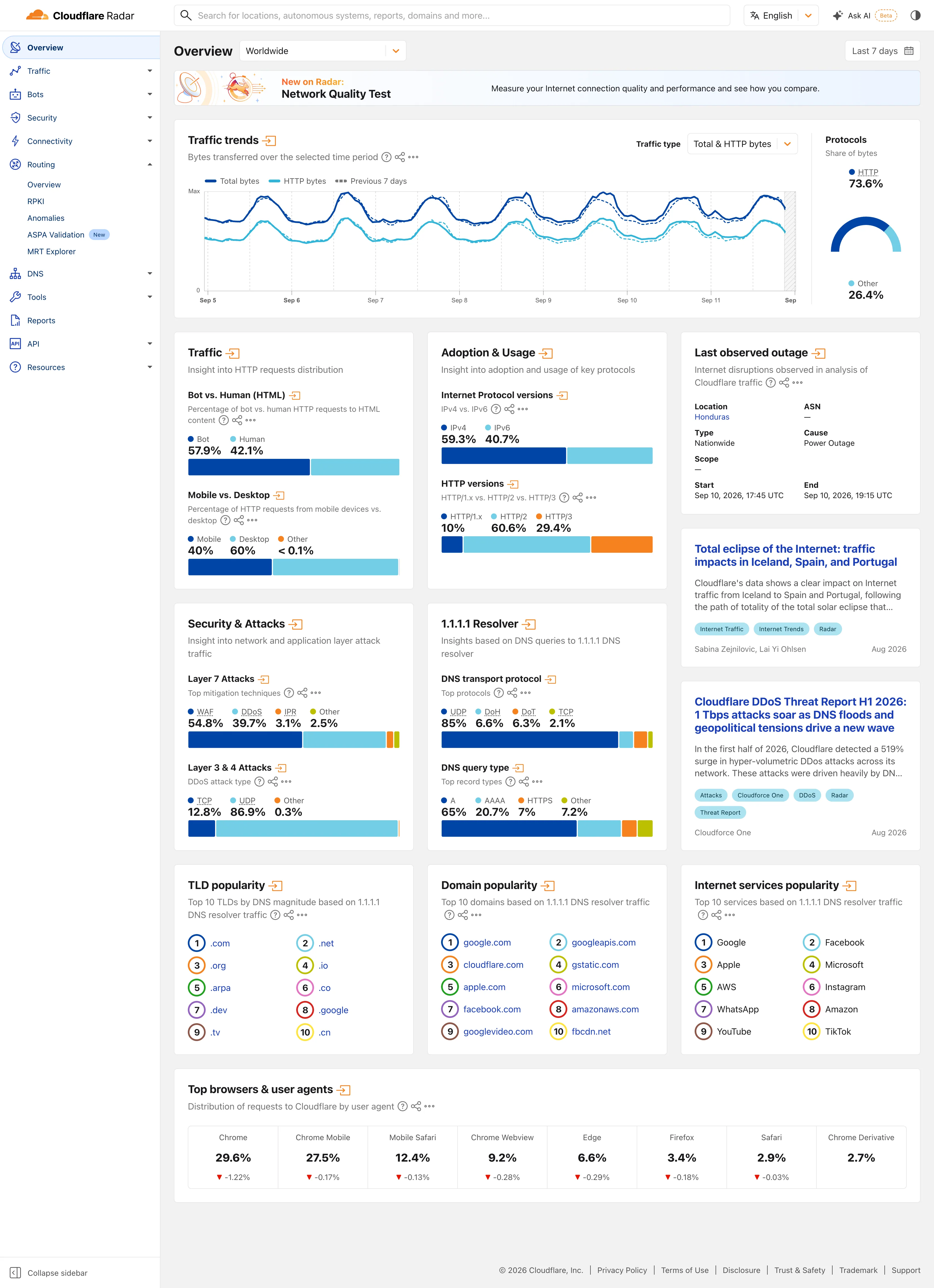
Multi-page dashboard. Eleven sections behind one rail, with the open one expanded in place. Radar is a site of dashboards, not a dashboard. Compare periods. The dotted series is the previous seven days, drawn on the same axis rather than beside it. Delta indicator. Eight shares with their change under them, all of them fractions of a point, which tells you how still this data is. Overview then detail. Two summaries and an arrow each. The panel exists to tell you whether the full page is worth opening. Ratio and rate. Shares only, never counts, and both sides of the split are named so the denominator is never in doubt. Stacked composition. Four mitigation techniques to 100%. The bar is almost redundant next to the printed figures, which is the point. Ranked list. A top ten with no magnitudes at all. The rank is the whole finding.
Worldwide Overview September 11, 2026 Public site, signed out; no version string exposed medium · light · desktop-web
Radar is a dashboard for people who did not come to use a dashboard. The audience is journalists, researchers and the merely curious, nobody has an account, and the design follows from that in two ways worth copying. Two controls scope the whole page—where, and when—and neither is a filter in the sense the rest of this gallery means it; the only other selector on the page sits inside the traffic panel. Everything else that looks like a control is a link. Each panel is a standing summary of a section that has its own full page behind the arrow in its heading, so the overview works as a table of contents rather than a filtered view of one dataset. And almost every value is printed as text above the chart that encodes it: "Bot 57.9%, Human 42.1%" sits over the bar rather than inside it. You can read the number without reading the chart, which is the right trade when most of your readers will take one figure and leave.
  • Multi-page dashboard Eleven sections behind one rail, with the open one expanded in place. Radar is a site of dashboards, not a dashboard.
  • Compare periods The dotted series is the previous seven days, drawn on the same axis rather than beside it.
  • Overview then detail Two summaries and an arrow each. The panel exists to tell you whether the full page is worth opening.
  • Ratio and rate Shares only, never counts, and both sides of the split are named so the denominator is never in doubt.
  • Stacked composition Four mitigation techniques to 100%. The bar is almost redundant next to the printed figures, which is the point.
  • Ranked list A top ten with no magnitudes at all. The rank is the whole finding.
  • Delta indicator Eight shares with their change under them, all of them fractions of a point, which tells you how still this data is.
Show 2 more examples Hide the rest

Grafana

The reference implementation for panel grids, template variables, and stat panels; most other tools are defined by how they differ from it.

Examples / Logs Panel September 10, 2026 Grafana Play (signed out; no version string exposed) medium · dark · desktop-web
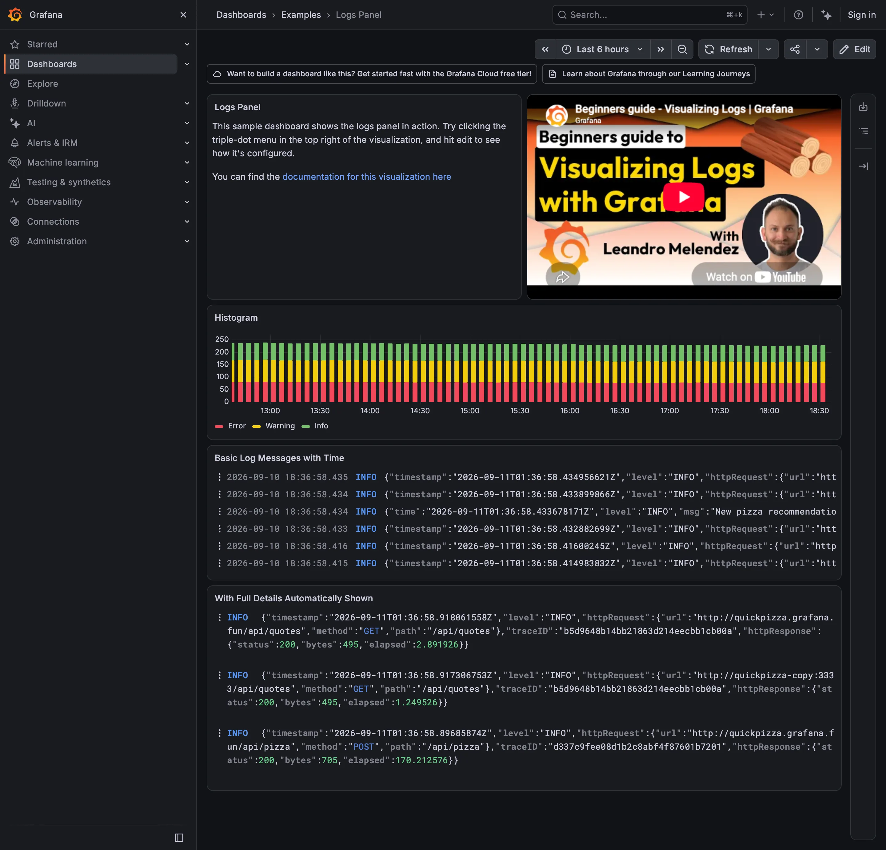
The arrangement is the standard one and it is right: a stacked volume chart by log level across the top, then the raw stream underneath, so the shape of the traffic and the individual lines share one page. Two details are worth stopping on. Every line carries two timestamps in two timezones—the gutter reads 2026-09-10 18:36:58.435 in the browser's local time, and the JSON three characters later reads 2026-09-11T01:36:58.434956621Z in UTC. Same instant, seven hours apart, on the same row, and nothing labels either one. The second is the trace ID in the expanded panel at the bottom, which is the thing that makes a log line usable: it is the route from a line of text to the request it came from. Two of the three entries shown carry the identical trace ID, which is also the case deduplication exists for.
  • Stacked composition Volume by level over time. The bottom band sits on a flat baseline; the two above it are approximate.
  • Log tail Raw lines, truncated at the right edge, with two timestamps in two timezones on every row.
  • Drill-down The trace ID: the route out of the wall of text and into the request that produced it.

Kibana

Query-first rather than panel-first: the search bar is the primary control and the charts are downstream of it, which inverts Grafana's arrangement.

Kibana — Dashboards / [Flights] Global Flight Dashboard
Panel grid. Twelve columns, and the biggest panel is a table rather than the headline chart. Size isn't carrying priority here. Ratio and rate. Delay rates up to 100% with no denominator anywhere. One flight and a thousand flights render identically. Stacked composition. Stacked to 100%, so the total is discarded on purpose and only the mix of delay types remains. Annotation. Event markers along the top of the series, numbered and grouped, on the data's own axis. Header KPI strip. Five tiles in three different sizes and two different layouts, so the row reads as five things. Compare periods. "vs 1 week earlier, 76.9%"—the comparison base is named and the expression isn't. Filter bar. Declared controls under the query bar: two pickers and a price range. Both mechanisms on screen at once. Share and embed. Share, export and full-screen in the header. Whether the range and filters travel with them is the whole question.
Dashboards / [Flights] Global Flight Dashboard September 10, 2026 Elastic demo environment, sample flight data (guest session) dense · light · desktop-web
Two things on this page are worth arguing with. The first is the table on the right, sorted by delay rate: Chicago/Rockford 100%, Syracuse 100%, Birmingham 75%. A hundred percent of flights delayed is either a catastrophe or one flight, and nothing in the table says which, because the denominator isn't a column. The cells are on a red ramp, so the two rows that are almost certainly a sample of one are the loudest thing in the panel. The second is the tile row: Delayed 25.2%, then beside it "Delayed vs 1 week earlier—76.9%". Seventy-six point nine percent of what? It could be last week's rate, it could be this week as a proportion of last week, it could be the change. Three different numbers, one label, and the tile picks whichever the query returned. What the page gets right is the filtering: a KQL bar for people who know the syntax and three declared controls underneath for people who don't, both visible at once.
  • Ratio and rate Delay rates up to 100% with no denominator anywhere. One flight and a thousand flights render identically.
  • Compare periods "vs 1 week earlier, 76.9%"—the comparison base is named and the expression isn't.
  • Share and embed Share, export and full-screen in the header. Whether the range and filters travel with them is the whole question.
  • Filter bar Declared controls under the query bar: two pickers and a price range. Both mechanisms on screen at once.
  • Panel grid Twelve columns, and the biggest panel is a table rather than the headline chart. Size isn't carrying priority here.
  • Stacked composition Stacked to 100%, so the total is discarded on purpose and only the mix of delay types remains.
  • Annotation Event markers along the top of the series, numbered and grouped, on the data's own axis.
  • Header KPI strip Five tiles in three different sizes and two different layouts, so the row reads as five things.