Skip to content
KONIGI

Dashboards / Data information / Ratio and rate

5 of 7

Ratio and rate

A raw count misleads; the viewer needs it normalized by a denominator they understand.

Updated September 9, 2026

Problem

Four hundred errors. The viewer can’t act on that, because four hundred out of four hundred million is a good day and four hundred out of six hundred is an outage, and the count alone doesn’t say which.

Solution

Divide by something the viewer already understands. Errors per request, revenue per customer, cost per gigabyte, requests per second. The choice of denominator is the entire pattern, and it is the part dashboards habitually hide.

Two failure modes account for most of the damage.

The invisible denominator. A tile reading 99.9% is unreadable without knowing 99.9% of what, over what window. The same figure over a minute and over a quarter describe different systems. Percentages computed over small denominators are worse than useless: one failure out of three is 33%, which will sit next to a genuine 33% computed over millions and look identical.

The smoothing you didn’t ask for. Rates are computed, not measured, and the computation makes choices. Prometheus rate() automatically adjusts for counter resets from target restarts, and extrapolates to the ends of the range to cover missed scrapes, so the value on the panel is deliberately slightly synthetic. That’s the correct behavior and it means the number is smoother than reality. Prometheus is also explicit that applying rate() to a gauge produces a nonsensical result and runs the query without complaining, which is a class of dashboard bug that never announces itself.

The fix on the design side is small and almost never done: put the denominator on the tile. “0.04% of 2.1M requests, last 5m” is one line longer and answerable.

Use when

The raw count changes with volume and the viewer cares about the underlying condition rather than the traffic. Error rates, conversion rates, utilization, unit economics.

Don’t use when

The count itself is the thing someone acts on. Open incidents, people on call, orders waiting to ship. Nobody dispatches against a percentage. Also don’t normalize when the denominator is small or unstable enough that the ratio swings more than the numerator does.

Trade-offs

A ratio deletes scale. The viewer loses the ability to tell a rounding error from an outage, which is why a rate should almost always be shown next to its count rather than instead of it. Rates additionally hide burstiness: an even trickle and a hard spike inside the same window produce the same per-second average. And ratios are the easiest metric to construct dishonestly without lying, by choosing a denominator that flatters, which is a thing dashboards do to themselves as often as to anyone else.

Checklist

  • What is the denominator, and is it on the screen?
  • Over what window, and is it the same window as everything beside it?
  • How large does the denominator get at the quiet end of the day, and does the ratio stay meaningful there?
  • Is the raw count shown alongside, so the viewer can size the problem?
  • Is this a rate over a counter, and does the query handle resets?
  • Could this function be running against a gauge, where it would return nonsense silently?
  • Does the smoothing hide bursts the viewer would care about?
  • Percent, per-mille, or per-unit, and does the unit match how the team talks?
  • If this ratio feeds an SLO, is the SLO’s window the same as the panel’s?
  • What does the tile show when the denominator is zero?

Compare

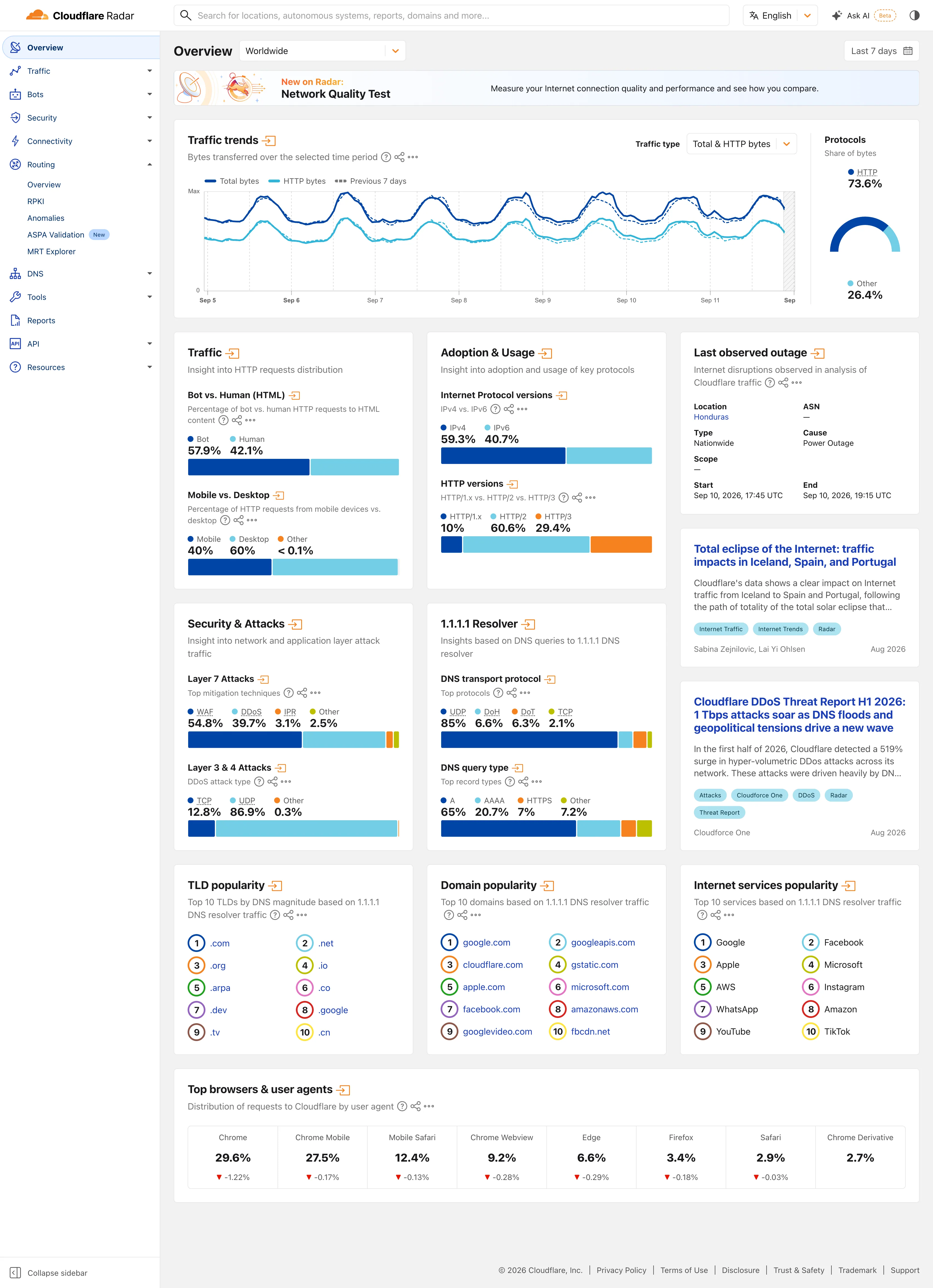
Grafana treats normalization as a query concern and formatting as a panel concern, so a ratio’s correctness lives in PromQL the viewer never sees while the panel confidently formats whatever comes back as a percentage. Netdata leans on per-second rates as the default unit of everything, which makes bursts visible where a per-minute average would have flattened them. Honeycomb prefers to keep the raw events and derive the ratio at query time, so the denominator is something you chose in the query rather than something baked into a metric name months ago. Sentry normalizes by session and by release, which turns “how many errors” into “what fraction of sessions were bad”, the form product teams can actually argue about. Cloudflare Radar puts the denominator where nobody can miss it, printing both sides as text above the bar so “Bot 57.9%, Human 42.1%” reads without the chart at all. That suits an audience which will take one figure and leave, and it means the ratio cannot be misread by anyone who skips the encoding.

KPI tile is the container, and inherits every denominator problem above. Percentile summary is the other way to avoid being fooled by an average. Explain this metric is the escape hatch for the denominator question when it won’t fit on the tile. Metric targets is where a ratio becomes an SLO and the window suddenly matters a great deal more.
Ratio and rate anatomy An error-rate tile broken into four numbered parts: label, the ratio itself, the denominator spelled out, and the window. Below, the same thirty-three percent computed over three requests and over two million. Anatomy Error rate 1 0.04% 2 842 of 2,104,338 requests 3 Last 5 minutes 4 1 LABEL Names the ratio, not the query. 2 THE RATIO Normalised by something the viewer already understands: a request, a customer, a gigabyte. 3 DENOMINATOR One line longer and the tile becomes answerable. Almost nobody prints it. 4 WINDOW The same figure over a minute and over a quarter describe different systems. Why the denominator has to be on the tile Both of these are thirty-three percent. 33% 1 of 3 requests 33% 694,431 of 2,104,338 requests
Wireframe — the pattern's anatomy, not any one product's version of it

Implementation

99.9% of ten requests is one failure. The denominator is what makes a rate readable, and it is the first thing dropped when a tile gets tight.

Tokens
--foreground--muted--muted-foreground--border--chart-1

Error rate

0.04%

842 of 2,104,338 requests

Last 5 minutes

Rate.tsxThe denominator is a required prop and a low-count rate is marked as unreliable.

/**
 * A rate without its denominator is not a measurement.
 *
 * 99.9% over ten requests and 99.9% over four million are different claims, and
 * only one of them survives a single bad minute. `of` is required, and below a
 * threshold the component says the number is thin rather than letting a viewer
 * read it as precision.
 */
export function Rate({
  numerator,
  of,
  label,
  unit,
  minReliable = 100,
}: {
  numerator: number;
  of: number;
  label: string;
  /** What is being counted: "requests", "sessions". */
  unit?: string;
  minReliable?: number;
}) {
  const pct = of === 0 ? null : (numerator / of) * 100;
  const thin = of < minReliable;

  return (
    <div>
      <p className="text-xs text-muted-foreground">{label}</p>
      <p className="mt-1 text-2xl font-semibold tabular-nums text-foreground">
        {/* Two decimals at both ends. 99.95% and 0.04% are the rates people
            act on, and one decimal rounds both to a lie. */}
        {pct === null ? "—" : `${pct.toFixed(pct > 99 || pct < 1 ? 2 : 1)}%`}
      </p>
      <p className="text-xs tabular-nums text-muted-foreground">
        {numerator.toLocaleString()} of {of.toLocaleString()}{unit ? ` ${unit}` : ""}
        {thin && <span className="ml-1 text-status-warn">· small sample</span>}
      </p>
    </div>
  );
}

demo.tsxHow it is called: numerator, denominator and what is counted.

import { Rate } from "./Rate";

/** A rate with its denominator in view. Drop `of` below 100 and it says so. */
export default function Demo() {
  return (
    <div className="w-[272px] rounded-lg border bg-card p-5">
      <Rate label="Error rate" numerator={842} of={2_104_338} unit="requests" />
      <p className="mt-4 text-xs text-muted-foreground">Last 5 minutes</p>
    </div>
  );
}
What it renders. Identical markup in both panes, with only the token values changing.

Examples

Captures whose hotspots reference this pattern, grouped by product and dated. The dashed boxes are this pattern; hover any box for the note.

Cloudflare Radar

A public dashboard with no account, no filters worth the name, and an audience of journalists. Designed for people who will read one number and leave.

Cloudflare Radar — Worldwide Overview
Multi-page dashboard. Eleven sections behind one rail, with the open one expanded in place. Radar is a site of dashboards, not a dashboard. Compare periods. The dotted series is the previous seven days, drawn on the same axis rather than beside it. Delta indicator. Eight shares with their change under them, all of them fractions of a point, which tells you how still this data is. Overview then detail. Two summaries and an arrow each. The panel exists to tell you whether the full page is worth opening. Ratio and rate. Shares only, never counts, and both sides of the split are named so the denominator is never in doubt. Stacked composition. Four mitigation techniques to 100%. The bar is almost redundant next to the printed figures, which is the point. Ranked list. A top ten with no magnitudes at all. The rank is the whole finding.
Worldwide Overview September 11, 2026 Public site, signed out; no version string exposed medium · light · desktop-web
Radar is a dashboard for people who did not come to use a dashboard. The audience is journalists, researchers and the merely curious, nobody has an account, and the design follows from that in two ways worth copying. Two controls scope the whole page—where, and when—and neither is a filter in the sense the rest of this gallery means it; the only other selector on the page sits inside the traffic panel. Everything else that looks like a control is a link. Each panel is a standing summary of a section that has its own full page behind the arrow in its heading, so the overview works as a table of contents rather than a filtered view of one dataset. And almost every value is printed as text above the chart that encodes it: "Bot 57.9%, Human 42.1%" sits over the bar rather than inside it. You can read the number without reading the chart, which is the right trade when most of your readers will take one figure and leave.
  • Multi-page dashboard Eleven sections behind one rail, with the open one expanded in place. Radar is a site of dashboards, not a dashboard.
  • Compare periods The dotted series is the previous seven days, drawn on the same axis rather than beside it.
  • Overview then detail Two summaries and an arrow each. The panel exists to tell you whether the full page is worth opening.
  • Ratio and rate Shares only, never counts, and both sides of the split are named so the denominator is never in doubt.
  • Stacked composition Four mitigation techniques to 100%. The bar is almost redundant next to the printed figures, which is the point.
  • Ranked list A top ten with no magnitudes at all. The rank is the whole finding.
  • Delta indicator Eight shares with their change under them, all of them fractions of a point, which tells you how still this data is.
Show 6 more examples Hide the rest

Kraken Pro

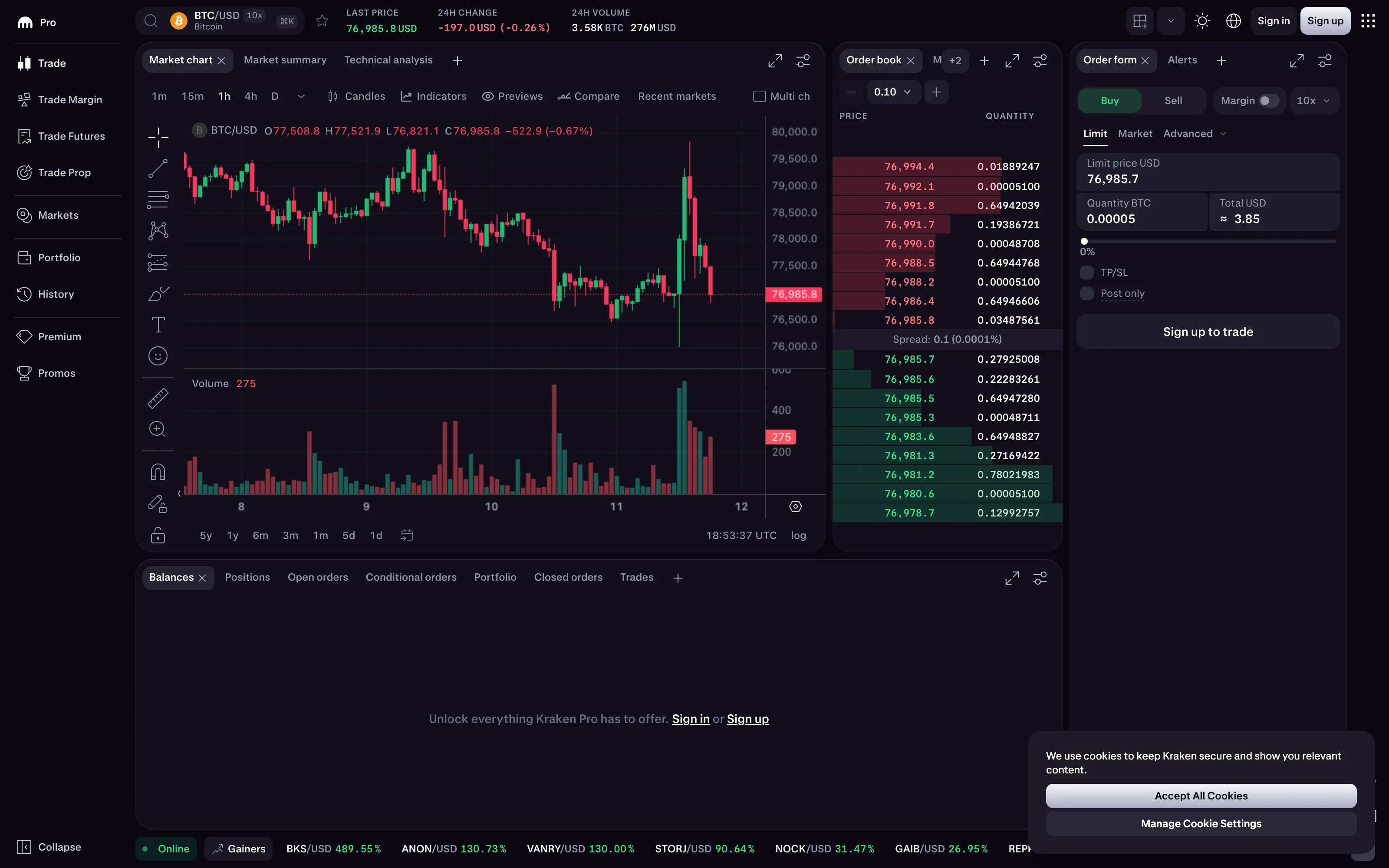
The full order book and depth ladder are public with no account, which makes it the only display here updating several times a second that anyone can go and watch.

Trade / BTC-USD September 11, 2026 Kraken Pro, signed out (public market data) dense · dark · desktop-web
The red-green-direction entry argues that the convention should never carry the information alone, and this ladder shows the redundancy arriving for free. Asks are red and bids are green, but asks are also above the spread and bids below it, so the side is encoded twice—once in a hue that a colourblind reader may not separate, and once in a position that everyone can. Convert this panel to greyscale and it still works. The spread row between them is the other good decision: it reads "0.1 (0.0001%)", the absolute and the ratio side by side, so the number means something whether you are trading one Bitcoin or a hundred. Two details worth noticing. The quantity column runs to eight decimal places, which is correct for the asset and unreadable at a glance, and the depth bars behind each row are doing most of the actual communicating. And the "0.10" control at the top of the panel is the price increment the book is aggregated into—change it and the number of levels changes underneath you.
  • Order book and depth Two ladders sharing a price axis, with the spread labelled between them and a depth bar behind every row.
  • Red/green direction coloring Asks in red, and also above the spread. Position carries the side on its own, so greyscale survives.
  • Ratio and rate The spread as 0.1 and as 0.0001% together, which is the absolute and the normalised form on one line.
  • Delta indicator −197.0 USD and −0.26% together, over a named 24-hour base. All three of the decisions, made and stated.
  • Time series Candles rather than a line, so each interval carries open, high, low and close instead of one sampled value.
  • Order book and depth The price increment the book is aggregated into. Change it and the level count changes under the eye.

Tableau Public

Thousands of dashboards made by people who are not designers, published without a review step. The best available sample of what the pattern language looks like in the wild.

Cohort Retention Analysis September 11, 2026 Tableau Public embed view; workbook published by Tyran Christian medium · light · desktop-web
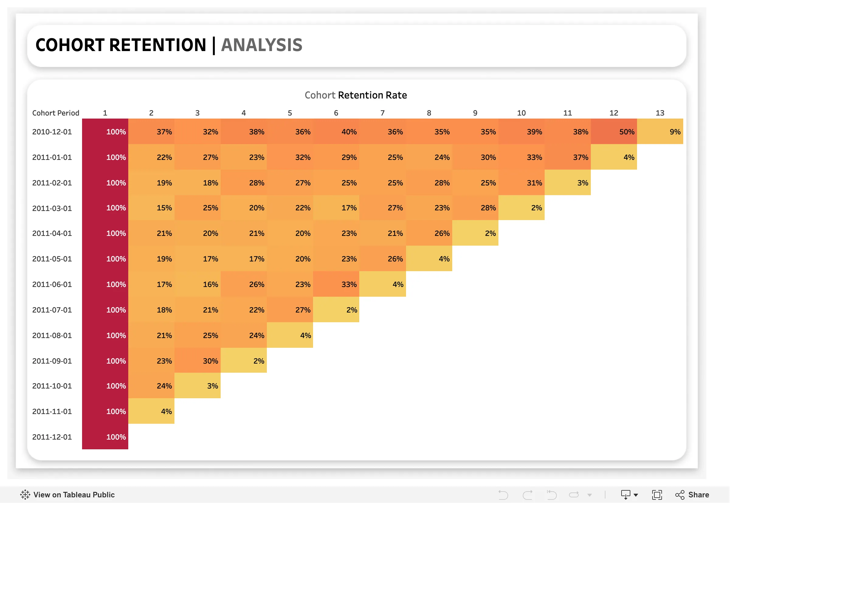
The triangle, exactly as the entry describes it: thirteen monthly cohorts down the side, thirteen periods since joining across the top, and each row one cell shorter than the last because younger cohorts have had less time. Reading down column two gives the comparison the grid exists for—37%, 22%, 19%, 15%, then a slow climb back to 24%—which no single averaged retention number could show. Two things undercut it. The first column is 100% for every cohort by definition, and it takes the darkest step on the ramp, so the one column carrying no information anchors the scale and compresses every real value between 2% and 50% into what is left. And look along the staircase edge: 9%, 4%, 3%, 2%, 4%, 2%, 4%, 2%, 3%, 4%. Every row's final cell falls off a cliff relative to its neighbour, because that period is still in progress and is being drawn as though it were complete.
  • Cohort grid One row per cohort, one column per period since joining. The triangle is the shape, not a rendering accident.
  • Cohort grid 50% then 9%. The last cell in every row is a partial period drawn as a finished one.
  • Sequential and diverging scales Column one is 100% for everyone and takes the darkest step, so a constant sets the top of the ramp.
  • Ratio and rate Cohort dates, and no cohort size. A 100% first cell could be ten people or ten thousand.
Energy flows in the Regional scenario September 11, 2026 Tableau Public embed view; workbook published by Chia Yu Lin medium · light · desktop-web
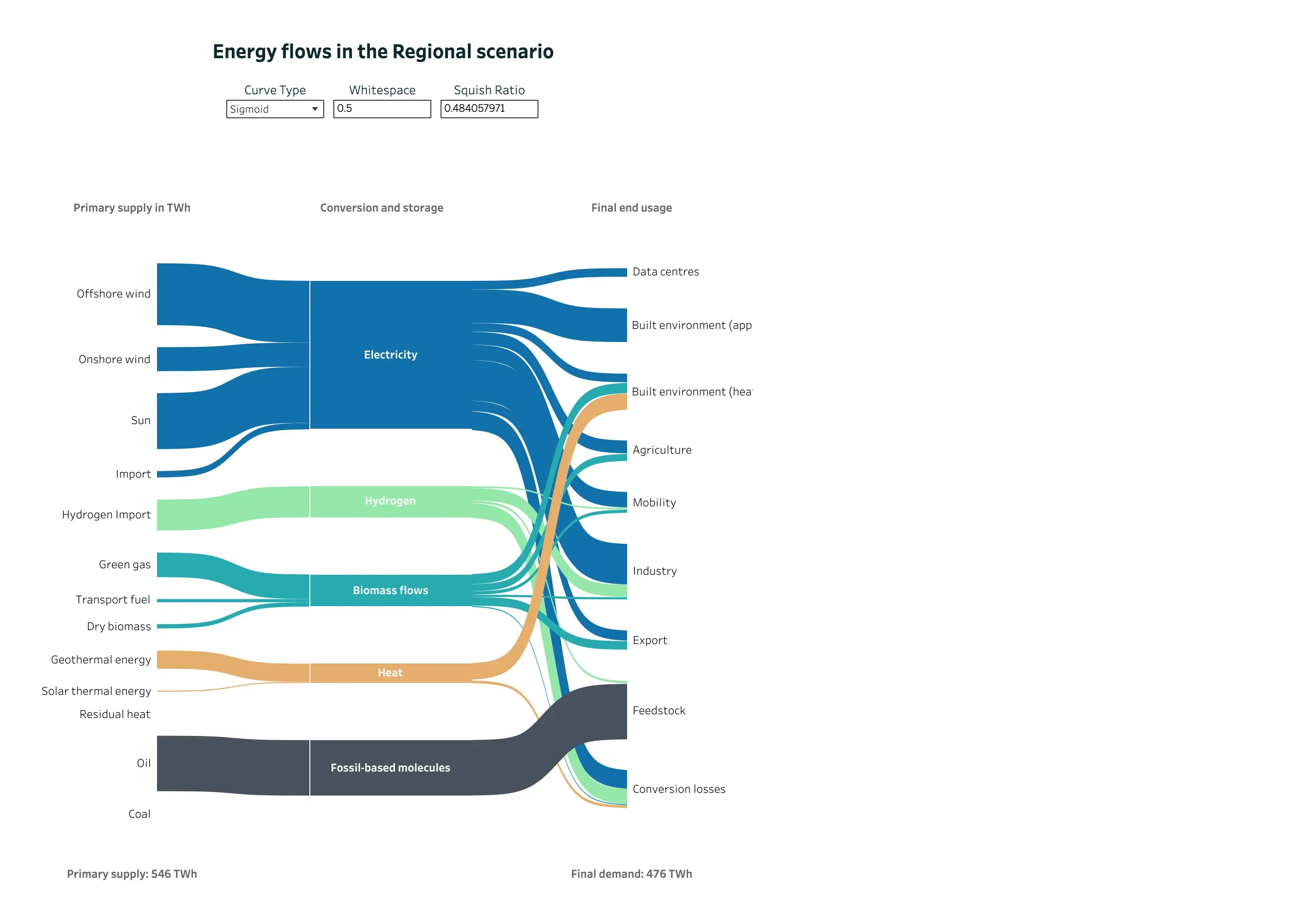
A Sankey doing the job it was invented for, published by an analyst rather than designed by Tableau. The entry argues that the form comes from engineering, where what enters a node leaves it, and that conservation is what makes band width readable as quantity—and that product analytics breaks it because people leave and nothing accounts for them. Here conservation holds and is stated: primary supply 546 TWh at the bottom left, final demand 476 TWh at the bottom right, and the missing 70 TWh has its own destination node called Conversion losses. Nothing disappears off the edge of the diagram. Colour is doing identity rather than status—blue for electricity, green for hydrogen, teal for biomass, orange for heat—and it stays consistent across all three columns, so a carrier can be traced from supply to end use without a legend. The one oddity is that the author has exposed the layout parameters as live controls, including a squish ratio printed to nine decimal places.
  • Sankey and path Three columns of nodes, link width as volume, and crossings kept to the few places where a carrier genuinely switches rank.
  • Sankey and path Conversion losses as an explicit destination. This is the node product analytics leaves out, and the reason its widths stop adding up.
  • Ratio and rate 546 TWh in, 476 TWh out, both stated. The diagram's own arithmetic is checkable from the page.
  • Categorical series palette Five carriers, five hues, held constant across every column so a band can be followed end to end.
  • Dashboard builder Curve type, whitespace and squish ratio exposed as reader-facing controls. The last one reads 0.484057971.
User Funnel & Conversion Rates September 11, 2026 Tableau Public embed view; workbook published by Tetiana Berezhna medium · light · desktop-web
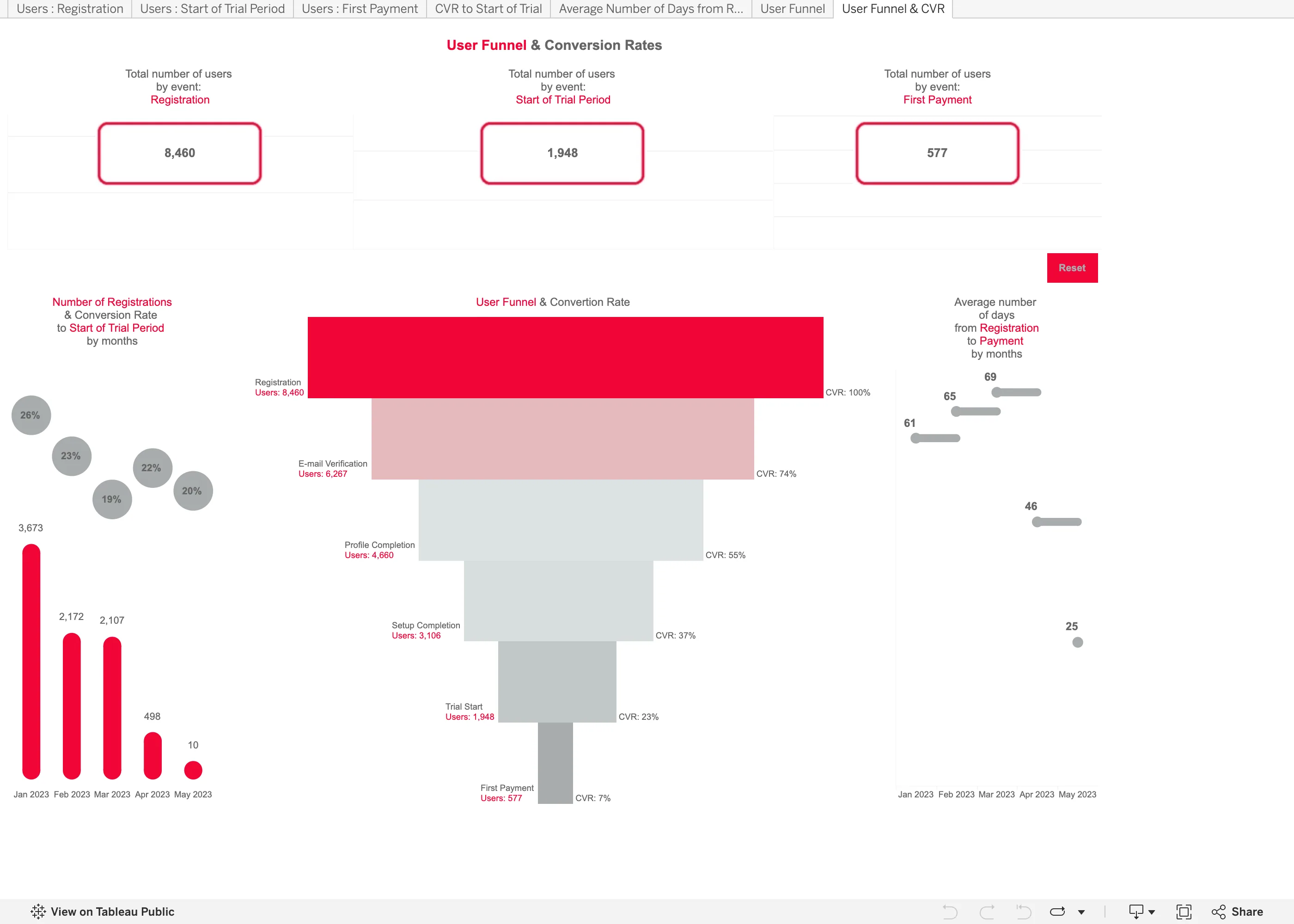
Another published workbook rather than anything Tableau designed, and it makes both of the mistakes the funnel entry names. It shows one number per step, not two. The labels down the right read CVR 100%, 74%, 55%, 37%, 23%, 7%, and every one of those is overall conversion—the share of the original 8,460 still present. Step conversion is missing, which matters because the worst step in this funnel is invisible: 1,948 people start a trial and 577 pay, so that step converts at 30%, and nothing on the chart says 30. You have to divide two numbers printed four inches apart. The second is the rendering. It is drawn as a taper, so quantity is encoded as the width of a trapezoid, and the eye compares areas rather than lengths. Plain horizontal bars would have been easier to read and easier to label. The panel on the left has a third problem: a 20% conversion rate sits above a bar of 10 registrations, next to a 26% rate over 3,673, at the same size and in the same grey.
  • Funnel Drawn as a taper, so the count is the width of a trapezoid. Length would have read more accurately for nothing.
  • Funnel Overall conversion only. The trial-to-payment step converts at 30% and no number on the chart says so.
  • Ratio and rate A 20% rate over 10 registrations drawn the same size as a 26% rate over 3,673.
  • Header KPI strip Three counts, boxed and centred, with no delta and no base. The first and last are the funnel's own endpoints.
  • Tabs as genres Seven worksheet tabs across the top, named after the data rather than the question—Users : Registration, CVR to Start of Trial.

Kibana

Query-first rather than panel-first: the search bar is the primary control and the charts are downstream of it, which inverts Grafana's arrangement.

Kibana — Dashboards / [Flights] Global Flight Dashboard
Panel grid. Twelve columns, and the biggest panel is a table rather than the headline chart. Size isn't carrying priority here. Ratio and rate. Delay rates up to 100% with no denominator anywhere. One flight and a thousand flights render identically. Stacked composition. Stacked to 100%, so the total is discarded on purpose and only the mix of delay types remains. Annotation. Event markers along the top of the series, numbered and grouped, on the data's own axis. Header KPI strip. Five tiles in three different sizes and two different layouts, so the row reads as five things. Compare periods. "vs 1 week earlier, 76.9%"—the comparison base is named and the expression isn't. Filter bar. Declared controls under the query bar: two pickers and a price range. Both mechanisms on screen at once. Share and embed. Share, export and full-screen in the header. Whether the range and filters travel with them is the whole question.
Dashboards / [Flights] Global Flight Dashboard September 10, 2026 Elastic demo environment, sample flight data (guest session) dense · light · desktop-web
Two things on this page are worth arguing with. The first is the table on the right, sorted by delay rate: Chicago/Rockford 100%, Syracuse 100%, Birmingham 75%. A hundred percent of flights delayed is either a catastrophe or one flight, and nothing in the table says which, because the denominator isn't a column. The cells are on a red ramp, so the two rows that are almost certainly a sample of one are the loudest thing in the panel. The second is the tile row: Delayed 25.2%, then beside it "Delayed vs 1 week earlier—76.9%". Seventy-six point nine percent of what? It could be last week's rate, it could be this week as a proportion of last week, it could be the change. Three different numbers, one label, and the tile picks whichever the query returned. What the page gets right is the filtering: a KQL bar for people who know the syntax and three declared controls underneath for people who don't, both visible at once.
  • Ratio and rate Delay rates up to 100% with no denominator anywhere. One flight and a thousand flights render identically.
  • Compare periods "vs 1 week earlier, 76.9%"—the comparison base is named and the expression isn't.
  • Share and embed Share, export and full-screen in the header. Whether the range and filters travel with them is the whole question.
  • Filter bar Declared controls under the query bar: two pickers and a price range. Both mechanisms on screen at once.
  • Panel grid Twelve columns, and the biggest panel is a table rather than the headline chart. Size isn't carrying priority here.
  • Stacked composition Stacked to 100%, so the total is discarded on purpose and only the mix of delay types remains.
  • Annotation Event markers along the top of the series, numbered and grouped, on the data's own axis.
  • Header KPI strip Five tiles in three different sizes and two different layouts, so the row reads as five things.

Plausible Analytics

One column, top to bottom, where the metric row doubles as the chart's control. The clearest working argument that a dashboard can have exactly one interaction.

Plausible Analytics — Live demo / plausible.io
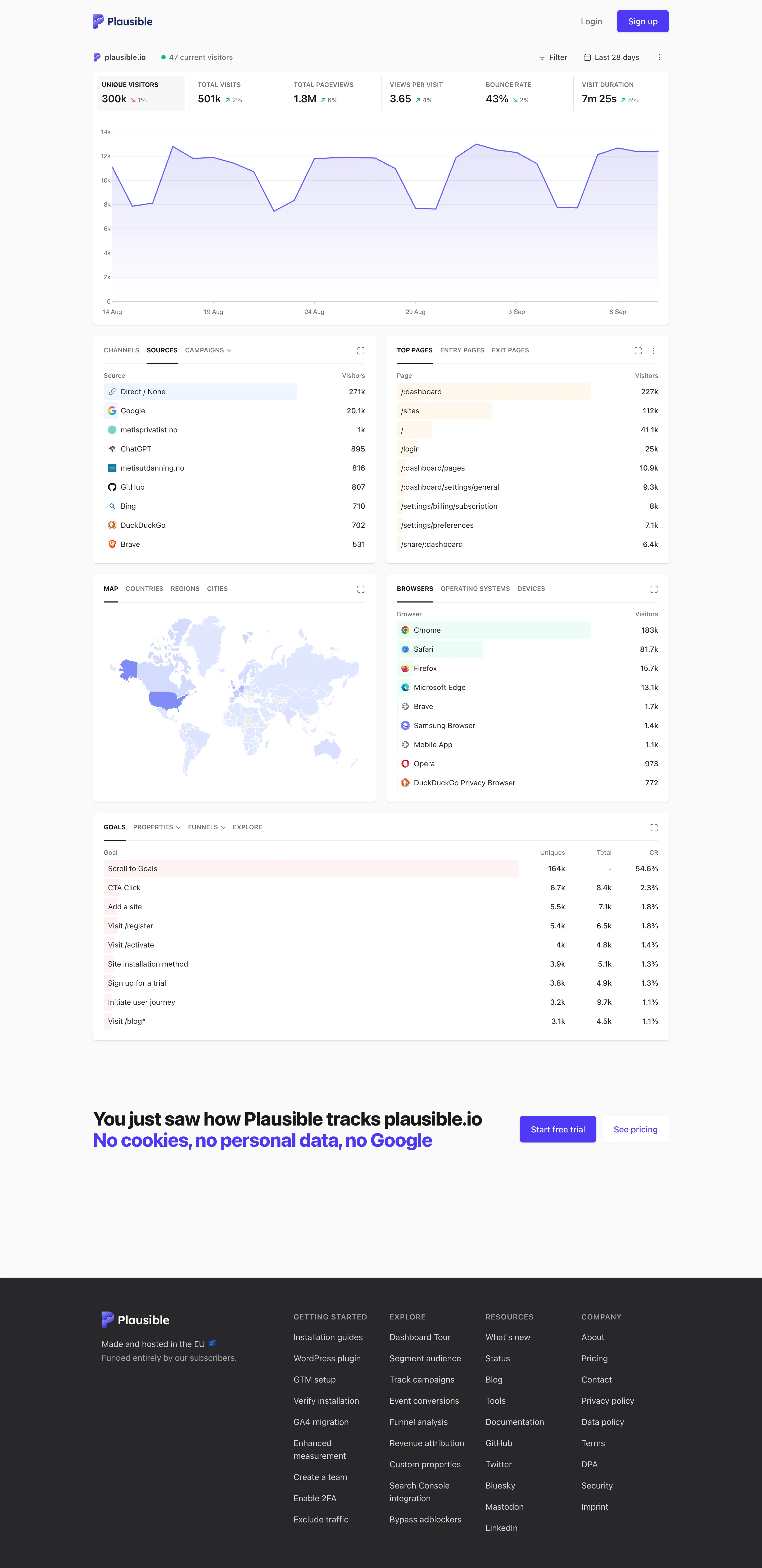
Single-column narrative. One column, top to bottom, no panel arrangement and nothing to configure before reading starts. Overview then detail. The decomposition: sources, pages, geography, browsers, goals. Same subject, narrowed, no navigation. Ranked list. Sorted with an in-row bar, no share of total and no other row. Direct 271k versus Google 25.1k, out of what? Geo map with markers. A choropleth pale enough that every country but one reads as the same white. Raw counts, unnormalised. Header KPI strip. Six tiles sharing one anatomy, each with a delta. The boxed one is selected, and the chart below plots it. Ratio and rate. Bounce rate 43%, with the denominator two tiles away and the window only in the header. Tabs as genres. Tabs inside the panel—channels, sources, campaigns—so one card answers three questions in one slot.
Live demo / plausible.io September 10, 2026 Plausible live demo, plausible.io's own stats (signed out) medium · light · desktop-web
My single-column-narrative entry names Plausible as the reference implementation and says the trick is that the metric row doubles as the chart's control. Here it is doing exactly that: six tiles across the top, the first one boxed because it's selected, and the chart underneath plotting that metric and no other. Click a different tile and the chart follows. The page therefore has one interaction, and it is the same gesture as paying attention. Everything below reads as a single column in argument order—headline, then the shape behind it, then what it decomposes into, then goals. Two things it doesn't do. The ranked lists carry a count and a bar and no share of total, so Direct at 271k against Google at 25.1k tells you the ordering and not whether the top row is most of the traffic. And the choropleth is so pale that outside the United States almost every country is the same near-white, which is the encoding spending a whole panel to say "mostly America".
  • Single-column narrative One column, top to bottom, no panel arrangement and nothing to configure before reading starts.
  • Header KPI strip Six tiles sharing one anatomy, each with a delta. The boxed one is selected, and the chart below plots it.
  • Ratio and rate Bounce rate 43%, with the denominator two tiles away and the window only in the header.
  • Overview then detail The decomposition: sources, pages, geography, browsers, goals. Same subject, narrowed, no navigation.
  • Ranked list Sorted with an in-row bar, no share of total and no other row. Direct 271k versus Google 25.1k, out of what?
  • Geo map with markers A choropleth pale enough that every country but one reads as the same white. Raw counts, unnormalised.
  • Tabs as genres Tabs inside the panel—channels, sources, campaigns—so one card answers three questions in one slot.