Skip to content
KONIGI

Funnel

People move through steps and the viewer needs to see where they leave.

Updated September 10, 2026

Problem

Ten thousand people started signing up and four hundred finished. The viewer needs to know which step lost the other nine thousand six hundred, because that step is the only thing worth working on.

Solution

One bar per step, ordered by sequence, each showing how many reached it. The shape falls away left to right and the biggest single drop is the finding.

Two numbers per step do most of the work, and showing only one is the most common mistake. Step conversion is the percentage who moved from the previous step to this one. Overall conversion is the percentage of the original population still present. A step converting at 91% looks healthy until you notice it sits after four other steps and only 12% of the original cohort ever reached it.

The definitional questions matter more than the chart, and they are the ones that get skipped.

Is the sequence real? A funnel imposes an order. If people can skip a step, do them out of order, or arrive mid-sequence, the chart is describing a path that only some of them took while implying all of them did.

What is the window? Somebody who started on Tuesday and converted on Friday either counts or doesn’t. Fixed-window funnels understate conversion for anything with a long consideration period; unbounded ones overstate it and never settle.

Is it the same people? Counting distinct users per step, independently, produces a chart where a later step can exceed an earlier one and nobody notices for a quarter.

The traditional tapered-shape rendering is worth avoiding, incidentally. It encodes quantity as a trapezoid’s area, which reads less accurately than length, for no gain but the metaphor. Plain horizontal bars are easier to compare and easier to label.

Use when

The sequence is genuinely ordered and mandatory, the population is large enough for percentages to mean something, and someone owns improving a step.

Don’t use when

The path is a graph rather than a line. If people arrive from several entry points and take different routes, a funnel picks one story and hides the rest—that is what the Sankey pattern is for.

Trade-offs

Funnels flatten time, so a drop-off that appeared last Tuesday looks identical to one that has always been there. They flatten segments too: one funnel over all traffic averages a mobile disaster with a desktop success. The biggest bar-to-bar drop attracts all the attention, which is right when the steps are equally improvable and wrong when the big drop is an intentional qualifying step. And a funnel is a claim about intent—everyone who entered wanted to finish—which is frequently untrue at the top.

Checklist

  • Is the step order real and mandatory, or imposed on a messier reality?
  • Is both step conversion and overall conversion shown?
  • What is the conversion window, and does it suit the decision cycle?
  • Is this the same set of people at each step, or independently counted?
  • Can someone enter mid-funnel, and where do they appear?
  • Is the funnel segmented, or is one number averaging incompatible populations?
  • Does anything show whether a drop-off is new or long-standing?
  • Is the biggest drop actually the most improvable one?
  • Are the counts shown, not only the percentages?
  • Is quantity encoded as length rather than as a tapered area?

Compare

Amplitude and Mixpanel made this the centrepiece of product analytics, with conversion windows, segmentation and step reordering as first-class controls, which is what turns a static chart into an analysis tool. Google Analytics ships a goal-funnel view built on session-scoped steps, which is why its numbers so often disagree with a product-analytics tool measuring the same flow on user scope. Grafana has no funnel panel and teams approximate it with a sorted bar chart, which works and loses the step-conversion arithmetic that makes the pattern useful. Sentry inverts the framing entirely, measuring where sessions fail rather than where they convert, which answers the same “where do we lose people” question from the error side.

Sankey and path is what to use when the route branches rather than narrowing. Cohort grid answers the time question a funnel flattens. Ratio and rate covers the denominator problem, which is the funnel’s central hazard. Stacked composition is the other way to show part-to-whole. Compare periods is how you tell a new drop-off from an old one.
Funnel anatomy Five steps as plain horizontal bars, each carrying two numbers: the share who moved from the step above, and the share of the original population still present. The fourth step converts at ninety-one percent and only twelve percent of the original cohort ever reached it. Two numbers per step, not one Step From last Of all Viewed product 100% Added to cart 41% 41% Began checkout 53% 22% Entered payment 55% 12% Paid 91% 11% 1 2 1 THE BIGGEST DROP Fifty-nine percent leave between viewing and the cart. That's the finding, and it's a shape, not a number. 2 91% OF WHAT A step converting at 91% looks healthy until you notice only 12% ever reached it. Three definitional questions decide whether the chart is true at all, and they are the ones that get skipped. Is the sequence real, or can people skip steps and arrive mid-way? What is the window, given somebody who started Tuesday and converted Friday either counts or doesn't? And is it the same people, because counting distinct users per step independently lets a later step exceed an earlier one. Plain bars, not a taper. A trapezoid encodes quantity as area, which reads worse than length for no gain but the metaphor.
Wireframe — the pattern's anatomy, not any one product's version of it

Implementation

Each step's drop is the finding, so the step-to-step percentage matters more than the absolute width. A funnel that only shows totals hides which stage is actually broken.

Tokens
--card--card-foreground--muted-foreground--border--status-warn--chart-1
StepFrom lastOf all
  1. Viewed product100%
  2. Added to cart41%41%
  3. Began checkout53%22%
  4. Entered payment55%12%
  5. Paid91%11%

10,000 people, same users, 7-day window from first view

Funnel.tsxTakes counts and computes both percentages, colours the biggest drop, and prints the window the counts were taken over.

import { cn } from "@/lib/utils";

/** A step is a name and how many of the cohort reached it. Both percentages
 *  are computed here, so the chart can never show one without the other. */
export type Step = { name: string; count: number };

type Props = {
  /** In sequence. The first step is the population everything is measured against. */
  steps: Step[];
  /** The conversion window, printed under the chart. Somebody who started
   *  Tuesday and paid Friday either counts or does not, and the chart has to
   *  say which. */
  window: string;
  barWidth?: number;
};

const pct = (n: number) => `${Math.round(n * 100)}%`;
const fmt = new Intl.NumberFormat("en-GB");

export function Funnel({ steps, window, barWidth = 160 }: Props) {
  const base = steps[0]?.count ?? 0;
  const rows = steps.map((s, i) => ({
    ...s,
    ofAll: s.count / base,
    fromLast: i === 0 ? null : s.count / steps[i - 1].count,
  }));
  // The finding is the biggest single drop, and it gets the only colour.
  const worst = rows.reduce((w, r, i) => (r.fromLast !== null && (w < 0 || r.fromLast < rows[w].fromLast!) ? i : w), -1);

  return (
    <div className="w-full max-w-[480px] rounded-lg border bg-card p-4">
      <div className="flex items-baseline border-b pb-2 text-[11px] uppercase tracking-wide text-muted-foreground">
        <span className="flex-1">Step</span>
        <span className="w-20 text-right">From last</span>
        <span className="w-14 text-right">Of all</span>
      </div>
      <ol className="mt-1 text-xs">
        {rows.map((r, i) => (
          <li key={r.name} className="flex items-center py-2">
            <span className="w-28 text-card-foreground" title={`${fmt.format(r.count)} people`}>{r.name}</span>
            {/* Length, never area. A taper reads worse for no gain but the metaphor. */}
            <span
              className={cn("h-3.5 rounded-[1px]", i === worst ? "bg-status-warn" : "bg-chart-1")}
              style={{ width: Math.max(1, Math.round(r.ofAll * barWidth)) }}
            />
            <span className={cn("ml-auto w-20 text-right tabular-nums", i === worst ? "text-status-warn" : "text-muted-foreground")}>
              {r.fromLast === null ? "—" : pct(r.fromLast)}
            </span>
            <span className="w-14 text-right tabular-nums text-card-foreground">{pct(r.ofAll)}</span>
          </li>
        ))}
      </ol>
      <p className="mt-2 border-t pt-2 text-[11px] text-muted-foreground">
        {fmt.format(base)} people, {window}
      </p>
    </div>
  );
}

demo.tsxHow it is called: five checkout steps as counts, so the percentages are derived rather than typed.

import { Funnel } from "./Funnel";

/**
 * Five steps from a checkout. Ten thousand viewed, 1,083 paid. The counts are
 * chosen so the two percentages land on the drawing's: 41, 53, 55 and 91 from
 * the step before, 11% of everyone at the end.
 */
export default function Demo() {
  return (
    <Funnel
      steps={[
        { name: "Viewed product", count: 10000 },
        { name: "Added to cart", count: 4100 },
        { name: "Began checkout", count: 2170 },
        { name: "Entered payment", count: 1190 },
        { name: "Paid", count: 1083 },
      ]}
      window="same users, 7-day window from first view"
    />
  );
}
What it renders. Identical markup in both panes, with only the token values changing.

Examples

Captures whose hotspots reference this pattern, grouped by product and dated. The dashed boxes are this pattern; hover any box for the note.

Tableau Public

Thousands of dashboards made by people who are not designers, published without a review step. The best available sample of what the pattern language looks like in the wild.

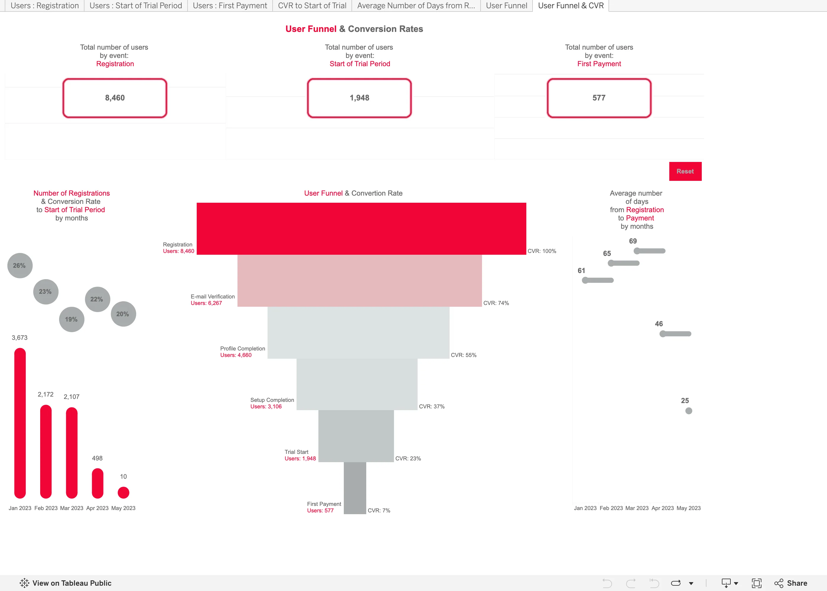
User Funnel & Conversion Rates September 11, 2026 Tableau Public embed view; workbook published by Tetiana Berezhna medium · light · desktop-web
Another published workbook rather than anything Tableau designed, and it makes both of the mistakes the funnel entry names. It shows one number per step, not two. The labels down the right read CVR 100%, 74%, 55%, 37%, 23%, 7%, and every one of those is overall conversion—the share of the original 8,460 still present. Step conversion is missing, which matters because the worst step in this funnel is invisible: 1,948 people start a trial and 577 pay, so that step converts at 30%, and nothing on the chart says 30. You have to divide two numbers printed four inches apart. The second is the rendering. It is drawn as a taper, so quantity is encoded as the width of a trapezoid, and the eye compares areas rather than lengths. Plain horizontal bars would have been easier to read and easier to label. The panel on the left has a third problem: a 20% conversion rate sits above a bar of 10 registrations, next to a 26% rate over 3,673, at the same size and in the same grey.
  • Funnel Drawn as a taper, so the count is the width of a trapezoid. Length would have read more accurately for nothing.
  • Funnel Overall conversion only. The trial-to-payment step converts at 30% and no number on the chart says so.
  • Ratio and rate A 20% rate over 10 registrations drawn the same size as a 26% rate over 3,673.
  • Header KPI strip Three counts, boxed and centred, with no delta and no base. The first and last are the funnel's own endpoints.
  • Tabs as genres Seven worksheet tabs across the top, named after the data rather than the question—Users : Registration, CVR to Start of Trial.