Skip to content
KONIGI

Dashboards / Visual representation / Data table

5 of 22

Data table

The viewer needs exact values for many items and wants to sort and scan them.

Updated September 10, 2026

Problem

There are two hundred services and the viewer needs to know which ones are slow, by how much exactly, and in an order they choose. A chart of two hundred series is a colour test.

Solution

Rows, columns, exact values, and a sort the viewer controls. The table is what you reach for when a chart would lie by omission, and its real superpower is not display but reordering: the same rows sorted by error rate and by request volume answer two different questions with no second panel.

The thing that separates a good dashboard table from a spreadsheet is what goes inside a cell. Grafana’s table panel makes this explicit with cell display modes. Colored background applies threshold or value-mapping colour to the whole cell, so a column becomes scannable at a glance. Gauge renders the value as a horizontal bar in the cell, with Basic, Gradient and Retro LCD styles. Sparkline puts a shape in the cell. Data links turns the cell text into a link out.

Those modes are how a table stops competing with charts and starts absorbing them. A column of sparklines is a small-multiples grid that happens to have labels and exact numbers attached, which is usually strictly better than nine separate panels.

The controls matter as much as the cells. Grafana cycles sort order on a column title click—default, descending, ascending—and holds Cmd or Ctrl for multi-column sorts. Enable pagination caps visible rows and sizes the page to the panel height. A Column filter switch puts a filter icon on each header, with checkboxes and operators including Contains, Expression and the comparisons.

The trap in all of it: sorting and filtering happen on what the query returned, not on the whole population. A table showing the top 100 rows, sorted client-side, is sorting a sample and looks exactly like sorting the data.

Use when

Exact values matter, the item count is beyond what a chart can encode, and different viewers want different orderings. Triage lists, cost breakdowns, inventory, anything where the next action is on a specific row.

Don’t use when

The question is about trend or shape. A table of 24 hourly values is a line chart that has been made harder to read. Also avoid it as the only view when most rows are uninteresting; rank and cut instead.

Trade-offs

Tables are dense and slow to read, and they reward the reader who already knows which column matters. They scale badly on a wall or a phone, where the columns that get dropped are chosen by CSS rather than by importance. Sorting invites over-reading of small differences: adjacent rows separated by noise still look ranked. And the more cell modes you turn on, the more the table becomes a chart with worse alignment, at which point a chart is the honest choice.

Checklist

  • What is the default sort, and is it the order most viewers need first?
  • Is the sort applied to the whole population or only to the rows the query returned?
  • Are numbers right-aligned with tabular figures so columns compare by eye?
  • Do units and precision match how the team talks, and are they consistent down the column?
  • How many rows before this needs pagination, and does pagination break the sort?
  • Which columns survive a narrow viewport, and who decided?
  • Is there a row action, and does the whole row afford it or just one cell?
  • Do colour-coded cells derive from the same thresholds as the charts nearby?
  • What does a null show as, and can it be told apart from a zero?
  • Would two of these columns be better as one chart?

Compare

Grafana turns the cell into a container—background colour, in-cell bar gauge, in-cell sparkline, data links—so a single table can carry status, magnitude and trend per row and needs discipline to stay readable. Sentry builds its primary interface as a table and treats each row as an object with its own lifecycle: count, users affected, first seen, last seen, and a shape, which is the pattern doing triage rather than reporting. Honeycomb returns a results table as one output of a query rather than a standing panel, so the columns are whatever you grouped by a moment ago instead of a schema someone fixed in advance. Netdata uses tables mainly for inventory—nodes, alarms, collectors—and leaves the measurement to its charts, which keeps both simple.

Ranked list is this pattern with a cut applied and the total made visible. Drill-down is where a row click should go. Sparkline is the cell mode that does the most work per pixel. Filter bar is how the population gets narrowed before sorting means anything. Two-pane list and detail is the layout a triage table usually wants to live in.
Data table anatomy A table whose cells carry more than text: a coloured background column scannable at a glance, a bar rendered inside the cell, a sparkline in the cell, and a linked value. The sort control sits on the header, and the footer says the sort ran over a hundred rows out of nine thousand. What goes inside a cell Service Error rate Budget left Last hour P95 checkout 4.12% 412ms search 1.80% 308ms cart 0.41% 191ms user 0.12% 96ms showing 100 of 9,412 rows · sorted client-side 1 2 3 4 1 COLOURED BACKGROUND Threshold colour on the whole cell, so the column is scannable without being read. 2 A BAR IN THE CELL Magnitude and exact value in one column, which no chart beside the table can give. 3 A SPARKLINE IN THE CELL A small-multiples grid that happens to have labels and exact numbers attached, which beats nine separate panels. 4 SORTING A SAMPLE Sorting happens on what the query returned, not on the population, and it looks exactly like sorting the data. The superpower isn't display, it's reordering. Two sorts answer two questions.
Wireframe — the pattern's anatomy, not any one product's version of it

Implementation

shadcn's Table gives you the markup. What a dashboard table needs beyond it is cells that carry more than text, meaning a bar, a status or a sparkline, and a footer that admits the sort ran over a sample.

shadcn
npx shadcn@latest add table
Tokens
--background--foreground--card--card-foreground--muted--muted-foreground--border--status-warn--chart-1--scale-seq-1--scale-seq-3--scale-seq-5
checkout4.12%412ms
search1.80%308ms
cart0.41%191ms
user0.12%96ms

showing 4 of 9,412 rows · sorted client-side

DataTable.tsxColumns declare a cell mode from a closed set, header clicks cycle the sort, and the footer computes what fraction of the population it sorted.

import { useState } from "react";
import { Table, TableBody, TableCell, TableHead, TableHeader, TableRow } from "@/components/ui/table";
import { cn } from "@/lib/utils";
import { Sparkline } from "../sparkline/Sparkline";

/**
 * What goes inside a cell is the whole difference between a dashboard table
 * and a spreadsheet. The modes are a closed set, after Grafana's cell display
 * modes: colour the cell by threshold so the column scans, draw the value as
 * a bar so magnitude and figure share a column, put a sparkline in the cell,
 * or make the value a link out.
 */
export type CellMode = "text" | "background" | "bar" | "sparkline" | "link";

export type Column<Row> = {
  key: keyof Row & string;
  label: string;
  mode?: CellMode;
  align?: "left" | "right";
  format?: (value: Row[keyof Row]) => string;
  /** Lower bound of each colour step for `background`, ascending. Share these with the charts beside the table. */
  thresholds?: number[];
  href?: (row: Row) => string;
};

/** Threshold steps for `background`, low to high. Full class names so Tailwind ships them. */
const STEP = ["bg-scale-seq-1 text-foreground", "bg-scale-seq-3 text-foreground", "bg-scale-seq-5 text-background"];
type Sort<Row> = { key: keyof Row & string; dir: "desc" | "asc" } | null;

export function DataTable<Row extends Record<string, unknown>>({ columns, rows, total, defaultSort = null, onSort, onRowClick }: {
  columns: Column<Row>[];
  /** What the query returned. The sort runs over these and nothing else. */
  rows: Row[];
  /** How many rows the population holds. Required: without it a sorted sample looks exactly like sorted data. */
  total: number;
  defaultSort?: Sort<Row>;
  onSort?: (sort: Sort<Row>) => void;
  onRowClick?: (row: Row) => void;
}) {
  const [sort, setSort] = useState<Sort<Row>>(defaultSort);
  const cycle = (key: keyof Row & string) => {
    const next: Sort<Row> = sort?.key !== key ? { key, dir: "desc" } : sort.dir === "desc" ? { key, dir: "asc" } : null;
    setSort(next);
    onSort?.(next);
  };
  const sorted = sort
    ? [...rows].sort((a, b) => {
        const x = a[sort.key], y = b[sort.key];
        const d = typeof x === "number" && typeof y === "number" ? x - y : String(x).localeCompare(String(y));
        return sort.dir === "desc" ? -d : d;
      })
    : rows;

  const cell = (col: Column<Row>, row: Row) => {
    const v = row[col.key];
    const text = col.format ? col.format(v) : String(v);
    switch (col.mode) {
      case "background": {
        const step = (col.thresholds ?? []).filter((t) => (v as number) >= t).length;
        return <span className={cn("rounded-[2px] px-2 py-0.5", STEP[Math.min(step, STEP.length - 1)])}>{text}</span>;
      }
      case "bar":
        return (
          <span role="meter" aria-valuemin={0} aria-valuemax={1} aria-valuenow={v as number} aria-label={`${col.label} ${text}`} title={text}
            className="flex h-2.5 w-[110px] rounded-[2px] bg-muted">
            <span className="rounded-[2px] bg-chart-1" style={{ width: `${(v as number) * 100}%` }} />
          </span>
        );
      case "sparkline":
        return <span className="text-muted-foreground"><Sparkline values={v as number[]} width={96} height={20} /></span>;
      case "link":
        return <a href={col.href?.(row)} className="text-chart-1 underline underline-offset-2">{text}</a>;
      default:
        return text;
    }
  };

  return (
    <div className="overflow-hidden rounded-lg border bg-card">
      <Table className="text-xs">
        <TableHeader>
          <TableRow className="text-[11px] uppercase tracking-wide">
            {columns.map((c) => (
              <TableHead key={c.key} className={cn("h-9 px-4", c.align === "right" && "text-right")}>
                <button type="button" onClick={() => cycle(c.key)} className="font-medium" aria-sort={sort?.key === c.key ? (sort.dir === "desc" ? "descending" : "ascending") : undefined}>
                  {c.label}
                  {sort?.key === c.key && <span className="ml-1 text-foreground" aria-hidden="true">{sort.dir === "desc" ? "▾" : "▴"}</span>}
                </button>
              </TableHead>
            ))}
          </TableRow>
        </TableHeader>
        <TableBody className="tabular-nums">
          {sorted.map((row, i) => (
            <TableRow key={i} onClick={onRowClick && (() => onRowClick(row))} className={cn(onRowClick && "cursor-pointer")}>
              {columns.map((c) => (
                <TableCell key={c.key} className={cn("px-4 py-2.5 text-card-foreground", c.align === "right" && "text-right")}>{cell(c, row)}</TableCell>
              ))}
            </TableRow>
          ))}
        </TableBody>
      </Table>
      {/* Sorting a sample looks exactly like sorting the data, so the footer says which it was. */}
      {rows.length < total && (
        <p className="border-t px-4 py-2.5 text-[11px] text-status-warn">
          showing {rows.length} of {total.toLocaleString("en-GB")} rows · sorted client-side
        </p>
      )}
    </div>
  );
}

demo.tsxHow it is called: four services of 9,412, sorted by error rate, with a coloured cell, a bar, a sparkline and a link in each row.

import { DataTable, type Column } from "./DataTable";

/**
 * Four services out of a population of 9,412, sorted by error rate on the
 * client. Error rate colours its cell against the thresholds the charts use,
 * budget left is a bar, the last hour is a sparkline, and P95 links out.
 */
type Service = { service: string; errorRate: number; budgetLeft: number; lastHour: number[]; p95: number };

const COLUMNS: Column<Service>[] = [
  { key: "service", label: "Service" },
  { key: "errorRate", label: "Error rate", mode: "background", thresholds: [1, 3], format: (v) => `${(v as number).toFixed(2)}%` },
  { key: "budgetLeft", label: "Budget left", mode: "bar", format: (v) => `${Math.round((v as number) * 100)}% left` },
  { key: "lastHour", label: "Last hour", mode: "sparkline" },
  { key: "p95", label: "P95", mode: "link", align: "right", format: (v) => `${v}ms`, href: (r) => `/services/${r.service}/latency` },
];

const ROWS: Service[] = [
  { service: "checkout", errorRate: 4.12, budgetLeft: 0.2, lastHour: [4, 8, 6, 16, 20], p95: 412 },
  { service: "search", errorRate: 1.8, budgetLeft: 0.58, lastHour: [2, 4, 0, 6, 4], p95: 308 },
  { service: "cart", errorRate: 0.41, budgetLeft: 0.84, lastHour: [2, 4, 0, 6, 4], p95: 191 },
  { service: "user", errorRate: 0.12, budgetLeft: 0.95, lastHour: [2, 4, 0, 6, 4], p95: 96 },
];

export default function Demo() {
  return (
    <DataTable
      columns={COLUMNS}
      rows={ROWS}
      total={9412}
      defaultSort={{ key: "errorRate", dir: "desc" }}
      onSort={(s) => console.log("sort", s)}
    />
  );
}
What it renders. Identical markup in both panes, with only the token values changing.

Examples

Captures whose hotspots reference this pattern, grouped by product and dated. The dashed boxes are this pattern; hover any box for the note.

Grafana

The reference implementation for panel grids, template variables, and stat panels; most other tools are defined by how they differ from it.

Where The Cool Dashboards Live / Chicago L Trains September 10, 2026 Grafana Play (signed out; no version string exposed) sparse · dark · wall
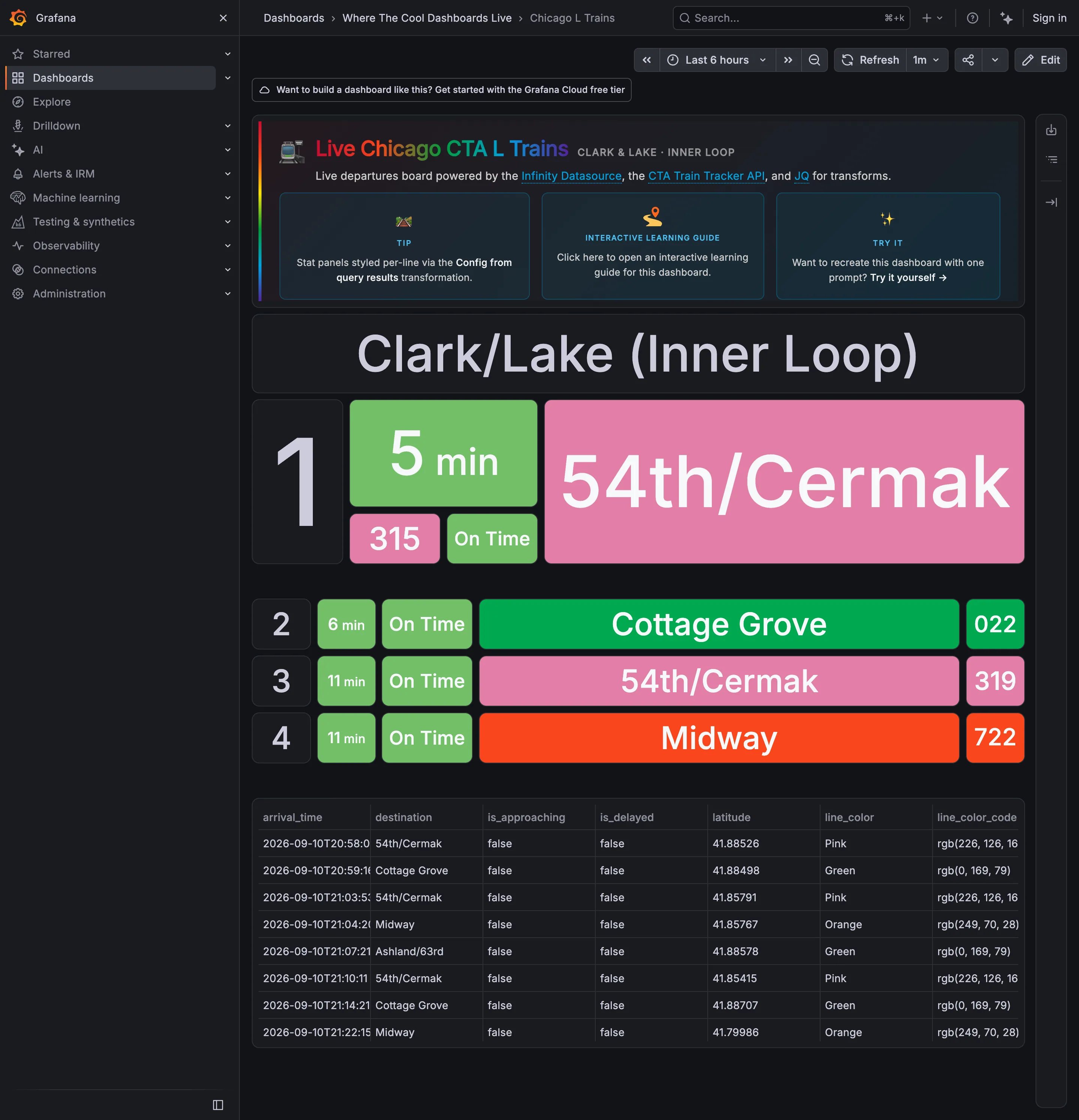
A live departures board for one platform, built out of stat panels against the CTA Train Tracker API, and it is the clearest wallboard in the gallery: four rows, type large enough to read across a concourse, no chrome inside the board and nothing to hover. The next train gets three times the height of the three behind it, which is the layout saying "start here" without a word of copy. The interesting problem is the colour. Pink, Green and Orange are the CTA's own line colours, inherited from the world outside the screen and already known to every rider—which is the best possible reason to use a palette. But the status chip beside them is also green when a train is on time, so on the second row "Cottage Grove" is green because it is the Green Line and "On Time" is green because it is on time, side by side, meaning two unrelated things.
  • Wallboard mode The next train, three times the height of the rest. Readable at ten feet with no pointer.
  • Panel grid Rows two to four at a third the size. Panel size is carrying the priority.
  • Semantic status color Green for on time, next to green for the Green Line. One hue, two unrelated jobs, one row.
  • Freshness indicator A countdown rather than a clock time, which is the right call and hides how old the feed is.
  • Data table The raw feed under the board, including the rgb string each line colour came from.
Show 4 more examples Hide the rest

Grafana

The reference implementation for panel grids, template variables, and stat panels; most other tools are defined by how they differ from it.

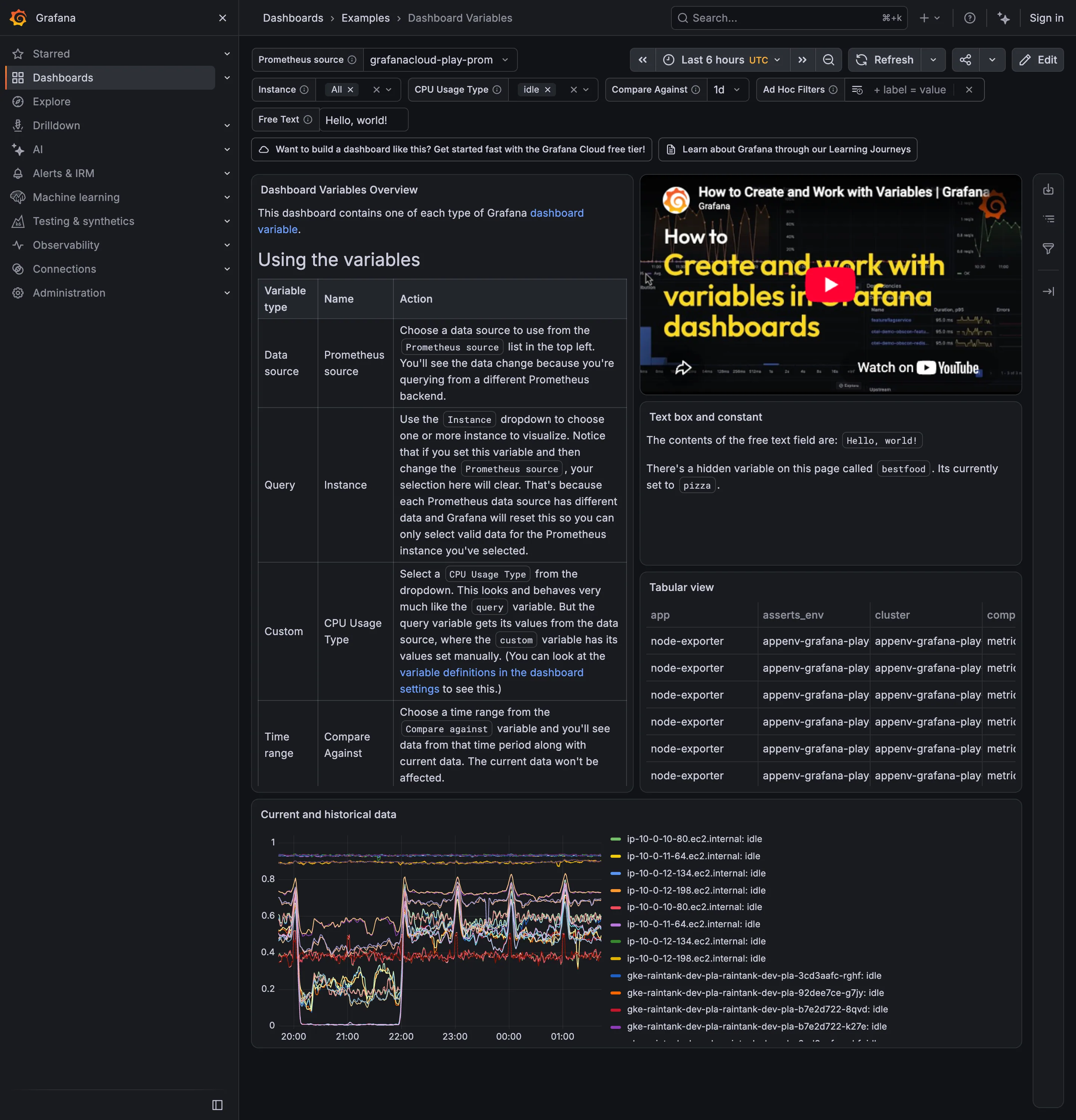
Examples / Dashboard Variables September 10, 2026 Grafana Play (signed out; no version string exposed) medium · dark · desktop-web
Six selectors across the top and the page is unusually honest about what they cost. The middle panel says there is a hidden variable called bestfood, currently set to pizza, which has no control anywhere on screen—state affecting the page that a viewer cannot see or change. The overview panel says that setting Instance and then changing the Prometheus source will clear your selection, because the two variables are chained and the second one invalidates the first. Both of those are correct behaviour and both are the reason parameterised pages get distrusted. What the top row gets right is the display: Instance and CPU Usage Type show their selected values as chips with an × rather than as a count, so what is filtering the page is legible without opening anything.
  • Template variable Six selectors bound to every panel's query, with the chosen values carried in the URL.
  • Filter bar Values as removable chips rather than a dropdown saying Instance (3).
  • Explain this metric Names a hidden variable set to pizza. Prose is doing the work a control should.
  • Categorical series palette Twelve-plus hostnames differing only in the middle digits, with twelve-plus colours to match.
  • Data table Four columns visible, the fourth cut mid-word, with no horizontal scroll offered.
Examples / Table September 10, 2026 Grafana Play (signed out; no version string exposed) dense · dark · desktop-web
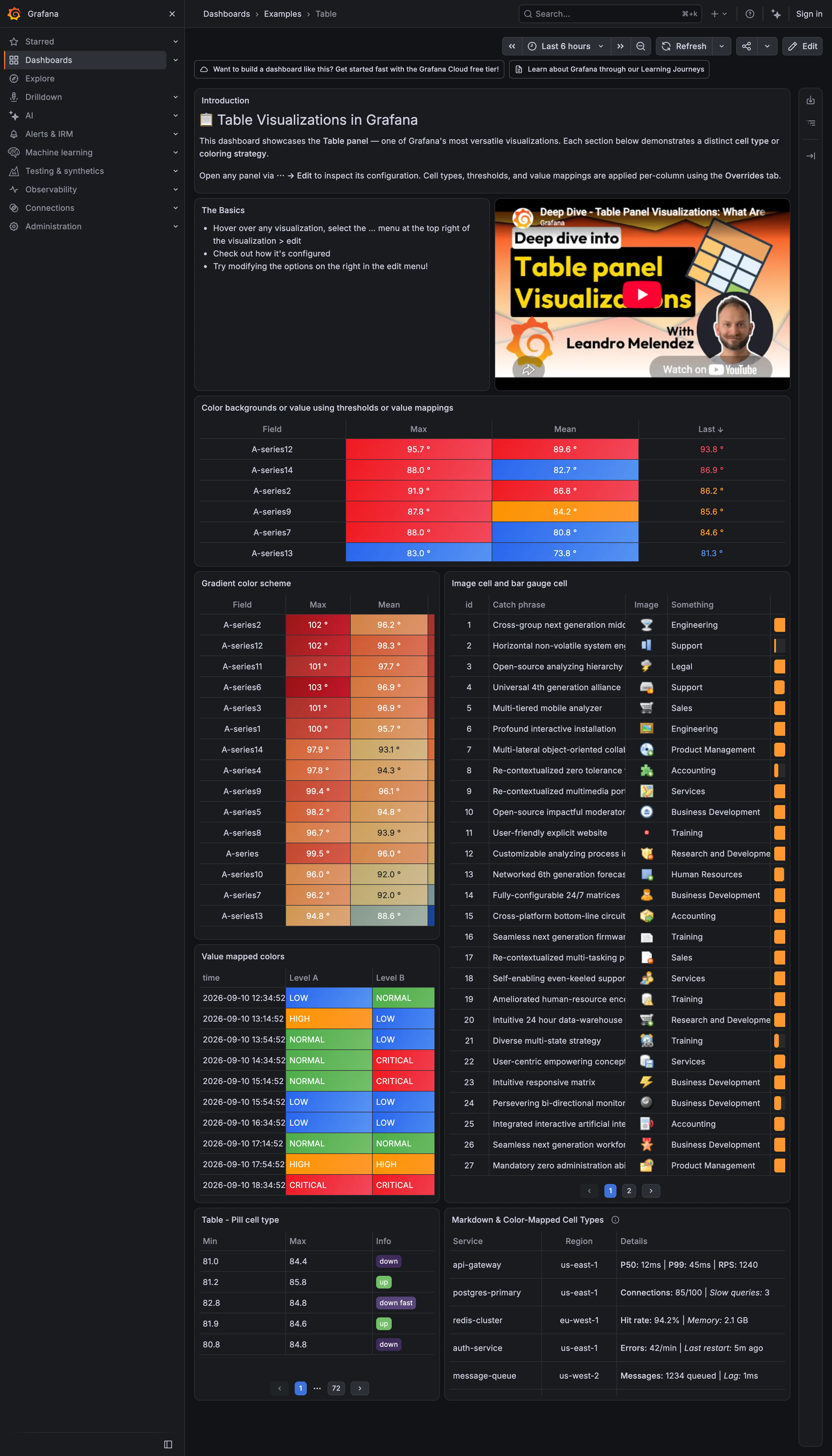
Seven tables demonstrating what a cell can hold, and the range is the point: a threshold colour on the whole cell, a continuous gradient down a column, an image, a bar rendered inside the cell, a pill, and a markdown block carrying three metrics at once. Two of them stop working at this size. The bar gauge column on the right is squeezed to a sliver about six pixels wide, so the encoding that was supposed to make magnitude visible carries nothing, and the catch-phrase column beside it truncates mid-word with no way to see the rest. The bottom-left table is the one to look at hardest. It is sorted, it has column headers you can click, and the pager under it reads page 1 of 72. Any sort applied there is a sort of the page unless the query re-runs, and nothing on screen tells you which of those is happening.
  • Data table Threshold colour filling the cell, which makes a column scannable without being read.
  • Sequential and diverging scales A continuous ramp down a sorted column: the table doing a heatmap's job.
  • Data table In-cell bar gauge clipped to a sliver, and text truncated mid-word with no escape to the full value.
  • Semantic status color Value mappings turning raw levels into a closed set, each with its word in the cell.
  • Delta indicator Pills reading up, down and down fast: direction with no magnitude and no base. Also page 1 of 72.

Kibana

Query-first rather than panel-first: the search bar is the primary control and the charts are downstream of it, which inverts Grafana's arrangement.

Dashboards / list September 10, 2026 Elastic demo environment (guest session) medium · light · desktop-web
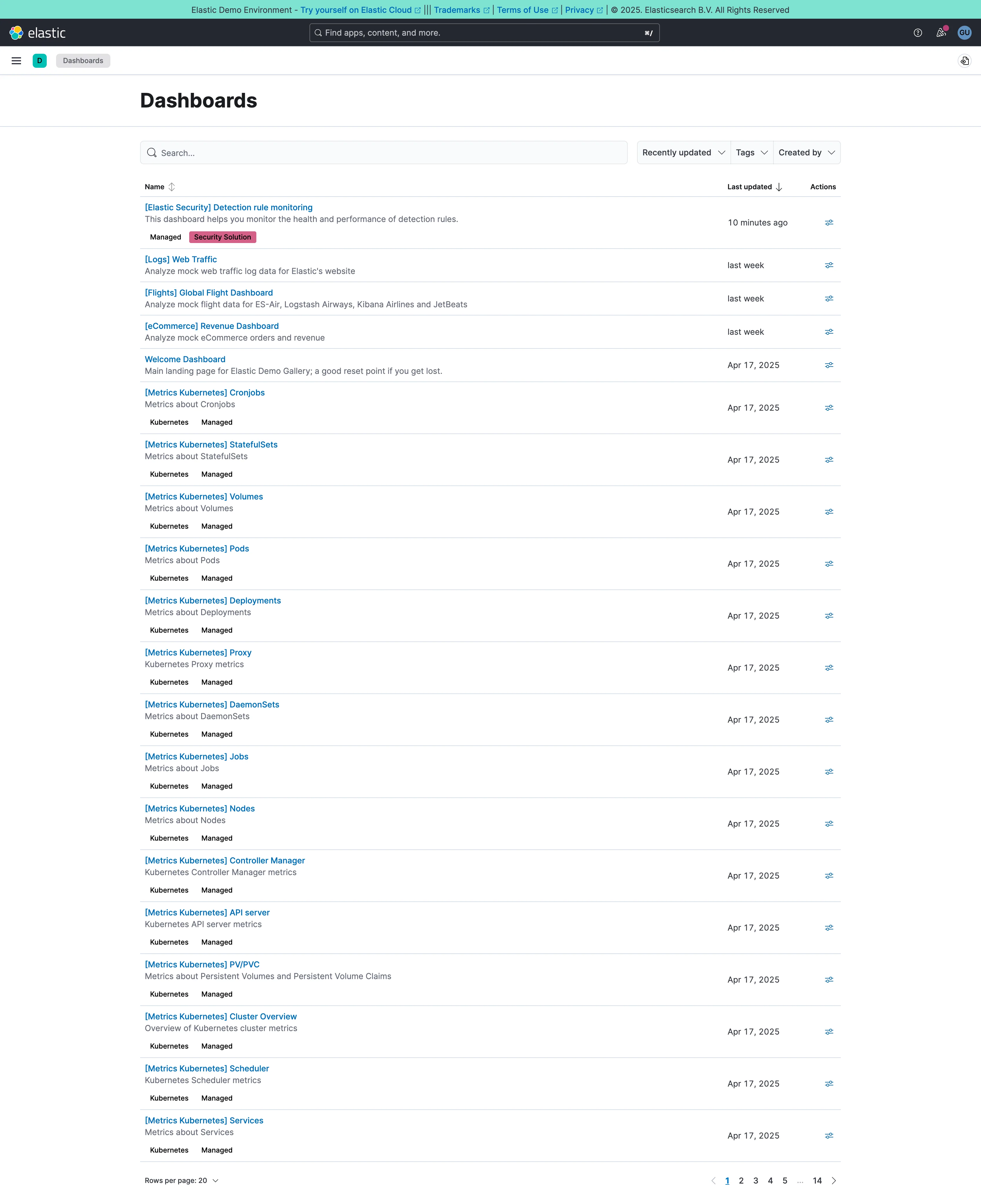
The estate, rather than a dashboard. Twenty rows a page and fourteen pages, so something close to 280 dashboards, and sixteen of the twenty on this first page are called "[Metrics Kubernetes] something"—Cronjobs, StatefulSets, Volumes, Pods, Deployments, Proxy, DaemonSets, Jobs, Nodes. They were generated by an integration rather than designed, they all landed on the same day, and they will sit in this list forever. That's the shape every mature dashboard estate takes, and it's why search stops being a convenience at this scale: nobody is browsing to page nine. The list does two things well. Each row carries a one-line description under the title, which is the difference between a name and an answer. And the bracket prefix is doing the work a folder would, so the generated ones sort together and stay out of the way of the four a person actually made.
  • Multi-page dashboard A set of peers with no landing page. Fourteen pages of them, and nothing says which is the one the team uses.
  • Search across panels Past about fifty dashboards this is the navigation and the list below it is a filing system nobody browses.
  • Semantic grouping Tags and a bracket prefix standing in for folders, which is what keeps 250 generated pages out of the way.
  • Data table Name, description, last updated, actions. The description column is what makes this a list you can read rather than scan.
Kibana — Discover / filebeat logs
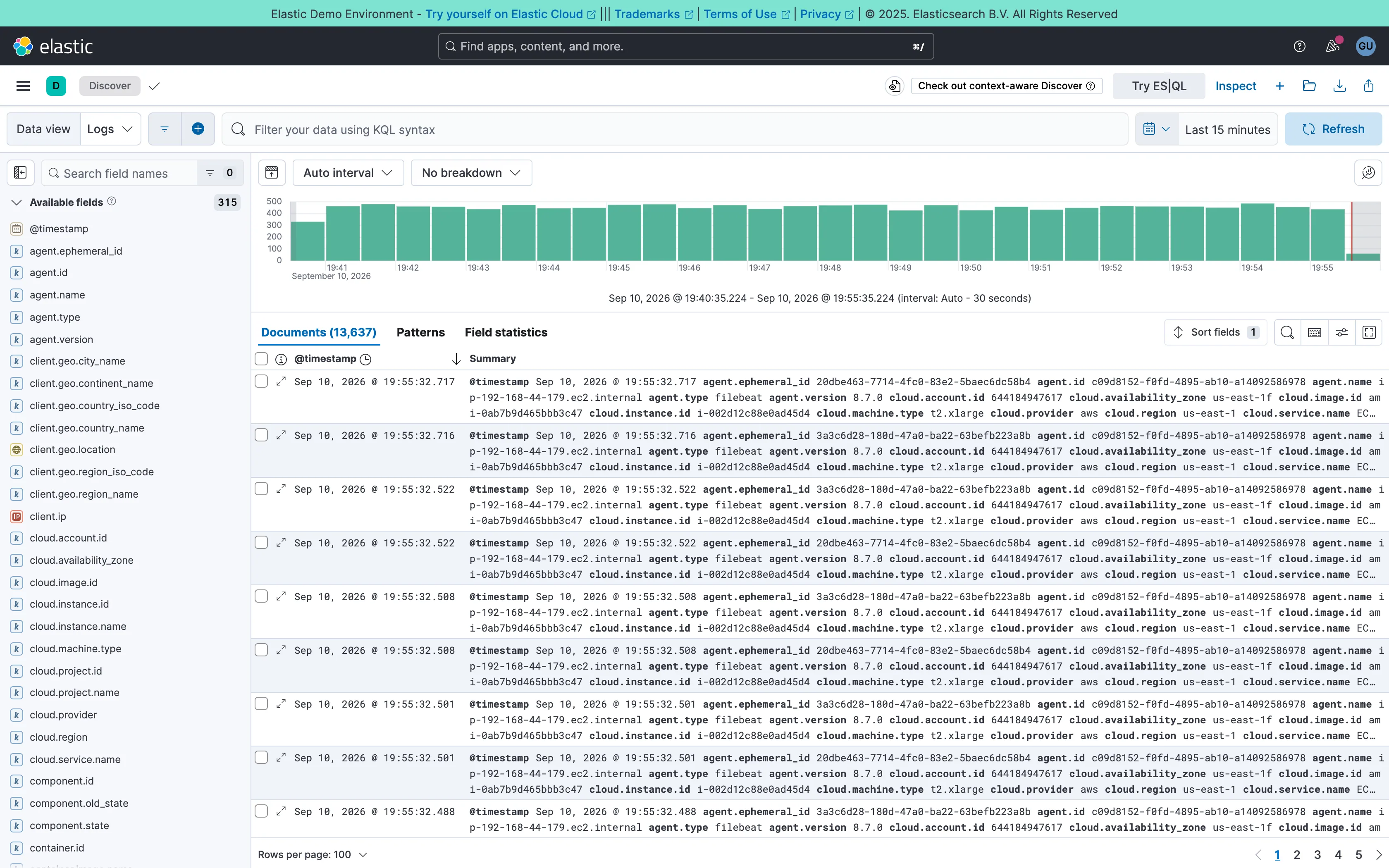
Two-pane list and detail. Fields on the left, records on the right, both on screen at once. The oldest working shape for a queue there is. Data table. One column called Summary holding every field on the record. Complete, and unreadable at a glance. Histogram and distribution. Volume over the window at a 30-second auto interval. The final bar is the bucket still filling, and it always reads low. Filter bar. A query language in the bar rather than chips. Powerful, and it hides what's applied from anyone who didn't type it. Detail on demand. An expander on every row. Inline rather than a side panel, so it pushes the rest of the list down. Time-range picker. Relative by default, with the refresh control beside it rather than buried in a settings menu. Search across panels. 315 fields, so the sidebar opens with a filter box. Past a certain count a tree is a filing system nobody browses.
Discover / filebeat logs September 10, 2026 Elastic demo environment (guest session; no version string exposed) dense · light · desktop-web
Two panes: 315 fields down the left, 13,637 documents on the right, and a volume histogram over both. The left pane is the good half—it opens with a search box rather than a tree, which is the only sane way to navigate that many fields. The right pane is where it falls over. The documents table ships with two columns, a timestamp and "Summary", and Summary is every field on the record concatenated into one cell: agent.ephemeral_id, agent.id, agent.name, agent.type, agent.version, cloud.account.id, cloud.availability_zone, and on for three wrapped lines per row. It is technically complete and it cannot be scanned, so the first thing anyone does here is pick columns—which is to say the default view's job is to make you configure it. Underneath, the pager reads 100 rows per page across 137 pages, and the sort control sits above a table showing the first of them.
  • Two-pane list and detail Fields on the left, records on the right, both on screen at once. The oldest working shape for a queue there is.
  • Detail on demand An expander on every row. Inline rather than a side panel, so it pushes the rest of the list down.
  • Data table One column called Summary holding every field on the record. Complete, and unreadable at a glance.
  • Search across panels 315 fields, so the sidebar opens with a filter box. Past a certain count a tree is a filing system nobody browses.
  • Filter bar A query language in the bar rather than chips. Powerful, and it hides what's applied from anyone who didn't type it.
  • Time-range picker Relative by default, with the refresh control beside it rather than buried in a settings menu.
  • Histogram and distribution Volume over the window at a 30-second auto interval. The final bar is the bucket still filling, and it always reads low.