Skip to content
KONIGI

Dashboards / Screenspace / Detail on demand

2 of 6

Detail on demand

A small panel needs to become a big one for a moment.

Updated September 10, 2026

Problem

One panel in a grid of twenty has something interesting in it. At a sixth of the screen the viewer can see that it moved and cannot see when, by how much, or which series. They do not want to navigate away, because the surrounding panels are the context.

Solution

Expand in place. The panel takes the full page, keeps its query and its time range, and closes back to exactly where it was.

Shneiderman names details-on-demand as one of the seven tasks and the ordering matters: it comes after overview, zoom and filter, which is to say the viewer has already decided this is the interesting thing. The interaction’s job is to be cheap in both directions, because it will be used dozens of times in a session and most expansions end in “no, not that one”.

Reversibility is the whole design. If closing is as cheap as opening, viewers expand freely and the pattern does its job. If closing loses the scroll position, resets the grid, or drops the time range, they learn not to expand, and the detail may as well not exist.

The three common forms trade differently.

Full-screen panel gives the most room and the strongest context switch, which is right for a chart with many series and wrong when the neighbouring panels are the reason you are looking.

Side panel keeps the page visible and works well when the detail is a record rather than a chart—a log line, a host, an issue.

Inline expansion pushes the grid down, which preserves the most context and disturbs the layout most, and is the option that most often makes the surrounding page unusable while open.

The subtle trap is state. An expanded panel is a different view of the same query, and if expanding changes the interval, the aggregation or the series limit, the viewer sees something that disagrees with the small version they were just looking at. That disagreement is rarely explained and quietly undermines trust in both.

Use when

Panels are necessarily small, the page’s arrangement is the context, and viewers need occasional close reading rather than navigation.

Don’t use when

The detail belongs to a different subject. That is drill-down, and dressing a navigation as an expansion makes back behave unexpectedly.

Trade-offs

Expansion state rarely survives a link, so what you found is not what a colleague opens. It is nearly always mouse-driven, so touch and keyboard get a worse version or none. Modal expansions trap focus and are frequently the least accessible thing on the page. And the pattern lets teams justify panels too small to read on the grounds that they can be expanded, which quietly degrades the default view everybody actually uses.

Checklist

  • Is closing exactly as cheap as opening?
  • Does closing restore scroll position and grid state?
  • Does the expanded view use the same query, interval and time range as the small one?
  • If it uses a finer interval, does anything explain the disagreement?
  • Full-screen, side panel or inline, and does the choice suit the content?
  • Does the expansion go into the URL so it can be shared?
  • Is it reachable by keyboard, and does focus return correctly on close?
  • What is the touch equivalent?
  • Is any panel too small to read in its default state, relying on this to be usable?
  • Does expanding trigger a fresh query, and how long does it take?

Compare

Grafana offers full-screen panel view from a keyboard shortcut or the panel menu, keeps the dashboard’s time range, and puts the view in the URL so an expanded panel is linkable, which is the detail most implementations miss. Sentry favours the side-panel form for events and traces, keeping the issue list visible, which suits a queue where the next item matters as much as the current one. Datadog uses full-screen with the surrounding scope preserved, so an expanded graph stays filtered to whatever the page was showing. Honeycomb barely needs the pattern, because the result of a query already occupies the page and there is no grid of small panels to escape from.

Drill-down is the navigate-away sibling and the entry that covers moving to a different subject. Hover detail is the cheapest form of the same task. Collapsible row applies the idea at section scale. Panel grid is what has to hold still while a panel expands. Two-pane list and detail is the layout that makes this permanent rather than on demand.
Detail on demand anatomy Three ways one small panel becomes a big one: taking the full page, opening a side panel beside it, or expanding inline and pushing the grid down. Each keeps different amounts of the surrounding page. Three forms, three things kept Full page Side panel Inline 1 2 3 1 MOST ROOM Right for a chart with many series. Wrong when the neighbouring panels are why you're looking. 2 MOST CONTEXT Keeps the page visible. Works when the detail is a record rather than a chart: a log line, a host. 3 MOST DISTURBANCE Preserves the most and disturbs the most. Often makes the page around it unusable while open. Reversibility is the whole design. If closing is as cheap as opening, people expand freely. If expanding changes the interval or the series limit, the two views disagree and nobody explains why.
Wireframe — the pattern's anatomy, not any one product's version of it

Implementation

A small panel becomes a big one for a moment. The expanded view must keep the same time range and the same series, or the reader compares two different things and does not notice.

shadcn
npx shadcn@latest add button toggle-group
npm
lucide-react
Tokens
--background--card--card-foreground--muted-foreground--border--chart-1

Requests

1,080/s

Last 6 hours · 5m

Error rate

0.5%

Last 6 hours · 5m

p95 latency

258ms

Last 6 hours · 5m

CPU

51%

Last 6 hours · 5m

Memory

70%

Last 6 hours · 5m

Queue depth

16

Last 6 hours · 5m

p95 latency

258ms

Last 6 hours · 5m · 24 points

DetailOnDemand.tsxSmall and large render from the same panel and the same range, so they cannot disagree. One button opens and closes, Esc closes, and focus goes back where it came from. Three forms behind one prop.

import { useEffect, useRef } from "react";
import { Maximize2, X } from "lucide-react";
import { Button } from "@/components/ui/button";
import { cn } from "@/lib/utils";

export type Form = "full-page" | "side-panel" | "inline";

export type Panel = { id: string; title: string; unit: string; values: number[] };

/** The one query every panel shares. Both sizes render from it, so
 *  expanding cannot change the interval or the range. */
export type Range = { label: string; interval: string };

const FORM_LABEL: Record<Form, string> = { "full-page": "Full page", "side-panel": "Side panel", inline: "Inline" };

/** One path, scaled to whatever box it is in. */
function Line({ values, className }: { values: number[]; className?: string }) {
  const min = Math.min(...values), max = Math.max(...values), span = max - min || 1;
  const d = values.map((v, i) => `${i ? "L" : "M"}${(i / (values.length - 1)) * 100} ${100 - ((v - min) / span) * 100}`).join(" ");
  return (
    <svg viewBox="0 0 100 100" preserveAspectRatio="none" className={cn("h-full w-full overflow-visible", className)} aria-hidden="true">
      <path d={d} fill="none" stroke="hsl(var(--chart-1))" strokeWidth="1.5" vectorEffect="non-scaling-stroke" />
    </svg>
  );
}

function PanelCard({ panel, range, large, onToggle, buttonRef }: {
  panel: Panel; range: Range; large: boolean; onToggle: () => void; buttonRef?: (el: HTMLButtonElement | null) => void;
}) {
  const last = panel.values[panel.values.length - 1];
  return (
    <div className={cn("flex flex-col rounded-lg border bg-card p-3", large && "border-chart-1")}>
      <div className="flex items-center gap-2">
        <p className="text-xs text-muted-foreground">{panel.title}</p>
        <p className="text-sm tabular-nums text-card-foreground">{last.toLocaleString("en-GB")}{panel.unit}</p>
        {/* The same button opens and closes; Esc closes too. */}
        <Button ref={buttonRef} variant="ghost" size="sm" className="ml-auto h-6 w-6 p-0" onClick={onToggle} aria-label={large ? `Close ${panel.title}` : `Expand ${panel.title}`}>
          {large ? <X className="size-3.5" /> : <Maximize2 className="size-3" />}
        </Button>
      </div>
      <div className={cn("mt-2 min-h-0 flex-1", large ? "min-h-[120px]" : "h-10")}><Line values={panel.values} /></div>
      {/* The range is printed at both sizes, from the same object, so the two views cannot disagree. */}
      <p className={cn("mt-2 tabular-nums text-muted-foreground", large ? "text-xs" : "text-[10px]")}>
        {range.label} · {range.interval}{large && ` · ${panel.values.length} points`}
      </p>
    </div>
  );
}

export function DetailOnDemand({ panels, range, form, expanded, onExpand, columns = 3 }: {
  panels: Panel[];
  range: Range;
  form: Form;
  /** Which panel is open, or null. Lift it into the URL so the page a
   *  colleague opens is the one you found. */
  expanded: string | null;
  onExpand: (id: string | null) => void;
  columns?: number;
}) {
  const buttons = useRef(new Map<string, HTMLButtonElement>());
  const open = panels.find((p) => p.id === expanded) ?? null;

  useEffect(() => {
    if (!open) return;
    const onKey = (e: KeyboardEvent) => e.key === "Escape" && onExpand(null);
    window.addEventListener("keydown", onKey);
    return () => window.removeEventListener("keydown", onKey);
  }, [open, onExpand]);

  // Closing puts focus back on the button that opened it, so keyboard users
  // land where they were rather than at the top of the page.
  const close = (id: string) => { onExpand(null); requestAnimationFrame(() => buttons.current.get(id)?.focus()); };

  const grid = (
    <div className="grid gap-3" style={{ gridTemplateColumns: `repeat(${columns}, minmax(0, 1fr))` }}>
      {panels.map((p) => {
        const large = form === "inline" && p.id === expanded;
        return (
          <div key={p.id} className={cn(large && "col-span-full")}>
            <PanelCard panel={p} range={range} large={large} onToggle={() => (p.id === expanded ? close(p.id) : onExpand(p.id))} buttonRef={(el) => el && buttons.current.set(p.id, el)} />
          </div>
        );
      })}
    </div>
  );

  return (
    <div className="relative" data-form={form} aria-label={`Detail as ${FORM_LABEL[form]}`}>
      {form === "side-panel" && open ? (
        <div className="grid grid-cols-[1fr_44%] gap-3">
          {grid}
          <PanelCard panel={open} range={range} large onToggle={() => close(open.id)} />
        </div>
      ) : grid}
      {/* In a page this is `fixed inset-0`; the preview keeps it inside the frame. */}
      {form === "full-page" && open && (
        <div className="absolute inset-0 z-10 flex bg-background/95 p-2">
          <div className="flex-1"><PanelCard panel={open} range={range} large onToggle={() => close(open.id)} /></div>
        </div>
      )}
    </div>
  );
}

export const FORMS = Object.entries(FORM_LABEL) as [Form, string][];

demo.tsxHow it is called: six service panels with p95 open as a side panel, and a picker to try the same state as full page or inline.

import { useState } from "react";
import { ToggleGroup, ToggleGroupItem } from "@/components/ui/toggle-group";
import { DetailOnDemand, FORMS, type Form, type Panel } from "./DetailOnDemand";

/** Six panels for one service over the last six hours at five-minute
 *  intervals. p95 latency is the one that moved. */
const PANELS: Panel[] = [
  { id: "rps", title: "Requests", unit: "/s", values: [812, 826, 840, 833, 851, 870, 902, 915, 931, 944, 960, 958, 971, 990, 1004, 1012, 1030, 1027, 1041, 1055, 1063, 1058, 1072, 1080] },
  { id: "errors", title: "Error rate", unit: "%", values: [0.4, 0.4, 0.5, 0.4, 0.4, 0.5, 0.5, 0.4, 0.6, 0.5, 0.5, 0.4, 0.5, 0.6, 0.5, 0.5, 0.4, 0.5, 0.5, 0.6, 0.5, 0.5, 0.4, 0.5] },
  { id: "p95", title: "p95 latency", unit: "ms", values: [212, 218, 209, 224, 231, 226, 240, 238, 252, 261, 274, 290, 318, 342, 361, 355, 338, 322, 301, 288, 276, 269, 262, 258] },
  { id: "cpu", title: "CPU", unit: "%", values: [41, 42, 44, 43, 45, 47, 48, 50, 52, 53, 55, 58, 61, 63, 62, 60, 58, 57, 55, 54, 53, 52, 52, 51] },
  { id: "mem", title: "Memory", unit: "%", values: [63, 63, 64, 64, 64, 65, 65, 65, 66, 66, 66, 67, 67, 67, 68, 68, 68, 68, 69, 69, 69, 69, 70, 70] },
  { id: "queue", title: "Queue depth", unit: "", values: [12, 14, 11, 15, 18, 16, 21, 24, 28, 33, 41, 52, 68, 81, 77, 64, 51, 43, 36, 30, 25, 21, 18, 16] },
];

/** p95 open as a side panel. The picker tries the other two forms on the
 *  same state; the range under every panel stays the same one. */
export default function Demo() {
  const [form, setForm] = useState<Form>("side-panel");
  const [expanded, setExpanded] = useState<string | null>("p95");

  return (
    <div className="flex flex-col gap-3">
      <ToggleGroup type="single" value={form} onValueChange={(v) => v && setForm(v as Form)} aria-label="Form of expansion" className="justify-start">
        {FORMS.map(([id, label]) => (
          <ToggleGroupItem key={id} value={id} size="sm" className="h-7 rounded-md border text-xs data-[state=on]:border-chart-1 data-[state=on]:bg-chart-1/10 data-[state=on]:text-chart-1">{label}</ToggleGroupItem>
        ))}
      </ToggleGroup>
      <DetailOnDemand
        panels={PANELS}
        range={{ label: "Last 6 hours", interval: "5m" }}
        form={form}
        expanded={expanded}
        onExpand={setExpanded}
      />
    </div>
  );
}
What it renders. Identical markup in both panes, with only the token values changing.

Examples

Captures whose hotspots reference this pattern, grouped by product and dated. The dashed boxes are this pattern; hover any box for the note.

Honeycomb

Query-first; heatmaps and BubbleUp replace the dashboard-of-panels model with draw-a-region cross-filtering.

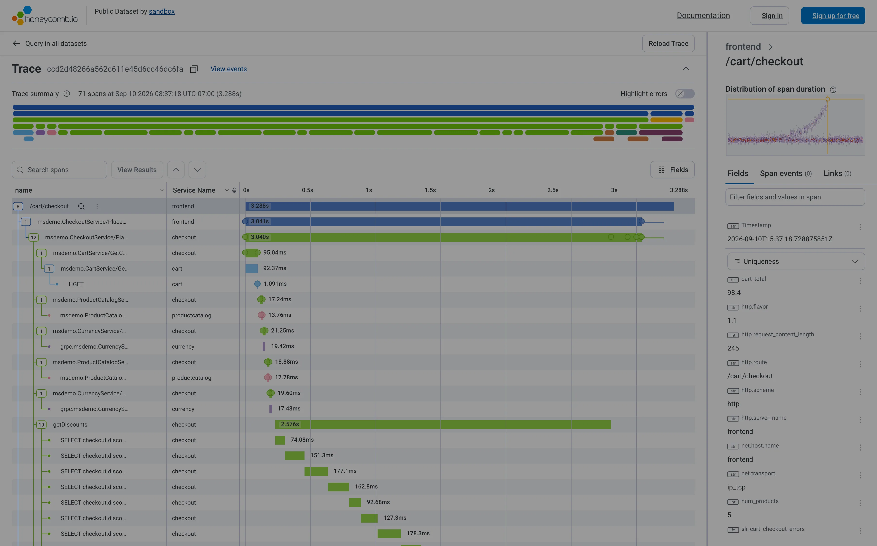
Honeycomb — Trace / cart checkout
Trace waterfall. Indentation is causality, length is duration, horizontal position is when it started. Six levels deep here. Trace waterfall. The staircase: nineteen SELECTs one after another inside getDiscounts. Batch the query, don't add a machine. Detail on demand. Selecting a span fills the right pane with its fields. The waterfall never moves while you read. Overview then detail. A minimap of all 71 spans above the list, so the shape of the whole trace is visible before you scroll it. Categorical series palette. Five services, five hues, and the name in a column beside every one. Colour is never carrying it alone. Percentile summary. This span's duration against the whole distribution, with this trace marked—so you know if you're looking at the tail.
Trace / cart checkout September 11, 2026 Honeycomb sandbox, public dataset (signed out) dense · light · desktop-web
Seventy-one spans over 3.288 seconds for one checkout, and the shape gives the answer away before you read a single duration. Two thirds of the way down, getDiscounts runs for 2.576s—more than three quarters of the whole request —and underneath it nine visible SELECT spans step down and to the right in a staircase, each starting after the last one finished. The badge on the parent says 19. Nineteen queries in a loop, run one at a time, and the waterfall says so by its outline rather than by any number. That is the shape worth learning: siblings overlapping means concurrency, siblings in a staircase means something that should have been one query. The panel top right is the other good idea here—it plots the distribution of this span's duration across the whole dataset and marks where this particular trace fell, so you can see whether you are looking at a normal request or the tail before you start optimising.
  • Trace waterfall Indentation is causality, length is duration, horizontal position is when it started. Six levels deep here.
  • Trace waterfall The staircase: nineteen SELECTs one after another inside getDiscounts. Batch the query, don't add a machine.
  • Percentile summary This span's duration against the whole distribution, with this trace marked—so you know if you're looking at the tail.
  • Detail on demand Selecting a span fills the right pane with its fields. The waterfall never moves while you read.
  • Overview then detail A minimap of all 71 spans above the list, so the shape of the whole trace is visible before you scroll it.
  • Categorical series palette Five services, five hues, and the name in a column beside every one. Colour is never carrying it alone.
Show 1 more example Hide the rest

Kibana

Query-first rather than panel-first: the search bar is the primary control and the charts are downstream of it, which inverts Grafana's arrangement.

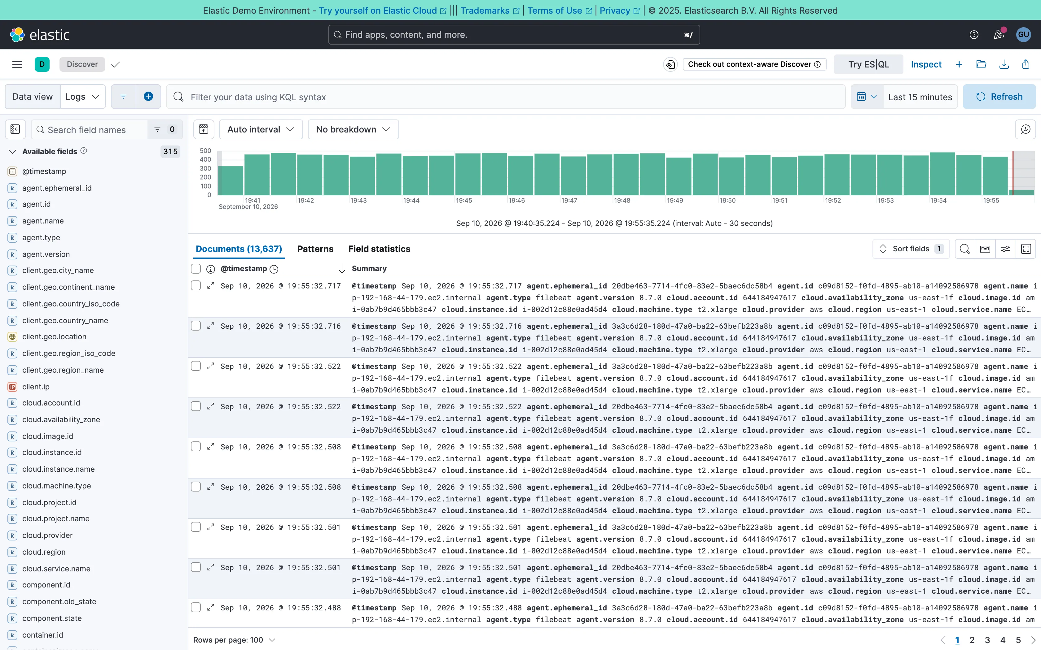
Kibana — Discover / filebeat logs
Two-pane list and detail. Fields on the left, records on the right, both on screen at once. The oldest working shape for a queue there is. Data table. One column called Summary holding every field on the record. Complete, and unreadable at a glance. Histogram and distribution. Volume over the window at a 30-second auto interval. The final bar is the bucket still filling, and it always reads low. Filter bar. A query language in the bar rather than chips. Powerful, and it hides what's applied from anyone who didn't type it. Detail on demand. An expander on every row. Inline rather than a side panel, so it pushes the rest of the list down. Time-range picker. Relative by default, with the refresh control beside it rather than buried in a settings menu. Search across panels. 315 fields, so the sidebar opens with a filter box. Past a certain count a tree is a filing system nobody browses.
Discover / filebeat logs September 10, 2026 Elastic demo environment (guest session; no version string exposed) dense · light · desktop-web
Two panes: 315 fields down the left, 13,637 documents on the right, and a volume histogram over both. The left pane is the good half—it opens with a search box rather than a tree, which is the only sane way to navigate that many fields. The right pane is where it falls over. The documents table ships with two columns, a timestamp and "Summary", and Summary is every field on the record concatenated into one cell: agent.ephemeral_id, agent.id, agent.name, agent.type, agent.version, cloud.account.id, cloud.availability_zone, and on for three wrapped lines per row. It is technically complete and it cannot be scanned, so the first thing anyone does here is pick columns—which is to say the default view's job is to make you configure it. Underneath, the pager reads 100 rows per page across 137 pages, and the sort control sits above a table showing the first of them.
  • Two-pane list and detail Fields on the left, records on the right, both on screen at once. The oldest working shape for a queue there is.
  • Detail on demand An expander on every row. Inline rather than a side panel, so it pushes the rest of the list down.
  • Data table One column called Summary holding every field on the record. Complete, and unreadable at a glance.
  • Search across panels 315 fields, so the sidebar opens with a filter box. Past a certain count a tree is a filing system nobody browses.
  • Filter bar A query language in the bar rather than chips. Powerful, and it hides what's applied from anyone who didn't type it.
  • Time-range picker Relative by default, with the refresh control beside it rather than buried in a settings menu.
  • Histogram and distribution Volume over the window at a 30-second auto interval. The final bar is the bucket still filling, and it always reads low.