Problem
The average response time looks fine. A meaningful number of people are having a bad time anyway, and the viewer needs to see them before those people write in.
Solution
Report the tail of the distribution instead of its centre. p50 says what a typical request felt like. p95 and p99 say what the unlucky ones felt like, and the unlucky ones are the ones who churn.
Two things make this harder than it looks, and both are invisible on the panel.
The first is that percentiles computed from histograms are estimates. Prometheus interpolates linearly inside whichever bucket contains the quantile, so the error is bounded by the bucket width and by nothing about the data itself. Their own documentation carries the example: a true p95 near 320ms reported as 443ms, because nearly every observation landed in one wide 300–450ms bucket. The number on the tile has three significant figures and one of them is real.
The second is that percentiles don’t average. A p95 per instance does not aggregate into a p95 across instances by any arithmetic. You have to sum the buckets and compute the quantile from the total, which is why Prometheus says flatly that aggregating precomputed quantiles rarely makes sense. Dashboards do it anyway, usually without meaning to, by putting a percentile in a panel and letting the panel’s own rollup average it across the window.
Then there’s what the measurement never saw. Gil Tene’s coordinated omission: when a system stalls, the thing measuring it usually stalls too, so the slow period produces fewer samples rather than more. The percentile improves at exactly the moment the system gets worse.
Use when
The metric is a latency or a duration, the distribution has a tail, and somebody is accountable for that tail. Which describes most SLOs.
Don’t use when
The population is small. A p99 over forty requests is the slowest request with extra steps, and calling it a percentile lends it a confidence it hasn’t earned. Also don’t reach for it when the viewer’s real question is “what shape is this”, because a percentile is one number and the shape is the thing they asked about.
Trade-offs
Percentiles compress a distribution into a handful of numbers, and every one of them hides the multi-modal case: two populations, one fast and one slow, produce a p95 that describes neither. Computing them exactly is expensive, so nearly everyone computes them approximately and nobody says by how much. And the ladder is seductive. p99, p99.9, p99.99—each rung needs an order of magnitude more data to mean anything, and buys less than the last.
Checklist
- Which percentiles, and why those? Is p99 there because someone needs it, or because it looks rigorous?
- Over what window, and how many samples land in it?
- Are these computed from histogram buckets, and if so, where are the boundaries?
- Does the interesting range sit inside one wide bucket, where the estimate is worst?
- Is any percentile on this page being averaged, by the query or by the panel’s rollup?
- Do the percentiles cover the same window as the request count shown beside them?
- Is latency timed from intended dispatch or from when the request actually went out?
- Is p50 shown next to the tail, so the viewer sees the spread and not just the edge?
- Does the panel say what “good” is for this percentile, and who decided?
- Would a histogram or a heatmap answer this viewer’s real question better?
Compare
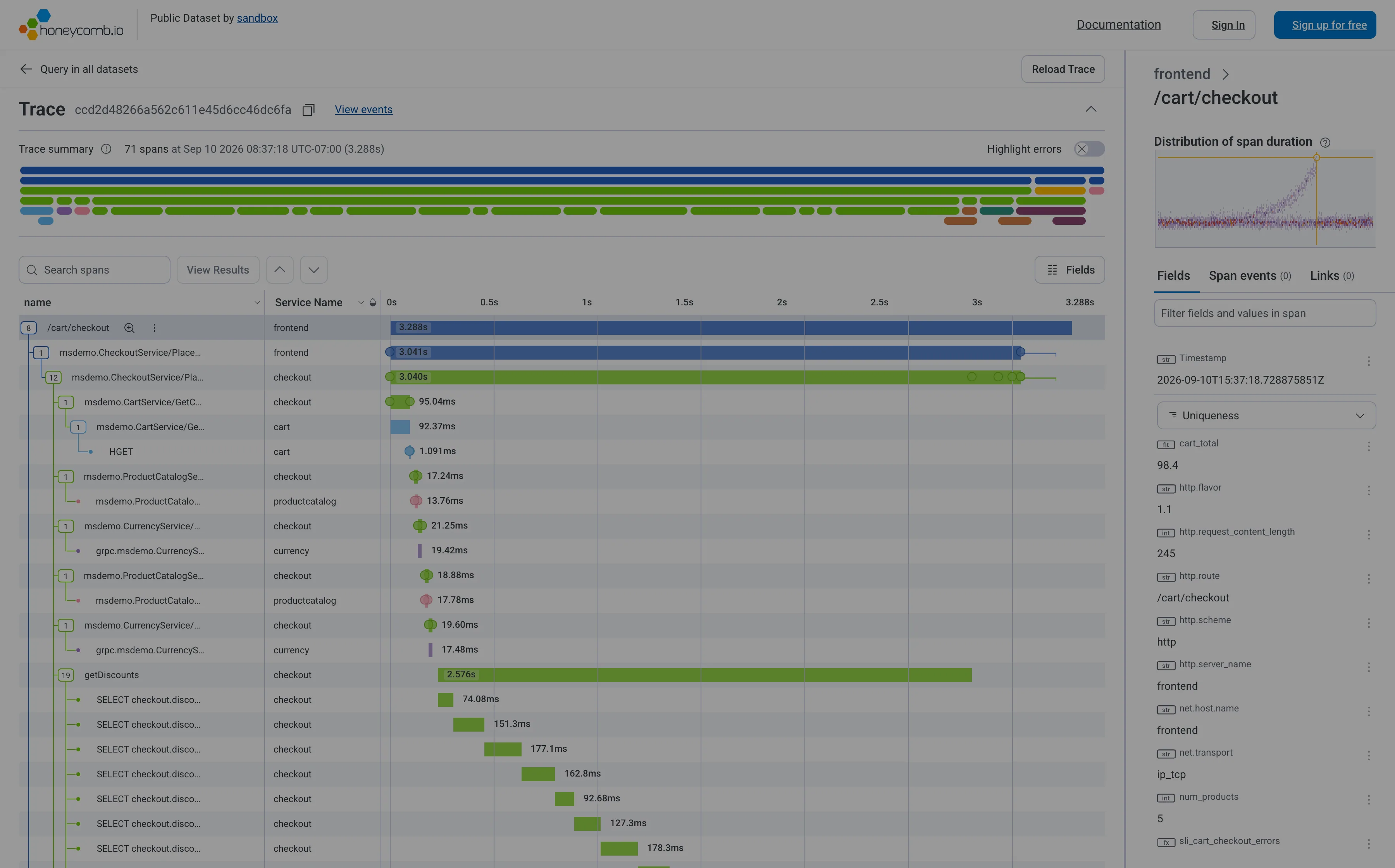
Grafana renders whatever the query returns, which puts the whole correctness burden on whoever wrote the histogram_quantile expression, and will then average that result across the rollup window without comment. Honeycomb argues the pattern itself is the problem and shows a heatmap instead, on the grounds that a line through a percentile hides the distribution that explains it; BubbleUp then compares the points inside a drawn region against the baseline outside it, answering “why is the tail slow” rather than “how slow is the tail”. Netdata keeps per-second resolution, so its windows are short enough that the aggregation trap mostly doesn’t get a chance to spring. Sentry attaches percentiles to a transaction rather than to a service, so the tail arrives already scoped to a code path, which is the form an engineer can act on.
Related
Histogram is the same data before it was reduced to a few numbers, and often the better answer. Heatmap is that distribution over time. KPI tile is the container a percentile usually lands in, and it inherits every problem above on top of its own. Time series is what a percentile looks like plotted, and it’s where the averaging mistake usually happens. Metric targets is where somebody writes down what the tail is allowed to be.