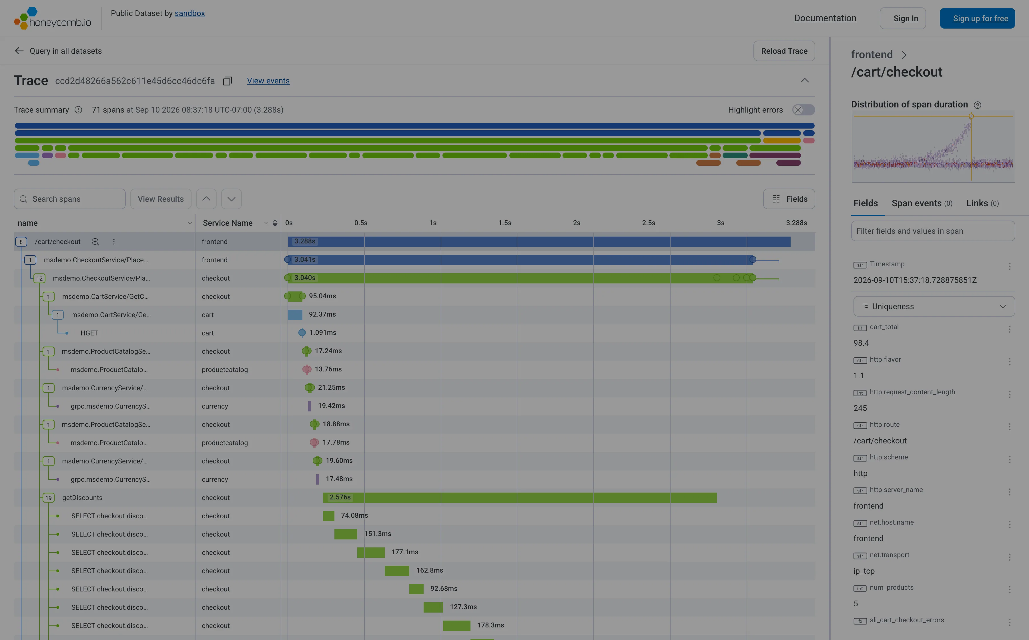
Problem
A request took 4.2 seconds and touched twenty services. It passed through a gateway, a dozen services, two databases and a cache, and every one of those has a dashboard saying it is healthy. The viewer needs to see where the 4.2 seconds actually went.
Solution
Draw each unit of work as a horizontal bar on a shared time axis, indented under whatever called it. Length is duration, horizontal position is when it started, indentation is causality. Read down the left edge for structure and across for time.
The data model does most of the design work. In OpenTelemetry a span is a unit of work carrying a name, start and end timestamps, a parent span ID, attributes, events, links and a status of Ok, Error or Unset. A root span is the one with no parent_id. Children share the parent’s trace ID and reference its span ID. That structure is already a tree with timings attached, which is why every implementation of this pattern looks broadly alike.
The reading skill the waterfall teaches is the gap. A bar that starts late was waiting, and the empty space to its left is the actual finding. Nested bars that fill their parent mean the work is where you think. A parent much longer than the sum of its children means time went somewhere nobody instrumented, which is the most useful thing a trace can tell you and the thing a summary metric never will.
Sibling bars overlapping means concurrency; siblings in a staircase mean a sequential loop that probably shouldn’t be one. Those two shapes are worth learning to spot, because they are the difference between “add a machine” and “batch the query”.
Use when
A single slow or failed request needs explaining and the work crosses process boundaries. This is the view you land on from the tail of a latency distribution, not the view you monitor.
Don’t use when
The question is about the population rather than the instance. One trace is an anecdote; a p99 that moved needs a heatmap or a distribution first, and the waterfall afterwards to explain one example of it.
Trade-offs
A waterfall shows exactly one request, and the request you happened to open may be unrepresentative. Deep traces produce hundreds of spans and the interesting one is often collapsed three levels down. Wide dynamic range is brutal on the axis: a 4-second span and a 2-millisecond span on one linear scale means the short one is invisible, which is precisely the sub-span that turns out to run four hundred times. Clock skew between hosts can render a child starting before its parent. And the pattern only shows what was instrumented, so the most important gap on the screen is by definition unlabelled.
Checklist
- Can the viewer get here from an aggregate, or must they already have a trace ID?
- Is the root span’s total duration stated as a number, not just a bar?
- Is the gap between a parent and the sum of its children visible or does the layout hide it?
- What happens with several hundred spans, and what is collapsed by default?
- Are errored spans distinguishable at a glance, and does the status field drive that?
- Can the viewer see span attributes without leaving the waterfall?
- Are repeated identical spans grouped, or does one N+1 loop fill the screen?
- Does the axis handle three orders of magnitude, and is a log option available?
- Can this trace be reached from, and get back to, the logs for the same request?
- Is clock skew across hosts handled or at least flagged?
Compare
Jaeger is the reference implementation most people picture and keeps the view deliberately plain: a timeline, a collapsible tree, and span detail on click, with the trace ID as the unit of navigation. Honeycomb treats the waterfall as the last step of an analysis loop rather than an entry point, so you arrive holding a group of events you already narrowed down, and the single trace is evidence for a conclusion rather than a place to start guessing. Datadog links the waterfall to the service it belongs to in both directions, so a slow span carries you back out to that service’s dashboards and monitors. Sentry comes at it from the error rather than the metric, attaching the trace to an exception so the question is why this request failed rather than why it was slow.
Related
Service map is the same relationships aggregated instead of instanced. Drill-down is how the viewer arrives here. Hover detail is how span attributes get read without losing the shape. Percentile summary is usually the panel that sent them looking. Log tail is the other view of the same request, and the two should link.