Honeycomb
Query-first; heatmaps and BubbleUp replace the dashboard-of-panels model with draw-a-region cross-filtering.
honeycomb.io , opens in a new tab Live demo , opens in a new tab
Patterns seen here 12
Captures
2 captures, newest first. Hover any box for the pattern and the note.
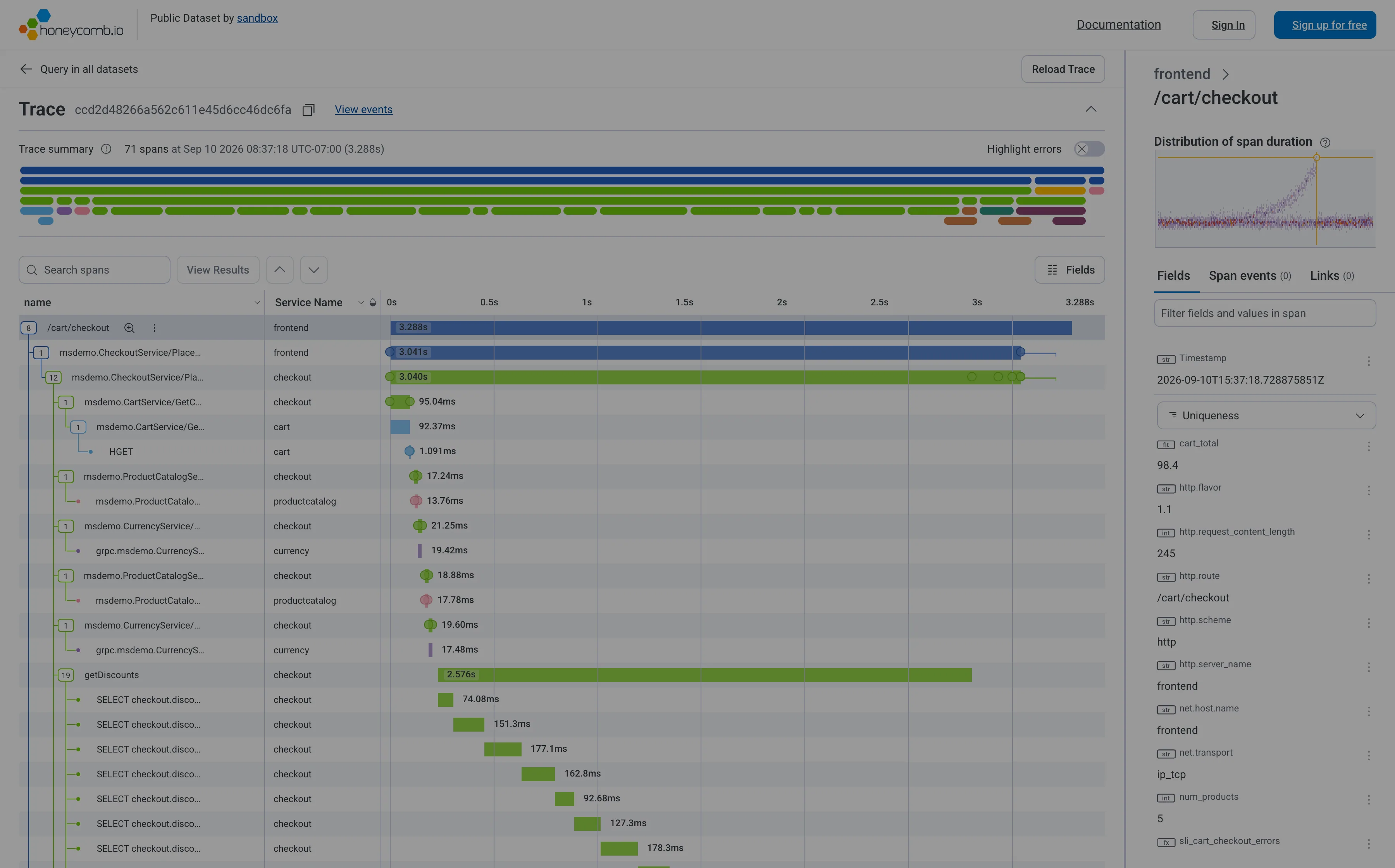
Trace waterfall. Indentation is causality, length is duration, horizontal position is when it started. Six levels deep here. Trace waterfall. The staircase: nineteen SELECTs one after another inside getDiscounts. Batch the query, don't add a machine. Detail on demand. Selecting a span fills the right pane with its fields. The waterfall never moves while you read. Overview then detail. A minimap of all 71 spans above the list, so the shape of the whole trace is visible before you scroll it. Categorical series palette. Five services, five hues, and the name in a column beside every one. Colour is never carrying it alone. Percentile summary. This span's duration against the whole distribution, with this trace marked—so you know if you're looking at the tail.
- Trace waterfall Indentation is causality, length is duration, horizontal position is when it started. Six levels deep here.
- Trace waterfall The staircase: nineteen SELECTs one after another inside getDiscounts. Batch the query, don't add a machine.
- Percentile summary This span's duration against the whole distribution, with this trace marked—so you know if you're looking at the tail.
- Detail on demand Selecting a span fills the right pane with its fields. The waterfall never moves while you read.
- Overview then detail A minimap of all 71 spans above the list, so the shape of the whole trace is visible before you scroll it.
- Categorical series palette Five services, five hues, and the name in a column beside every one. Colour is never carrying it alone.
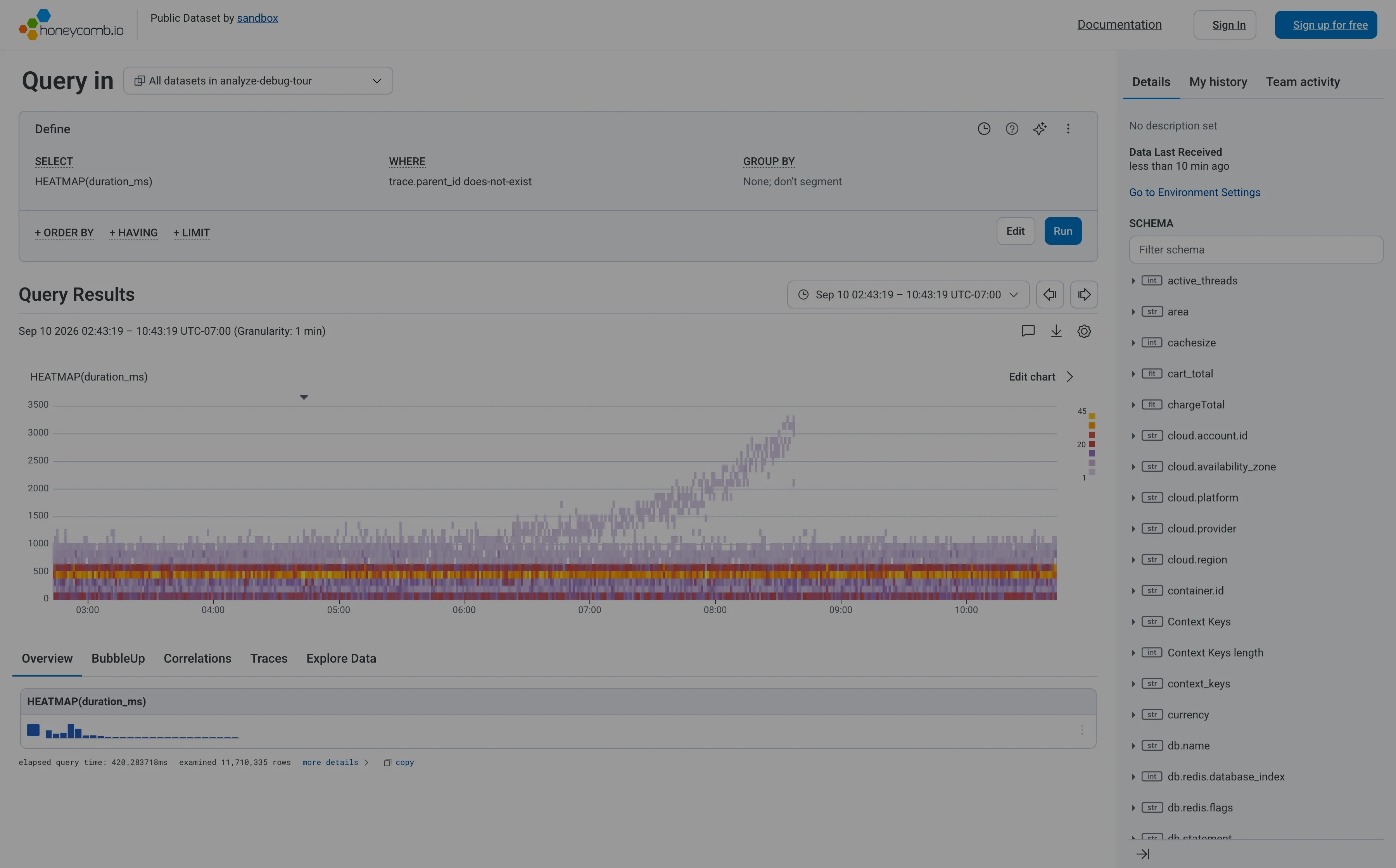
Heatmap. Linear y-axis, so the band holding most requests is six percent of the panel height and the empty top half gets the rest. Search across panels. The schema is the navigation, and it opens with a filter box rather than a tree you're expected to browse. Dashboard builder. No panel to configure—the query is the page. WHERE trace.parent_id does-not-exist is how you say root spans only. Tabs as genres. Five readings of one result: overview, BubbleUp, correlations, traces, raw. Each tab is a different question, not a different subject. Freshness indicator. When data last arrived, not when the page last ran. The one of the three ages that actually matters. Time-range picker. Absolute, with the granularity stated beside it, and arrows that step to the previous window rather than retyping it. Data source badge. Elapsed query time and 11,710,335 rows examined. The panel reporting its own cost and scope, which almost nothing else does.
- Heatmap Linear y-axis, so the band holding most requests is six percent of the panel height and the empty top half gets the rest.
- Dashboard builder No panel to configure—the query is the page. WHERE trace.parent_id does-not-exist is how you say root spans only.
- Tabs as genres Five readings of one result: overview, BubbleUp, correlations, traces, raw. Each tab is a different question, not a different subject.
- Search across panels The schema is the navigation, and it opens with a filter box rather than a tree you're expected to browse.
- Time-range picker Absolute, with the granularity stated beside it, and arrows that step to the previous window rather than retyping it.
- Data source badge Elapsed query time and 11,710,335 rows examined. The panel reporting its own cost and scope, which almost nothing else does.
- Freshness indicator When data last arrived, not when the page last ran. The one of the three ages that actually matters.