Skip to content
KONIGI

Dashboards / Meta information / Time-range picker

6 of 6

Time-range picker

Every question about a metric starts with 'over what window', and the control has to be fast for the common windows.

Updated September 10, 2026

Problem

Every number on a dashboard is a number over some window. The window is the first thing an investigator changes and the last thing a casual reader checks, so it has to be both fast to change and impossible to misread.

Solution

Three kinds of range, and a product needs all three for different reasons.

Relative is what people use. Last 15 minutes, last 6 hours, last 7 days. Grafana lets you type 13h into the picker and get the last thirteen hours, which is the right level of friction for the most common action on the page.

Absolute is what people share. A specific start and end, pinned.

Semi-relative is the one that gets skipped and shouldn’t: an absolute start with now as the end. That’s the shape of “since the deploy” and “since the incident started”, which is most of what anyone actually wants during an investigation.

The detail that decides whether the control is any good is what happens to the range when it leaves the page. Grafana puts from, to and timezone in the URL, so a link carries the window. That also creates the trap: a link containing from=now-6h describes a different six hours to whoever opens it tomorrow. Paste a relative range into an incident writeup and within a day it points at nothing in particular. The fix is a product decision, not a user one—pin to absolute when copying a link, or say clearly that you haven’t.

Then timezone. The dashboard has one, the browser has one, and the incident happened in UTC. Grafana treats timezone as both a dashboard setting and a URL parameter, which is the honest arrangement, because two people reading the same chart in different offices are otherwise reading different charts.

Use when

Any view built on time series, which is nearly all of them. The control belongs where the eye lands first, usually top right, and its current value has to be readable without opening it.

Don’t use when

The view answers a fixed question over a fixed window. A month-end report with a range picker invites someone to change it and get an answer that no longer matches the title above it.

Trade-offs

A global picker makes every panel agree, which is what you want during an incident and wrong for a page that mixes a live rate with a year-over-year trend. Per-panel overrides fix that and quietly destroy the guarantee that two panels on one screen cover the same period. Wide ranges silently change the aggregation underneath, so the same panel at 1h and 30d is showing different maths under one title. And quick-range lists grow: eleven options where four would do turns a one-second decision into a menu.

Checklist

  • Is the current range readable without opening the control?
  • Are the common windows one click away, and are they the windows this audience actually uses?
  • Can someone express “since 09:40 today” without doing arithmetic?
  • Does the range go into the URL, and does a copied link mean the same thing tomorrow?
  • Which timezone is this, and does the control say so?
  • Does changing the range change the aggregation interval, and can the viewer tell?
  • Do all panels share this range, and if any override it, is that visible on the panel?
  • What happens to a relative range on a wallboard nobody reloads?
  • Does zooming on a chart update this control, and does the control update the chart?
  • Is there a way back to the previous range after an accidental change?

Compare

Grafana carries the fullest version of the control—relative, absolute, semi-relative, typed shorthand, timezone, per-panel shift—and pays for it with a picker that takes a moment to learn and a URL that can disagree with itself. Honeycomb folds the range into the query rather than floating it above the page, so the window is part of what you asked rather than ambient state that can drift out from under a saved result. Sentry scopes time to the thing being examined, so an issue carries first-seen and last-seen and the range is mostly a filter on a list rather than an axis on a chart. Netdata treats dragging on any chart as the range control itself and syncs every other chart on the page to match, which removes the picker as a separate thing to find.

Zoom and pan is the same control operated directly on the chart, and the two have to stay in sync. Compare periods is what happens when one window stops being enough. Freshness indicator answers how old the newest point in this window is. Saved view is how a useful range stops being something you retype. Template variable is the other piece of dashboard state that belongs in the URL for the same reasons.
Time-range picker anatomy Three kinds of range drawn on one axis: a relative window that slides with now, an absolute one pinned to two timestamps, and a semi-relative one with a fixed start and now as its end. Below, the same relative range pasted into a writeup and read a day later. Three kinds of range, one axis now RELATIVE last 6h 1 ABSOLUTE 14:05 to 17:20 2 SEMI-RELATIVE since the deploy 3 08:00 13:00 18:00 1 WHAT PEOPLE USE Last 15 minutes, last 6 hours, last 7 days. The most common action on the page, so it gets the least friction. 2 WHAT PEOPLE SHARE A pinned start and end. The only kind that means the same thing tomorrow. 3 WHAT GETS SKIPPED A fixed start with now as the end. That's the shape of "since the incident started", which is most of what anyone wants mid-investigation. Paste from=now-6h into a writeup and by tomorrow it points at nothing in particular.
Wireframe — the pattern's anatomy, not any one product's version of it

Implementation

The control that decides what every panel on the page means. Relative ranges are the common case and the absolute one has to state its timezone, because a shared link crossing timezones silently changes the data.

shadcn
npx shadcn@latest add button popover input
npm
lucide-react
Tokens
--foreground--popover--popover-foreground--secondary--secondary-foreground--muted--muted-foreground--border--input--chart-1--status-warn

TimeRangePicker.tsxThe panel is the three kinds: relative with a typed box, absolute with both ends, since with the events. An axis draws the choice against now.

import { useState } from "react";
import { Clock, Link } from "lucide-react";
import { Button } from "@/components/ui/button";
import { Input } from "@/components/ui/input";
import { Popover, PopoverContent, PopoverTrigger } from "@/components/ui/popover";

/**
 * Three kinds of range, and the type says which one this is. A relative
 * range slides with now, an absolute one is pinned at both ends, and a
 * semi-relative one is pinned at the start with now as its end, which is the
 * shape of "since the deploy" and the one pickers leave out.
 */
export type Range =
  | { kind: "relative"; last: string }
  | { kind: "absolute"; from: Date; to: Date }
  | { kind: "since"; from: Date; label?: string };

export type Event = { label: string; at: Date };

const QUICK = ["15m", "1h", "6h", "24h", "7d"];
const UNIT: Record<string, number> = { m: 60_000, h: 3_600_000, d: 86_400_000 };
const back = (last: string, now: Date) => new Date(now.getTime() - parseInt(last) * UNIT[last.slice(-1)]);

const hhmm = (d: Date, timeZone: string) =>
  new Intl.DateTimeFormat("en-GB", { hour: "2-digit", minute: "2-digit", timeZone }).format(d);

/** Both ends as instants, whichever kind it is. */
export function resolve(r: Range, now: Date): { from: Date; to: Date } {
  if (r.kind === "relative") return { from: back(r.last, now), to: now };
  if (r.kind === "absolute") return { from: r.from, to: r.to };
  return { from: r.from, to: now };
}

/** The range as the trigger reads it, without opening anything. */
export function label(r: Range, tz: string) {
  if (r.kind === "relative") return `last ${r.last}`;
  if (r.kind === "absolute") return `${hhmm(r.from, tz)} to ${hhmm(r.to, tz)}`;
  return r.label ? `since ${r.label}` : `since ${hhmm(r.from, tz)}`;
}

/** What goes in a shared link. Both ends are pinned first: from=now-6h means
 *  a different six hours to whoever opens it tomorrow. */
export function toParams(r: Range, now: Date, tz: string) {
  const { from, to } = resolve(r, now);
  return new URLSearchParams({ from: from.toISOString(), to: to.toISOString(), tz }).toString();
}

/** The range drawn on an axis that ends at now, so the reader sees which end
 *  slides. The axis is the last `spanMs` before now. */
function Axis({ range, now, tz, spanMs }: { range: Range; now: Date; tz: string; spanMs: number }) {
  const { from, to } = resolve(range, now);
  const x = (d: Date) => Math.max(0, Math.min(100, 100 - ((now.getTime() - d.getTime()) / spanMs) * 100));
  const ticks = [0.75, 0.5, 0.25].map((f) => new Date(now.getTime() - spanMs * f));
  const slides = range.kind !== "absolute";
  return (
    <div className="px-2 pb-1 pt-2">
      <div className="relative h-5">
        <div className="absolute inset-x-0 top-2 h-px bg-border" />
        <div
          className={`absolute top-0 h-4 rounded-sm ${slides ? "bg-chart-1/60" : "bg-muted-foreground/40"}`}
          style={{ left: `${x(from)}%`, width: `${Math.max(1, x(to) - x(from))}%` }}
          title={`${hhmm(from, tz)} to ${to.getTime() === now.getTime() ? "now" : hhmm(to, tz)}`}
        />
        <div className="absolute right-0 top-[-2px] h-6 w-px bg-status-warn" />
      </div>
      <div className="relative h-3 text-[9px] tabular-nums text-muted-foreground">
        {ticks.map((t) => <span key={+t} className="absolute -translate-x-1/2" style={{ left: `${x(t)}%` }}>{hhmm(t, tz)}</span>)}
        <span className="absolute right-0 text-status-warn">now</span>
      </div>
    </div>
  );
}

export function TimeRangePicker({ value, onChange, now, timezone, events, onCopyLink, defaultOpen = false }: {
  value: Range;
  onChange: (range: Range) => void;
  /** The clock a relative range is measured from. Passed in, so a wallboard
   *  that never reloads can still be told what time it is. */
  now: Date;
  timezone: string;
  /** Deploys, incidents: the starts people want without doing arithmetic. */
  events: Event[];
  onCopyLink: (params: string) => void;
  defaultOpen?: boolean;
}) {
  const [open, setOpen] = useState(defaultOpen);
  const [typed, setTyped] = useState("");
  const abs = resolve(value, now);
  const [from, setFrom] = useState(hhmm(abs.from, timezone));
  const [to, setTo] = useState(hhmm(abs.to, timezone));
  const pick = (r: Range) => { onChange(r); setOpen(false); };
  const is = (r: Range) => label(r, timezone) === label(value, timezone);
  const row = (on: boolean) =>
    `flex w-full items-center justify-between rounded px-2 py-1 text-left text-xs hover:bg-muted ${on ? "font-medium text-chart-1" : ""}`;

  // "13h" is a range. Grafana accepts it, and so should anything else.
  const submitTyped = () => {
    if (/^\d+[mhd]$/.test(typed)) pick({ kind: "relative", last: typed });
  };
  // Two clock times on today's date. A real picker takes a date too; the
  // shape is what matters here: both ends pinned, nothing slides.
  const submitAbsolute = () => {
    const day = now.toISOString().slice(0, 10);
    const f = new Date(`${day}T${from}:00Z`), t = new Date(`${day}T${to}:00Z`);
    if (!isNaN(+f) && !isNaN(+t) && f < t) pick({ kind: "absolute", from: f, to: t });
  };

  return (
    <Popover open={open} onOpenChange={setOpen} modal={false}>
      <PopoverTrigger asChild>
        <Button variant="outline" size="sm" className="gap-2 text-xs">
          <Clock className="size-3.5" />
          {label(value, timezone)}
          {value.kind !== "absolute" && <span className="text-muted-foreground">to now</span>}
          <span className="text-muted-foreground">{timezone}</span>
        </Button>
      </PopoverTrigger>

      <PopoverContent align="start" className="w-[340px] p-2 text-xs" onOpenAutoFocus={(e) => e.preventDefault()}>
        <Axis range={value} now={now} tz={timezone} spanMs={12 * UNIT.h} />

        <p className="mt-1 px-2 py-1 text-muted-foreground">Relative · slides with now</p>
        <div className="flex flex-wrap items-center gap-1 px-2 pb-2">
          {QUICK.map((last) => (
            <Button key={last} variant={is({ kind: "relative", last }) ? "secondary" : "ghost"} size="sm"
              className="h-6 px-2 text-xs" onClick={() => pick({ kind: "relative", last })}>
              last {last}
            </Button>
          ))}
          <Input value={typed} onChange={(e) => setTyped(e.target.value)} onKeyDown={(e) => e.key === "Enter" && submitTyped()}
            placeholder="13h" aria-label="last, typed" className="h-6 w-14 px-1.5 text-xs" />
        </div>

        <p className="px-2 py-1 text-muted-foreground">Absolute · pinned at both ends</p>
        <div className="flex items-center gap-1.5 px-2 pb-2">
          <Input value={from} onChange={(e) => setFrom(e.target.value)} aria-label="from" className="h-6 w-16 px-1.5 text-xs tabular-nums" />
          <span className="text-muted-foreground">to</span>
          <Input value={to} onChange={(e) => setTo(e.target.value)} aria-label="to" className="h-6 w-16 px-1.5 text-xs tabular-nums" />
          <Button variant="secondary" size="sm" className="h-6 px-2 text-xs" onClick={submitAbsolute}>apply</Button>
        </div>

        <p className="px-2 py-1 text-muted-foreground">Since · pinned start, now as the end</p>
        {events.map((e) => (
          <button key={e.label} type="button" className={row(is({ kind: "since", from: e.at, label: e.label }))}
            aria-current={is({ kind: "since", from: e.at, label: e.label }) || undefined}
            onClick={() => pick({ kind: "since", from: e.at, label: e.label })}>
            <span>since {e.label}</span>
            <span className="tabular-nums text-muted-foreground">{hhmm(e.at, timezone)}</span>
          </button>
        ))}

        <div className="mt-2 flex items-center justify-between border-t pt-2">
          <span className="text-muted-foreground">{timezone}</span>
          <Button variant="ghost" size="sm" className="h-6 gap-1 px-2 text-xs" onClick={() => onCopyLink(toParams(value, now, timezone))}>
            <Link className="size-3" /> copy link, pinned
          </Button>
        </div>
      </PopoverContent>
    </Popover>
  );
}

demo.tsxHow it is called: open on since the deploy, with the deploy and the incident as starts.

import { useState } from "react";
import { TimeRangePicker, type Range } from "./TimeRangePicker";

/**
 * Mid-investigation: the range is "since the deploy", a pinned start with
 * now as its end. The axis at the top of the panel shows it against now.
 * Pick "last 6h" or type 14:05 to 17:20 to see the other two kinds drawn.
 * The clock is fixed so relative ranges resolve the same on the server.
 */
const NOW = new Date("2026-09-15T17:40:00Z");
const at = (hhmm: string) => new Date(`2026-09-15T${hhmm}:00Z`);

const DEPLOY = { label: "the deploy", at: at("12:20") };
const INCIDENT = { label: "the incident opened", at: at("14:05") };

export default function Demo() {
  const [range, setRange] = useState<Range>({ kind: "since", from: DEPLOY.at, label: DEPLOY.label });
  const [link, setLink] = useState<string | null>(null);

  return (
    <div className="min-h-[440px]">
      <TimeRangePicker
        value={range}
        onChange={setRange}
        now={NOW}
        timezone="UTC"
        events={[DEPLOY, INCIDENT]}
        onCopyLink={setLink}
        defaultOpen
      />
      {link && <p className="mt-2 break-all font-mono text-[10px] text-muted-foreground">?{link}</p>}
    </div>
  );
}
What it renders. Identical markup in both panes, with only the token values changing.

Examples

Captures whose hotspots reference this pattern, grouped by product and dated. The dashed boxes are this pattern; hover any box for the note.

GitHub

The contribution graph is the calendar heatmap every other product copied, and its five-step bucketing is the deliberate trade that made it legible.

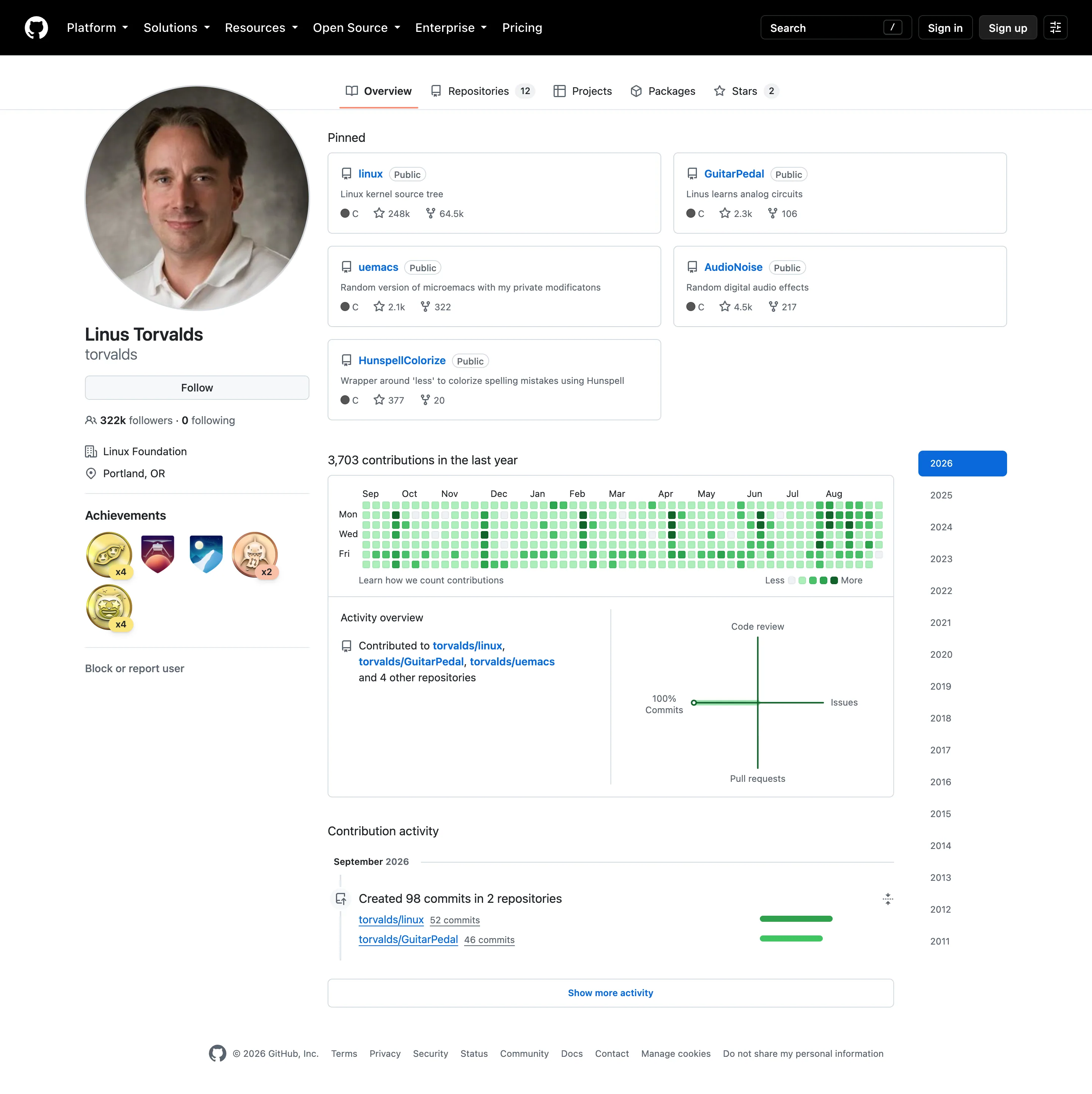
Profile / contribution graph September 11, 2026 github.com, signed out (public profile) medium · light · desktop-web
The calendar heatmap everyone else copied, and a good demonstration of what it trades away. 3,703 contributions across 365 days is about ten a day, and the scale has five steps, so almost every cell here lands in the middle two and the year reads as one flat field of mid-green. A day with five commits and a day with twenty-five are the same colour. That is the deliberate choice—coarse buckets make the rhythm readable and make any individual day approximate—but on a profile this active there is no rhythm left to read either, because the bucketing has flattened the variation it was meant to reveal. The layout still earns its place: weeks as columns and weekdays as rows means a weekend effect would show as two pale rows across the full width, and here it doesn't, which tells you something true about this person's week. The panel beside it is worse off. It is a four-axis diagram of code review, issues, pull requests and commits, and with 100% commits it collapses to a single straight line.
  • Calendar heatmap Fifty-three columns of weeks, seven rows of weekdays, and only Mon, Wed and Fri labelled to save the space.
  • KPI tile The total sits above the grid, so the cells have a denominator. Most calendar heatmaps omit this.
  • Sequential and diverging scales Five discrete steps rather than a continuous ramp, which is why ten commits and thirty share a colour.
  • Time-range picker Sixteen years as a list. No arbitrary range, no relative window—the only unit on offer is a calendar year.
Show 3 more examples Hide the rest

Grafana

The reference implementation for panel grids, template variables, and stat panels; most other tools are defined by how they differ from it.

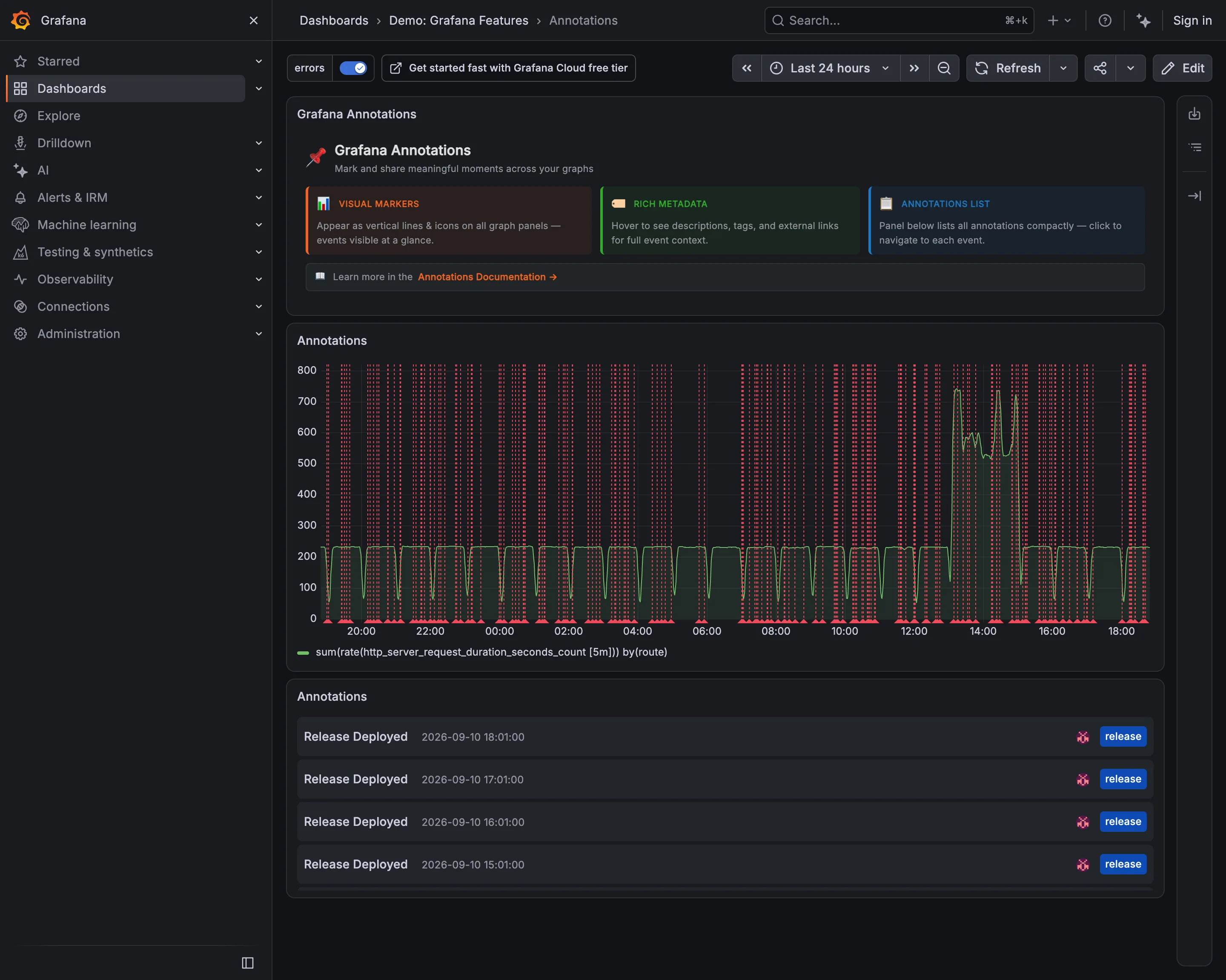
Demo / Annotations September 10, 2026 Grafana Play (signed out; no version string exposed) medium · dark · desktop-web
The header on this dashboard says annotations "appear as vertical lines and icons on all graph panels—events visible at a glance", and the panel directly beneath it is the counter-example. Roughly fifty red dashed lines across twenty-four hours, evenly spaced, and the request-rate series behind them is genuinely hard to follow: the fence is denser than the data. Every one of those lines is a real event correctly recorded, and the tag filter in the top left is switched on, so this is the filtered view. That is the whole problem with automatic annotations—they are complete and they never stop arriving, and completeness at this cadence is indistinguishable from noise. The list panel at the bottom is what makes them usable again: the same events, four of them, timestamped and tagged, in a form you can read.
  • Annotation Fifty deploy markers on a 24-hour chart. Each one is correct and together they are a picket fence.
  • Annotation The same events as a list, tagged release and timestamped. Readable in a way the chart is not.
  • Filter bar The tag filter that makes this survivable, already on. The chart above is the filtered version.
  • Time-range picker Twenty-four hours, which is what sets the marker density. An hour here would be three lines.

Honeycomb

Query-first; heatmaps and BubbleUp replace the dashboard-of-panels model with draw-a-region cross-filtering.

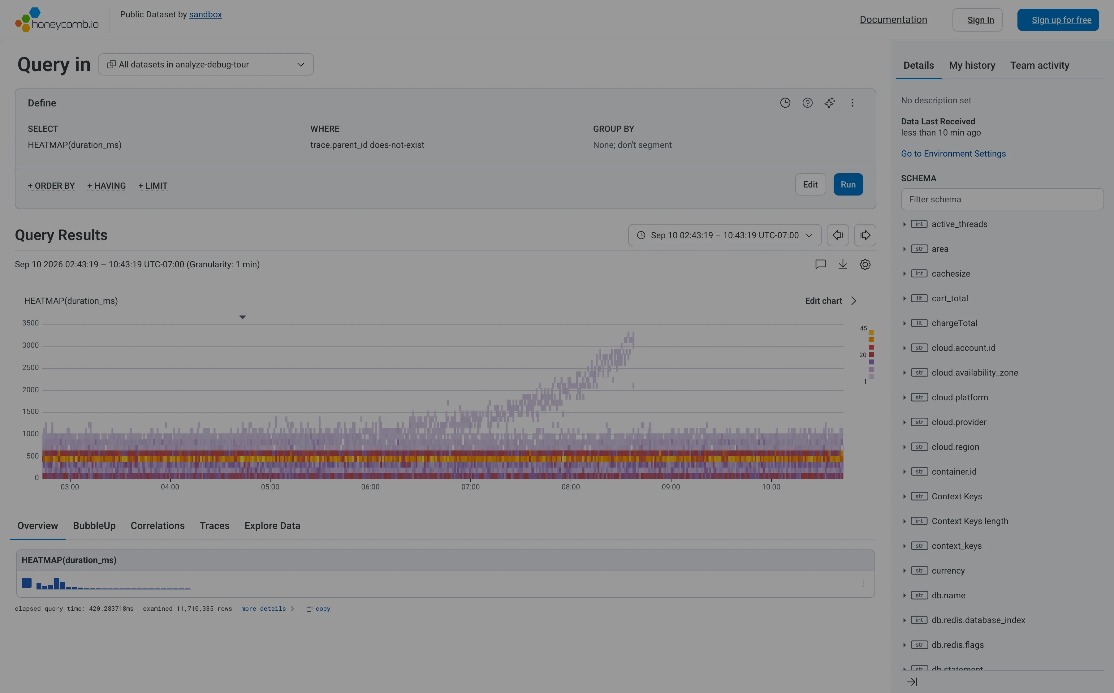
Honeycomb — Query / HEATMAP(duration_ms)
Heatmap. Linear y-axis, so the band holding most requests is six percent of the panel height and the empty top half gets the rest. Search across panels. The schema is the navigation, and it opens with a filter box rather than a tree you're expected to browse. Dashboard builder. No panel to configure—the query is the page. WHERE trace.parent_id does-not-exist is how you say root spans only. Tabs as genres. Five readings of one result: overview, BubbleUp, correlations, traces, raw. Each tab is a different question, not a different subject. Freshness indicator. When data last arrived, not when the page last ran. The one of the three ages that actually matters. Time-range picker. Absolute, with the granularity stated beside it, and arrows that step to the previous window rather than retyping it. Data source badge. Elapsed query time and 11,710,335 rows examined. The panel reporting its own cost and scope, which almost nothing else does.
Query / HEATMAP(duration_ms) September 10, 2026 Honeycomb sandbox, public dataset (signed out; no version string exposed) medium · light · desktop-web
My heatmap entry cites Honeycomb as the argument for log-scale y-buckets, so it's worth recording that this is Honeycomb's own sandbox rendering the same chart on a linear axis. The result is the failure the argument warns about: the ticks run 0 to 3500 evenly, the dense band where almost every request actually lives is squashed into the bottom sixth of the panel, and the top half is mostly empty. What survives anyway is the thing a percentile can't tell you. The solid band under a second doesn't move across the whole window, while from about 07:00 a separate purple tail climbs to 3000ms and keeps going. Two populations, one of them fine and one of them deteriorating. A p95 line over this data would have risen and said nothing about which. The other thing worth stealing: the footer reports elapsed query time and that it examined 11,710,335 rows, so the panel tells you what it cost and how much it looked at. Cookie banner and a no-signup onboarding modal were removed to take the shot; nothing of the product's own UI was.
  • Heatmap Linear y-axis, so the band holding most requests is six percent of the panel height and the empty top half gets the rest.
  • Dashboard builder No panel to configure—the query is the page. WHERE trace.parent_id does-not-exist is how you say root spans only.
  • Tabs as genres Five readings of one result: overview, BubbleUp, correlations, traces, raw. Each tab is a different question, not a different subject.
  • Search across panels The schema is the navigation, and it opens with a filter box rather than a tree you're expected to browse.
  • Time-range picker Absolute, with the granularity stated beside it, and arrows that step to the previous window rather than retyping it.
  • Data source badge Elapsed query time and 11,710,335 rows examined. The panel reporting its own cost and scope, which almost nothing else does.
  • Freshness indicator When data last arrived, not when the page last ran. The one of the three ages that actually matters.

Kibana

Query-first rather than panel-first: the search bar is the primary control and the charts are downstream of it, which inverts Grafana's arrangement.

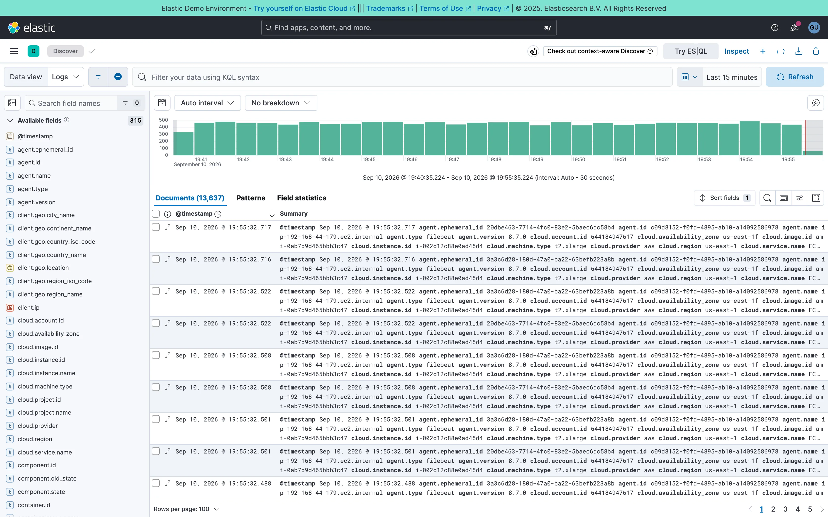
Kibana — Discover / filebeat logs
Two-pane list and detail. Fields on the left, records on the right, both on screen at once. The oldest working shape for a queue there is. Data table. One column called Summary holding every field on the record. Complete, and unreadable at a glance. Histogram and distribution. Volume over the window at a 30-second auto interval. The final bar is the bucket still filling, and it always reads low. Filter bar. A query language in the bar rather than chips. Powerful, and it hides what's applied from anyone who didn't type it. Detail on demand. An expander on every row. Inline rather than a side panel, so it pushes the rest of the list down. Time-range picker. Relative by default, with the refresh control beside it rather than buried in a settings menu. Search across panels. 315 fields, so the sidebar opens with a filter box. Past a certain count a tree is a filing system nobody browses.
Discover / filebeat logs September 10, 2026 Elastic demo environment (guest session; no version string exposed) dense · light · desktop-web
Two panes: 315 fields down the left, 13,637 documents on the right, and a volume histogram over both. The left pane is the good half—it opens with a search box rather than a tree, which is the only sane way to navigate that many fields. The right pane is where it falls over. The documents table ships with two columns, a timestamp and "Summary", and Summary is every field on the record concatenated into one cell: agent.ephemeral_id, agent.id, agent.name, agent.type, agent.version, cloud.account.id, cloud.availability_zone, and on for three wrapped lines per row. It is technically complete and it cannot be scanned, so the first thing anyone does here is pick columns—which is to say the default view's job is to make you configure it. Underneath, the pager reads 100 rows per page across 137 pages, and the sort control sits above a table showing the first of them.
  • Two-pane list and detail Fields on the left, records on the right, both on screen at once. The oldest working shape for a queue there is.
  • Detail on demand An expander on every row. Inline rather than a side panel, so it pushes the rest of the list down.
  • Data table One column called Summary holding every field on the record. Complete, and unreadable at a glance.
  • Search across panels 315 fields, so the sidebar opens with a filter box. Past a certain count a tree is a filing system nobody browses.
  • Filter bar A query language in the bar rather than chips. Powerful, and it hides what's applied from anyone who didn't type it.
  • Time-range picker Relative by default, with the refresh control beside it rather than buried in a settings menu.
  • Histogram and distribution Volume over the window at a 30-second auto interval. The final bar is the bucket still filling, and it always reads low.