GitHub
The contribution graph is the calendar heatmap every other product copied, and its five-step bucketing is the deliberate trade that made it legible.
github.com , opens in a new tab Live demo , opens in a new tab
Patterns seen here 4
Captures
1 capture, newest first. Hover any box for the pattern and the note.
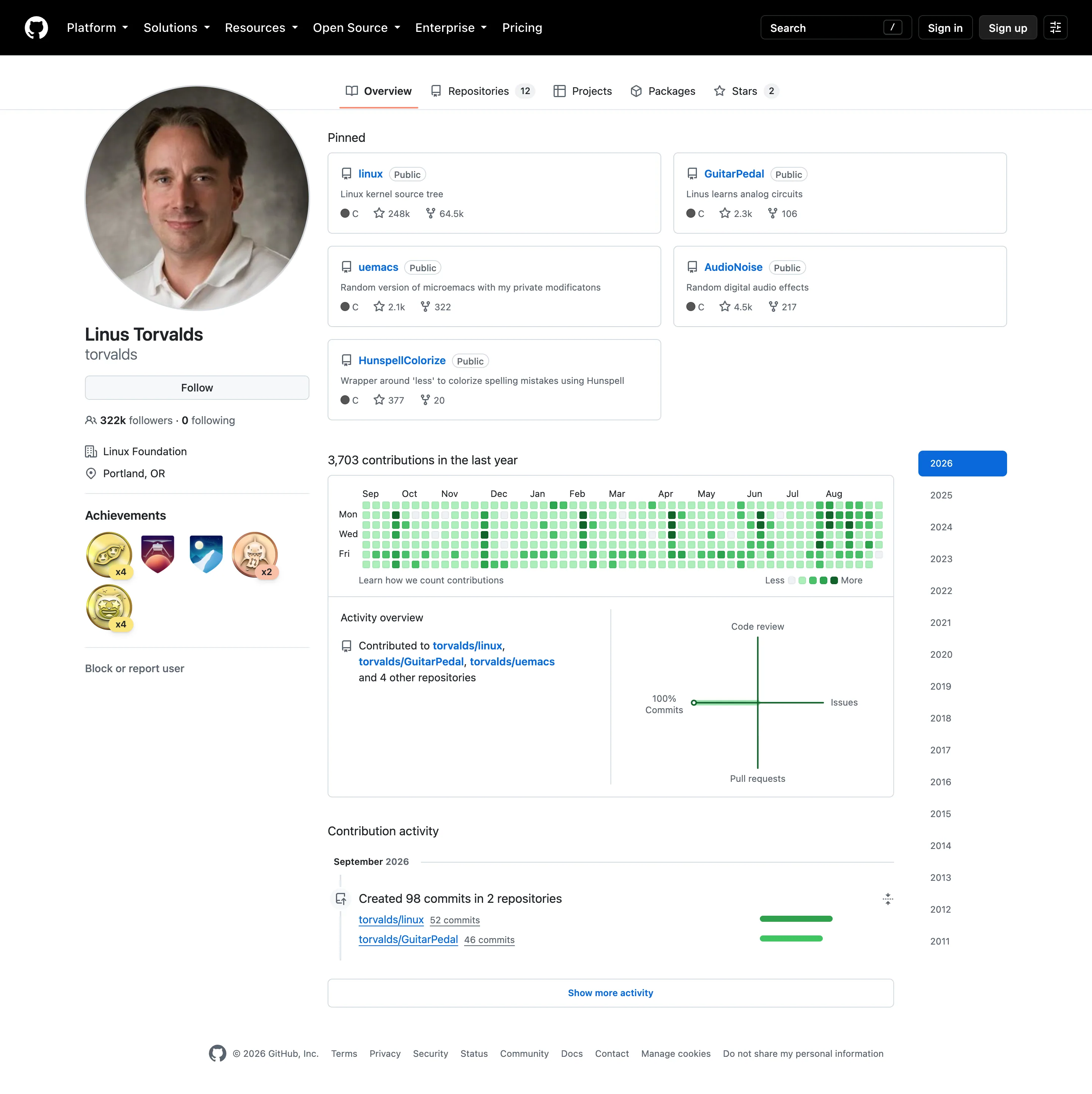
Time-range picker. Sixteen years as a list. No arbitrary range, no relative window—the only unit on offer is a calendar year. Calendar heatmap. Fifty-three columns of weeks, seven rows of weekdays, and only Mon, Wed and Fri labelled to save the space. KPI tile. The total sits above the grid, so the cells have a denominator. Most calendar heatmaps omit this. Sequential and diverging scales. Five discrete steps rather than a continuous ramp, which is why ten commits and thirty share a colour.
- Calendar heatmap Fifty-three columns of weeks, seven rows of weekdays, and only Mon, Wed and Fri labelled to save the space.
- KPI tile The total sits above the grid, so the cells have a denominator. Most calendar heatmaps omit this.
- Sequential and diverging scales Five discrete steps rather than a continuous ramp, which is why ten commits and thirty share a colour.
- Time-range picker Sixteen years as a list. No arbitrary range, no relative window—the only unit on offer is a calendar year.