Problem
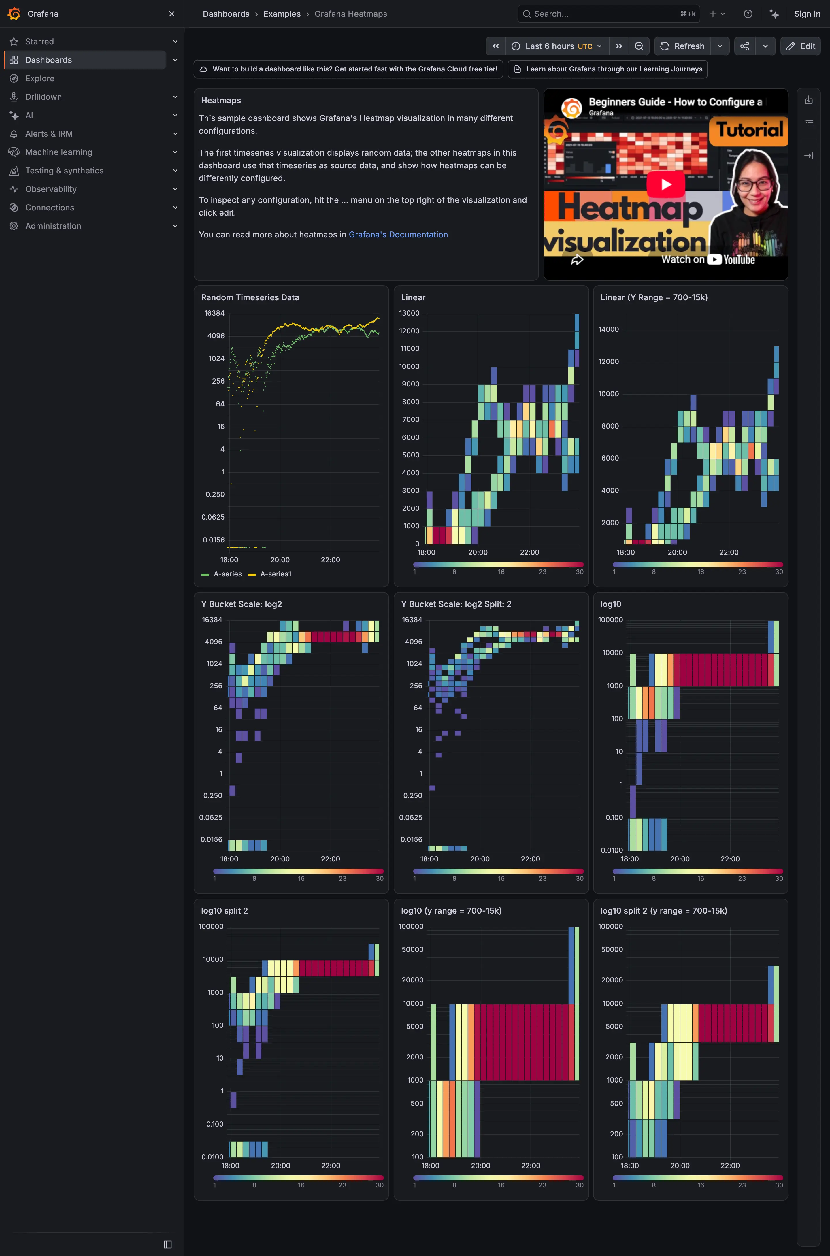
A heatmap, a choropleth or a cohort grid encodes a quantity as colour. Whether the viewer sees the real structure or a flattened smear depends entirely on a ramp somebody picked from a dropdown.
Solution
Match the ramp to the data’s shape, and there are exactly three shapes worth distinguishing.
Sequential for values running from low to high with no meaningful middle. The ramp should vary monotonically in lightness, because lightness is the channel people read magnitude from most reliably. A ramp that only changes hue—blue to green to red—has no perceptual order, so viewers cannot tell which end is more without consulting the legend on every cell.
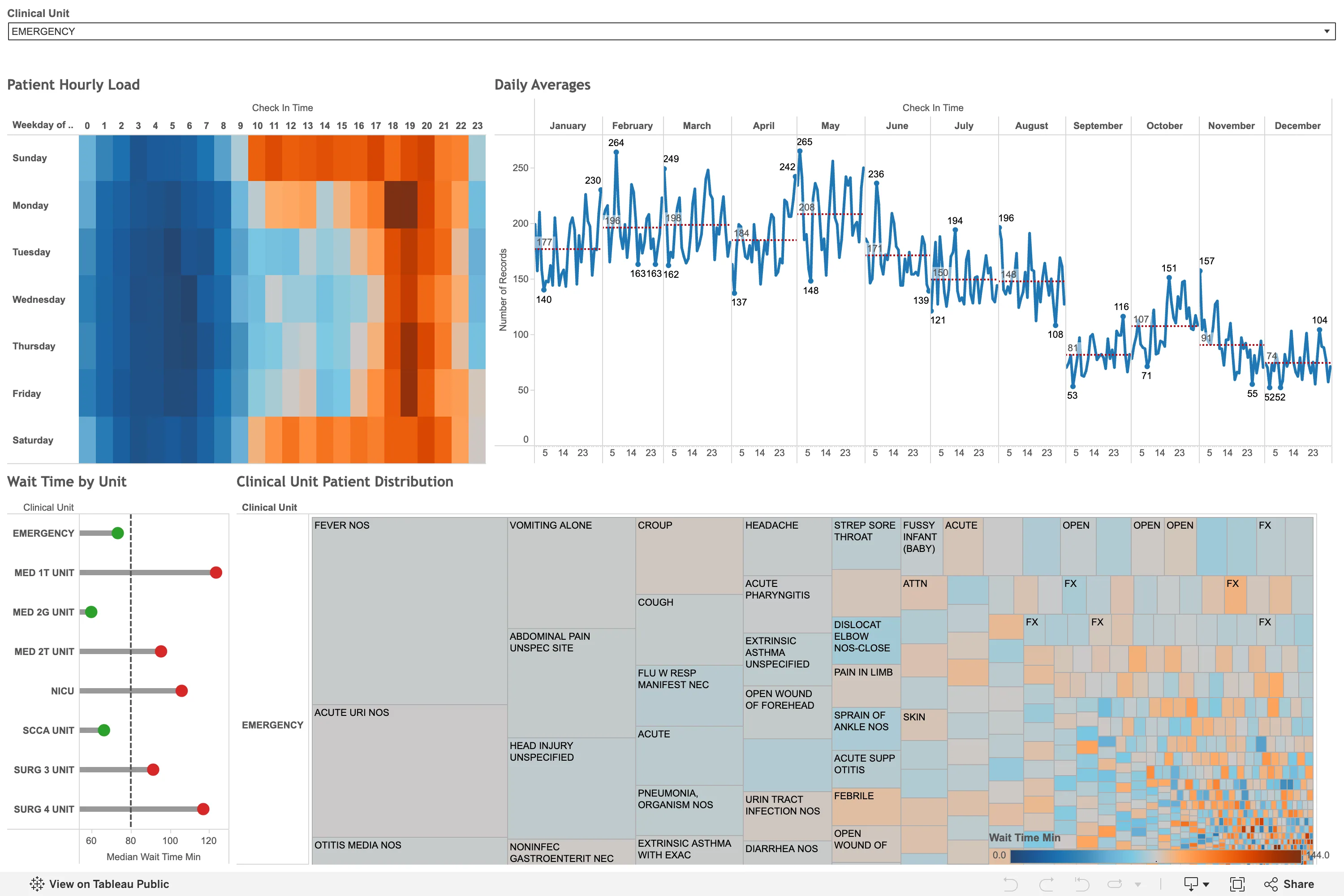
Diverging for values with a meaningful centre: change versus previous, deviation from a target, positive and negative. Two sequential ramps meeting at a neutral midpoint. The critical detail is that the midpoint must sit at the real zero. A diverging ramp centred at the data’s mean rather than at zero will colour a set of entirely positive values as if half of them were negative, which is a straightforward lie the chart tells confidently.
Cyclical for wrapping quantities—hour of day, angle, phase—where the ends must meet. Rare on dashboards and worth naming so nobody reaches for sequential and puts a hard discontinuity at midnight.
The rainbow ramp deserves specific mention because it remains a default in older tools and is the best-known bad choice in visualisation. It is not perceptually uniform: equal steps in value produce wildly unequal perceived changes, so it invents boundaries where the data is smooth and hides real transitions where the hues happen to be similar. It also fails completely in greyscale and for colourblind viewers.
The range is as consequential as the ramp. Grafana’s heatmap offers Start color scale from value and End color scale at value for exactly this: without clamping, one extreme cell consumes the entire ramp and everything else becomes one shade.
Use when
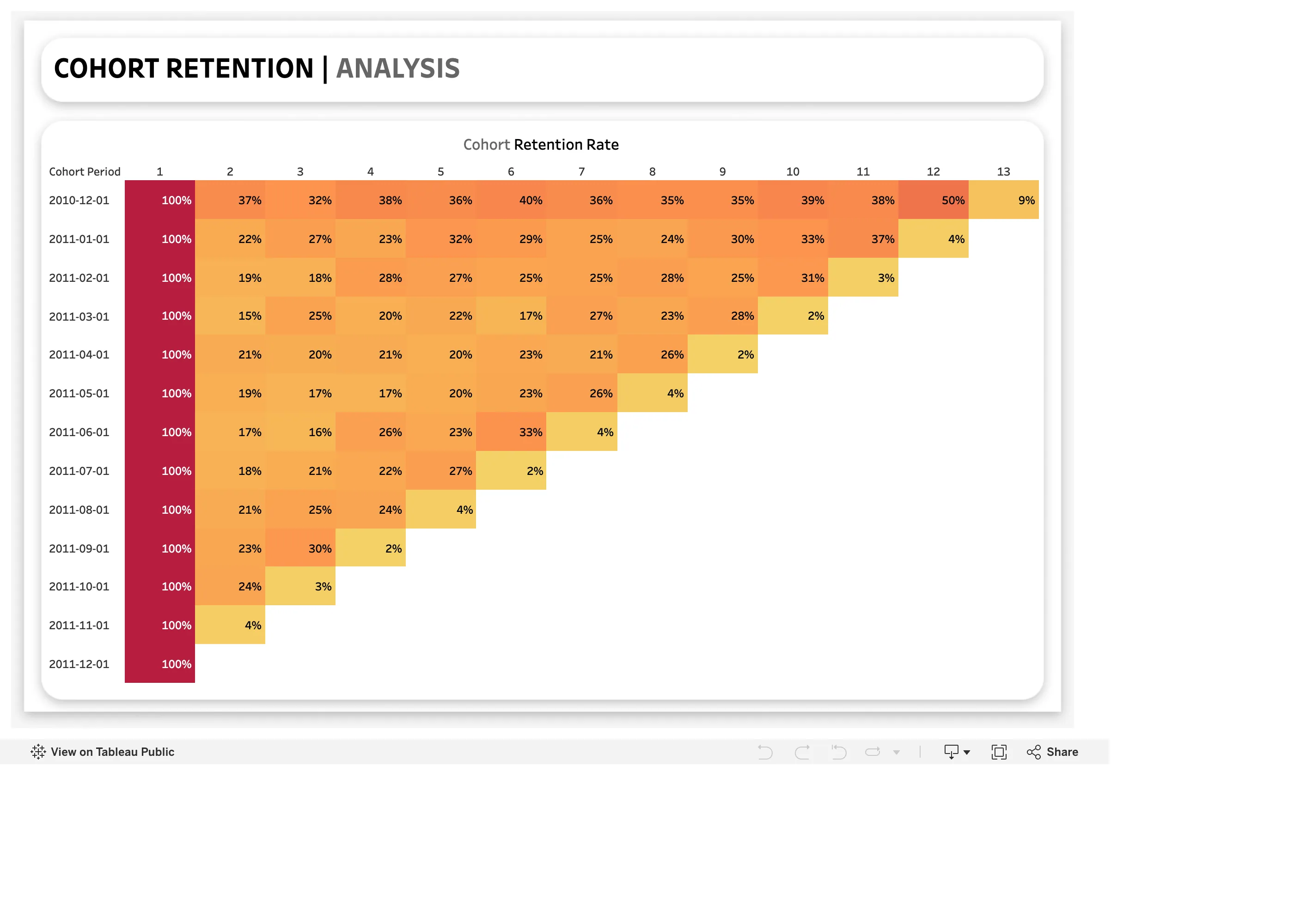
Colour carries a quantity rather than an identity. Heatmaps, choropleths, cohort grids, correlation matrices, calendar grids.
Don’t use when
The categories are unordered, where a ramp implies a ranking that does not exist. And avoid encoding anything precise in colour at all: people read position and length far more accurately, so a ramp is for pattern, not for measurement.
Trade-offs
Colour is the least precise encoding available, so any ramp answers “roughly” and never “exactly”, which means a companion number or hover is usually mandatory. Ramps are theme-sensitive and a scheme tuned on white loses its low end on charcoal. Perceptually uniform schemes look duller than rainbow ones, which is a real problem in stakeholder review and a fake one everywhere else. And clamping trades fidelity for legibility: it makes the body of the distribution readable and hides how extreme the extremes are.
Checklist
- Is this quantity sequential, diverging or cyclical, and does the ramp match?
- If diverging, does the midpoint sit at a real zero rather than at the mean?
- Does the ramp vary monotonically in lightness?
- Is it perceptually uniform, or does it invent boundaries?
- Is the scale clamped, and does one outlier otherwise consume it?
- Is the legend present with real values, not just a gradient bar?
- Does the ramp survive greyscale and the common colour vision deficiencies?
- Does it have a variant tuned for the dark theme?
- Do neighbouring panels share a scale where they are meant to be compared?
- Is there a number available for anyone who needs precision?
Compare
ColorBrewer remains the reference set, dividing schemes into sequential, diverging and qualitative and flagging which are colourblind-safe, print-friendly and photocopy-safe, which is the taxonomy every later tool borrowed. Viridis and its family were designed explicitly for perceptual uniformity and greyscale survival, and have become the default in scientific plotting for that reason. Grafana offers scheme and opacity modes plus explicit start and end clamps on its heatmap, which is more control than most dashboards use and exactly the control that matters. Older SCADA and BI tools still default to rainbow, which is the clearest available demonstration of why this entry exists.
Related
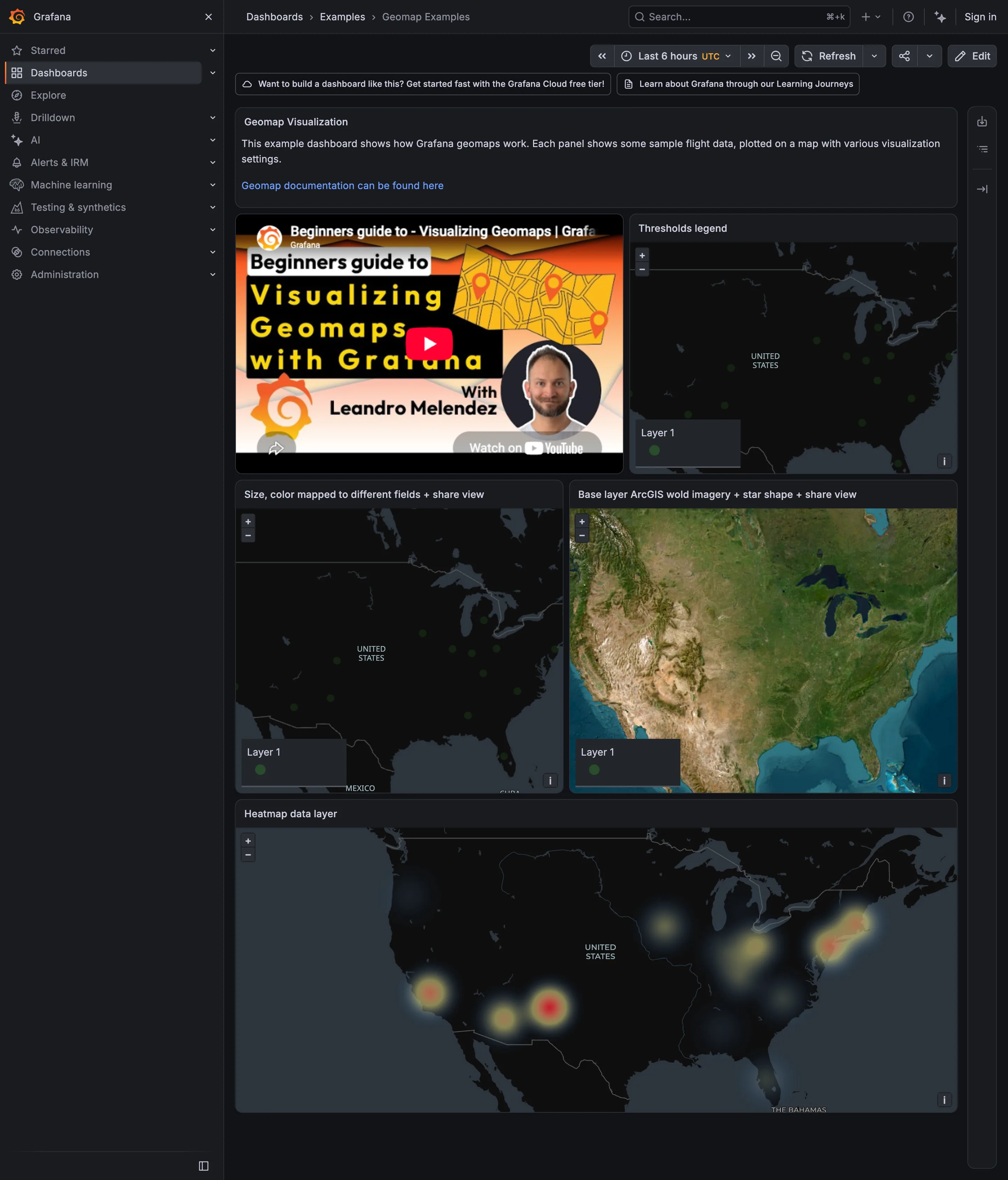
Heatmap is the pattern most dependent on getting this right. Geo map is where a bad ramp meets area distortion and compounds it. Calendar heatmap depends on the range choice more than the ramp choice. Categorical series palette is the unordered counterpart. Cohort grid is the other grid where clamping decides whether anything is visible.