Problem
One number, one range, and a viewer who needs to know where in that range it currently sits without reading anything.
Solution
An arc, a needle or filled sweep, and a scale. The gauge encodes position within a bounded range, which is genuinely useful and is also the only thing it does.
The case against it is well made and worth stating properly. Few designed the bullet graph specifically to replace the meters and gauges that were filling dashboards, on the argument that a linear, no-frills display gives a rich reading in a small space, and space is the scarce resource on a dashboard. A gauge occupies a square to encode one value along one dimension. A bullet graph encodes the same value plus a target plus qualitative ranges in a strip a fraction of the size. On area alone the gauge loses, and on a page of twelve panels that is the whole argument.
So when does it survive? Three cases, and they are narrower than the number of gauges in the wild suggests.
When the range is genuinely bounded and familiar. Percentage full, percentage utilised, battery, capacity. The arc’s endpoints mean something. A gauge of “requests per second” has invented its own maximum and is lying about the scale.
When it is the only radial thing on the page. A row of gauges above a wall of line charts reads as a summary row precisely because the shape differs. That contrast is doing the work, not the arc. Repeat the gauges further down and it evaporates.
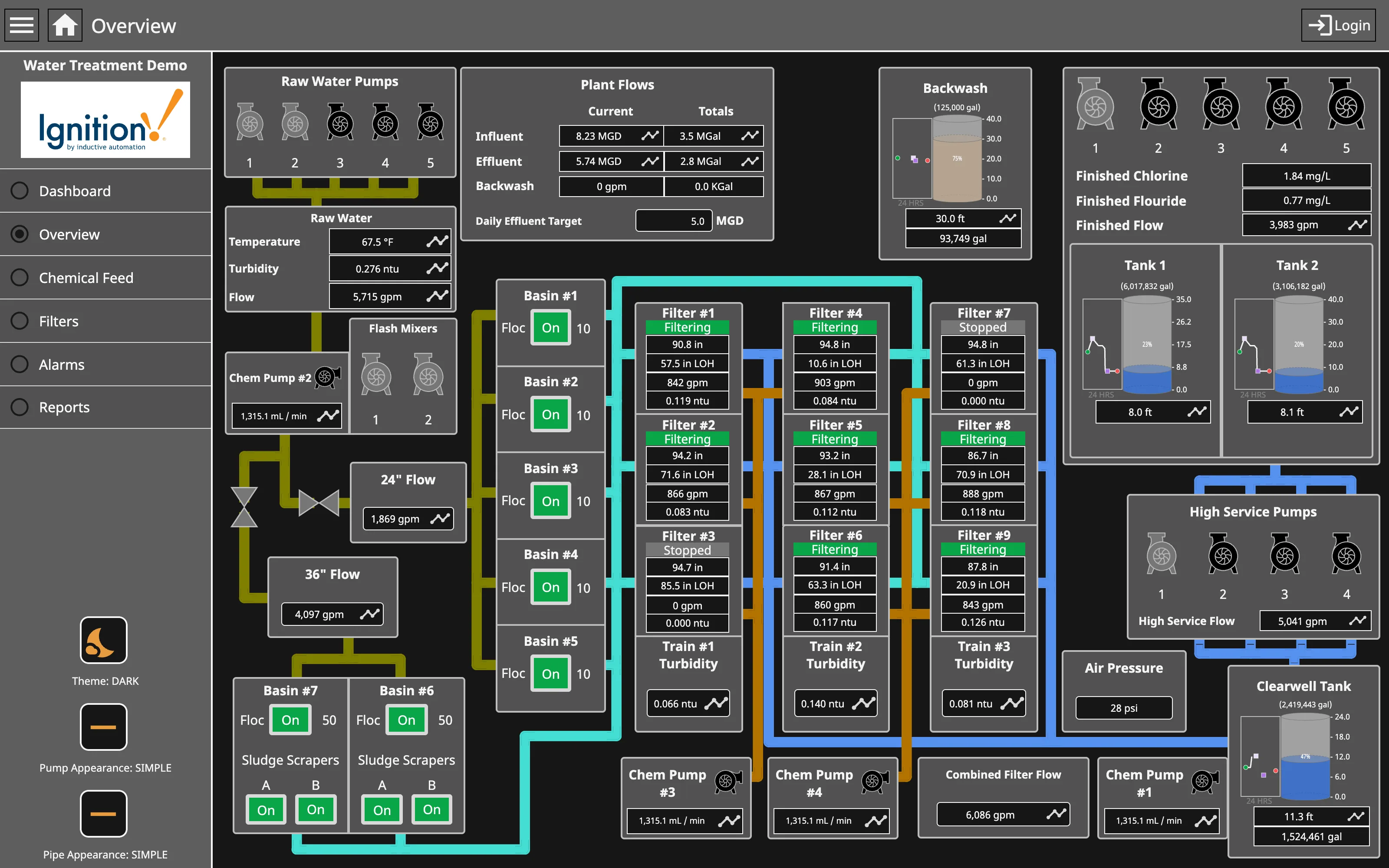
When it mimics a physical instrument the operator already reads. On a process display that mirrors real plant, matching the control-room instrument is a legitimate reason to be round, and consistency with the equipment beats abstract information density.
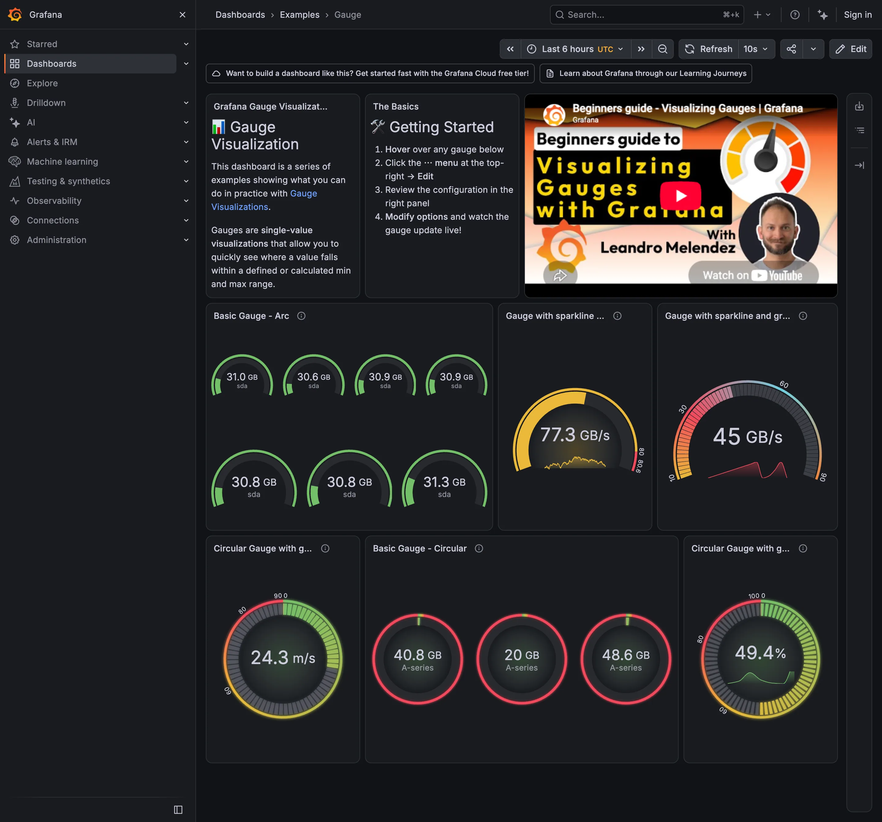
Grafana’s gauge inherits the standard threshold machinery, which is where most of the value lives: the arc is coloured by the same Absolute or Percentage thresholds used everywhere else, so the colour is a shared decision rather than a per-panel invention.
Use when
The range is real and bounded, the value’s position within it is the question, and there is exactly one row of them.
Don’t use when
You have more than about six, the maximum is invented, or the viewer needs to compare gauges against each other. Comparing angles across a grid is the task human perception is worst at, and it’s the task a grid of gauges sets.
Trade-offs
Gauges spend a lot of pixels on a single scalar, and the pixels come out of the panels that could have shown a trend. They carry no history, so a value sitting mid-arc looks identical whether it has been stable for a week or arrived there in the last minute. Angular position is read less accurately than length. And the decorative versions—chrome bezels, needle shadows, tick marks at every unit—add ink that encodes nothing, which is where the pattern gets its reputation.
Checklist
- Is the maximum a real limit or a number someone picked?
- Would a bullet graph carry the same information in a tenth of the space?
- How many gauges are on this page, and are viewers comparing them to each other?
- Does the gauge show a target as well as a value?
- Where do the threshold colours come from, and are they the same ones the charts use?
- Is there any history, or only the instantaneous value?
- Is the number also printed, for people who need precision?
- Does it stay readable at the size this panel actually renders at?
- Would a colourblind reader get the same reading from the arc?
- If this mirrors a physical instrument, does it match the one in the room?
Compare
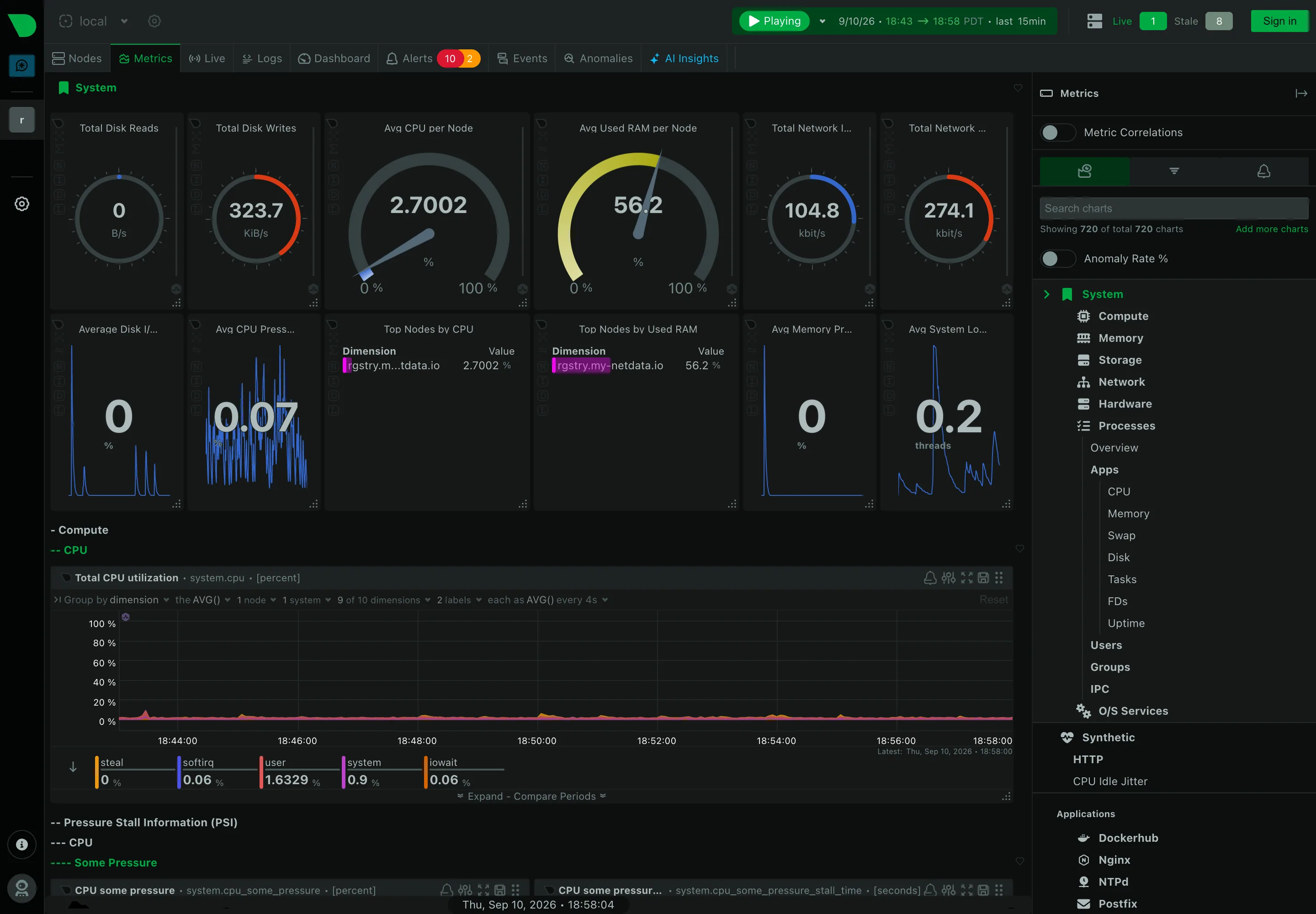
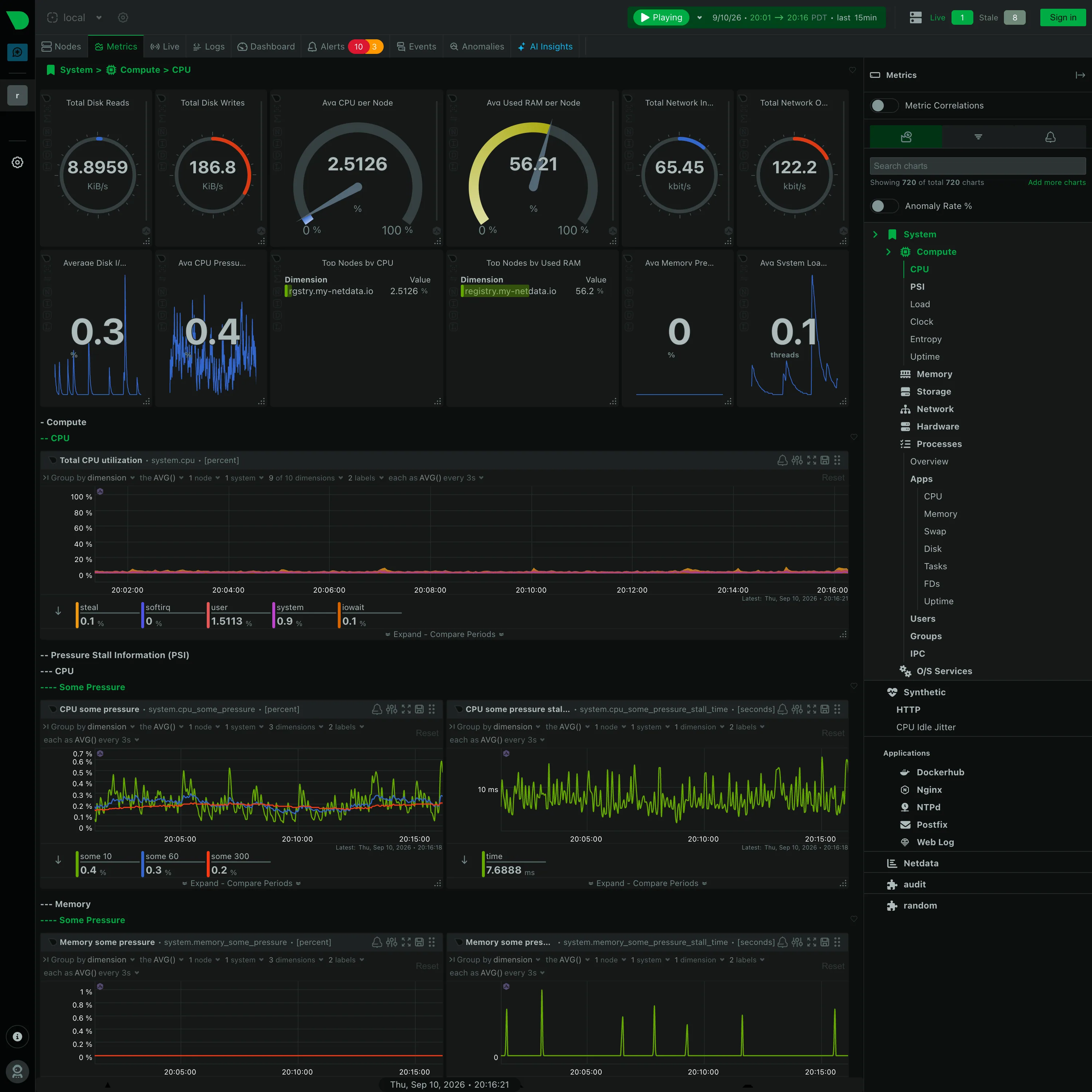
Grafana ships the gauge as a first-class panel wired into the same threshold system as everything else, which makes it consistent and makes it easy to scatter across a dashboard where a stat panel would serve better. Tableau has no native gauge and the community builds them from stacked pie charts, which is a quiet statement of position from a tool whose analyst audience took Few’s argument seriously. Netdata favours a compact value with a live chart behind it over a radial reading, on the grounds that a per-second trend answers more questions than a position in an arc. Industrial HMI software, working to ISA-101 conventions, keeps the round instrument where it matches plant equipment and strips its decoration to a thin arc, which is the version of this pattern with the strongest justification.
Related
Target and progress is the pattern Few built to replace this one, and the entry there covers the bullet graph properly. KPI tile is the smaller container for the same single number. Threshold line puts the same limits on a time axis where history is visible. Semantic status color governs the arc’s colouring. Process mimic is the context where a round instrument is the right answer rather than a nostalgic one.