Skip to content
KONIGI

Dashboards / Screenspace / Collapsible row

1 of 6

Collapsible row

The dashboard grew to sixty panels and the viewer needs the top twelve most of the time.

Updated September 10, 2026

Problem

The dashboard has sixty panels. Four of them are what anyone looks at on an ordinary day, and the other fifty-six exist for the one afternoon a quarter when they are the only thing that matters.

Solution

Group panels into named sections and let each collapse. Collapsed by default for the deep material, expanded for the summary, and the state remembered.

This is progressive disclosure, and NN/g’s rule for it is the useful part: show only a few of the most important options first, and get the split right, so people progress to the secondary display only on rare occasions. On a dashboard the split is easy to state and hard to do—the top section should answer “is it okay”, and everything below should answer “why”, and most dashboards get this backwards by opening with whatever was built first.

The counter-argument is worth taking seriously, because NN/g makes it against accordions in the same breath. Scrolling is cheap; deciding which heading to click is not. Readers treat clicks like currency and resent spending them on content they needed anyway. Hiding content behind navigation reduces awareness that it exists at all.

Both are true, and the reconciliation is the section title. A row labelled “Advanced” hides its contents from everyone forever. A row labelled “Disk and filesystem” is a promise specific enough that someone chasing a disk problem will spend the click. The titles are the whole design, and they are usually an afterthought.

The other thing that decides it: does an alert inside a collapsed row still reach the viewer? A page that looks healthy because the unhealthy part is folded away is worse than a long page.

Use when

The panel count exceeds a screen, the sections have genuinely different audiences or occasions, and the top of the page can stand alone as a summary.

Don’t use when

Every panel matters every time, which means you have a shorter dashboard than you think you do. Also don’t use it to make an overloaded page feel tidy; the load is still there and now it is hidden.

Trade-offs

Collapsed content is close to invisible, and the panels that get folded are the ones that then rot unnoticed. Expand-all becomes necessary and then becomes the thing everyone clicks first, which means the collapsing bought nothing. In-page search doesn’t reach collapsed content in most implementations, so a viewer looking for a panel by name finds nothing. And collapse state is per-viewer, so no two people are looking at the same dashboard, which makes screen-sharing during an incident quietly confusing.

Checklist

  • Does the section title say what is inside, specifically enough to be worth a click?
  • Which rows are collapsed by default, and does the open set answer “is it okay”?
  • Is the collapse state remembered, and is it per-viewer or per-dashboard?
  • Does a panel in a collapsed row still run its query, and should it?
  • If something inside a collapsed row is alerting, does the row say so?
  • Does browser find, or the product’s search, reach collapsed panels?
  • Is there an expand-all, and does everyone use it immediately?
  • On a wallboard, does anything start collapsed that nobody can expand?
  • Does a shared link carry the expansion state?
  • Would splitting into separate dashboards serve these audiences better?

Compare

Grafana makes rows first-class objects with their own titles, collapse state and repeat-by-variable behaviour, so a row can expand into one section per instance, which is the pattern doing real structural work rather than only tidying. Datadog groups panels into named sections that collapse, and surfaces alert status on the group header so a folded section can still say something is wrong. AWS CloudWatch leans on separate dashboards instead of sections, which sidesteps the hiding problem and replaces it with a navigation problem. Netdata builds the entire page as collapsible sections driven by a menu, and because the section list doubles as the navigation the titles are load-bearing in a way most implementations never make them.

Panel grid is what sits inside a row. Detail on demand is the same idea applied to a single panel. Dense small-multiple layout is the alternative that shows everything and asks the viewer to scan. Semantic grouping is what should decide the sections. Multi-page dashboard is the heavier answer when sections stop being enough.
Collapsible row anatomy A page of three named sections. The first is open and answers whether things are okay; the two below are folded, each naming what it holds and how many panels. One folded row carries an alert count, because a page that looks healthy with the unhealthy part folded away is worse than a long page. Anatomy Service health Disk and filesystem 12 panels JVM and garbage collection 2 firing 1 2 3 1 THE DISCLOSURE Open for the section that says whether things are okay; folded for the ones that say why. 2 THE TITLE The whole design, and usually an afterthought. Readers treat clicks like currency. 3 WHAT'S FIRING INSIDE A page that looks healthy because the unhealthy part is folded away is worse than a long page. Same twelve panels, two titles Advanced Hidden from everyone, forever Disk and filesystem A promise worth a click
Wireframe — the pattern's anatomy, not any one product's version of it

Implementation

Sections that fold, with the header carrying enough state that folding costs nothing. A collapsed row hiding a firing alert is the failure case, so the count belongs on the header.

shadcn
npx shadcn@latest add collapsible card
npm
lucide-react
Tokens
--card--card-foreground--muted-foreground--border--status-critical

Checkout success

99.4%

+0.3%Last 24 hours

p95 latency

412 ms

-2.1%Last 24 hours

Error budget left

71%

-4.0%This quarter

CollapsibleRows.tsxNamed sections that fold. A folded header carries its panel count, and the alerts firing inside it by name.

import { useState, type ReactNode } from "react";
import { ChevronRight } from "lucide-react";
import { Collapsible, CollapsibleContent, CollapsibleTrigger } from "@/components/ui/collapsible";
import { cn } from "@/lib/utils";

export type Section = {
  id: string;
  /** The whole design. "Advanced" hides its contents from everyone forever;
   *  "Disk and filesystem" is a promise specific enough to spend a click on. */
  title: string;
  panels: ReactNode[];
  /** Alerts firing inside, by name. A folded row still says so, because a
   *  page that looks healthy with the unhealthy part folded away is worse
   *  than a long page. */
  firing?: string[];
};

type Props = {
  sections: Section[];
  /** Which rows start open. The open set should answer "is it okay"; the
   *  folded rows answer why. */
  defaultOpen: string[];
  /** Remember it per viewer, and carry it in a shared link. */
  onToggle?: (id: string, open: boolean) => void;
};

export function CollapsibleRows({ sections, defaultOpen, onToggle }: Props) {
  const [open, setOpen] = useState(() => new Set(defaultOpen));
  const toggle = (id: string, next: boolean) => {
    const s = new Set(open);
    next ? s.add(id) : s.delete(id);
    setOpen(s);
    onToggle?.(id, next);
  };

  return (
    <div className="flex flex-col gap-2">
      {sections.map((s) => {
        const isOpen = open.has(s.id);
        const firing = s.firing ?? [];
        return (
          <Collapsible key={s.id} open={isOpen} onOpenChange={(o) => toggle(s.id, o)} className="rounded-lg border bg-card">
            <CollapsibleTrigger className="flex w-full items-center gap-2 px-3 py-2 text-left text-sm text-card-foreground">
              <ChevronRight className={cn("size-3.5 shrink-0 text-muted-foreground transition-transform", isOpen && "rotate-90")} />
              <span className="truncate">{s.title}</span>
              <span className="ml-auto flex shrink-0 items-center gap-2">
                {firing.length > 0 && (
                  <span
                    className="inline-flex items-center gap-1.5 rounded-full bg-status-critical/10 px-2 py-0.5 text-[11px] text-status-critical"
                    title={firing.join(", ")}
                  >
                    <span className="size-1.5 rounded-full bg-status-critical" aria-hidden="true" />
                    {firing.length} firing
                  </span>
                )}
                {/* The count is what is behind the click, so it shows only
                    while the row is folded. */}
                {!isOpen && (
                  <span className="text-[11px] tabular-nums text-muted-foreground">{s.panels.length} panels</span>
                )}
              </span>
            </CollapsibleTrigger>
            <CollapsibleContent>
              <div className="grid grid-cols-3 gap-2 border-t p-3">{s.panels}</div>
            </CollapsibleContent>
          </Collapsible>
        );
      })}
    </div>
  );
}

demo.tsxHow it is called: health open, disk and JVM folded, two alerts showing through the JVM header.

import { Card } from "@/components/ui/card";
import { KpiTile } from "../kpi-tile/KpiTile";
import { CollapsibleRows, type Section } from "./CollapsibleRows";

/**
 * Three sections. Service health is open and answers "is it okay". Disk is
 * folded with its count. JVM is folded too, and two alerts inside it show on
 * the header so folding it cost nothing.
 */
const NOW = new Date("2026-09-15T09:00:00Z");
const ago = (s: number) => new Date(NOW.getTime() - s * 1000);

const Stat = ({ label, value }: { label: string; value: string }) => (
  <Card className="p-3 shadow-none">
    <p className="text-xs text-muted-foreground">{label}</p>
    <p className="mt-1 text-lg font-semibold tabular-nums">{value}</p>
  </Card>
);

const DISK: [string, string][] = [
  ["Root used", "61%"], ["/var used", "78%"], ["/data used", "43%"], ["Inodes root", "12%"],
  ["Read IOPS", "1.2k"], ["Write IOPS", "640"], ["Read latency", "3.1 ms"], ["Write latency", "5.4 ms"],
  ["Queue depth", "2"], ["Throughput", "210 MB/s"], ["I/O errors", "0"], ["Days until full", "41"],
];
const JVM: [string, string][] = [
  ["Heap used", "92%"], ["GC pause p99", "1.8 s"], ["Old gen", "88%"],
  ["Threads", "412"], ["Young GC / min", "14"], ["Full GC / hr", "3"],
];

const SECTIONS: Section[] = [
  {
    id: "health",
    title: "Service health",
    panels: [
      <KpiTile key="ok" label="Checkout success" value="99.4%" delta={0.3} window="Last 24 hours" lastArrival={ago(40)} expectedEveryMs={60_000} now={NOW} />,
      <KpiTile key="p95" label="p95 latency" value="412 ms" delta={-2.1} polarity="lower-is-better" window="Last 24 hours" lastArrival={ago(40)} expectedEveryMs={60_000} now={NOW} />,
      <KpiTile key="budget" label="Error budget left" value="71%" delta={-4.0} window="This quarter" lastArrival={ago(300)} expectedEveryMs={60_000} now={NOW} />,
    ],
  },
  { id: "disk", title: "Disk and filesystem", panels: DISK.map(([l, v]) => <Stat key={l} label={l} value={v} />) },
  {
    id: "jvm",
    title: "JVM and garbage collection",
    firing: ["Heap used above 90%", "GC pause p99 above 1 s"],
    panels: JVM.map(([l, v]) => <Stat key={l} label={l} value={v} />),
  },
];

export default function Demo() {
  return (
    <div className="max-w-[560px]">
      <CollapsibleRows sections={SECTIONS} defaultOpen={["health"]} />
    </div>
  );
}
What it renders. Identical markup in both panes, with only the token values changing.

Examples

Captures whose hotspots reference this pattern, grouped by product and dated. The dashed boxes are this pattern; hover any box for the note.

Netdata

Per-second charts, hundreds per node, with a per-chart anomaly ribbon instead of a band on the series.

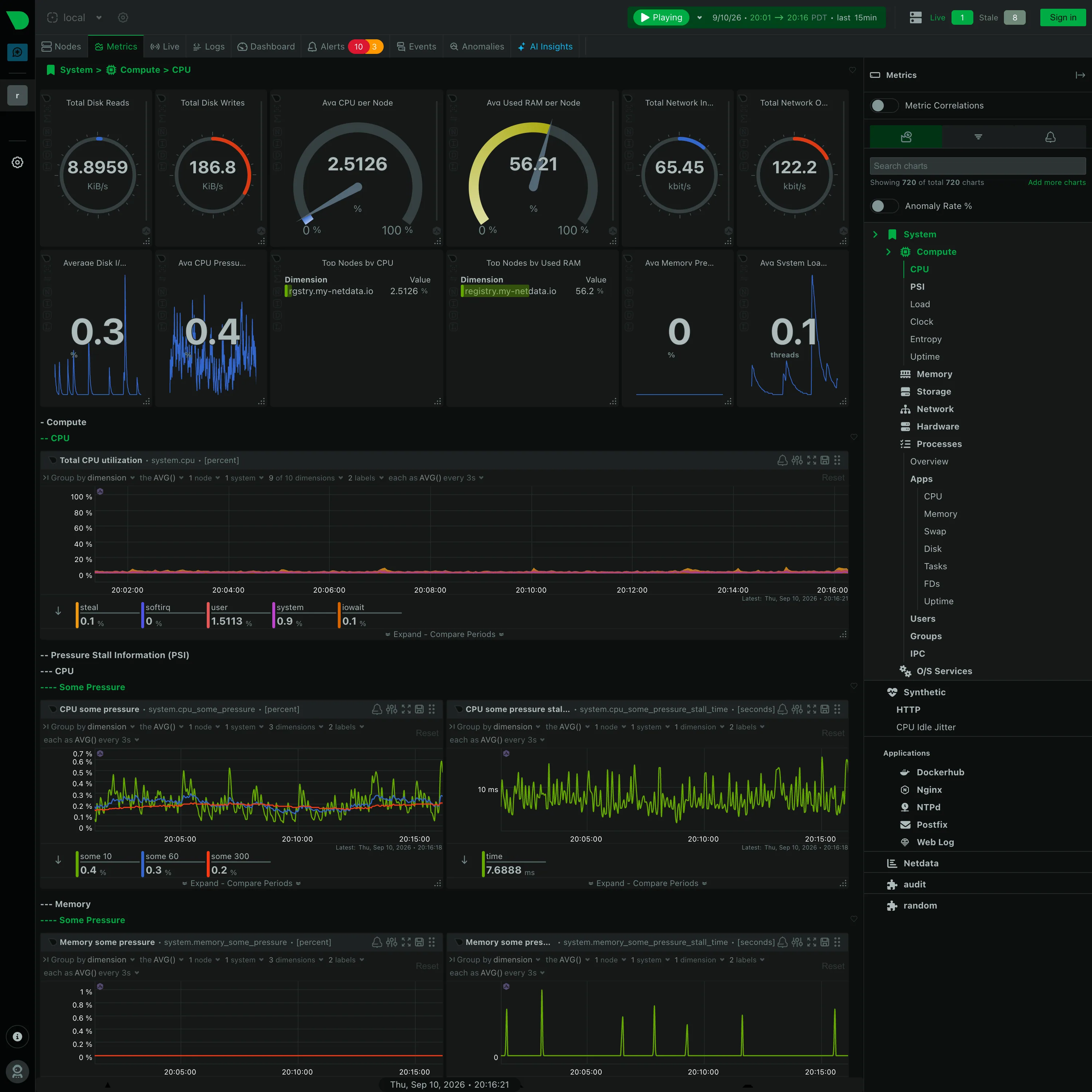
Metrics / System › Compute › CPU September 10, 2026 Netdata Agent (public registry node, signed out) dense · dark · desktop-web
Further down the same generated page, and the section nesting is the thing to look at: "− Compute", then "−− CPU", then "−− Pressure Stall Information (PSI)", then "−−− CPU", then "−−−− Some Pressure". Four levels, each collapsible, each named by the collector rather than by a person, and the depth is signalled with leading dashes because there was no design pass to give them a hierarchy in type. It is consistent and completely unedited. Every chart also carries its own query builder in the header—group by, aggregation, node count, dimension count, sample interval—so a panel here is a live query you can re-scope in place rather than a saved configuration. Worth noting what is not in this shot: the sidebar has an Anomaly Rate toggle, switched off, and Netdata's answer to the anomaly problem is a separate derived rate per chart rather than a band drawn around the series. This capture shows the control, not the thing it draws.
  • Collapsible row Four levels of section, depth carried by leading dashes. Generated by the collector, and never edited.
  • Gauge and dial Six arcs. Two are percentages where the endpoints mean something; four are rates in KiB/s and kbit/s on an invented maximum.
  • Legend and series toggle The legend is a value table: steal 0.1, softirq 0, user 1.5113, system 0.9, iowait 0.1, each with its own bar.
  • Dashboard builder A query builder in every chart header, so the panel is a live query rather than a saved configuration.
  • Overview then detail System › Compute › CPU. The breadcrumb is the only thing telling you where in 720 charts you are.