Problem
Something is wrong somewhere in a system too large to display at once. The viewer has to narrow from everything to one thing, and at no point should they have to remember what they just saw in order to keep going.
Solution
Build the estate as levels. A top view that fits on one screen and says where to look, then a level per step of narrowing, each one carrying forward what the last one established.
Shneiderman’s mantra is the whole design in seven words: overview first, zoom and filter, then details on demand. The order is not a suggestion. Landing someone in a detail view without an overview means they are inspecting a thing they have no reason to believe is the right thing.
The overview’s job is to route the viewer to the right detail page, which is a different job from showing everything. It is to make the abnormal findable. That means it should show few enough things to scan and should encode state rather than magnitude, because at this level the question is where, not how much.
Each level down should answer a question the level above raised, and should visibly be the same subject narrowed. The most common failure here is a level that changes subject: a fleet view of hosts leading to a page organised by service, so the viewer arrives somewhere that cannot answer what they came with.
The other requirement is a way back that preserves state. NN/g’s framing of progressive disclosure applies: the split has to be right, so that people only go deeper on the occasions they need to. If going back means re-entering the time range and the filters, viewers stop going deep, and the levels below the first become decoration.
Use when
The estate is large, has a natural hierarchy, and different roles enter at different levels. Fleet to node, org to team to service, region to store.
Don’t use when
There are six things. A hierarchy over a small set is ceremony, and the flat view is faster. Also avoid it when there is no natural containment—forcing a hierarchy onto a graph makes one arbitrary path privileged and every other question hard.
Trade-offs
Levels are a claim about how the world is organised, and the claim is only true for some questions. Cost of traversal is real: three clicks each with a page load is a different experience from three clicks that filter in place. Overviews tend to grow, because every team wants their thing on the front page, and an overview that grew is no longer scannable and no longer does its one job. And people who live at the detail level bookmark it and never see the overview, which means the summary nobody reads gradually stops being maintained.
Checklist
- Does the overview fit one screen without scrolling, at the smallest viewport used?
- Does it encode state rather than magnitude, so abnormal is findable?
- Does each level answer a question the level above raised?
- Is every level obviously the same subject, narrowed?
- Does time range, filter and selection survive both directions of travel?
- How many steps from landing to the thing someone acts on?
- Can a viewer arrive mid-hierarchy from an alert and still orient?
- Is there a visible indication of where you are in the hierarchy?
- What does the overview do when everything is healthy—does it still earn its place?
- Who maintains the overview, given that most daily users skip it?
Compare
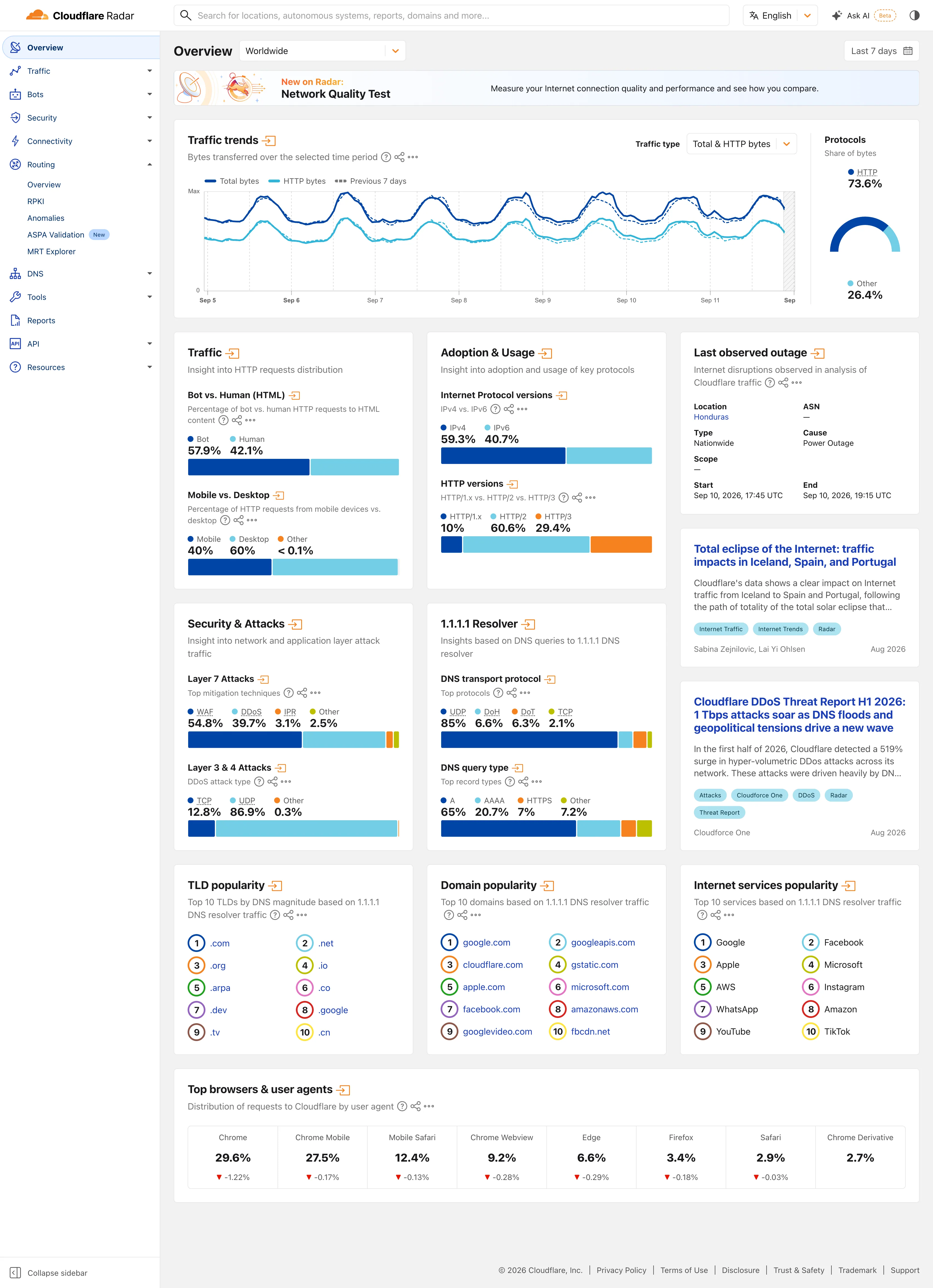
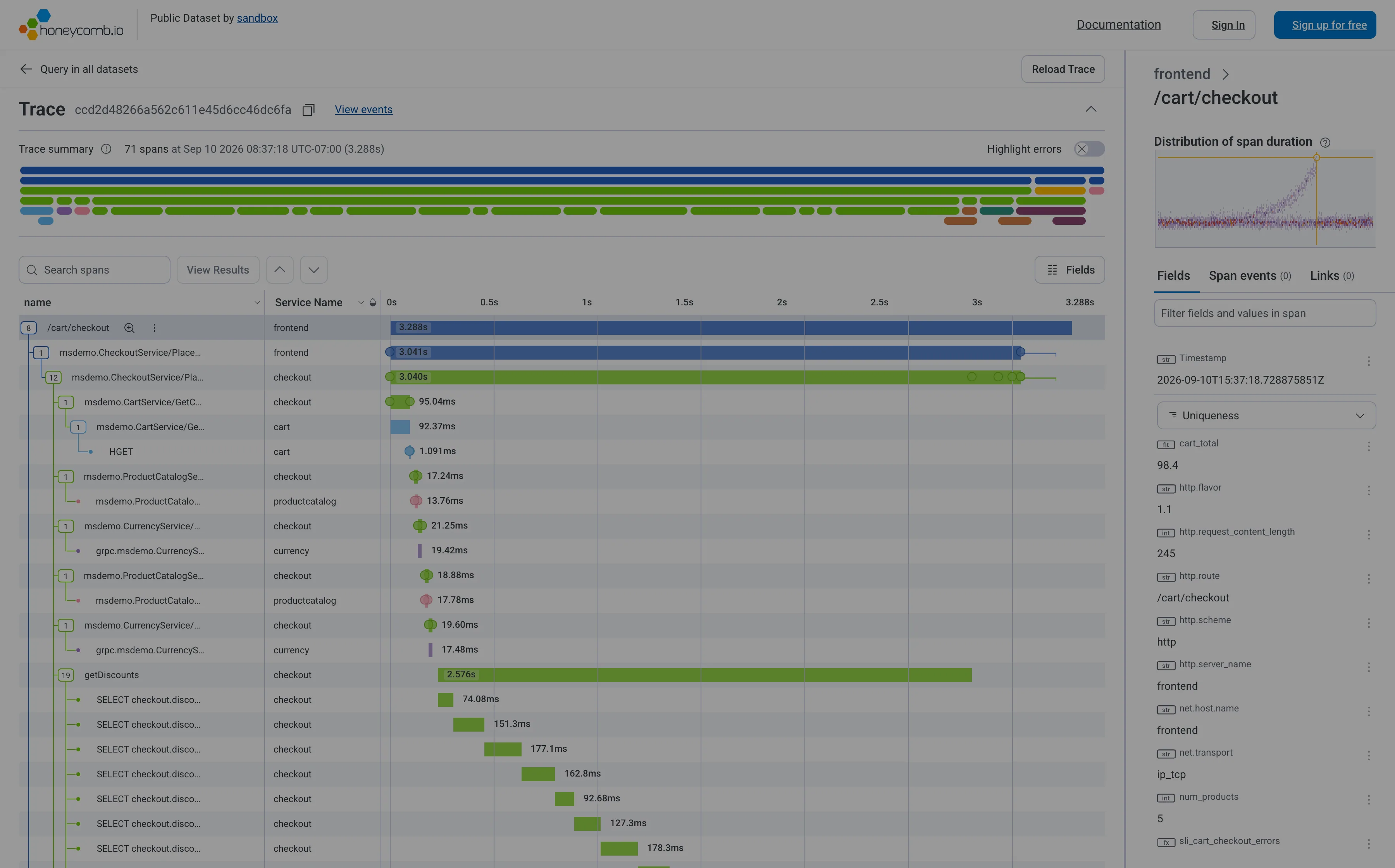
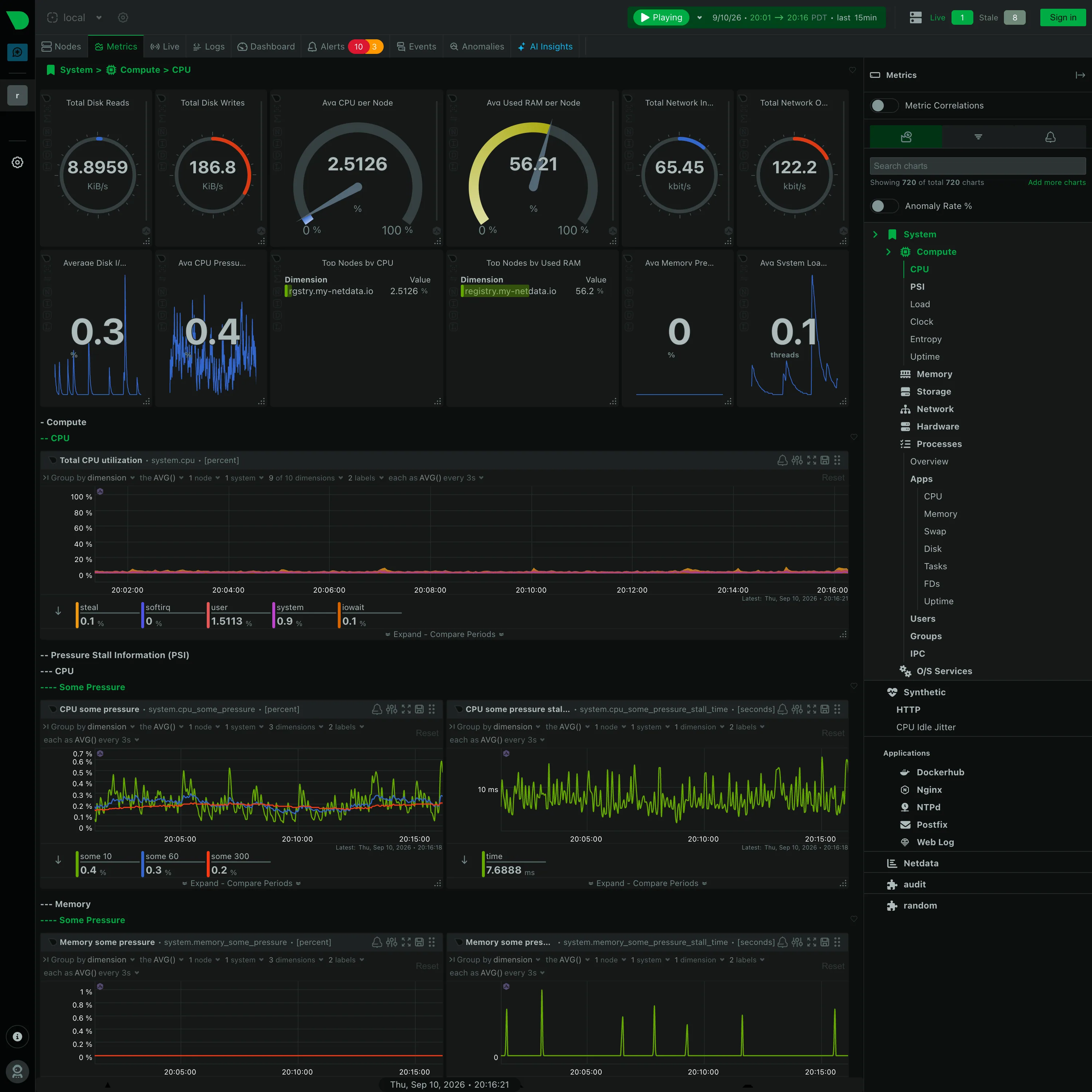
Datadog runs the pattern across products rather than within one dashboard: host map to host to process to trace, each hop carrying tags forward so the scope narrows rather than resetting. Sentry makes the hierarchy the data model—project, issue, event, trace—so the levels are objects with URLs rather than dashboards someone assembled, and the back button behaves. Netdata goes fleet overview to node to chart, with the node level being the same dashboard scoped, which keeps the vocabulary identical at every level. Grafana has no built-in hierarchy at all: levels are separate dashboards wired together by data links, which is fully flexible and means the coherence of the path is entirely a matter of whether one person thought it through. Cloudflare Radar uses it as an index rather than a drill. Each panel summarises a different topic and its arrow opens that topic’s own page, so the second level is a new subject rather than a narrowed view of the first. The overview becomes a table of contents, which only works because no scope is being carried down.
Related
Drill-down is the mechanism this structure is made of. Host map is a common top level. Sidebar and canvas is how the levels stay reachable without a full traversal. Ranked list is often the overview that actually works. Multi-page dashboard is the flatter alternative when the levels are parallel rather than nested.