Plausible Analytics
One column, top to bottom, where the metric row doubles as the chart's control. The clearest working argument that a dashboard can have exactly one interaction.
plausible.io , opens in a new tab Live demo , opens in a new tab
Patterns seen here 7
Captures
1 capture, newest first. Hover any box for the pattern and the note.
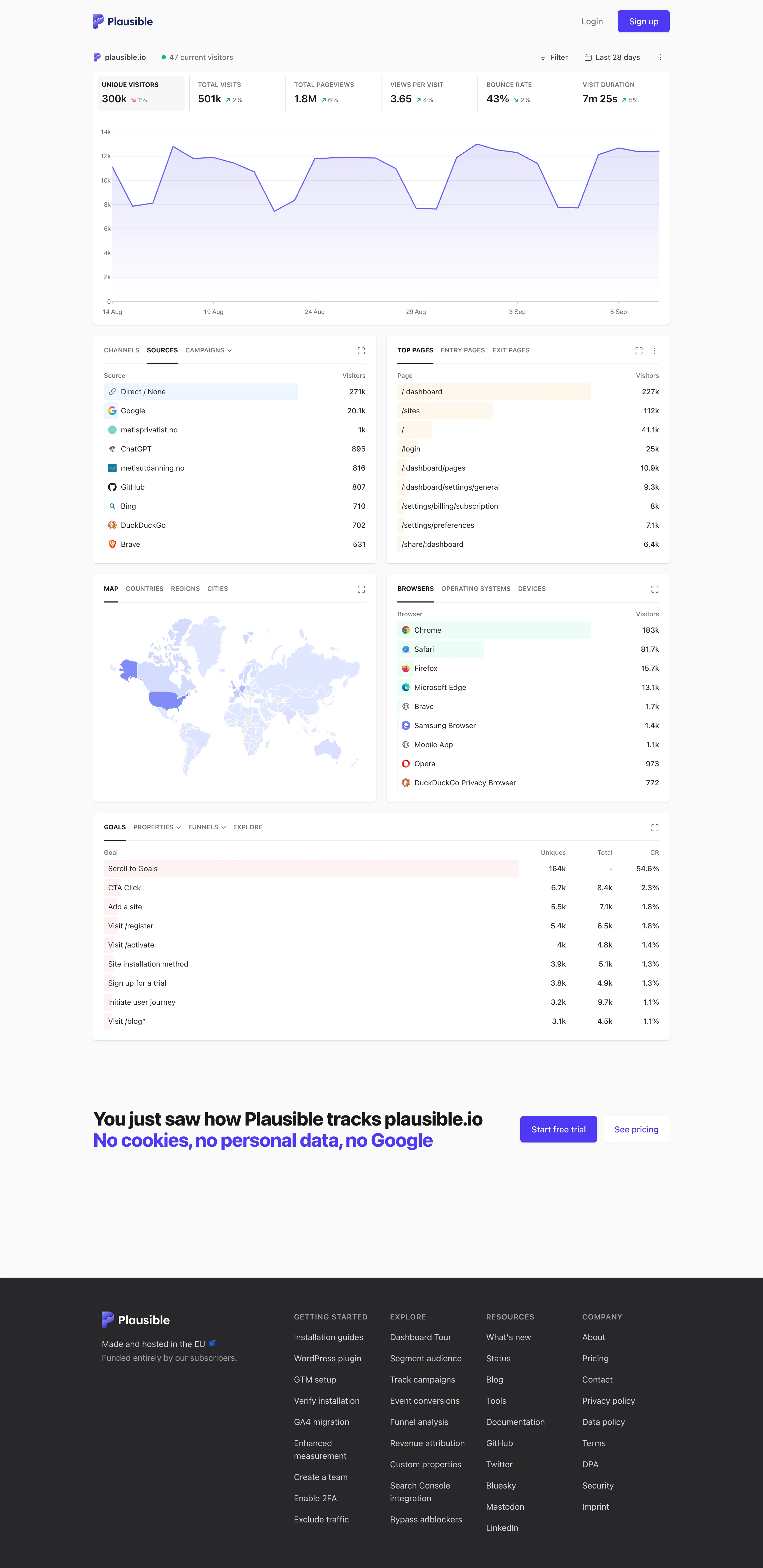
Single-column narrative. One column, top to bottom, no panel arrangement and nothing to configure before reading starts. Overview then detail. The decomposition: sources, pages, geography, browsers, goals. Same subject, narrowed, no navigation. Ranked list. Sorted with an in-row bar, no share of total and no other row. Direct 271k versus Google 25.1k, out of what? Geo map with markers. A choropleth pale enough that every country but one reads as the same white. Raw counts, unnormalised. Header KPI strip. Six tiles sharing one anatomy, each with a delta. The boxed one is selected, and the chart below plots it. Ratio and rate. Bounce rate 43%, with the denominator two tiles away and the window only in the header. Tabs as genres. Tabs inside the panel—channels, sources, campaigns—so one card answers three questions in one slot.
- Single-column narrative One column, top to bottom, no panel arrangement and nothing to configure before reading starts.
- Header KPI strip Six tiles sharing one anatomy, each with a delta. The boxed one is selected, and the chart below plots it.
- Ratio and rate Bounce rate 43%, with the denominator two tiles away and the window only in the header.
- Overview then detail The decomposition: sources, pages, geography, browsers, goals. Same subject, narrowed, no navigation.
- Ranked list Sorted with an in-row bar, no share of total and no other row. Direct 271k versus Google 25.1k, out of what?
- Geo map with markers A choropleth pale enough that every country but one reads as the same white. Raw counts, unnormalised.
- Tabs as genres Tabs inside the panel—channels, sources, campaigns—so one card answers three questions in one slot.