Cloudflare Radar
A public dashboard with no account, no filters worth the name, and an audience of journalists. Designed for people who will read one number and leave.
radar.cloudflare.com , opens in a new tab Live demo , opens in a new tab
Patterns seen here 9
Captures
2 captures, newest first. Hover any box for the pattern and the note.
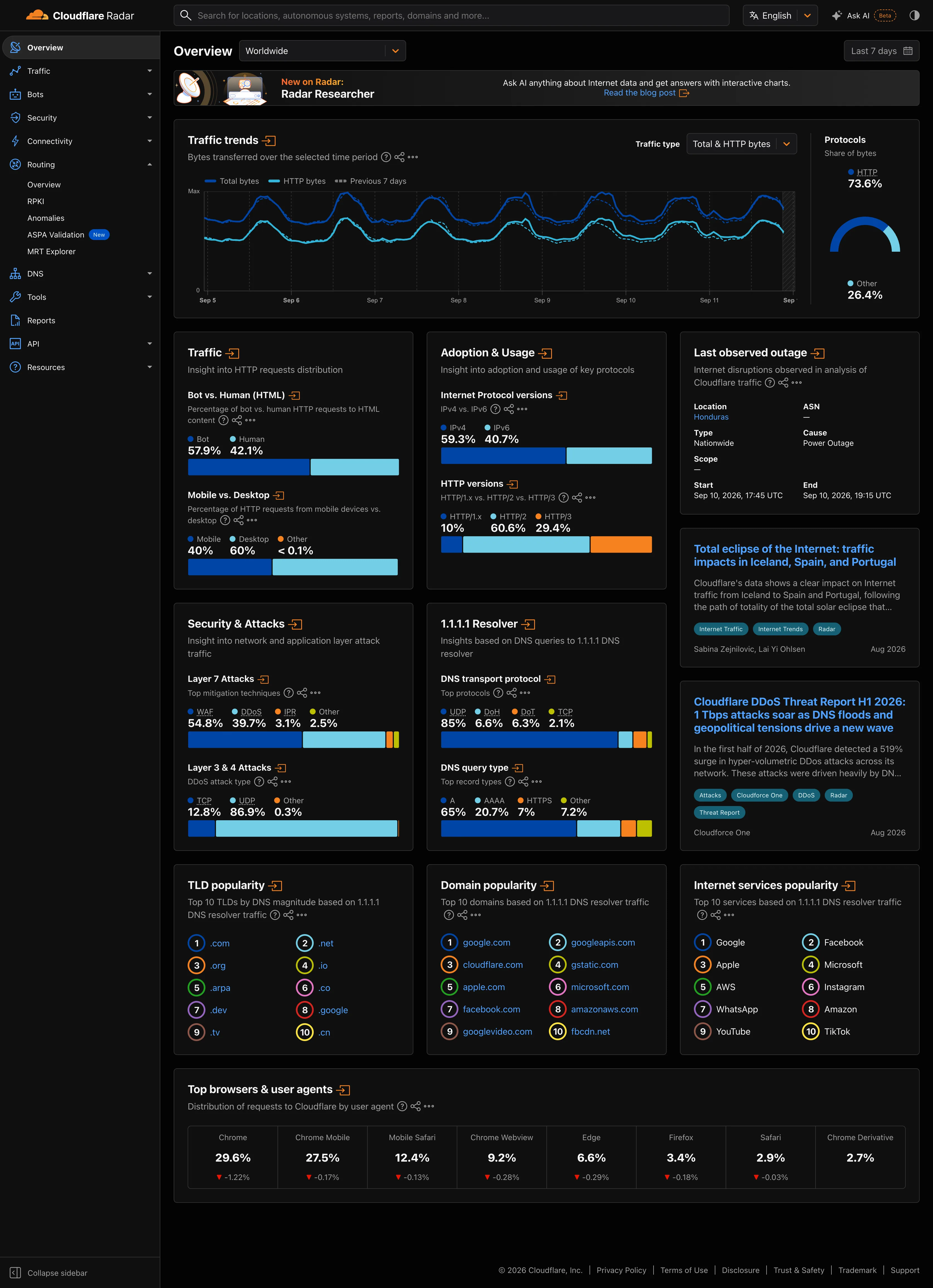
Dark-first data palette. Same two hues as the light capture. On charcoal the darker series is the one fighting the ground. Delta indicator. The one colour that reads the same on both grounds, because it is carrying meaning rather than identity. Categorical series palette. Four categories, four fixed hues, held across both grounds. Which one dominates the eye is not held.
- Dark-first data palette Same two hues as the light capture. On charcoal the darker series is the one fighting the ground.
- Categorical series palette Four categories, four fixed hues, held across both grounds. Which one dominates the eye is not held.
- Delta indicator The one colour that reads the same on both grounds, because it is carrying meaning rather than identity.
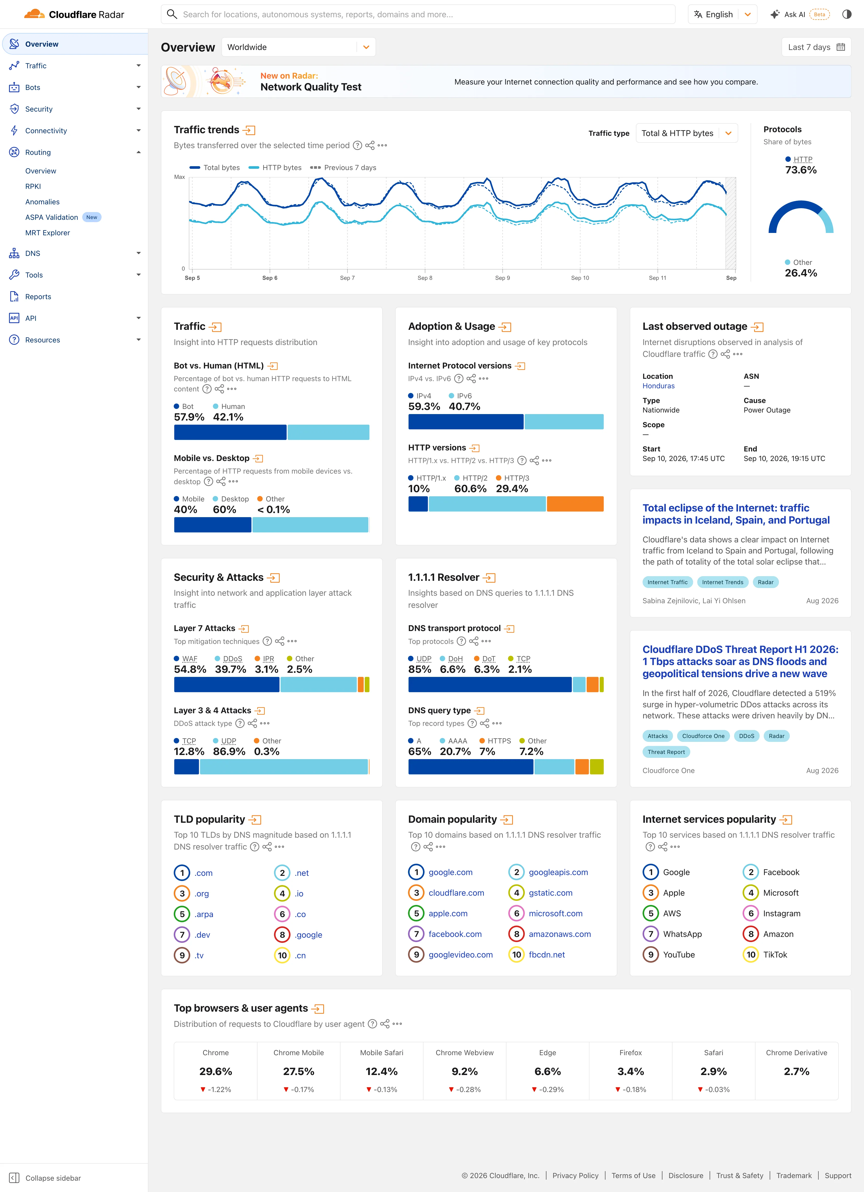
Multi-page dashboard. Eleven sections behind one rail, with the open one expanded in place. Radar is a site of dashboards, not a dashboard. Compare periods. The dotted series is the previous seven days, drawn on the same axis rather than beside it. Delta indicator. Eight shares with their change under them, all of them fractions of a point, which tells you how still this data is. Overview then detail. Two summaries and an arrow each. The panel exists to tell you whether the full page is worth opening. Ratio and rate. Shares only, never counts, and both sides of the split are named so the denominator is never in doubt. Stacked composition. Four mitigation techniques to 100%. The bar is almost redundant next to the printed figures, which is the point. Ranked list. A top ten with no magnitudes at all. The rank is the whole finding.
- Multi-page dashboard Eleven sections behind one rail, with the open one expanded in place. Radar is a site of dashboards, not a dashboard.
- Compare periods The dotted series is the previous seven days, drawn on the same axis rather than beside it.
- Overview then detail Two summaries and an arrow each. The panel exists to tell you whether the full page is worth opening.
- Ratio and rate Shares only, never counts, and both sides of the split are named so the denominator is never in doubt.
- Stacked composition Four mitigation techniques to 100%. The bar is almost redundant next to the printed figures, which is the point.
- Ranked list A top ten with no magnitudes at all. The rank is the whole finding.
- Delta indicator Eight shares with their change under them, all of them fractions of a point, which tells you how still this data is.