A public dashboard with no account, no filters worth the name, and an audience of journalists. Designed for people who will read one number and leave.
Security · Infrastructure and FinOpsSecurity
Signals, alerts, and the ones nobody has looked at yet. A backlog display as much as a monitoring one.
Products 3
Everything on one surface, which makes it the best place to see what a page looks like when the product refuses to choose between metrics, logs, traces and cost.
Observability · Infrastructure and FinOps · SecurityQuery-first rather than panel-first: the search bar is the primary control and the charts are downstream of it, which inverts Grafana's arrangement.
Observability · SecurityPatterns seen in this domain 21
- Annotation
- Categorical series palette
- Compare periods
- Dark-first data palette
- Data table
- Delta indicator
- Detail on demand
- Filter bar
- Header KPI strip
- Histogram and distribution
- Multi-page dashboard
- Overview then detail
- Panel grid
- Ranked list
- Ratio and rate
- Search across panels
- Semantic grouping
- Share and embed
- Stacked composition
- Time-range picker
- Two-pane list and detail
Captures
Newest first within each product.
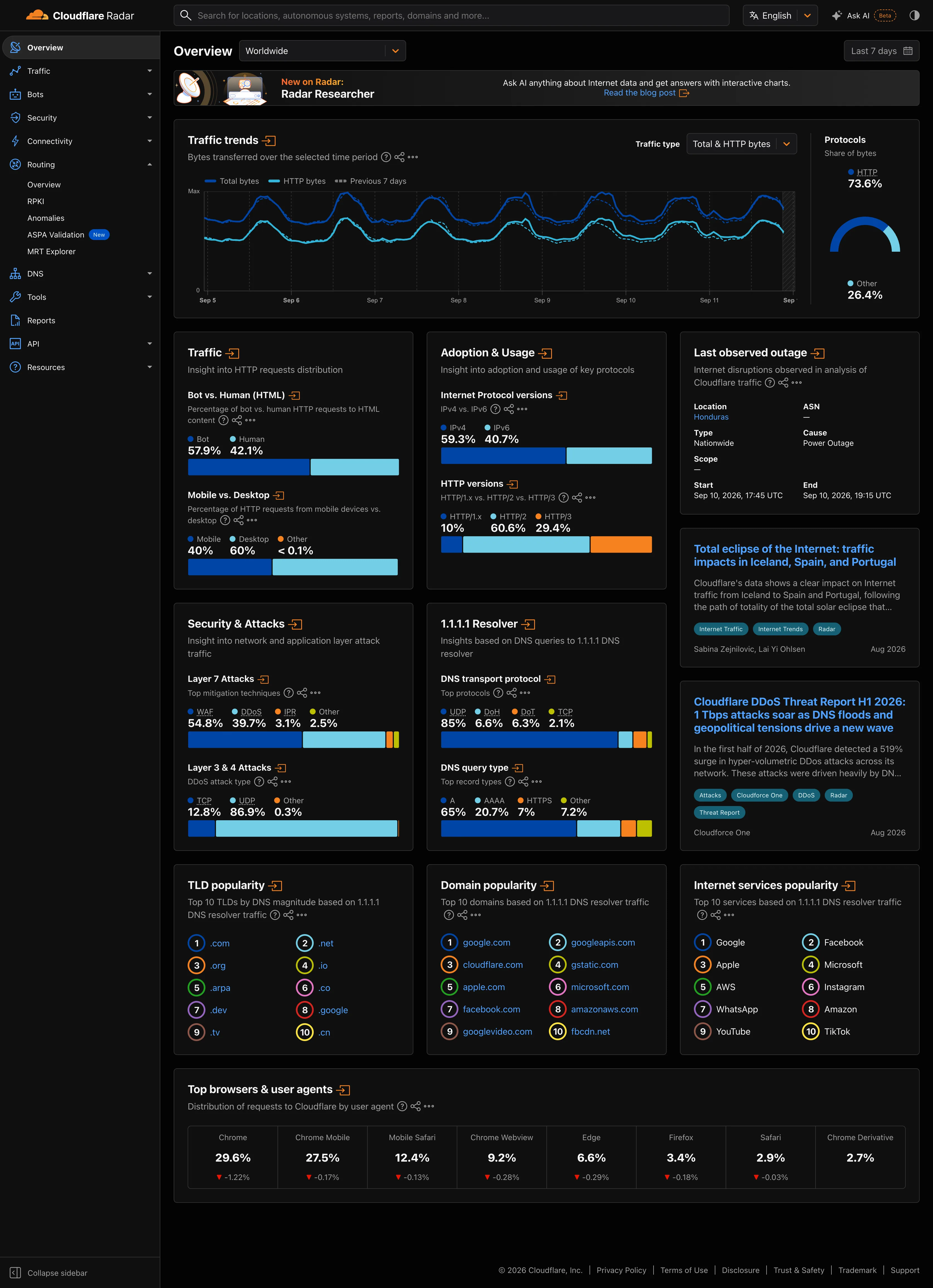
Dark-first data palette. Same two hues as the light capture. On charcoal the darker series is the one fighting the ground. Delta indicator. The one colour that reads the same on both grounds, because it is carrying meaning rather than identity. Categorical series palette. Four categories, four fixed hues, held across both grounds. Which one dominates the eye is not held.
- Dark-first data palette Same two hues as the light capture. On charcoal the darker series is the one fighting the ground.
- Categorical series palette Four categories, four fixed hues, held across both grounds. Which one dominates the eye is not held.
- Delta indicator The one colour that reads the same on both grounds, because it is carrying meaning rather than identity.
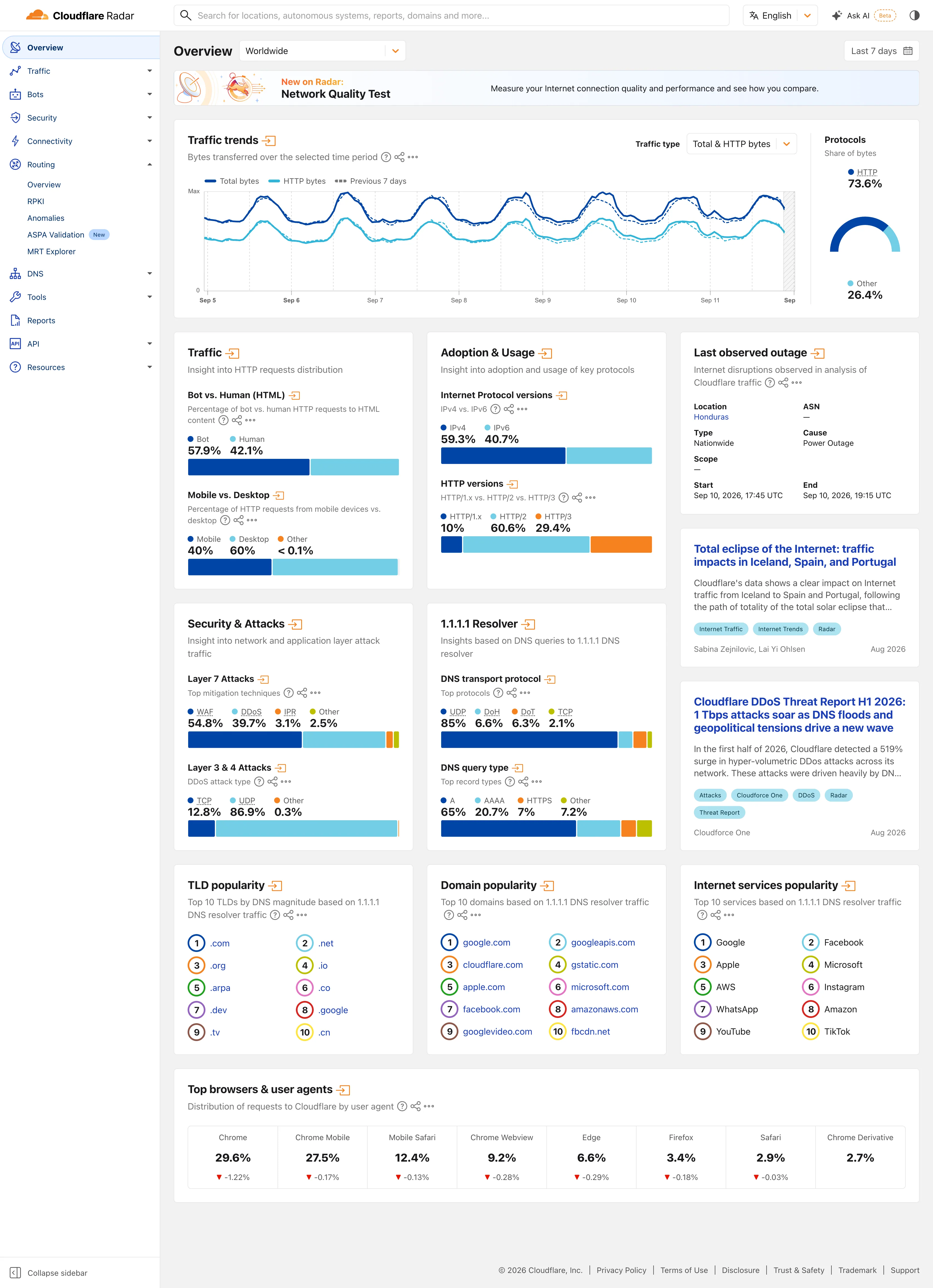
Multi-page dashboard. Eleven sections behind one rail, with the open one expanded in place. Radar is a site of dashboards, not a dashboard. Compare periods. The dotted series is the previous seven days, drawn on the same axis rather than beside it. Delta indicator. Eight shares with their change under them, all of them fractions of a point, which tells you how still this data is. Overview then detail. Two summaries and an arrow each. The panel exists to tell you whether the full page is worth opening. Ratio and rate. Shares only, never counts, and both sides of the split are named so the denominator is never in doubt. Stacked composition. Four mitigation techniques to 100%. The bar is almost redundant next to the printed figures, which is the point. Ranked list. A top ten with no magnitudes at all. The rank is the whole finding.
- Multi-page dashboard Eleven sections behind one rail, with the open one expanded in place. Radar is a site of dashboards, not a dashboard.
- Compare periods The dotted series is the previous seven days, drawn on the same axis rather than beside it.
- Overview then detail Two summaries and an arrow each. The panel exists to tell you whether the full page is worth opening.
- Ratio and rate Shares only, never counts, and both sides of the split are named so the denominator is never in doubt.
- Stacked composition Four mitigation techniques to 100%. The bar is almost redundant next to the printed figures, which is the point.
- Ranked list A top ten with no magnitudes at all. The rank is the whole finding.
- Delta indicator Eight shares with their change under them, all of them fractions of a point, which tells you how still this data is.
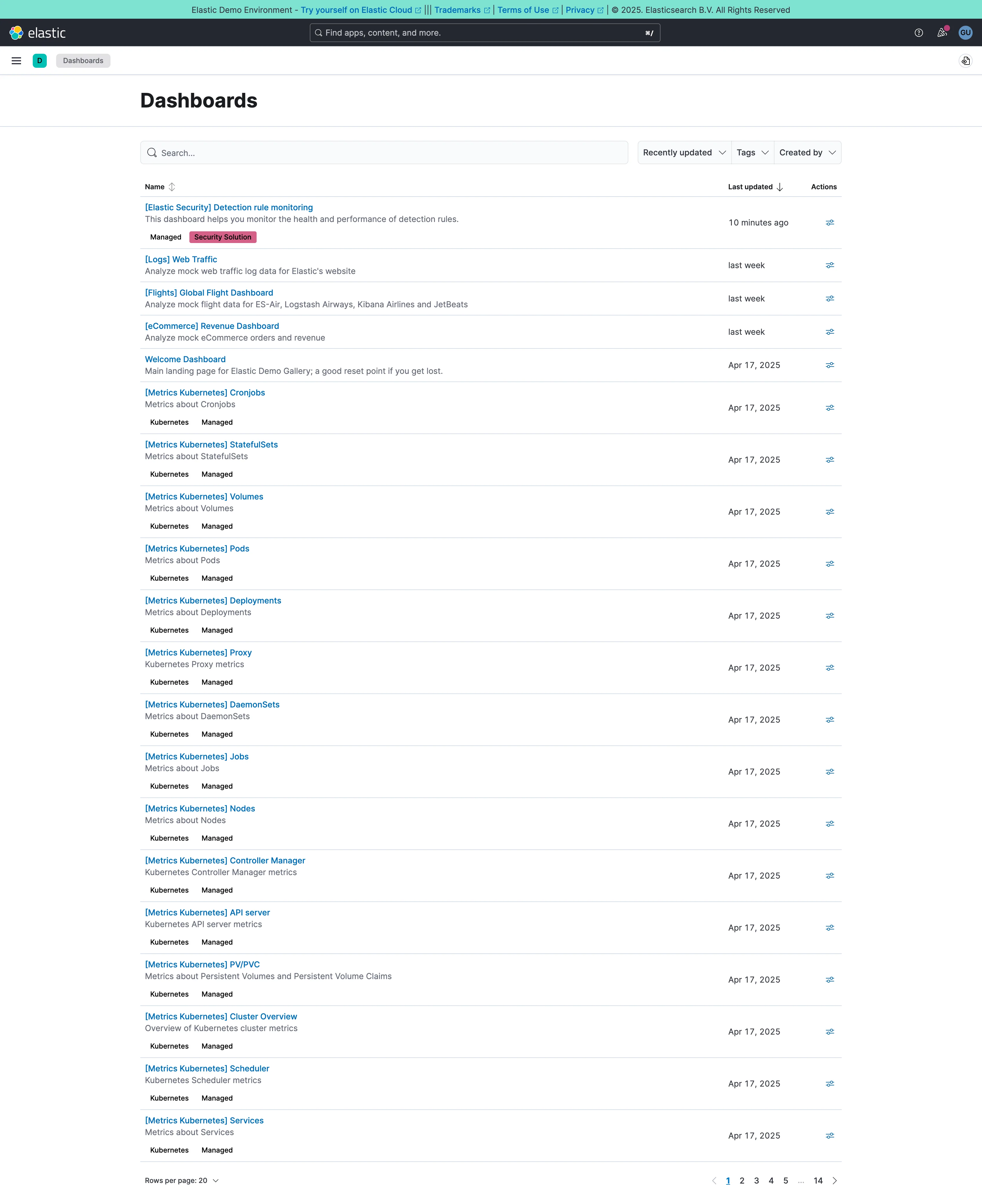
Multi-page dashboard. A set of peers with no landing page. Fourteen pages of them, and nothing says which is the one the team uses. Data table. Name, description, last updated, actions. The description column is what makes this a list you can read rather than scan. Search across panels. Past about fifty dashboards this is the navigation and the list below it is a filing system nobody browses. Semantic grouping. Tags and a bracket prefix standing in for folders, which is what keeps 250 generated pages out of the way.
- Multi-page dashboard A set of peers with no landing page. Fourteen pages of them, and nothing says which is the one the team uses.
- Search across panels Past about fifty dashboards this is the navigation and the list below it is a filing system nobody browses.
- Semantic grouping Tags and a bracket prefix standing in for folders, which is what keeps 250 generated pages out of the way.
- Data table Name, description, last updated, actions. The description column is what makes this a list you can read rather than scan.
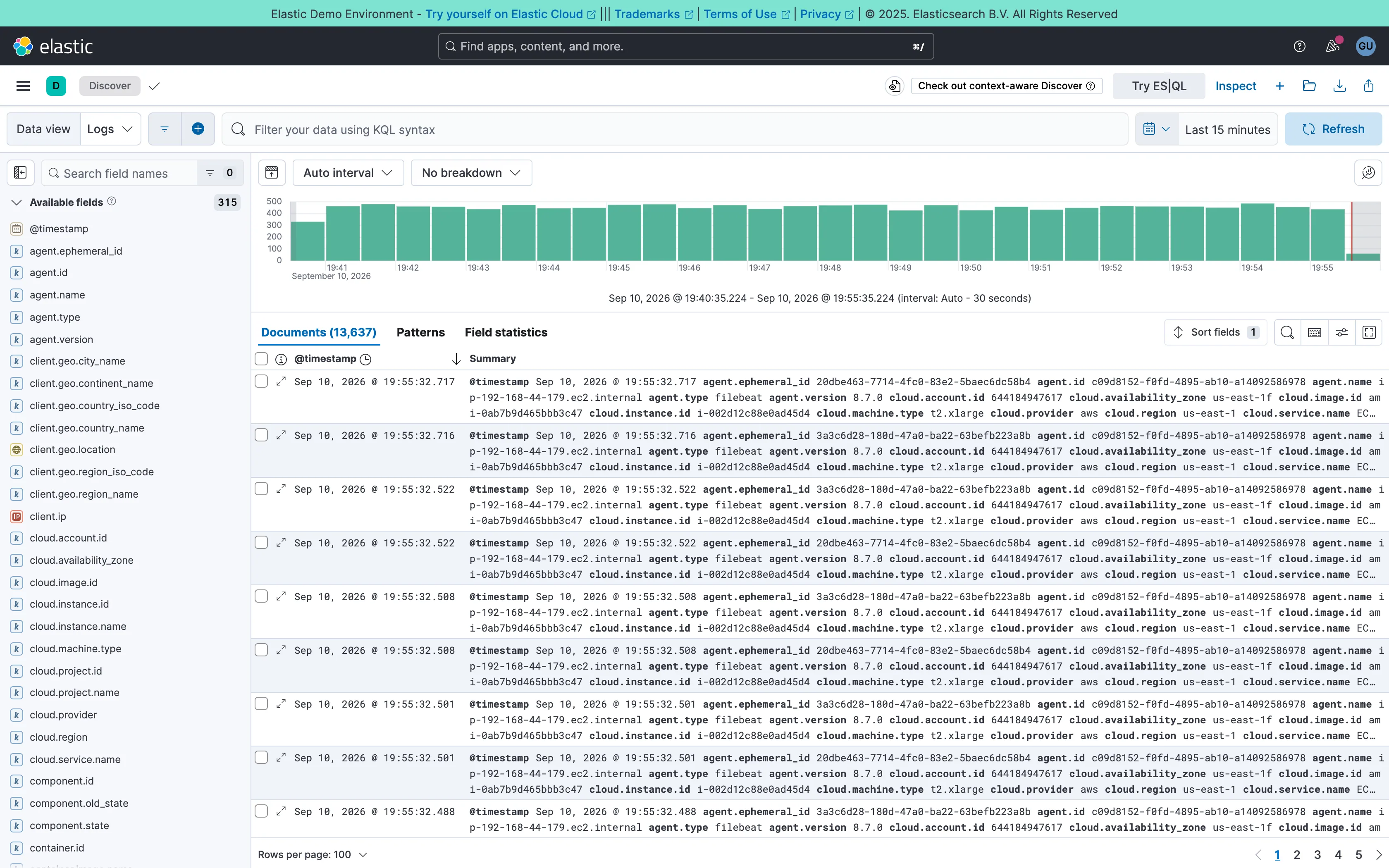
Two-pane list and detail. Fields on the left, records on the right, both on screen at once. The oldest working shape for a queue there is. Data table. One column called Summary holding every field on the record. Complete, and unreadable at a glance. Histogram and distribution. Volume over the window at a 30-second auto interval. The final bar is the bucket still filling, and it always reads low. Filter bar. A query language in the bar rather than chips. Powerful, and it hides what's applied from anyone who didn't type it. Detail on demand. An expander on every row. Inline rather than a side panel, so it pushes the rest of the list down. Time-range picker. Relative by default, with the refresh control beside it rather than buried in a settings menu. Search across panels. 315 fields, so the sidebar opens with a filter box. Past a certain count a tree is a filing system nobody browses.
- Two-pane list and detail Fields on the left, records on the right, both on screen at once. The oldest working shape for a queue there is.
- Detail on demand An expander on every row. Inline rather than a side panel, so it pushes the rest of the list down.
- Data table One column called Summary holding every field on the record. Complete, and unreadable at a glance.
- Search across panels 315 fields, so the sidebar opens with a filter box. Past a certain count a tree is a filing system nobody browses.
- Filter bar A query language in the bar rather than chips. Powerful, and it hides what's applied from anyone who didn't type it.
- Time-range picker Relative by default, with the refresh control beside it rather than buried in a settings menu.
- Histogram and distribution Volume over the window at a 30-second auto interval. The final bar is the bucket still filling, and it always reads low.
![Kibana — Dashboards / [Flights] Global Flight Dashboard](/captures/kibana/flights-dashboard-2026-09.webp)
Panel grid. Twelve columns, and the biggest panel is a table rather than the headline chart. Size isn't carrying priority here. Ratio and rate. Delay rates up to 100% with no denominator anywhere. One flight and a thousand flights render identically. Stacked composition. Stacked to 100%, so the total is discarded on purpose and only the mix of delay types remains. Annotation. Event markers along the top of the series, numbered and grouped, on the data's own axis. Header KPI strip. Five tiles in three different sizes and two different layouts, so the row reads as five things. Compare periods. "vs 1 week earlier, 76.9%"—the comparison base is named and the expression isn't. Filter bar. Declared controls under the query bar: two pickers and a price range. Both mechanisms on screen at once. Share and embed. Share, export and full-screen in the header. Whether the range and filters travel with them is the whole question.
- Ratio and rate Delay rates up to 100% with no denominator anywhere. One flight and a thousand flights render identically.
- Compare periods "vs 1 week earlier, 76.9%"—the comparison base is named and the expression isn't.
- Share and embed Share, export and full-screen in the header. Whether the range and filters travel with them is the whole question.
- Filter bar Declared controls under the query bar: two pickers and a price range. Both mechanisms on screen at once.
- Panel grid Twelve columns, and the biggest panel is a table rather than the headline chart. Size isn't carrying priority here.
- Stacked composition Stacked to 100%, so the total is discarded on purpose and only the mix of delay types remains.
- Annotation Event markers along the top of the series, numbered and grouped, on the data's own axis.
- Header KPI strip Five tiles in three different sizes and two different layouts, so the row reads as five things.