Problem
Traffic is down 30% this morning. That is either an incident or a Monday, and the current chart cannot tell the difference because it only shows now.
Solution
Draw the comparison period on the same axes. Same shape, same scale, offset in time, usually rendered ghosted or dashed so the current period stays dominant.
The comparison base is the entire design decision, and there are only a few honest choices.
Immediately previous period suits things without a cycle. Fine for a quarterly total, wrong for anything with a weekly rhythm, because yesterday was Sunday.
Same period last week is the workhorse for anything human-driven, since it aligns day of week and time of day, which are the two strongest cycles in most product data.
Same period last year aligns season and holiday, and misaligns day of week, which is why year-over-year charts have a characteristic weekly wobble that people mistake for signal.
None of them handle moving holidays, and every one of them breaks in the week after a clock change.
Grafana’s implementation of this is time shift, applied per panel relative to the dashboard’s range. That per-panel scoping is worth noticing, because it is also the trap: a dashboard where one panel is shifted and the others are not looks entirely normal and is comparing different things.
The rendering matters more than it seems. Two lines of equal weight produce a chart where the viewer has to keep checking which is which. The comparison should be quieter than the present—thinner, dashed, greyed—so the current period reads first and the past reads as context.
Use when
The metric has a cycle, the audience needs to judge whether today is unusual, and a single number’s delta is not enough because the shape matters.
Don’t use when
The underlying population changed. Comparing this week against last week is meaningless if a marketing campaign doubled acquisition in between, and the chart will look like a product improvement. Also skip it where an anomaly band already encodes expected range more compactly.
Trade-offs
Every comparison doubles the ink on the chart and roughly doubles the query cost. The base period is a choice that is rarely displayed, so two people can read the same chart under different assumptions. Comparisons invite over-reading of small differences—a 4% gap against last Tuesday is usually noise, and drawn as two visibly separated lines it does not look like noise. And clock changes, leap days and moving holidays produce annual artefacts that get explained as business events.
Checklist
- What is the comparison base, and is it stated on the chart?
- Does the base align day of week, or does it manufacture a weekly cycle?
- Is the comparison rendered subordinate to the current period?
- Is only some of the page shifted, and would anyone notice?
- Did the underlying population change between the periods?
- How are clock changes, leap days and moving holidays handled?
- Is the difference also available as a number, not only as two lines?
- Is a 4% gap distinguishable from normal variation, and does anything say so?
- Does the comparison survive a time-range change, and does it rescale sensibly?
- Would an anomaly band say the same thing with half the ink?
Compare
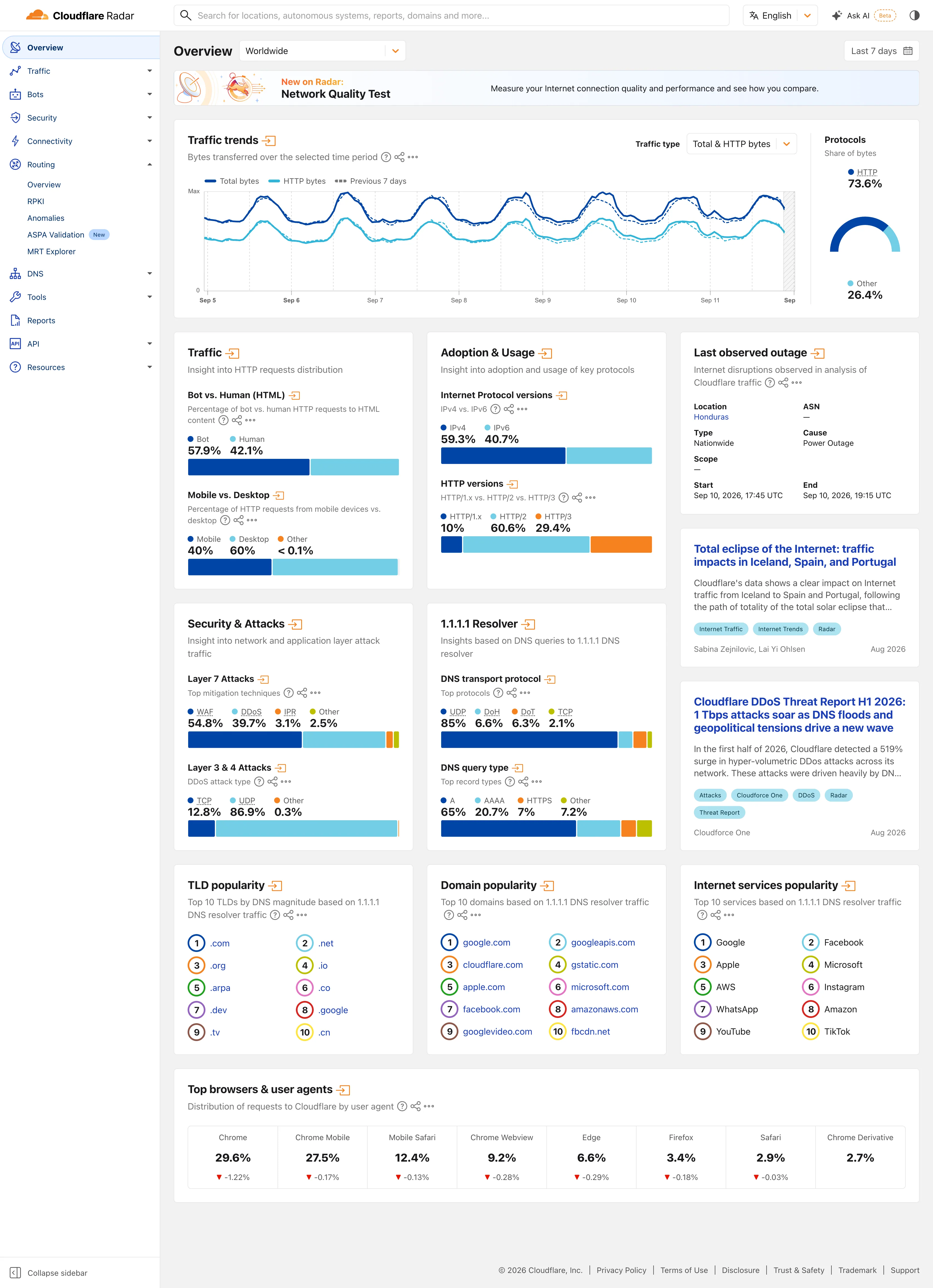
Grafana implements this as a per-panel time shift relative to the dashboard range, which is flexible and lets one panel silently compare a different window from its neighbours. Plausible and similar analytics tools make period comparison a page-level toggle, so every number and chart shifts together and the base is displayed once where it cannot be missed. Datadog offers explicit day-before, week-before and month-before overlays as graph options, naming the base in the UI rather than expressing it as an offset someone has to decode. Amplitude pushes past overlays into cohort comparison, which answers the population-changed objection this pattern otherwise has no response to. Cloudflare Radar draws the previous period as a dotted line on the same axis by default, with no control to turn it off. The comparison is how the chart is drawn rather than a feature a viewer has to find, which is the one arrangement where nobody forgets to switch it on.
Related
Delta indicator is this comparison reduced to a single badge, and inherits every base-period problem. Time-range picker sets the current window the comparison is relative to. Cohort grid is the rigorous answer when the population itself changes between periods. Anomaly band encodes “normal for this hour” more compactly. Time series is the chart both periods are drawn on.
![Kibana — Dashboards / [Flights] Global Flight Dashboard](/captures/kibana/flights-dashboard-2026-09.webp)