Skip to content
KONIGI

Dashboards / Product mechanics / Error and stale state

6 of 10

Error and stale state

One panel's query failed and the viewer must not mistake it for a zero.

Updated September 10, 2026

Problem

The error-rate panel shows zero. Either nothing is failing, or the thing that counts failures is itself down. Those are opposite conclusions and the panel looks identical for both.

Solution

Make failure loud, and make degraded distinct from both healthy and empty. Three states have to be separable on sight: this is fine, this is nothing, this is broken.

The distinction the pattern exists for is that a failed query has no value, and any rendering that produces a number is a lie. A panel that falls back to zero, or holds the last value silently, or averages across a gap, has manufactured data. On an error-rate panel that manufactured value reads as good news.

Staleness is the harder half, because it degrades rather than breaks. Prometheus is precise about the mechanics: an instant query returns the newest sample less than the lookback period ago, five minutes by default, so a metric that stopped arriving four minutes ago still renders and looks current. Past that, a target that went away has its series marked stale, no value is returned, and it disappears from the graph at its last collected sample. Absence is at least visible. The dangerous window is the one in between.

Grafana’s alerting side shows what taking this seriously looks like: No Data is a distinct state with four explicit mappings—Set No Data state, Set Alerting state, Set Normal state, Keep last state—and the default creates a DatasourceNoData instance rather than treating silence as health. The same rigour rarely reaches the panel, where a missing value renders as a hyphen.

Partial failure needs its own answer. A panel querying six series where two sources failed is showing a real chart of incomplete data, which is the most persuasive wrong answer a dashboard can produce. The panel has to say four of six, and it usually says nothing.

NN/g’s first heuristic covers the whole family: keep people informed about what is going on, with appropriate feedback, in reasonable time. A degraded panel that says nothing is failing that in the case where it matters most.

Use when

Always, on anything queried. Especially on any panel whose healthy state is a low number or a zero, where a failure and good news look the same.

Don’t use when

There is no case for skipping it. The only real decision is loudness, and that scales with consequence: a degraded panel on a wallboard driving on-call decisions needs to be unmissable, while one on an exploratory page can be quieter.

Trade-offs

Error states cost space and get designed last, so they are usually a tooltip on an icon nobody hovers. Loud failure on a flaky source produces a page that cries wolf, and viewers learn to ignore the error styling. Holding the last known value is genuinely useful and genuinely dangerous, and the only safe version is one clearly labelled as last-known with its age. And distinguishing all the states—loading, empty, partial, stale, failed—takes five designs for a panel most people only ever design one state of.

Checklist

  • Can a failed query ever render as a number, including as zero?
  • Is stale visually distinct from current, and does the panel say how old?
  • What is the staleness window, and does the display know it?
  • On partial failure, does the panel say how many series are missing?
  • Is error distinguishable from empty, and empty from healthy-zero?
  • Does the error say what failed and what to do, or only that something did?
  • Does the failure state survive being seen from across a room?
  • If the last known value is shown, is it labelled as such with a timestamp?
  • Does a panel failure surface anywhere other than the panel?
  • Does the alerting rule on this metric handle no-data the same way the panel does?

Compare

Grafana is two products on this question, and the gap is instructive. Its alerting side makes No Data an explicit four-way decision with a default that refuses to call silence healthy; its panel side renders a missing value as a hyphen by default. Prometheus solves the far end well with stale markers, so a departed target vanishes rather than flatlining, and leaves the five-minute middle to whoever builds the display. Datadog carries monitor status alongside the data so a degraded source can colour the panel from outside the query, rather than the panel having to infer trouble from its own empty result. Netdata makes staleness self-evident through motion: a per-second chart that stops moving is visibly stopped, which is the cheapest honest signal in this whole family.

Empty state is the sibling this pattern is most often confused with, and the confusion is the bug. Loading state is what precedes both. Freshness indicator answers “as of when” before the answer becomes “too old”. Data source badge says which source is the one that failed. Alert rule is what should fire when a panel has been in this state longer than anyone noticed.
Error and stale state anatomy Four renderings of the same panel: healthy, stale but still inside the lookback window and therefore still drawing, partially failed with four of six series present, and outright broken. The middle two are the ones that look fine. Four states, two of them look like the first Healthy 6 of 6 · 4s ago Stale last sample 4m ago Partial 4 of 6 series Broken query failed 1 2 3 4 1 THREE SEPARABLE ON SIGHT This is fine, this is nothing, this is broken. A failed query has no value, and any rendering that produces a number is a lie. 2 THE DANGEROUS WINDOW Inside the lookback period a metric that stopped four minutes ago still renders and still looks current. 3 PARTIAL IS THE WORST A real chart of incomplete data is the most persuasive wrong answer a panel can give. It has to say four of six. It usually says nothing. 4 LOUD IS CORRECT Falling back to zero, holding the last value, or averaging across a gap all manufacture data. On an error panel that reads as good news. A dead target disappears from the graph. Absence is at least visible.
Wireframe — the pattern's anatomy, not any one product's version of it

Implementation

Three states that look alike and mean different things. A panel with no data because nothing matched, a panel showing a value nobody can vouch for, and a panel that broke. Collapsing them into one spinner is how a dashboard lies.

shadcn
npx shadcn@latest add card
Tokens
--card--muted-foreground--border--status-critical--state-stale--state-live

Healthy

6 of 6 · 4s ago

Stale

last sample 4m ago—collector is behind

Partial

4 of 6 series

Broken

query failed

PanelState.tsxA union, so a panel cannot be in an unnamed state.

/**
 * The states a panel can be in, as a closed union.
 *
 * `stale` is the one that gets lost. A panel showing a real number from twenty
 * minutes ago looks exactly like a panel showing a real number from four
 * seconds ago, and only one of them is safe to act on. Keeping the last good
 * value is right; keeping it unlabelled is not.
 */
export type PanelState =
  | { kind: "ok"; lastGoodAt: Date }
  | { kind: "loading" }
  | { kind: "empty"; because: string }
  | { kind: "stale"; lastGoodAt: Date; reason: string }
  | { kind: "partial"; have: number; of: number }
  | { kind: "error"; message: string; retry: () => void };

/** "4s ago", "4m ago". Relative, because the viewer wants age, not a clock. */
export function ago(then: Date, now: Date) {
  const s = Math.max(0, Math.round((now.getTime() - then.getTime()) / 1000));
  if (s < 60) return `${s}s ago`;
  if (s < 3600) return `${Math.round(s / 60)}m ago`;
  return `${Math.round(s / 3600)}h ago`;
}

/**
 * Every non-ok state owes the viewer a next action. An error with no retry, or
 * an empty with no explanation, is a dead end dressed as information.
 */
export function stateMessage(s: PanelState, now = new Date()): { text: string; tone: string } | null {
  switch (s.kind) {
    case "ok":
      return { text: ago(s.lastGoodAt, now), tone: "hsl(var(--muted-foreground))" };
    case "loading":
      return null;
    case "empty":
      return { text: `No data—${s.because}`, tone: "hsl(var(--muted-foreground))" };
    case "stale":
      return { text: `last sample ${ago(s.lastGoodAt, now)}—${s.reason}`, tone: "hsl(var(--state-stale))" };
    case "partial":
      return { text: `${s.have} of ${s.of} series`, tone: "hsl(var(--state-stale))" };
    case "error":
      return { text: s.message, tone: "hsl(var(--status-critical))" };
  }
}

demo.tsxHow it is called: four panels, one per state, each saying in words what its picture cannot.

import { Sparkline } from "../sparkline/Sparkline";
import { stateMessage, type PanelState } from "./PanelState";

/**
 * Four panels in four states. The middle two are the ones that look fine: a
 * stale panel still draws and a partial one still draws, so each says in
 * words what its picture cannot. The clock is fixed for the server.
 */
const NOW = new Date("2026-09-15T09:00:00Z");
const SERIES = [40, 34, 38, 22, 28, 18];

const PANELS: { title: string; state: PanelState; values: number[] }[] = [
  { title: "Healthy", state: { kind: "ok", lastGoodAt: new Date(NOW.getTime() - 4_000) }, values: SERIES },
  { title: "Stale", state: { kind: "stale", lastGoodAt: new Date(NOW.getTime() - 240_000), reason: "collector is behind" }, values: SERIES.slice(0, 5) },
  { title: "Partial", state: { kind: "partial", have: 4, of: 6 }, values: SERIES },
  { title: "Broken", state: { kind: "error", message: "query failed", retry: () => {} }, values: [] },
];

function Panel({ title, state, values }: (typeof PANELS)[number]) {
  const msg = stateMessage(state, NOW);
  const flagged = state.kind === "stale" || state.kind === "partial";
  return (
    <div className={`rounded-lg border bg-card p-3 ${flagged ? "border-2 border-state-stale" : ""}`}>
      <p className="border-b pb-1.5 text-[11px] uppercase tracking-wide text-muted-foreground">{title}</p>
      <div className="mt-2 h-11 text-muted-foreground">
        {values.length > 1 && <Sparkline values={values} width={120} height={44} />}
      </div>
      {msg && (
        <p className="mt-2 text-[10px] tabular-nums" style={{ color: msg.tone }}>
          {state.kind === "ok" ? `6 of 6 · ${msg.text}` : msg.text}
        </p>
      )}
      {state.kind === "error" && (
        <button className="mt-1 text-[10px] underline underline-offset-2" onClick={state.retry}>retry</button>
      )}
    </div>
  );
}

export default function Demo() {
  return (
    <div className="grid grid-cols-4 gap-4">
      {PANELS.map((p) => <Panel key={p.title} {...p} />)}
    </div>
  );
}
What it renders. Identical markup in both panes, with only the token values changing.

Examples

Captures whose hotspots reference this pattern, grouped by product and dated. The dashed boxes are this pattern; hover any box for the note.

Grafana

The reference implementation for panel grids, template variables, and stat panels; most other tools are defined by how they differ from it.

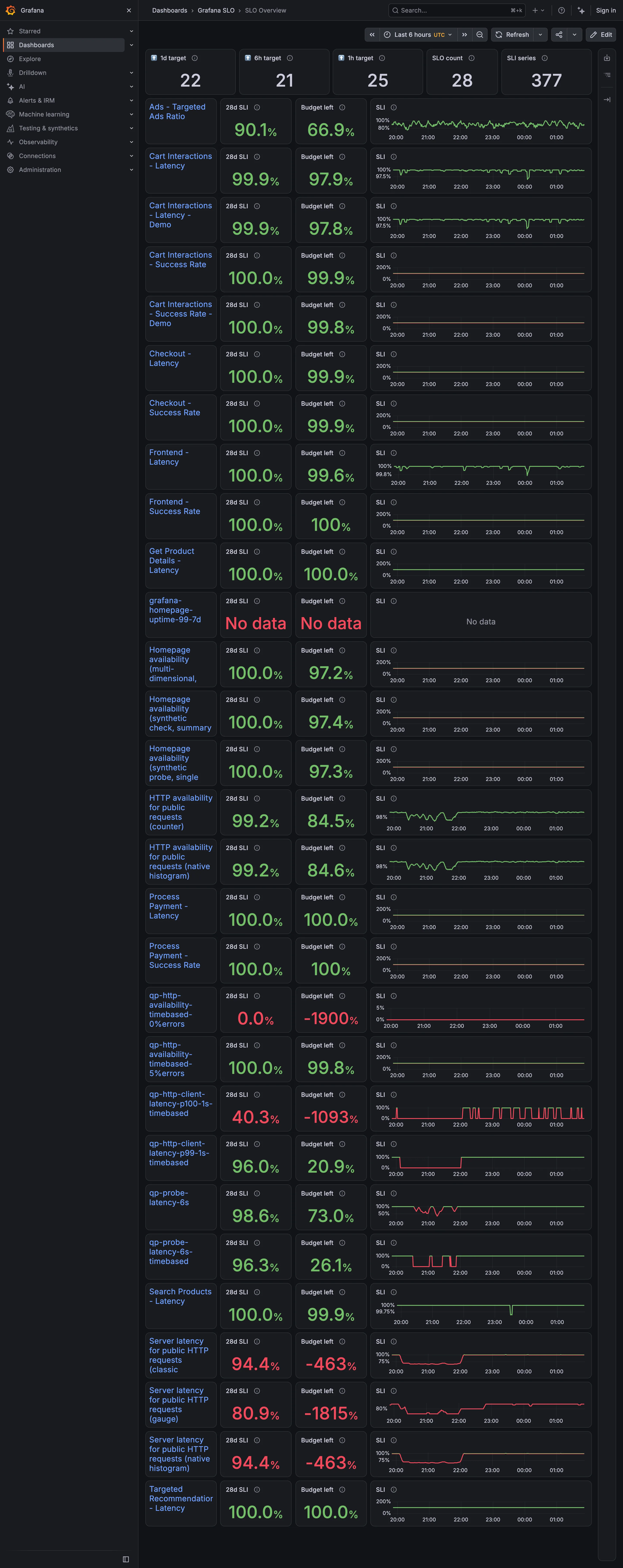
Grafana SLO / SLO Overview September 10, 2026 Grafana Play (signed out; no version string exposed) dense · dark · desktop-web
Twenty-eight objectives, each a row carrying a 28-day indicator, the budget remaining, and a sparkline. The budget column is where it comes apart. Four rows read −1900%, −1815%, −1093% and −463%. A budget is the amount of failure an objective permits, so it bottoms out at −100% and everything past that is the display reporting how wrong the target was rather than how broken the service is. Those four sit in the same column, in the same type, as a row reading 99.8%. Two rows above them an objective reports "No data" in the same red, which is a third thing again and looks like the second. Meanwhile eleven rows sit at exactly 100.0% with a full budget—objectives that cannot fire. The sparkline column is scaled per row, so one row's axis runs 0 to 200% and its neighbour's runs 96 to 100, and the shapes are not comparable down the page even though the layout invites exactly that.
  • Metric targets The budget column: the derived quantity that turns a target from a binary into a rate.
  • Target and progress Budget left, −1900%. Past −100% the number is measuring the objective, not the service.
  • Error and stale state No data, in the same red as a breach. A third state wearing the second one's colour.
  • Small multiples A column of sparklines, each on its own axis. One runs 0–200%, the next 96–100%.
  • Header KPI strip Five tiles counting targets, objectives and series. None of them says whether any of it is met.
Show 1 more example Hide the rest

Grafana

The reference implementation for panel grids, template variables, and stat panels; most other tools are defined by how they differ from it.

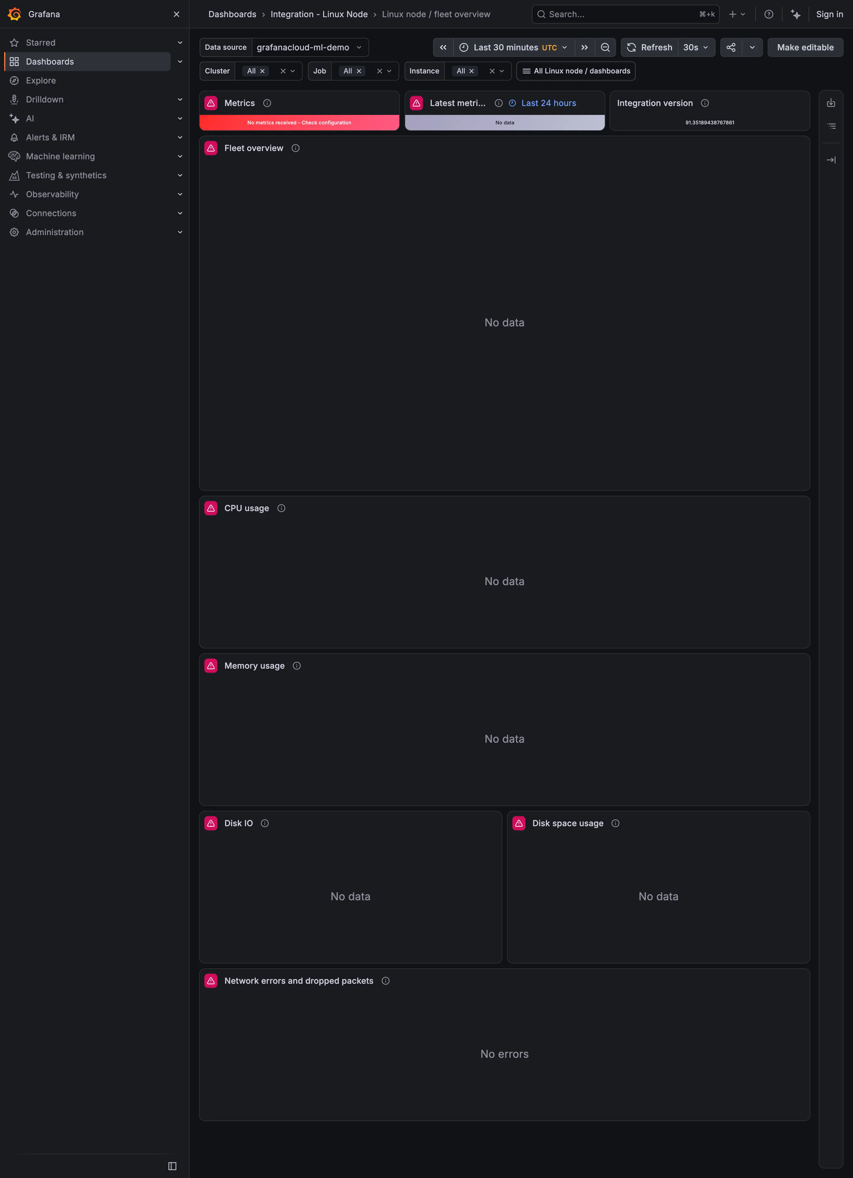
Linux node / fleet overview September 9, 2026 Grafana Play (signed out; no version string exposed) medium · dark · desktop-web
Captured while Play's demo data source was returning nothing, which makes this a better example of empty and error states than of the fleet overview it is meant to be. Three things are worth noticing. The top-left tile is red and reads "No metrics received - Check configuration", which is an actual diagnosis and the best thing on the page. The tile beside it exists to report when data last arrived, and it says "No data", so the freshness indicator has no freshness to report and doesn't say why. And every chart below says "No data" while the network panel says "No errors". A viewer scanning this page cannot tell from the words alone whether the network is clean or whether it is as unknown as everything else, which is the exact confusion the empty-state pattern exists to prevent.