A builder aimed at people making internal tools, so it shows what a dashboard looks like when the person assembling it is the person who will use it.
Admin and devtools · Embedded analyticsEmbedded analytics
Somebody else's charts inside your product, themed hard enough to look like they were always there.
Products 3
The reference for a financial admin surface: dense tables with in-cell state, and a home page that is a small strip of numbers above a very long list.
Consumer fintech · Ecommerce · Embedded analyticsThousands of dashboards made by people who are not designers, published without a review step. The best available sample of what the pattern language looks like in the wild.
Embedded analytics · Product analyticsPatterns seen in this domain 18
Captures
Newest first within each product.
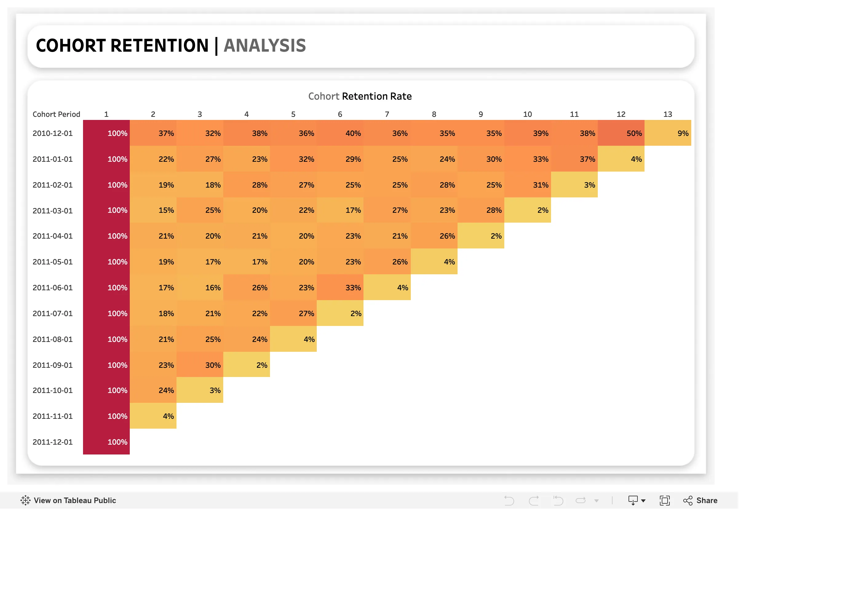
Cohort grid. One row per cohort, one column per period since joining. The triangle is the shape, not a rendering accident. Ratio and rate. Cohort dates, and no cohort size. A 100% first cell could be ten people or ten thousand. Sequential and diverging scales. Column one is 100% for everyone and takes the darkest step, so a constant sets the top of the ramp. Cohort grid. 50% then 9%. The last cell in every row is a partial period drawn as a finished one.
- Cohort grid One row per cohort, one column per period since joining. The triangle is the shape, not a rendering accident.
- Cohort grid 50% then 9%. The last cell in every row is a partial period drawn as a finished one.
- Sequential and diverging scales Column one is 100% for everyone and takes the darkest step, so a constant sets the top of the ramp.
- Ratio and rate Cohort dates, and no cohort size. A 100% first cell could be ten people or ten thousand.
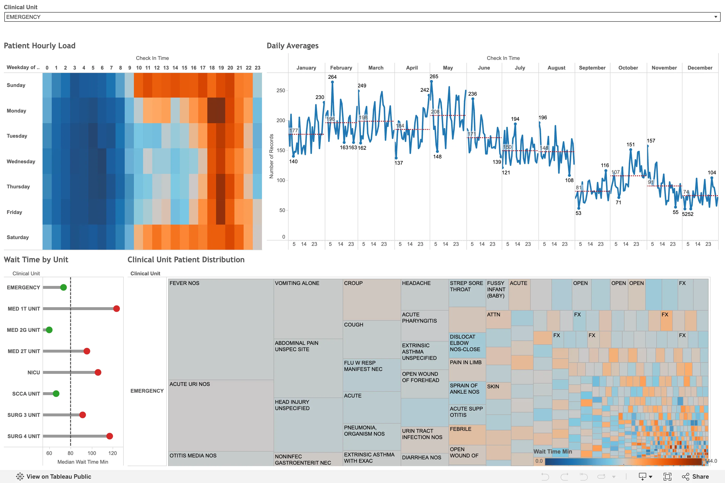
Sequential and diverging scales. A diverging blue-orange ramp on wait time, which has no meaningful centre, so the midpoint is wherever the mean fell. Small multiples. Twelve month panels on one shared y-axis, so the seasonal fall from 265 in May to 52 in December is comparable across all of them. Calendar heatmap. The punch-card variant: hour of day against weekday. The busy band reads in a second, from the layout alone. Target and progress. Each unit against a median reference line, green below and red above. A target marker doing the work of a threshold. Filter bar. One dropdown, full width, showing its selected value rather than a count. Everything below is scoped to it.
- Calendar heatmap The punch-card variant: hour of day against weekday. The busy band reads in a second, from the layout alone.
- Small multiples Twelve month panels on one shared y-axis, so the seasonal fall from 265 in May to 52 in December is comparable across all of them.
- Sequential and diverging scales A diverging blue-orange ramp on wait time, which has no meaningful centre, so the midpoint is wherever the mean fell.
- Target and progress Each unit against a median reference line, green below and red above. A target marker doing the work of a threshold.
- Filter bar One dropdown, full width, showing its selected value rather than a count. Everything below is scoped to it.
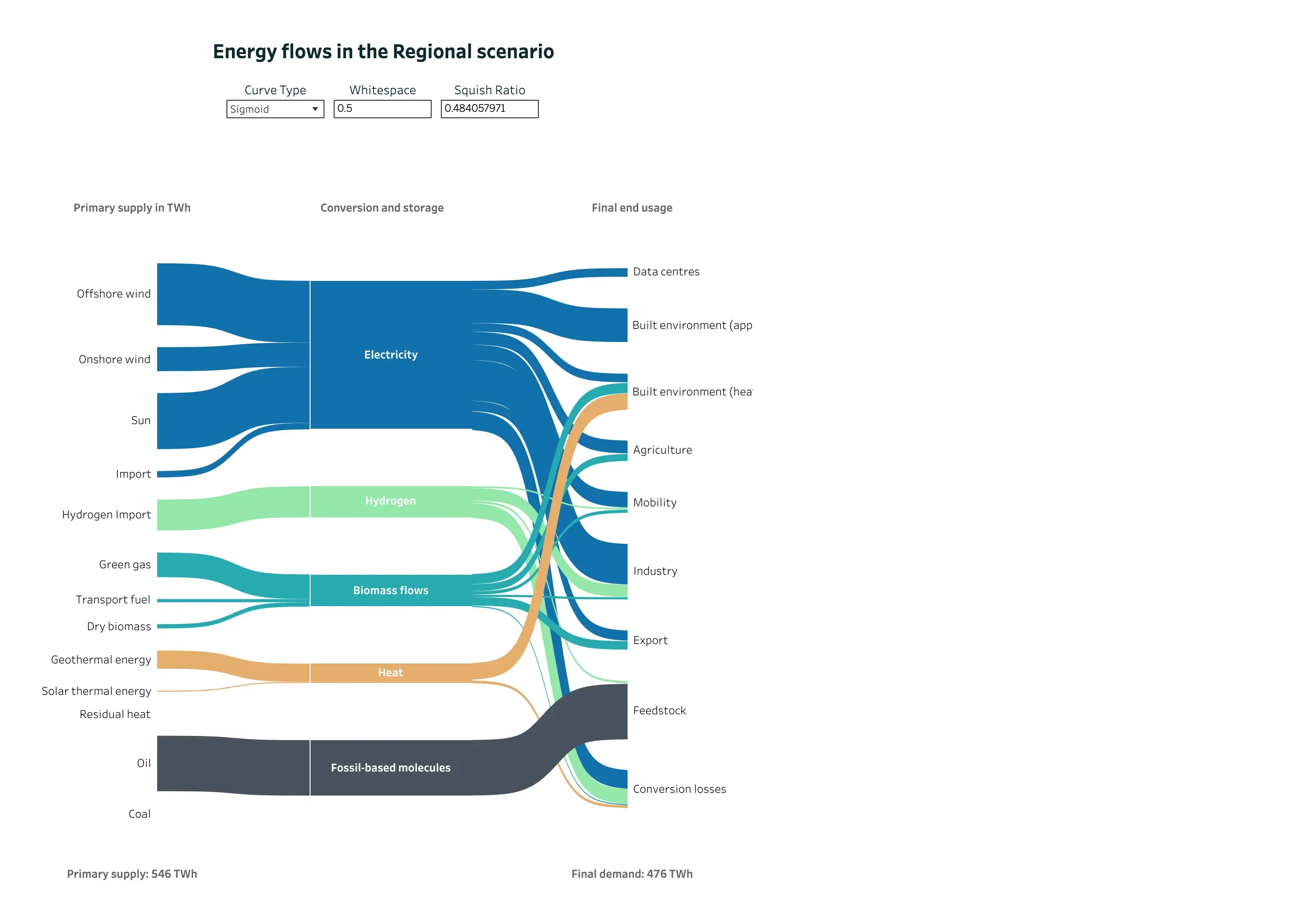
Sankey and path. Three columns of nodes, link width as volume, and crossings kept to the few places where a carrier genuinely switches rank. Categorical series palette. Five carriers, five hues, held constant across every column so a band can be followed end to end. Ratio and rate. 546 TWh in, 476 TWh out, both stated. The diagram's own arithmetic is checkable from the page. Dashboard builder. Curve type, whitespace and squish ratio exposed as reader-facing controls. The last one reads 0.484057971. Sankey and path. Conversion losses as an explicit destination. This is the node product analytics leaves out, and the reason its widths stop adding up.
- Sankey and path Three columns of nodes, link width as volume, and crossings kept to the few places where a carrier genuinely switches rank.
- Sankey and path Conversion losses as an explicit destination. This is the node product analytics leaves out, and the reason its widths stop adding up.
- Ratio and rate 546 TWh in, 476 TWh out, both stated. The diagram's own arithmetic is checkable from the page.
- Categorical series palette Five carriers, five hues, held constant across every column so a band can be followed end to end.
- Dashboard builder Curve type, whitespace and squish ratio exposed as reader-facing controls. The last one reads 0.484057971.
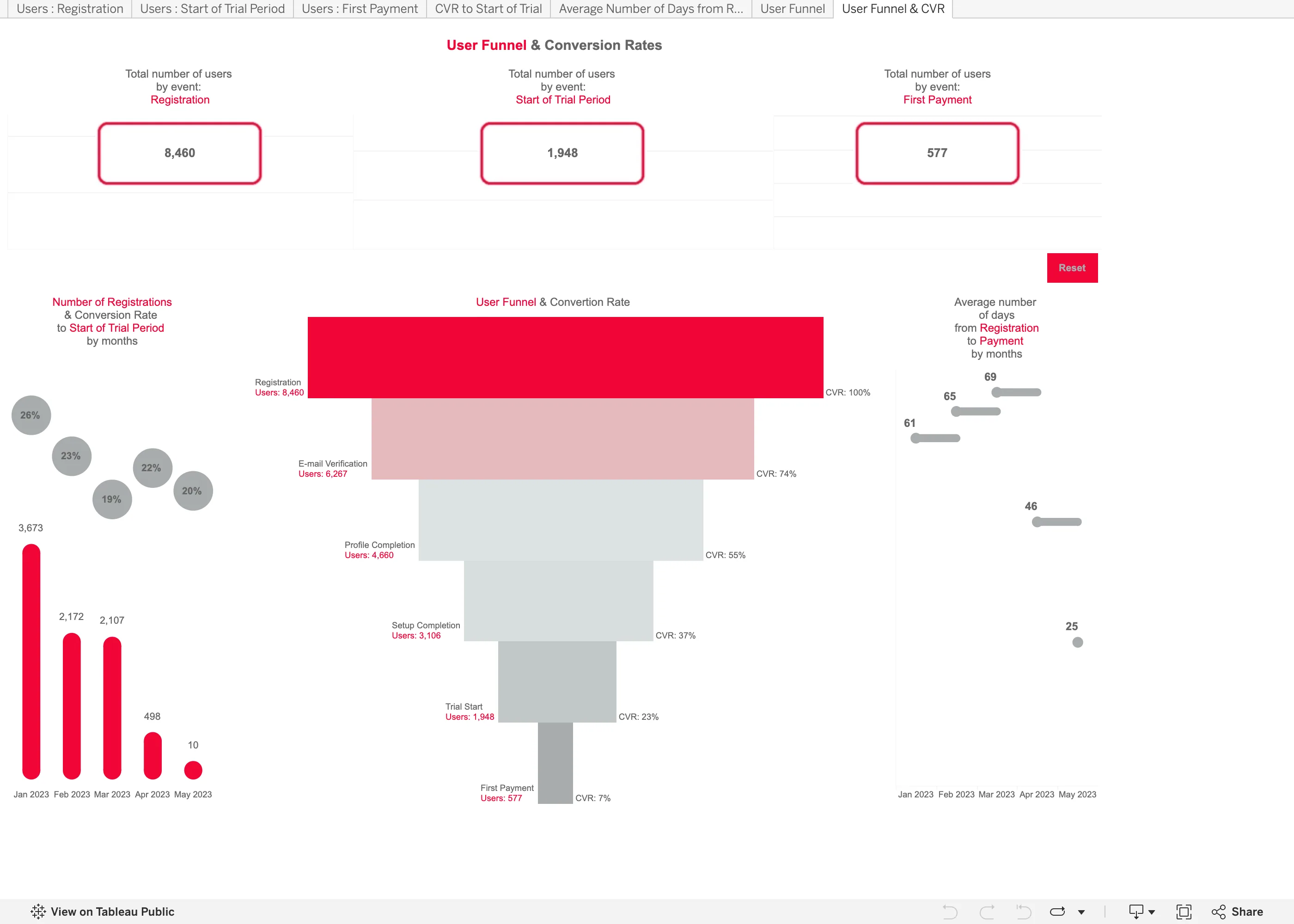
Funnel. Drawn as a taper, so the count is the width of a trapezoid. Length would have read more accurately for nothing. Header KPI strip. Three counts, boxed and centred, with no delta and no base. The first and last are the funnel's own endpoints. Funnel. Overall conversion only. The trial-to-payment step converts at 30% and no number on the chart says so. Ratio and rate. A 20% rate over 10 registrations drawn the same size as a 26% rate over 3,673. Tabs as genres. Seven worksheet tabs across the top, named after the data rather than the question—Users : Registration, CVR to Start of Trial.
- Funnel Drawn as a taper, so the count is the width of a trapezoid. Length would have read more accurately for nothing.
- Funnel Overall conversion only. The trial-to-payment step converts at 30% and no number on the chart says so.
- Ratio and rate A 20% rate over 10 registrations drawn the same size as a 26% rate over 3,673.
- Header KPI strip Three counts, boxed and centred, with no delta and no base. The first and last are the funnel's own endpoints.
- Tabs as genres Seven worksheet tabs across the top, named after the data rather than the question—Users : Registration, CVR to Start of Trial.
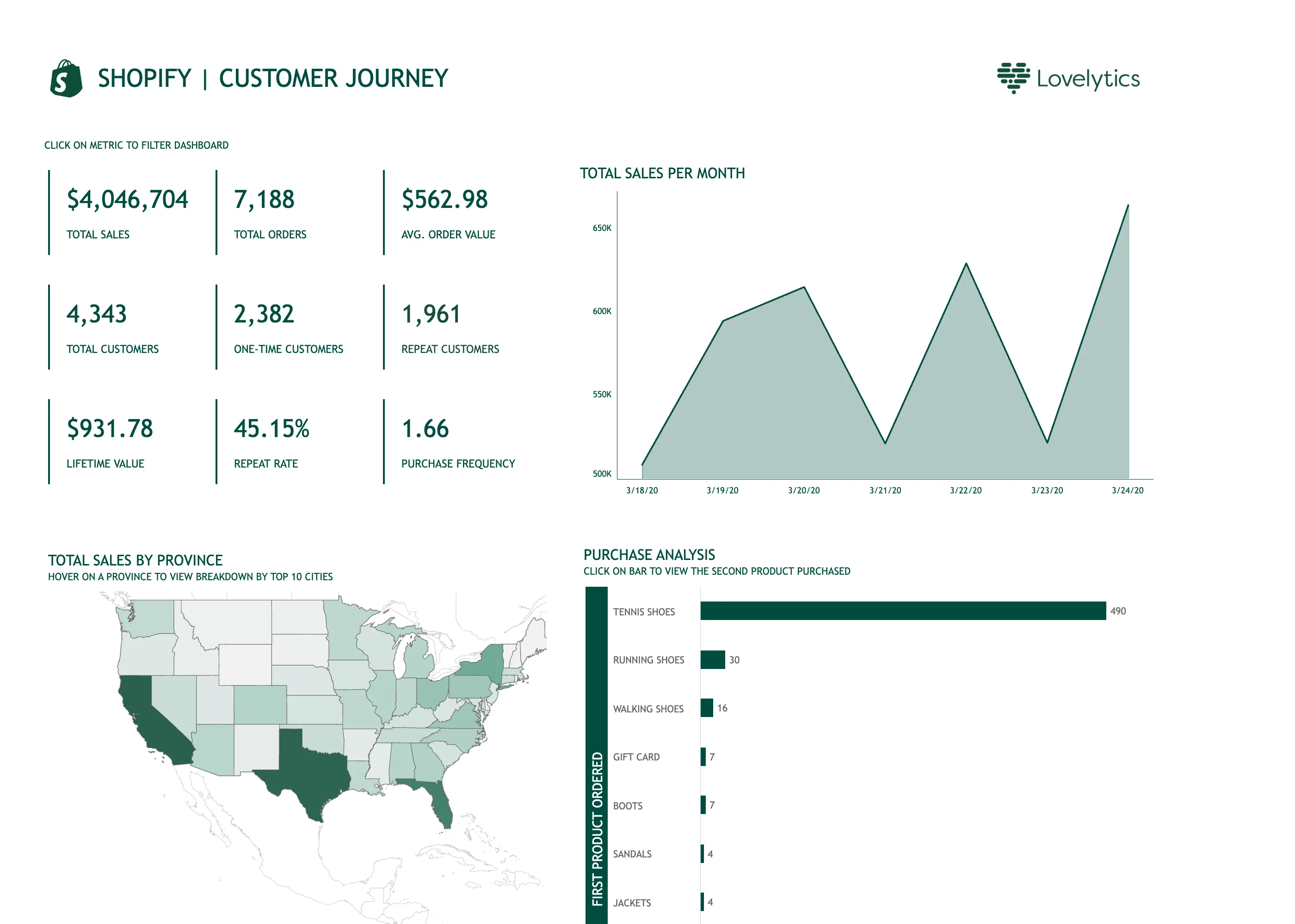
Ranked list. 490 against 30 for second place, so every bar below the first is a sliver and the ordering is all you get. Time series. Titled per month, plotting seven days, on an axis starting at 500K. A 25% spread rendered as a cliff. Geo map with markers. A choropleth of raw sales, unnormalised, so California and Texas lead partly by being large and populous. Header KPI strip. Nine values in a grid rather than four to six in a row, so there is no privileged place for the eye to start. Cross-filter. The tiles are the filter. It needed a line of instruction above it, because nothing about a number says it is clickable. Hover detail. The breakdown by city exists only on hover, so it is unavailable on touch and invisible in this screenshot.
- Cross-filter The tiles are the filter. It needed a line of instruction above it, because nothing about a number says it is clickable.
- Header KPI strip Nine values in a grid rather than four to six in a row, so there is no privileged place for the eye to start.
- Time series Titled per month, plotting seven days, on an axis starting at 500K. A 25% spread rendered as a cliff.
- Hover detail The breakdown by city exists only on hover, so it is unavailable on touch and invisible in this screenshot.
- Geo map with markers A choropleth of raw sales, unnormalised, so California and Texas lead partly by being large and populous.
- Ranked list 490 against 30 for second place, so every bar below the first is a sliver and the ordering is all you get.