Patterns seen in this genre 17
- Calendar heatmap
- Categorical series palette
- Compare periods
- Dark-first data palette
- Delta indicator
- Geo map with markers
- Header KPI strip
- KPI tile
- Multi-page dashboard
- Overview then detail
- Ranked list
- Ratio and rate
- Sequential and diverging scales
- Single-column narrative
- Stacked composition
- Tabs as genres
- Time-range picker
Captures
Newest first.
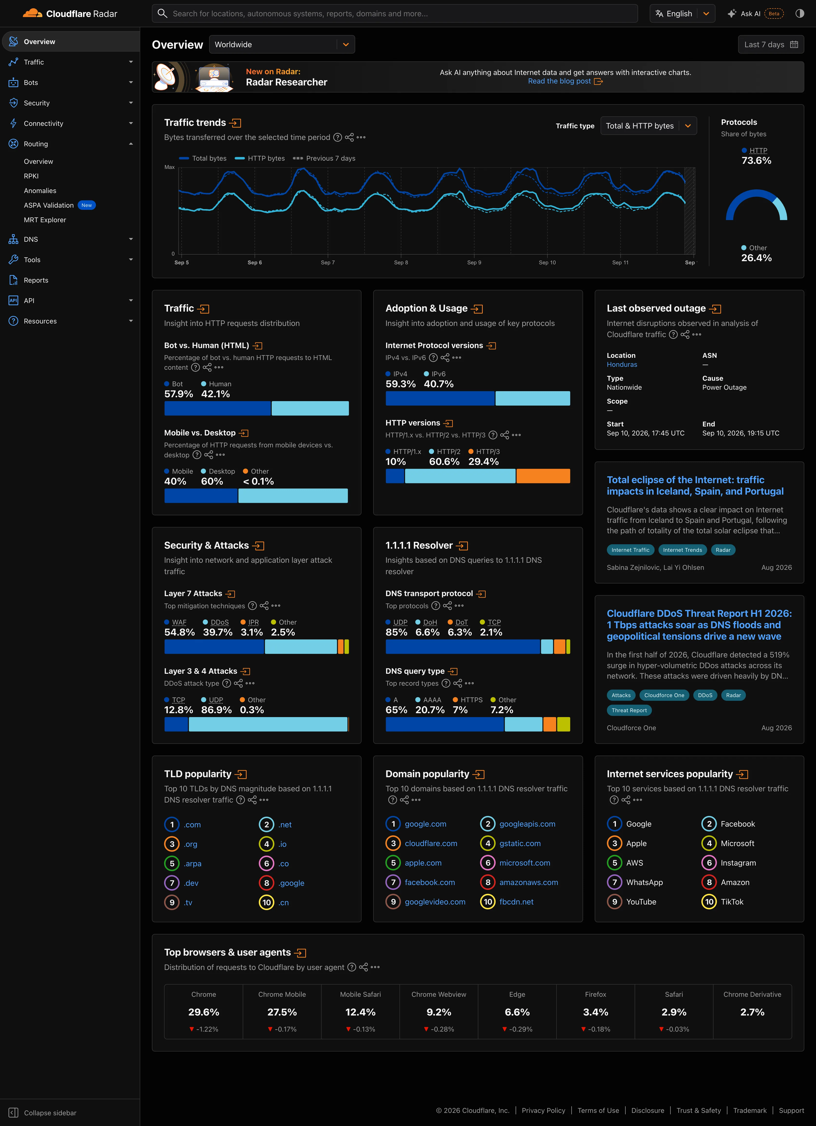
Dark-first data palette. Same two hues as the light capture. On charcoal the darker series is the one fighting the ground. Delta indicator. The one colour that reads the same on both grounds, because it is carrying meaning rather than identity. Categorical series palette. Four categories, four fixed hues, held across both grounds. Which one dominates the eye is not held.
- Dark-first data palette Same two hues as the light capture. On charcoal the darker series is the one fighting the ground.
- Categorical series palette Four categories, four fixed hues, held across both grounds. Which one dominates the eye is not held.
- Delta indicator The one colour that reads the same on both grounds, because it is carrying meaning rather than identity.

Time-range picker. Sixteen years as a list. No arbitrary range, no relative window—the only unit on offer is a calendar year. Calendar heatmap. Fifty-three columns of weeks, seven rows of weekdays, and only Mon, Wed and Fri labelled to save the space. KPI tile. The total sits above the grid, so the cells have a denominator. Most calendar heatmaps omit this. Sequential and diverging scales. Five discrete steps rather than a continuous ramp, which is why ten commits and thirty share a colour.
- Calendar heatmap Fifty-three columns of weeks, seven rows of weekdays, and only Mon, Wed and Fri labelled to save the space.
- KPI tile The total sits above the grid, so the cells have a denominator. Most calendar heatmaps omit this.
- Sequential and diverging scales Five discrete steps rather than a continuous ramp, which is why ten commits and thirty share a colour.
- Time-range picker Sixteen years as a list. No arbitrary range, no relative window—the only unit on offer is a calendar year.
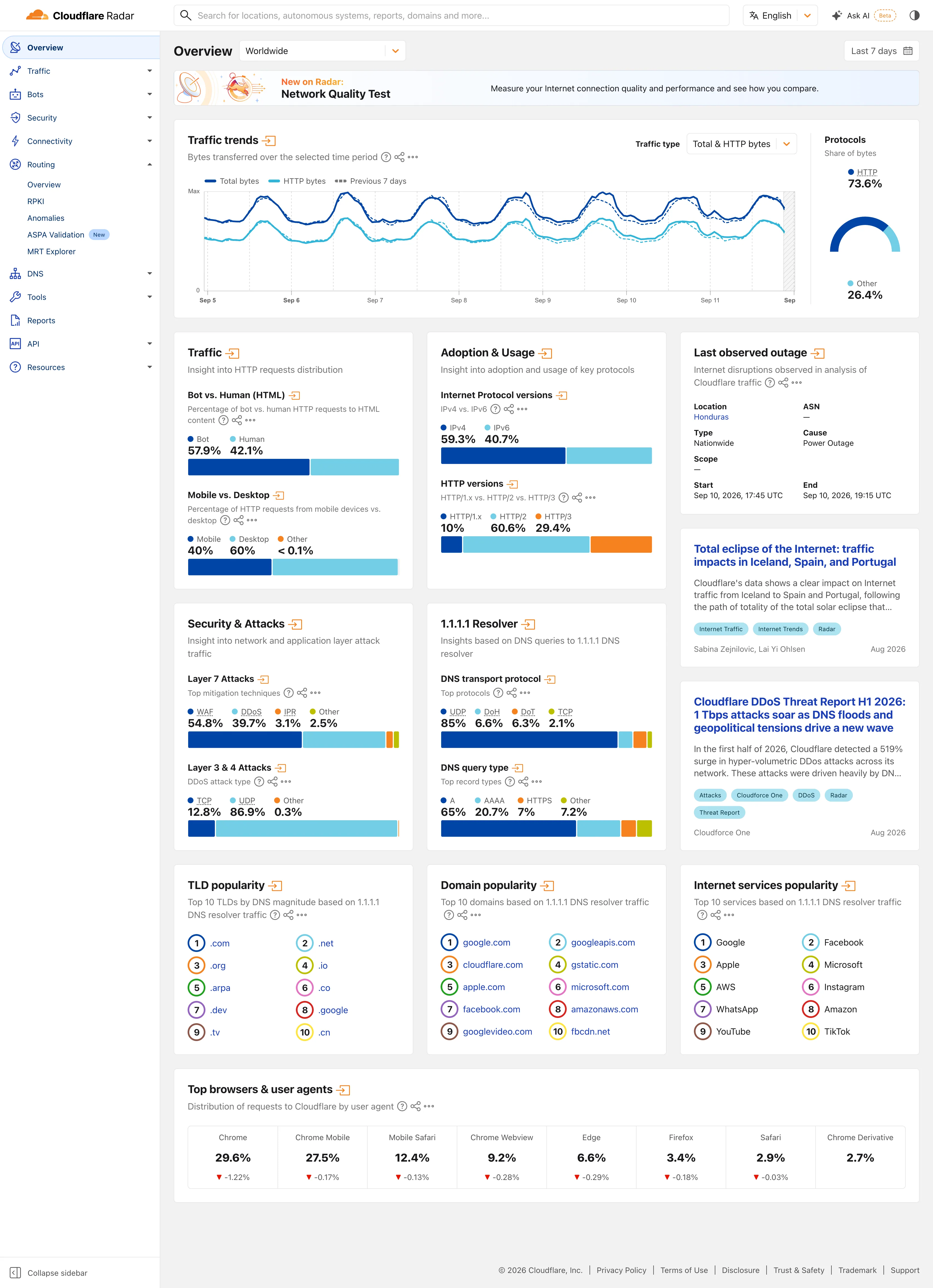
Multi-page dashboard. Eleven sections behind one rail, with the open one expanded in place. Radar is a site of dashboards, not a dashboard. Compare periods. The dotted series is the previous seven days, drawn on the same axis rather than beside it. Delta indicator. Eight shares with their change under them, all of them fractions of a point, which tells you how still this data is. Overview then detail. Two summaries and an arrow each. The panel exists to tell you whether the full page is worth opening. Ratio and rate. Shares only, never counts, and both sides of the split are named so the denominator is never in doubt. Stacked composition. Four mitigation techniques to 100%. The bar is almost redundant next to the printed figures, which is the point. Ranked list. A top ten with no magnitudes at all. The rank is the whole finding.
- Multi-page dashboard Eleven sections behind one rail, with the open one expanded in place. Radar is a site of dashboards, not a dashboard.
- Compare periods The dotted series is the previous seven days, drawn on the same axis rather than beside it.
- Overview then detail Two summaries and an arrow each. The panel exists to tell you whether the full page is worth opening.
- Ratio and rate Shares only, never counts, and both sides of the split are named so the denominator is never in doubt.
- Stacked composition Four mitigation techniques to 100%. The bar is almost redundant next to the printed figures, which is the point.
- Ranked list A top ten with no magnitudes at all. The rank is the whole finding.
- Delta indicator Eight shares with their change under them, all of them fractions of a point, which tells you how still this data is.
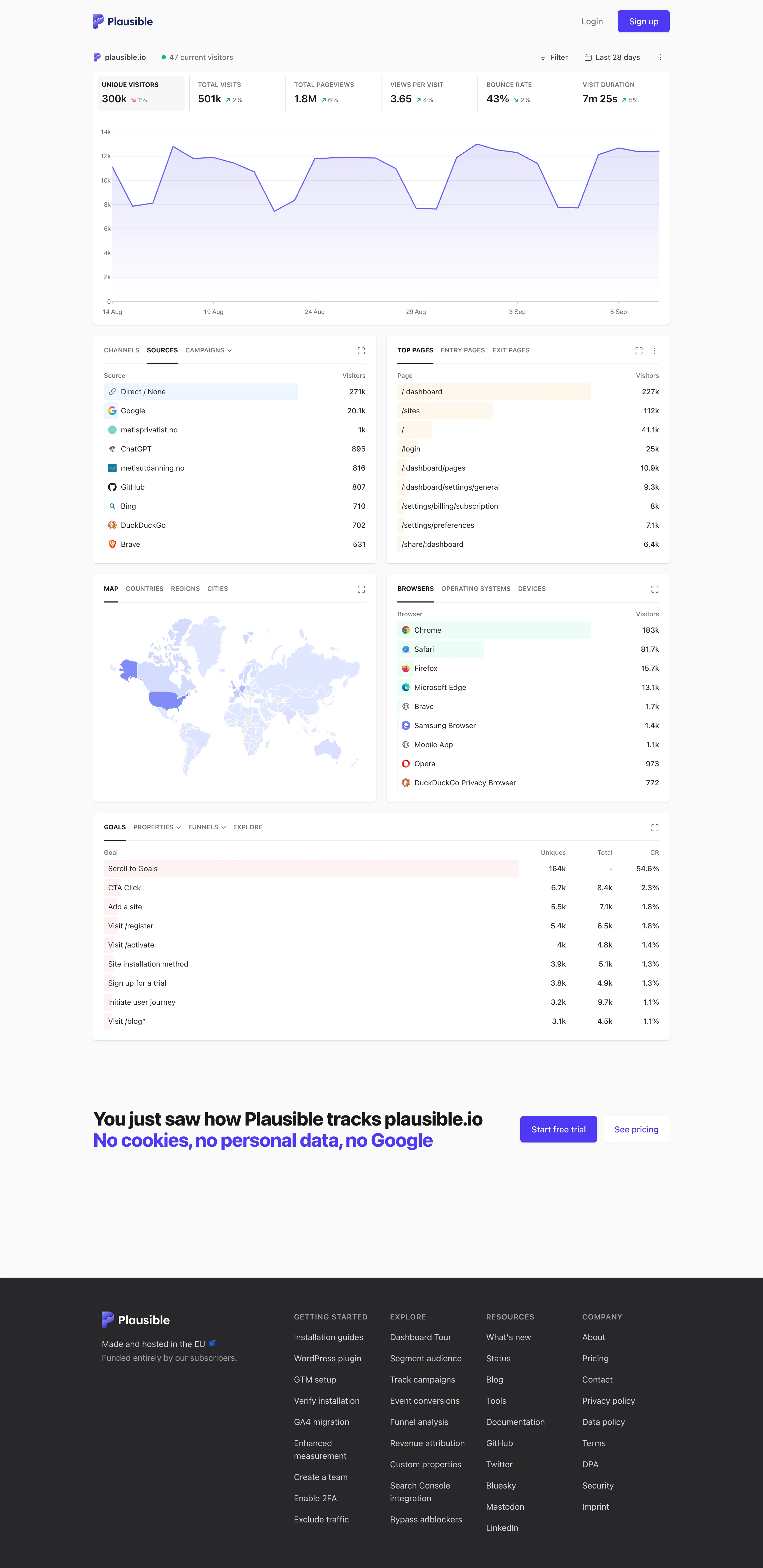
Single-column narrative. One column, top to bottom, no panel arrangement and nothing to configure before reading starts. Overview then detail. The decomposition: sources, pages, geography, browsers, goals. Same subject, narrowed, no navigation. Ranked list. Sorted with an in-row bar, no share of total and no other row. Direct 271k versus Google 25.1k, out of what? Geo map with markers. A choropleth pale enough that every country but one reads as the same white. Raw counts, unnormalised. Header KPI strip. Six tiles sharing one anatomy, each with a delta. The boxed one is selected, and the chart below plots it. Ratio and rate. Bounce rate 43%, with the denominator two tiles away and the window only in the header. Tabs as genres. Tabs inside the panel—channels, sources, campaigns—so one card answers three questions in one slot.
- Single-column narrative One column, top to bottom, no panel arrangement and nothing to configure before reading starts.
- Header KPI strip Six tiles sharing one anatomy, each with a delta. The boxed one is selected, and the chart below plots it.
- Ratio and rate Bounce rate 43%, with the denominator two tiles away and the window only in the header.
- Overview then detail The decomposition: sources, pages, geography, browsers, goals. Same subject, narrowed, no navigation.
- Ranked list Sorted with an in-row bar, no share of total and no other row. Direct 271k versus Google 25.1k, out of what?
- Geo map with markers A choropleth pale enough that every country but one reads as the same white. Raw counts, unnormalised.
- Tabs as genres Tabs inside the panel—channels, sources, campaigns—so one card answers three questions in one slot.