Operational
Watched continuously. Something is happening now and someone has to act on it.
Patterns seen in this genre 42
- Alert rule attached to panel
- Annotation
- Anomaly band
- Collapsible row
- Compare periods
- Cross-filter
- Dashboard builder
- Data source badge
- Delta indicator
- Dense small-multiple layout
- Drill-down
- Empty state
- Error and stale state
- Explain this metric
- Filter bar
- Freshness indicator
- Gauge and dial
- Grayscale with alerts
- Header KPI strip
- Host map
- KPI tile
- Legend and series toggle
- Log tail
- Order book and depth
- Overview then detail
- Process mimic
- Ranked list
- Ratio and rate
- Red/green direction coloring
- Search across panels
- Semantic grouping
- Semantic status color
- Sequential and diverging scales
- Service map
- Share and embed
- Sidebar and canvas
- Stacked composition
- Status history
- Threshold line and region
- Time series
- Time-range picker
- Zoom and pan on time
Captures
Newest first.
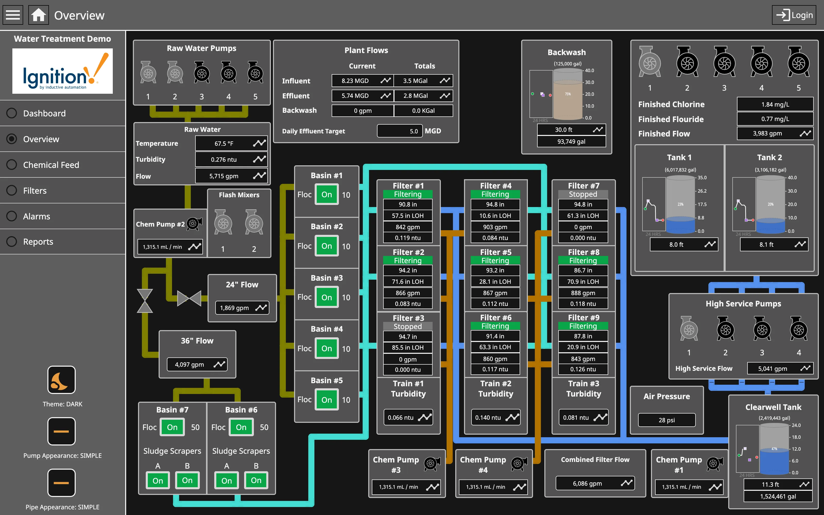
Process mimic. Flat two-dimensional shapes, values placed where the instrument is, and the flow ordered by process rather than by geography. Dense small-multiple layout. Nine filters, identical four-value panels. Reading one teaches you all nine, and the two stopped ones are found by shape. Gauge and dial. Tank level as a filled vertical scale—a bounded range where the endpoints are the physical tank, which is the case the gauge survives. Grayscale with alerts. Green for running, on every unit. The opposite of grey-at-rest, and it works only while stopped is the rare case. Process mimic. Pump and pipe appearance switchable between simple and photorealistic. The whole ISA-101 argument, shipped as a setting. Semantic status color. Stopped is grey and says Stopped. Colour and word together, so the state survives a monochrome screen.
- Process mimic Flat two-dimensional shapes, values placed where the instrument is, and the flow ordered by process rather than by geography.
- Grayscale with alerts Green for running, on every unit. The opposite of grey-at-rest, and it works only while stopped is the rare case.
- Dense small-multiple layout Nine filters, identical four-value panels. Reading one teaches you all nine, and the two stopped ones are found by shape.
- Semantic status color Stopped is grey and says Stopped. Colour and word together, so the state survives a monochrome screen.
- Gauge and dial Tank level as a filled vertical scale—a bounded range where the endpoints are the physical tank, which is the case the gauge survives.
- Process mimic Pump and pipe appearance switchable between simple and photorealistic. The whole ISA-101 argument, shipped as a setting.
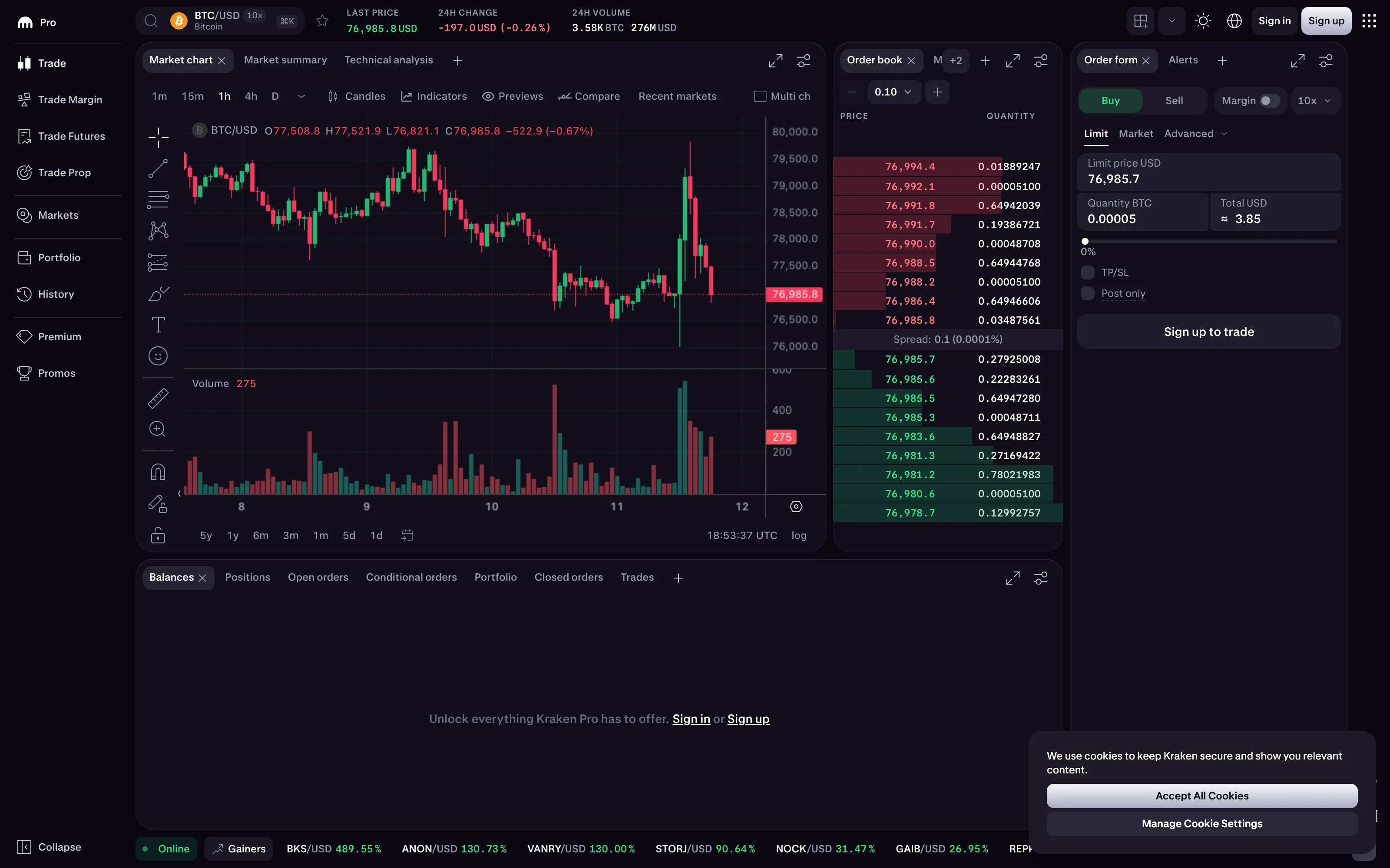
Time series. Candles rather than a line, so each interval carries open, high, low and close instead of one sampled value. Order book and depth. Two ladders sharing a price axis, with the spread labelled between them and a depth bar behind every row. Red/green direction coloring. Asks in red, and also above the spread. Position carries the side on its own, so greyscale survives. Ratio and rate. The spread as 0.1 and as 0.0001% together, which is the absolute and the normalised form on one line. Delta indicator. −197.0 USD and −0.26% together, over a named 24-hour base. All three of the decisions, made and stated. Order book and depth. The price increment the book is aggregated into. Change it and the level count changes under the eye.
- Order book and depth Two ladders sharing a price axis, with the spread labelled between them and a depth bar behind every row.
- Red/green direction coloring Asks in red, and also above the spread. Position carries the side on its own, so greyscale survives.
- Ratio and rate The spread as 0.1 and as 0.0001% together, which is the absolute and the normalised form on one line.
- Delta indicator −197.0 USD and −0.26% together, over a named 24-hour base. All three of the decisions, made and stated.
- Time series Candles rather than a line, so each interval carries open, high, low and close instead of one sampled value.
- Order book and depth The price increment the book is aggregated into. Change it and the level count changes under the eye.
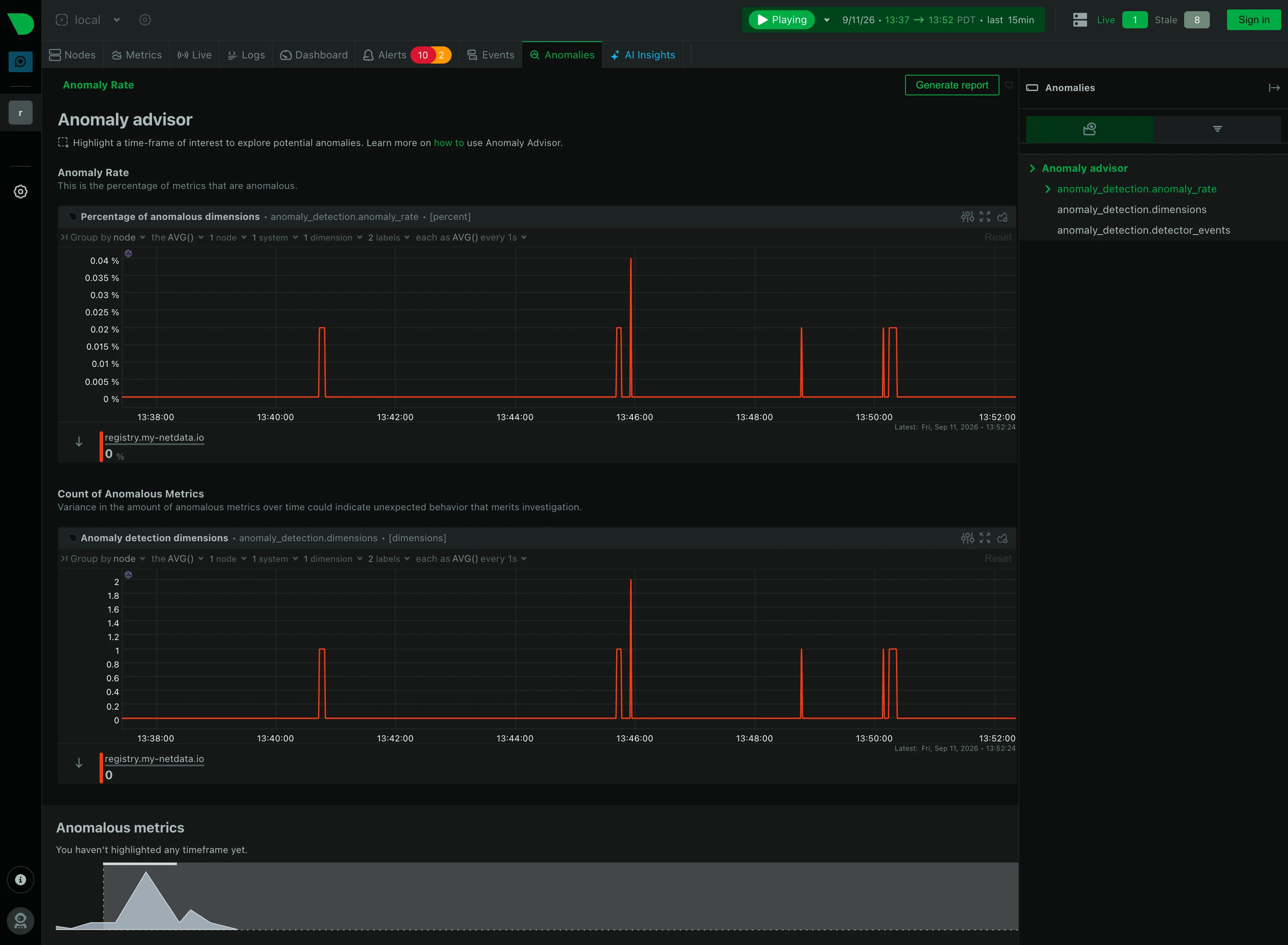
Anomaly band. Not a band. An anomaly rate as its own series, so one chart covers every metric instead of one band per chart. Empty state. "You haven't highlighted any timeframe yet"—the reason for the blank, and the action that fills it. Cross-filter. Highlight a timeframe and the page names which metrics drove it. The selection is the query. Explain this metric. Every section carries a sentence saying what it counts, directly under its heading rather than behind an icon. Share and embed. Generate report, top right. Whether the highlighted window travels with it is the question the button raises.
- Anomaly band Not a band. An anomaly rate as its own series, so one chart covers every metric instead of one band per chart.
- Explain this metric Every section carries a sentence saying what it counts, directly under its heading rather than behind an icon.
- Cross-filter Highlight a timeframe and the page names which metrics drove it. The selection is the query.
- Empty state "You haven't highlighted any timeframe yet"—the reason for the blank, and the action that fills it.
- Share and embed Generate report, top right. Whether the highlighted window travels with it is the question the button raises.
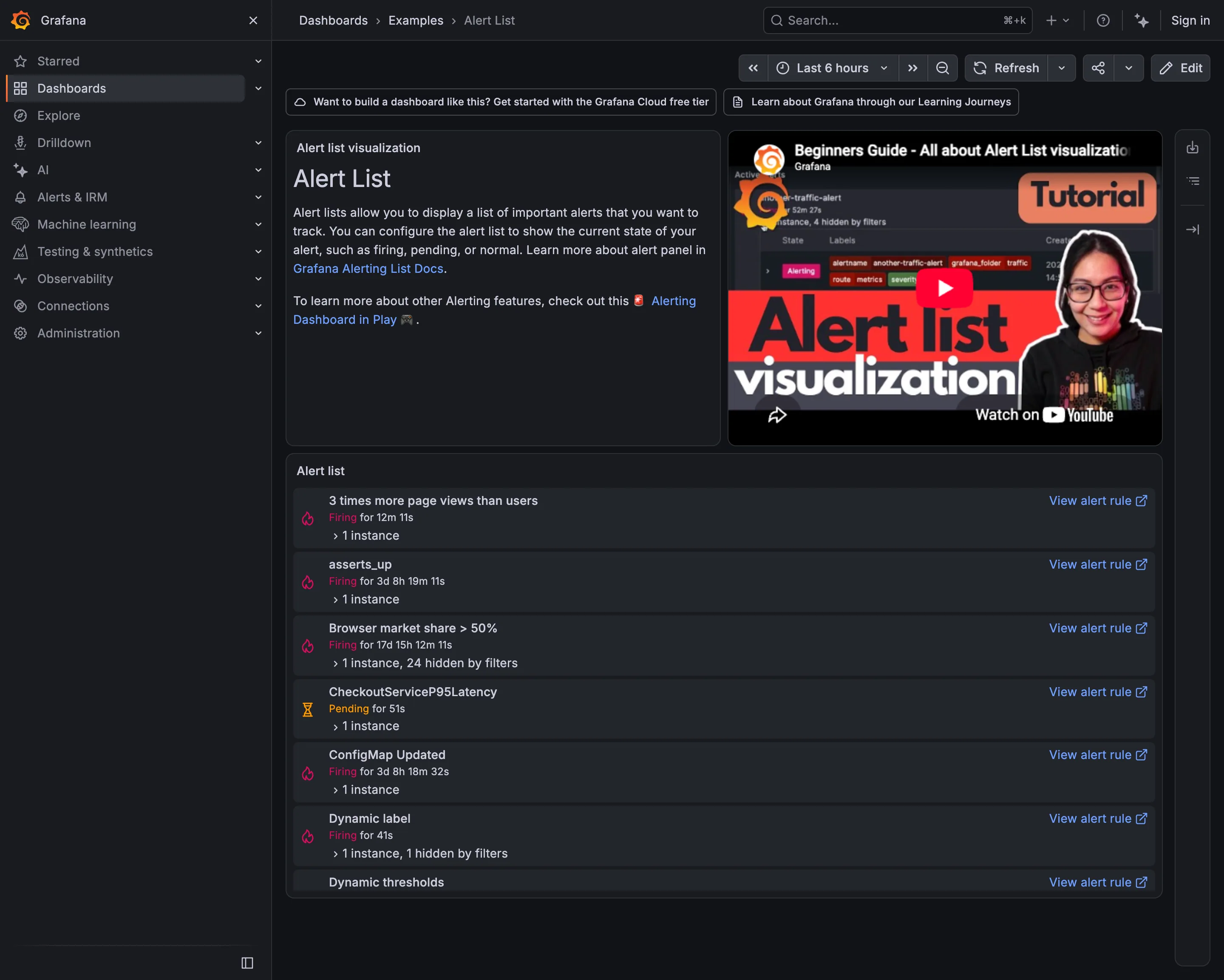
Alert rule attached to panel. Seven rules in six naming conventions. Nothing in the list conveys severity or subject. Alert rule attached to panel. Firing for 17 days. Still actionable, in principle; nobody has acted for two and a half weeks. Semantic status color. Pending rather than firing: the threshold is met and the duration isn't. Two states, both named. Drill-down. The route from an alert back to the rule that defined it, on every row. Filter bar. "1 instance, 24 hidden by filters"—the list saying what it is not showing you.
- Alert rule attached to panel Seven rules in six naming conventions. Nothing in the list conveys severity or subject.
- Alert rule attached to panel Firing for 17 days. Still actionable, in principle; nobody has acted for two and a half weeks.
- Semantic status color Pending rather than firing: the threshold is met and the duration isn't. Two states, both named.
- Filter bar "1 instance, 24 hidden by filters"—the list saying what it is not showing you.
- Drill-down The route from an alert back to the rule that defined it, on every row.
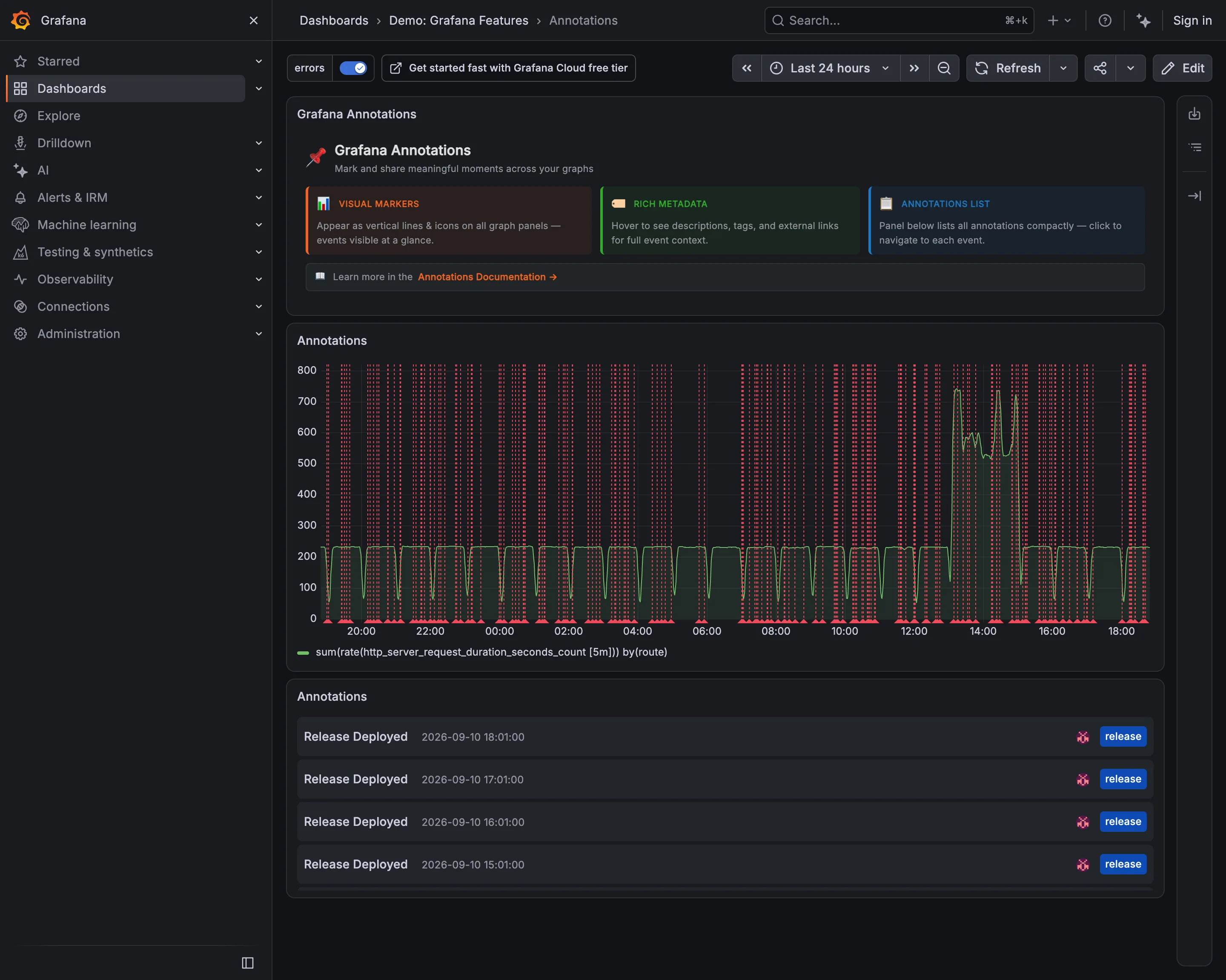
Annotation. Fifty deploy markers on a 24-hour chart. Each one is correct and together they are a picket fence. Annotation. The same events as a list, tagged release and timestamped. Readable in a way the chart is not. Time-range picker. Twenty-four hours, which is what sets the marker density. An hour here would be three lines. Filter bar. The tag filter that makes this survivable, already on. The chart above is the filtered version.
- Annotation Fifty deploy markers on a 24-hour chart. Each one is correct and together they are a picket fence.
- Annotation The same events as a list, tagged release and timestamped. Readable in a way the chart is not.
- Filter bar The tag filter that makes this survivable, already on. The chart above is the filtered version.
- Time-range picker Twenty-four hours, which is what sets the marker density. An hour here would be three lines.
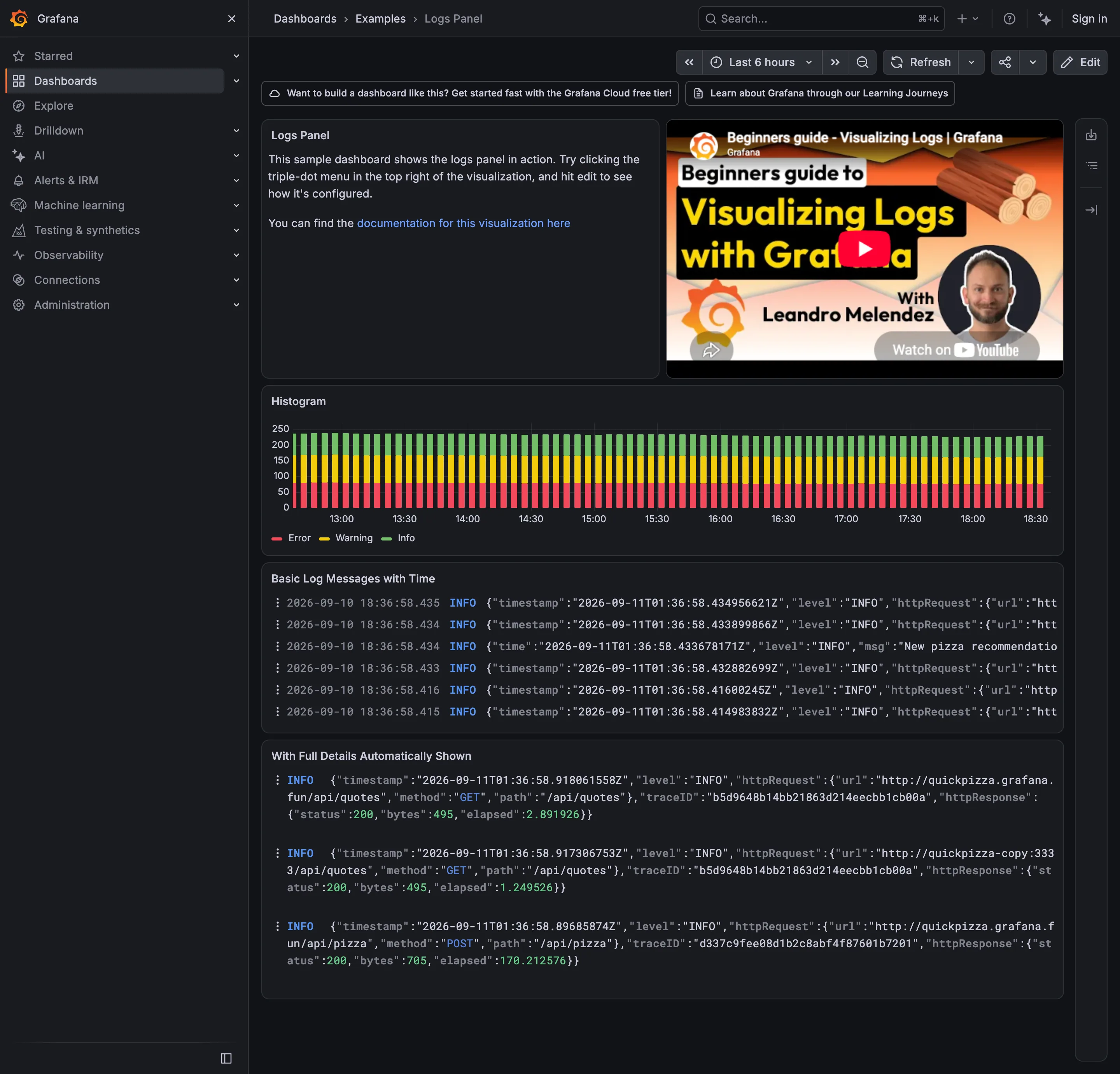
Drill-down. The trace ID: the route out of the wall of text and into the request that produced it. Stacked composition. Volume by level over time. The bottom band sits on a flat baseline; the two above it are approximate. Log tail. Raw lines, truncated at the right edge, with two timestamps in two timezones on every row.
- Stacked composition Volume by level over time. The bottom band sits on a flat baseline; the two above it are approximate.
- Log tail Raw lines, truncated at the right edge, with two timestamps in two timezones on every row.
- Drill-down The trace ID: the route out of the wall of text and into the request that produced it.
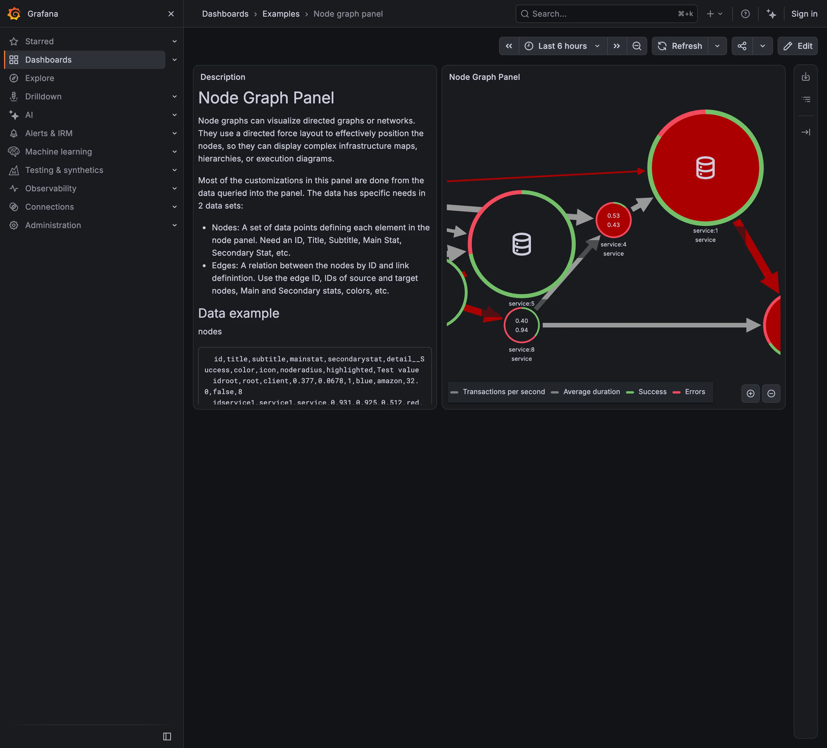
Service map. Nodes for services, edges for calls, both from instrumentation rather than from a diagram. Semantic status color. One node: two numbers inside and a success/error ring around it. Four measures, no verdict. Legend and series toggle. Four series named for a graph with seven nodes, which is the legend doing more work than the map. Zoom and pan on time. The only route to the nodes pushed off the right edge, and it doesn't move the rest of the page.
- Service map Nodes for services, edges for calls, both from instrumentation rather than from a diagram.
- Semantic status color One node: two numbers inside and a success/error ring around it. Four measures, no verdict.
- Legend and series toggle Four series named for a graph with seven nodes, which is the legend doing more work than the map.
- Zoom and pan on time The only route to the nodes pushed off the right edge, and it doesn't move the rest of the page.
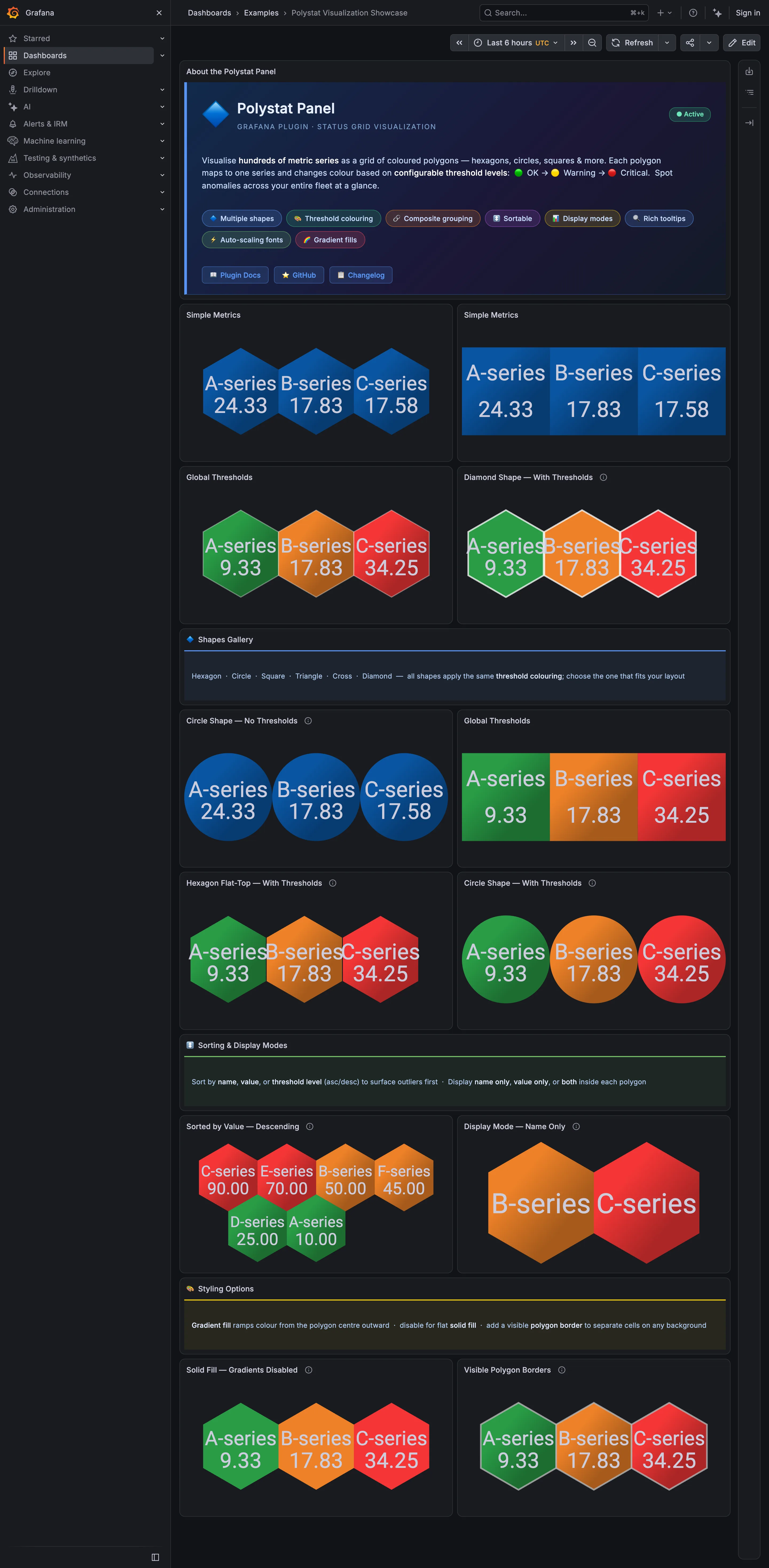
Host map. Hexagons sharing edges. Adjacent unhealthy cells merge into one shape, which is the point of the tiling. Host map. The same data as circles: a gap around every cell, so nothing clusters. Semantic status color. A closed set of three—OK, warning, critical—applied as the whole cell fill. Ranked list. Sorted descending so the worst cell lands where the eye starts. No share of total, and no row for the rest. KPI tile. Name-only mode: two cells carrying a label, a colour and no number at all.
- Host map Hexagons sharing edges. Adjacent unhealthy cells merge into one shape, which is the point of the tiling.
- Host map The same data as circles: a gap around every cell, so nothing clusters.
- Semantic status color A closed set of three—OK, warning, critical—applied as the whole cell fill.
- Ranked list Sorted descending so the worst cell lands where the eye starts. No share of total, and no row for the rest.
- KPI tile Name-only mode: two cells carrying a label, a colour and no number at all.
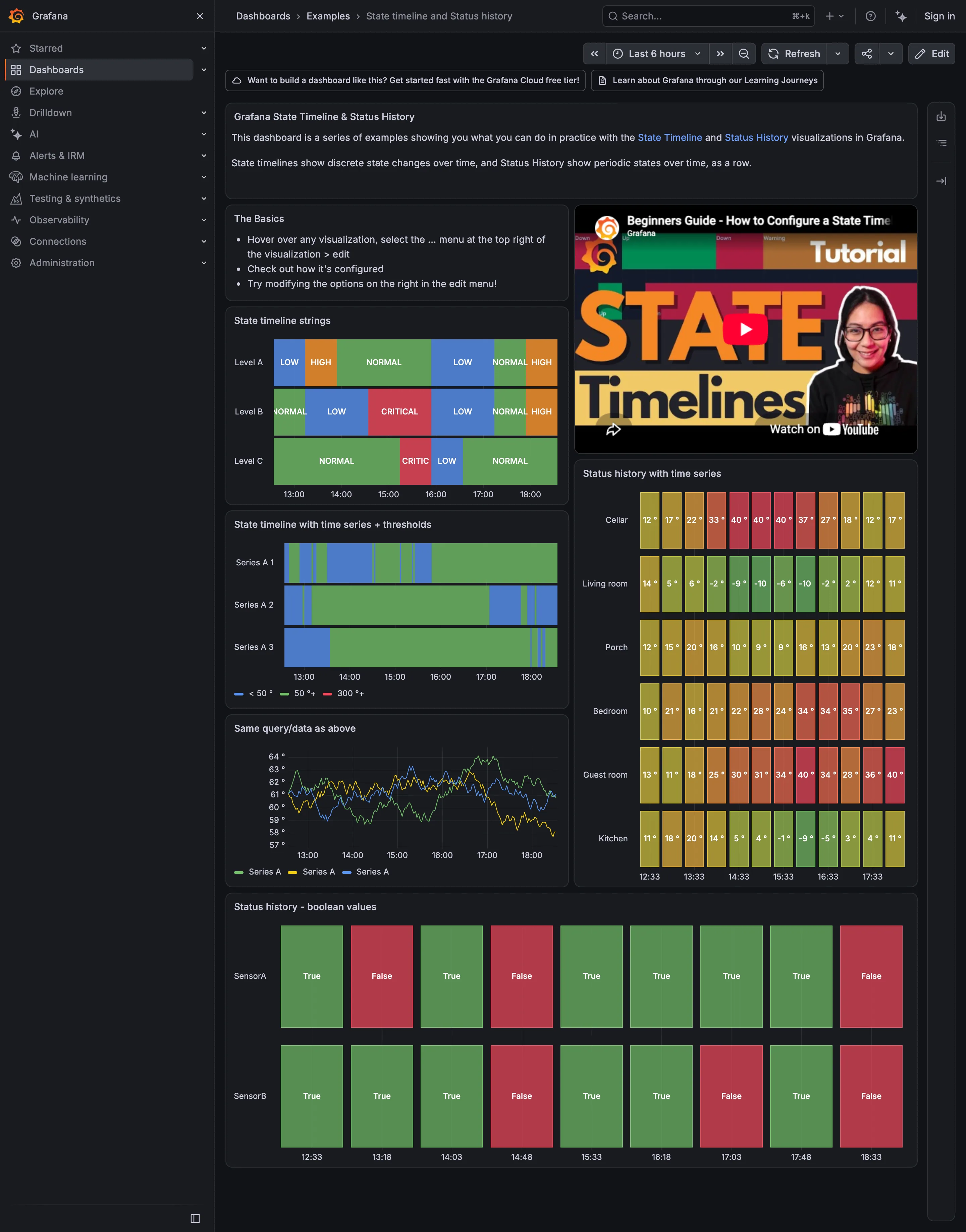
Semantic status color. A closed set of two, both labelled. The clearest case on the page of colour plus a word. Sequential and diverging scales. One mark per sample, green through red by temperature—so green here means cold, not good. Status history. Continuous regions with the state name written inside each one. Threshold line and region. Thresholds turning a numeric series into discrete bands: under 50, 50, 300. Time series. The same query as the panel above, untranslated. Three traces you have to threshold yourself.
- Status history Continuous regions with the state name written inside each one.
- Threshold line and region Thresholds turning a numeric series into discrete bands: under 50, 50, 300.
- Time series The same query as the panel above, untranslated. Three traces you have to threshold yourself.
- Sequential and diverging scales One mark per sample, green through red by temperature—so green here means cold, not good.
- Semantic status color A closed set of two, both labelled. The clearest case on the page of colour plus a word.
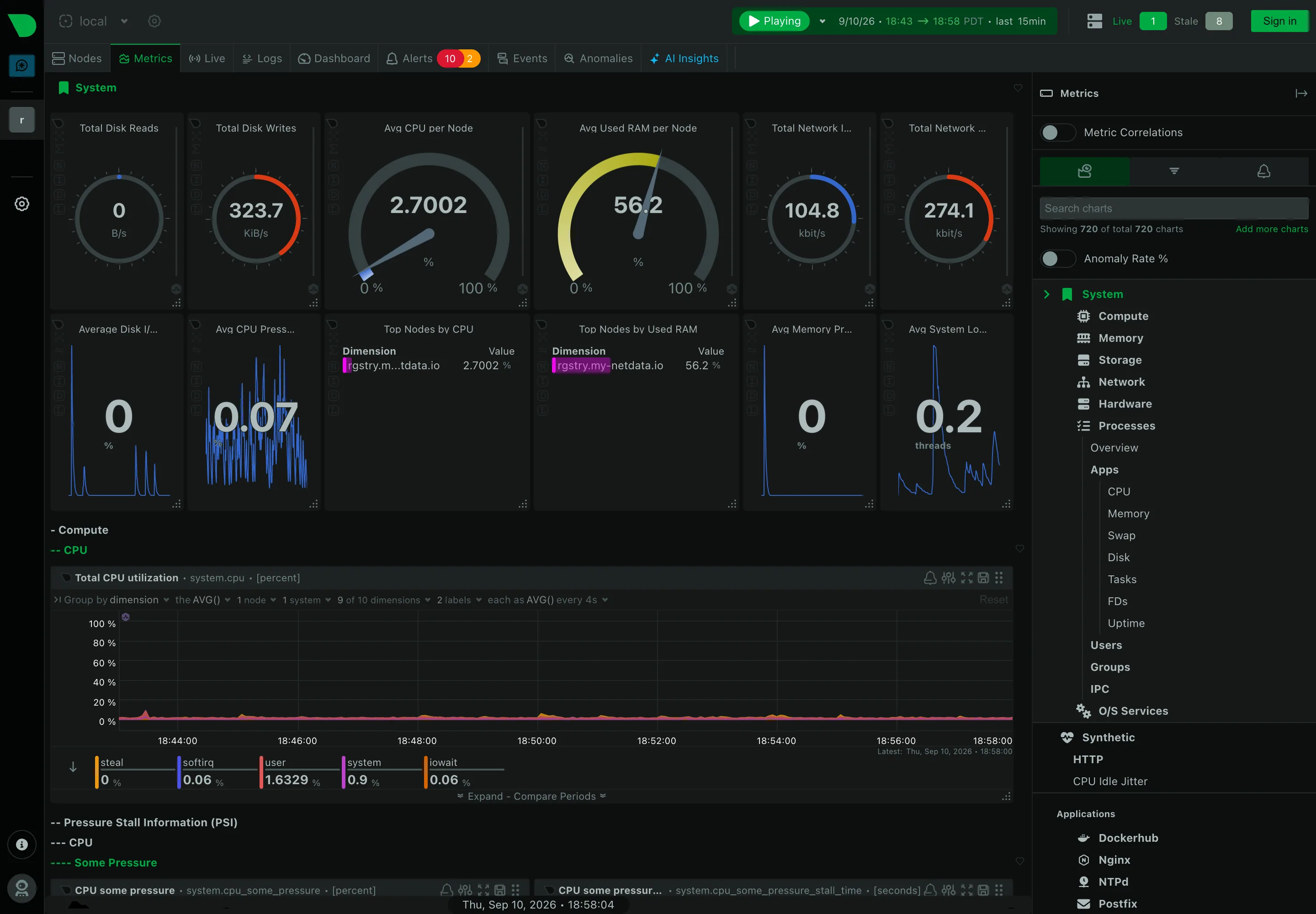
Header KPI strip. Twelve tiles in two rows, in four different layouts. It reads as twelve things rather than one strip. Sidebar and canvas. The rail is the dashboard. A generated tree of every metric family the agent found. Gauge and dial. Arcs for disk reads and writes, where the maximum is invented—this is a rate, not a capacity. Dashboard builder. A query builder inline in the panel header: group by, aggregation, node and dimension count. Search across panels. 720 charts, so search is the navigation and the tree is the filing system nobody browses. Semantic grouping. Sections generated by the collector rather than chosen. Consistent, and about nothing in particular. Compare periods. Offered per chart rather than per dashboard, which is the scoping trap: one panel shifted, the rest not. Freshness indicator. Live 1, Stale 8. Most products would have drawn all nine and said nothing.
- Sidebar and canvas The rail is the dashboard. A generated tree of every metric family the agent found.
- Search across panels 720 charts, so search is the navigation and the tree is the filing system nobody browses.
- Header KPI strip Twelve tiles in two rows, in four different layouts. It reads as twelve things rather than one strip.
- Gauge and dial Arcs for disk reads and writes, where the maximum is invented—this is a rate, not a capacity.
- Semantic grouping Sections generated by the collector rather than chosen. Consistent, and about nothing in particular.
- Freshness indicator Live 1, Stale 8. Most products would have drawn all nine and said nothing.
- Dashboard builder A query builder inline in the panel header: group by, aggregation, node and dimension count.
- Compare periods Offered per chart rather than per dashboard, which is the scoping trap: one panel shifted, the rest not.
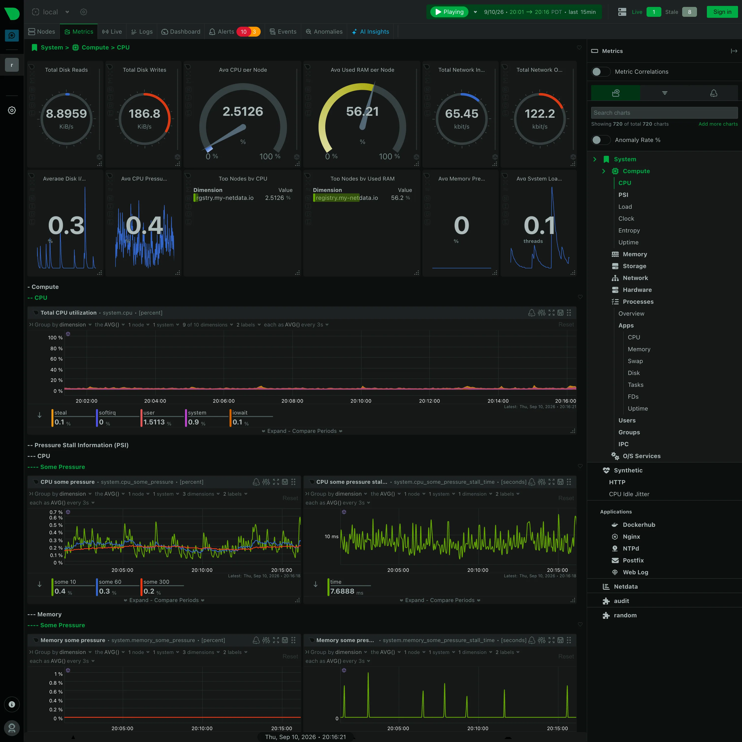
Gauge and dial. Six arcs. Two are percentages where the endpoints mean something; four are rates in KiB/s and kbit/s on an invented maximum. Collapsible row. Four levels of section, depth carried by leading dashes. Generated by the collector, and never edited. Legend and series toggle. The legend is a value table: steal 0.1, softirq 0, user 1.5113, system 0.9, iowait 0.1, each with its own bar. Dashboard builder. A query builder in every chart header, so the panel is a live query rather than a saved configuration. Overview then detail. System › Compute › CPU. The breadcrumb is the only thing telling you where in 720 charts you are.
- Collapsible row Four levels of section, depth carried by leading dashes. Generated by the collector, and never edited.
- Gauge and dial Six arcs. Two are percentages where the endpoints mean something; four are rates in KiB/s and kbit/s on an invented maximum.
- Legend and series toggle The legend is a value table: steal 0.1, softirq 0, user 1.5113, system 0.9, iowait 0.1, each with its own bar.
- Dashboard builder A query builder in every chart header, so the panel is a live query rather than a saved configuration.
- Overview then detail System › Compute › CPU. The breadcrumb is the only thing telling you where in 720 charts you are.
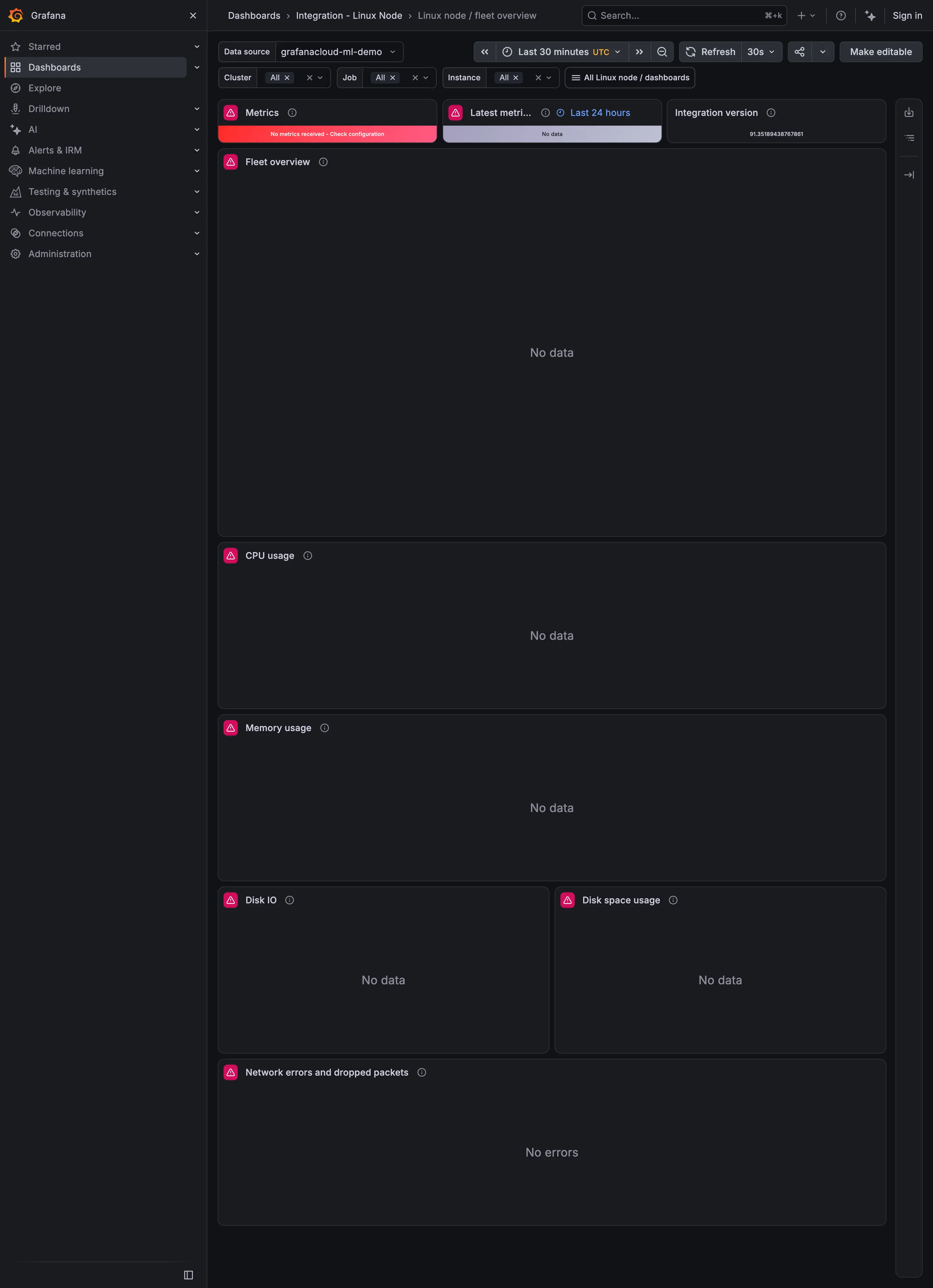
Empty state. No data, centred, with no distinction from a genuine zero. Header KPI strip. Three status tiles across the top, before any chart. Error and stale state. Red, and it names the cause: no metrics received, check configuration. Freshness indicator. The tile whose job is 'as of when', reporting No data instead. Data source badge. Integration version, the only tile on the row still able to answer.
- Header KPI strip Three status tiles across the top, before any chart.
- Error and stale state Red, and it names the cause: no metrics received, check configuration.
- Freshness indicator The tile whose job is 'as of when', reporting No data instead.
- Data source badge Integration version, the only tile on the row still able to answer.
- Empty state No data, centred, with no distinction from a genuine zero.