Patterns seen in this genre 48
- Annotation
- Calendar heatmap
- Categorical series palette
- Cohort grid
- Compare periods
- Cross-filter
- Dark-first data palette
- Dashboard builder
- Data source badge
- Data table
- Delta indicator
- Detail on demand
- Explain this metric
- Filter bar
- Freshness indicator
- Funnel
- Gauge and dial
- Geo map with markers
- Grayscale with alerts
- Header KPI strip
- Heatmap
- Histogram and distribution
- Hover detail
- KPI tile
- Legend and series toggle
- Multi-page dashboard
- Overview then detail
- Panel grid
- Percentile summary
- Ranked list
- Ratio and rate
- Sankey and path
- Search across panels
- Semantic grouping
- Semantic status color
- Sequential and diverging scales
- Share and embed
- Small multiples
- Sparkline
- Stacked composition
- Tabs as genres
- Target and progress
- Template variable
- Threshold line and region
- Time series
- Time-range picker
- Trace waterfall
- Two-pane list and detail
Captures
Newest first.
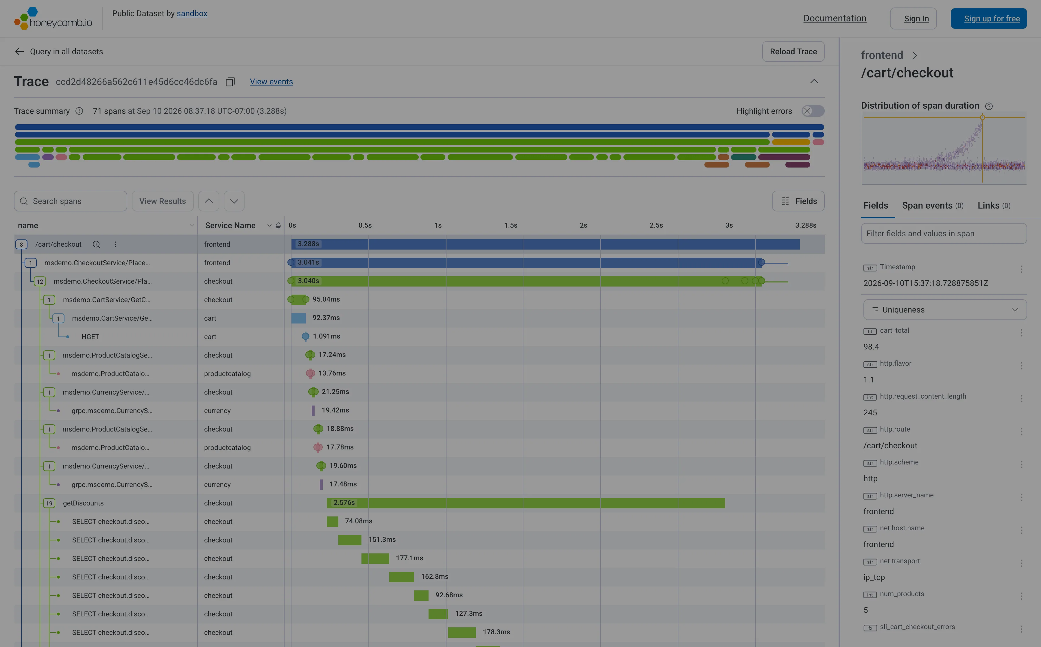
Trace waterfall. Indentation is causality, length is duration, horizontal position is when it started. Six levels deep here. Trace waterfall. The staircase: nineteen SELECTs one after another inside getDiscounts. Batch the query, don't add a machine. Detail on demand. Selecting a span fills the right pane with its fields. The waterfall never moves while you read. Overview then detail. A minimap of all 71 spans above the list, so the shape of the whole trace is visible before you scroll it. Categorical series palette. Five services, five hues, and the name in a column beside every one. Colour is never carrying it alone. Percentile summary. This span's duration against the whole distribution, with this trace marked—so you know if you're looking at the tail.
- Trace waterfall Indentation is causality, length is duration, horizontal position is when it started. Six levels deep here.
- Trace waterfall The staircase: nineteen SELECTs one after another inside getDiscounts. Batch the query, don't add a machine.
- Percentile summary This span's duration against the whole distribution, with this trace marked—so you know if you're looking at the tail.
- Detail on demand Selecting a span fills the right pane with its fields. The waterfall never moves while you read.
- Overview then detail A minimap of all 71 spans above the list, so the shape of the whole trace is visible before you scroll it.
- Categorical series palette Five services, five hues, and the name in a column beside every one. Colour is never carrying it alone.
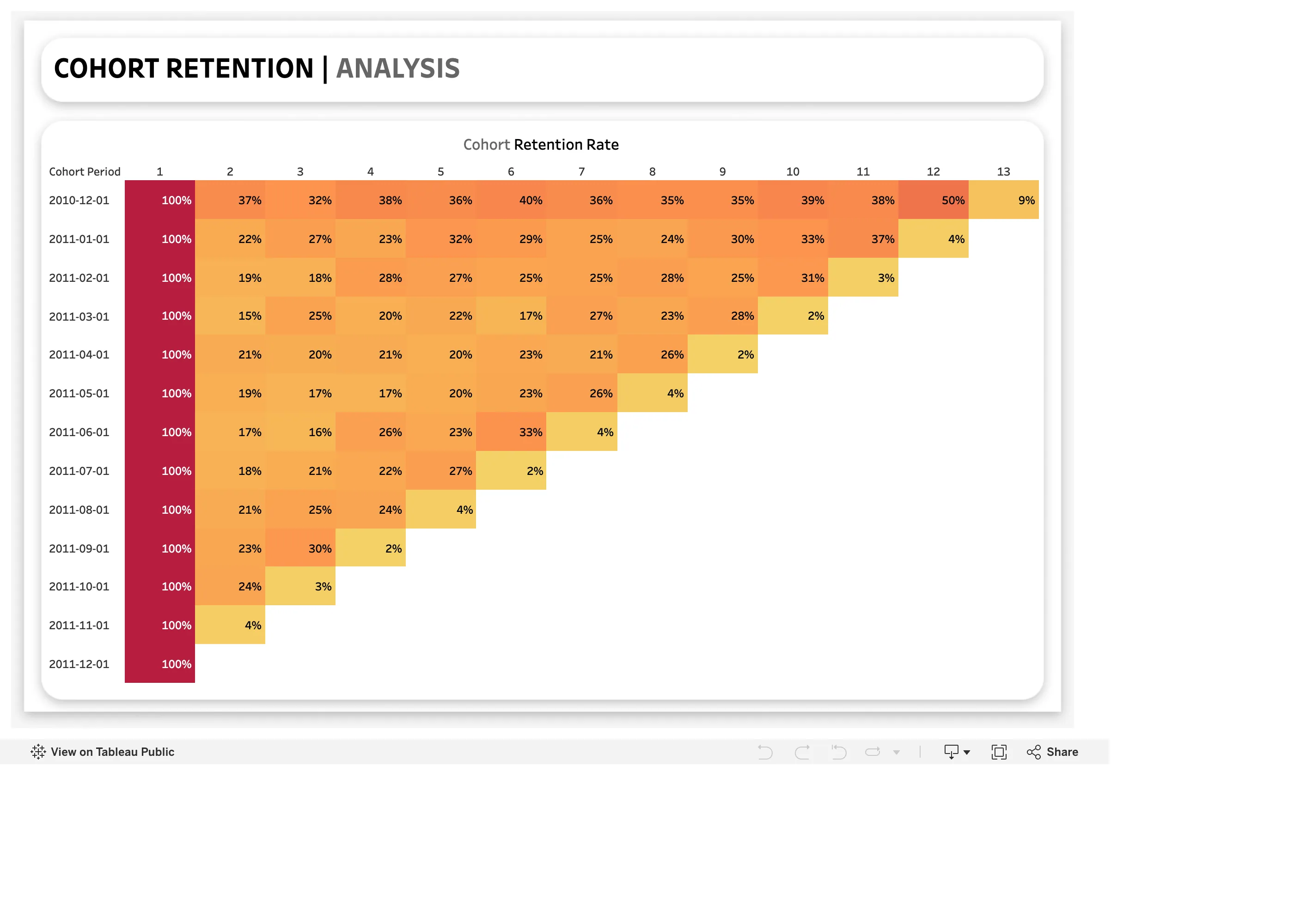
Cohort grid. One row per cohort, one column per period since joining. The triangle is the shape, not a rendering accident. Ratio and rate. Cohort dates, and no cohort size. A 100% first cell could be ten people or ten thousand. Sequential and diverging scales. Column one is 100% for everyone and takes the darkest step, so a constant sets the top of the ramp. Cohort grid. 50% then 9%. The last cell in every row is a partial period drawn as a finished one.
- Cohort grid One row per cohort, one column per period since joining. The triangle is the shape, not a rendering accident.
- Cohort grid 50% then 9%. The last cell in every row is a partial period drawn as a finished one.
- Sequential and diverging scales Column one is 100% for everyone and takes the darkest step, so a constant sets the top of the ramp.
- Ratio and rate Cohort dates, and no cohort size. A 100% first cell could be ten people or ten thousand.
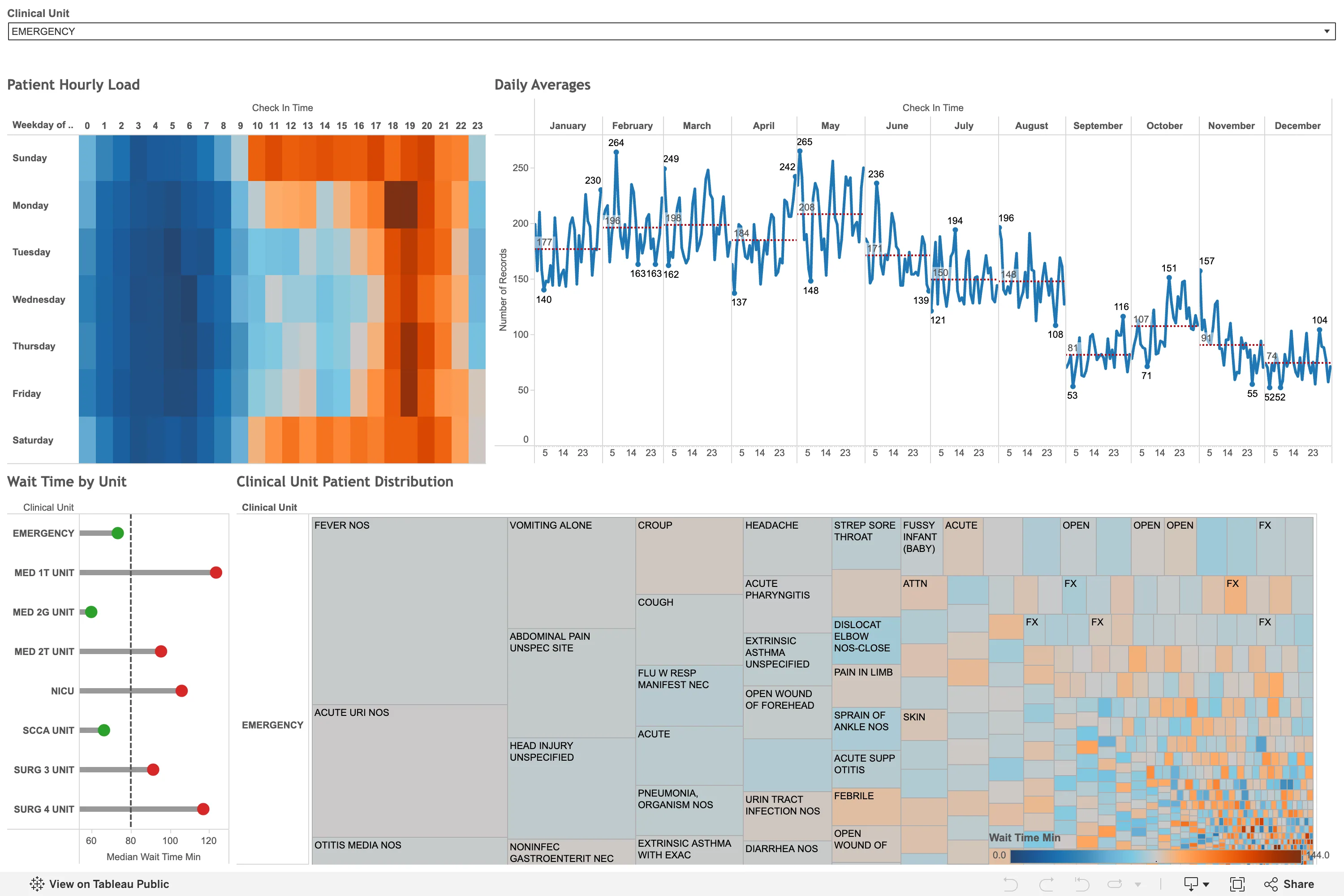
Sequential and diverging scales. A diverging blue-orange ramp on wait time, which has no meaningful centre, so the midpoint is wherever the mean fell. Small multiples. Twelve month panels on one shared y-axis, so the seasonal fall from 265 in May to 52 in December is comparable across all of them. Calendar heatmap. The punch-card variant: hour of day against weekday. The busy band reads in a second, from the layout alone. Target and progress. Each unit against a median reference line, green below and red above. A target marker doing the work of a threshold. Filter bar. One dropdown, full width, showing its selected value rather than a count. Everything below is scoped to it.
- Calendar heatmap The punch-card variant: hour of day against weekday. The busy band reads in a second, from the layout alone.
- Small multiples Twelve month panels on one shared y-axis, so the seasonal fall from 265 in May to 52 in December is comparable across all of them.
- Sequential and diverging scales A diverging blue-orange ramp on wait time, which has no meaningful centre, so the midpoint is wherever the mean fell.
- Target and progress Each unit against a median reference line, green below and red above. A target marker doing the work of a threshold.
- Filter bar One dropdown, full width, showing its selected value rather than a count. Everything below is scoped to it.
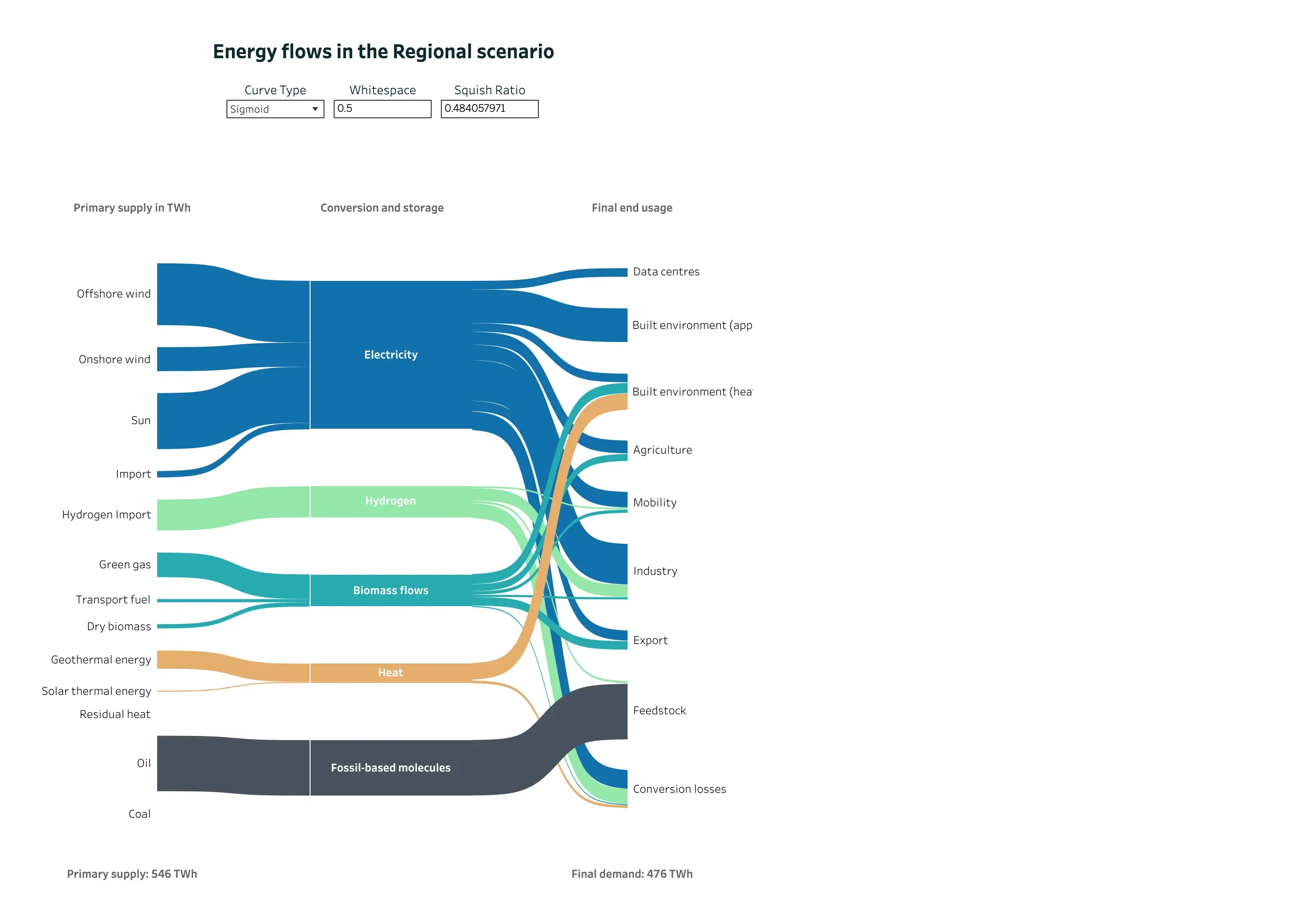
Sankey and path. Three columns of nodes, link width as volume, and crossings kept to the few places where a carrier genuinely switches rank. Categorical series palette. Five carriers, five hues, held constant across every column so a band can be followed end to end. Ratio and rate. 546 TWh in, 476 TWh out, both stated. The diagram's own arithmetic is checkable from the page. Dashboard builder. Curve type, whitespace and squish ratio exposed as reader-facing controls. The last one reads 0.484057971. Sankey and path. Conversion losses as an explicit destination. This is the node product analytics leaves out, and the reason its widths stop adding up.
- Sankey and path Three columns of nodes, link width as volume, and crossings kept to the few places where a carrier genuinely switches rank.
- Sankey and path Conversion losses as an explicit destination. This is the node product analytics leaves out, and the reason its widths stop adding up.
- Ratio and rate 546 TWh in, 476 TWh out, both stated. The diagram's own arithmetic is checkable from the page.
- Categorical series palette Five carriers, five hues, held constant across every column so a band can be followed end to end.
- Dashboard builder Curve type, whitespace and squish ratio exposed as reader-facing controls. The last one reads 0.484057971.
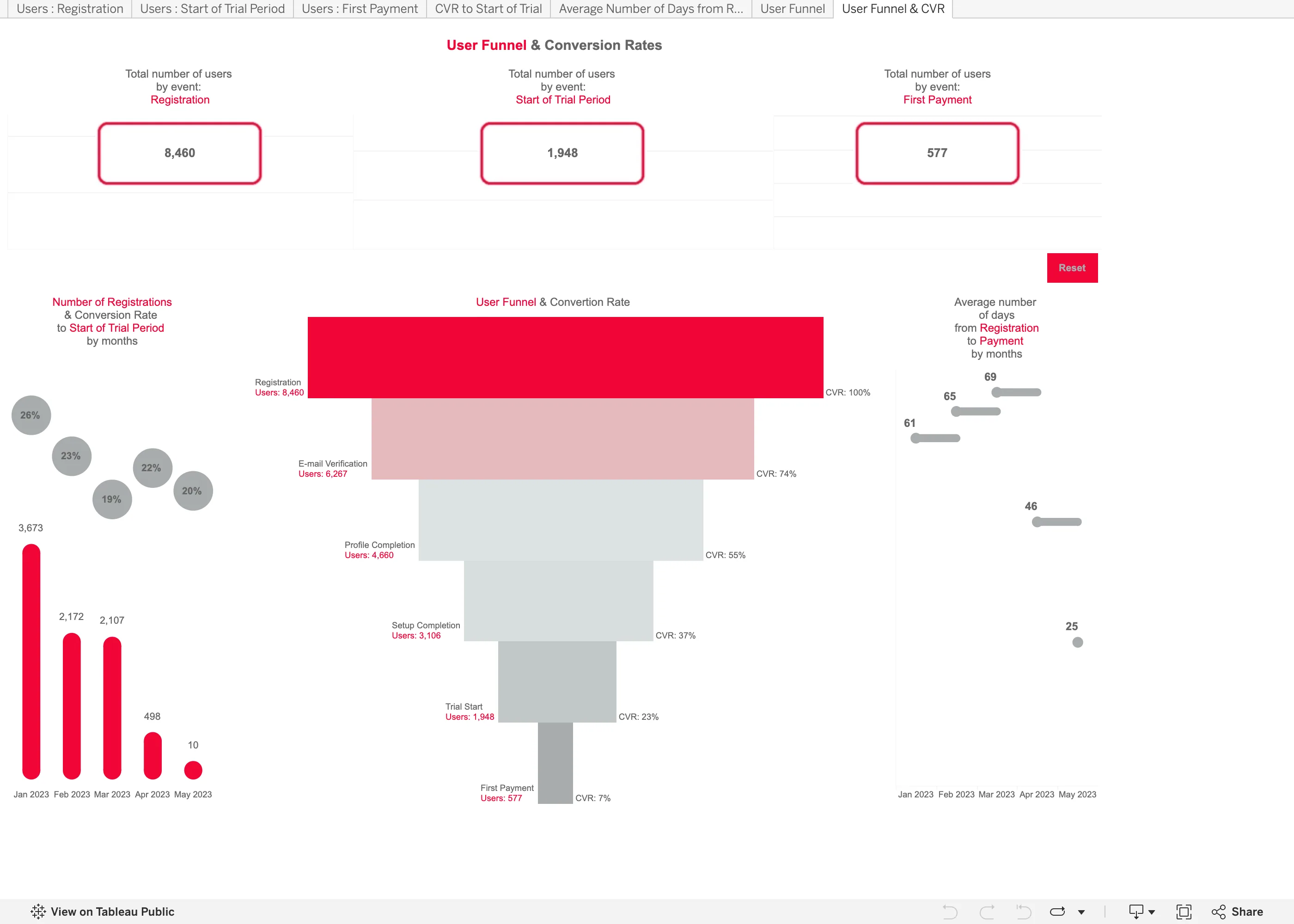
Funnel. Drawn as a taper, so the count is the width of a trapezoid. Length would have read more accurately for nothing. Header KPI strip. Three counts, boxed and centred, with no delta and no base. The first and last are the funnel's own endpoints. Funnel. Overall conversion only. The trial-to-payment step converts at 30% and no number on the chart says so. Ratio and rate. A 20% rate over 10 registrations drawn the same size as a 26% rate over 3,673. Tabs as genres. Seven worksheet tabs across the top, named after the data rather than the question—Users : Registration, CVR to Start of Trial.
- Funnel Drawn as a taper, so the count is the width of a trapezoid. Length would have read more accurately for nothing.
- Funnel Overall conversion only. The trial-to-payment step converts at 30% and no number on the chart says so.
- Ratio and rate A 20% rate over 10 registrations drawn the same size as a 26% rate over 3,673.
- Header KPI strip Three counts, boxed and centred, with no delta and no base. The first and last are the funnel's own endpoints.
- Tabs as genres Seven worksheet tabs across the top, named after the data rather than the question—Users : Registration, CVR to Start of Trial.
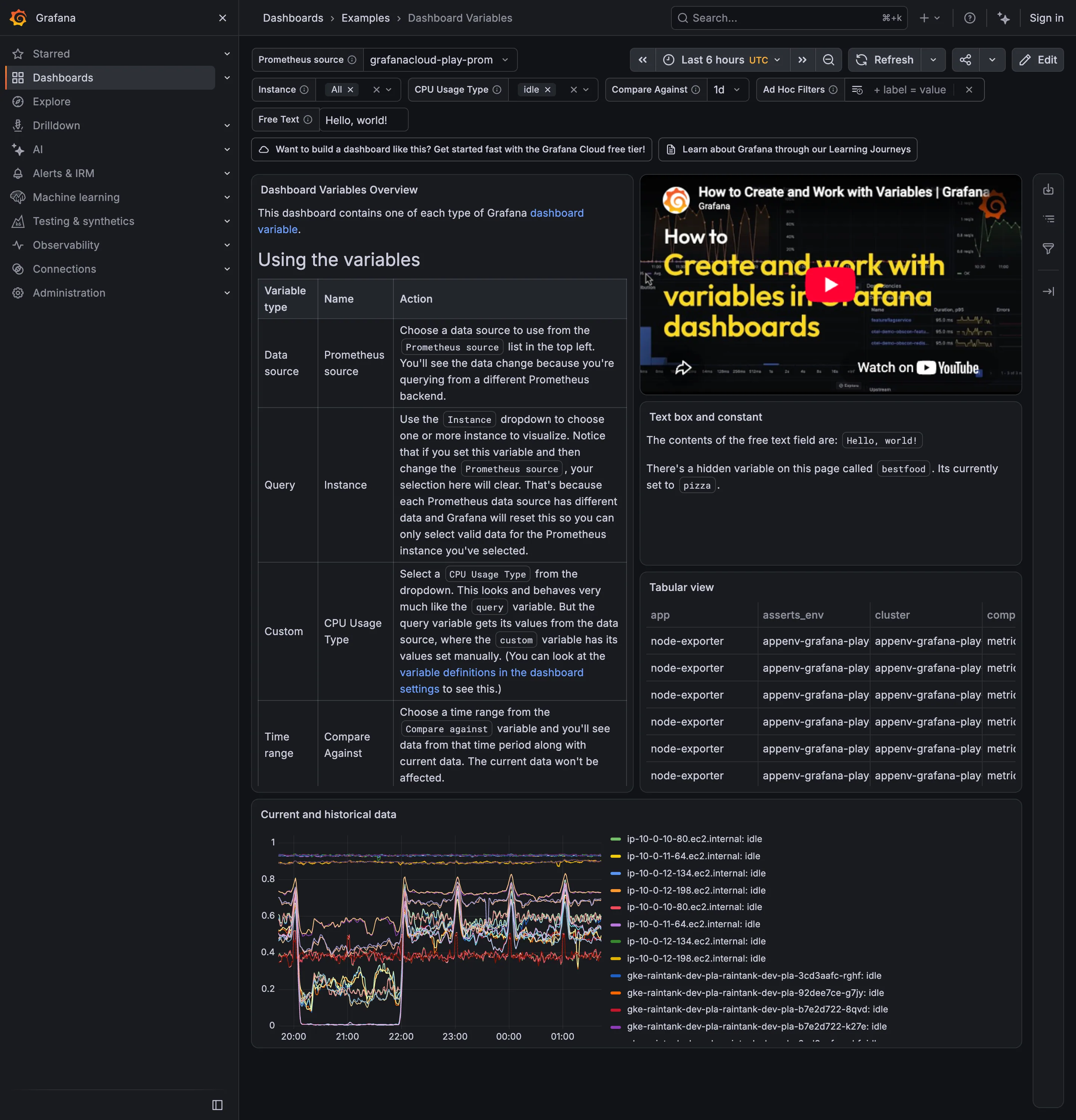
Categorical series palette. Twelve-plus hostnames differing only in the middle digits, with twelve-plus colours to match. Data table. Four columns visible, the fourth cut mid-word, with no horizontal scroll offered. Template variable. Six selectors bound to every panel's query, with the chosen values carried in the URL. Explain this metric. Names a hidden variable set to pizza. Prose is doing the work a control should. Filter bar. Values as removable chips rather than a dropdown saying Instance (3).
- Template variable Six selectors bound to every panel's query, with the chosen values carried in the URL.
- Filter bar Values as removable chips rather than a dropdown saying Instance (3).
- Explain this metric Names a hidden variable set to pizza. Prose is doing the work a control should.
- Categorical series palette Twelve-plus hostnames differing only in the middle digits, with twelve-plus colours to match.
- Data table Four columns visible, the fourth cut mid-word, with no horizontal scroll offered.
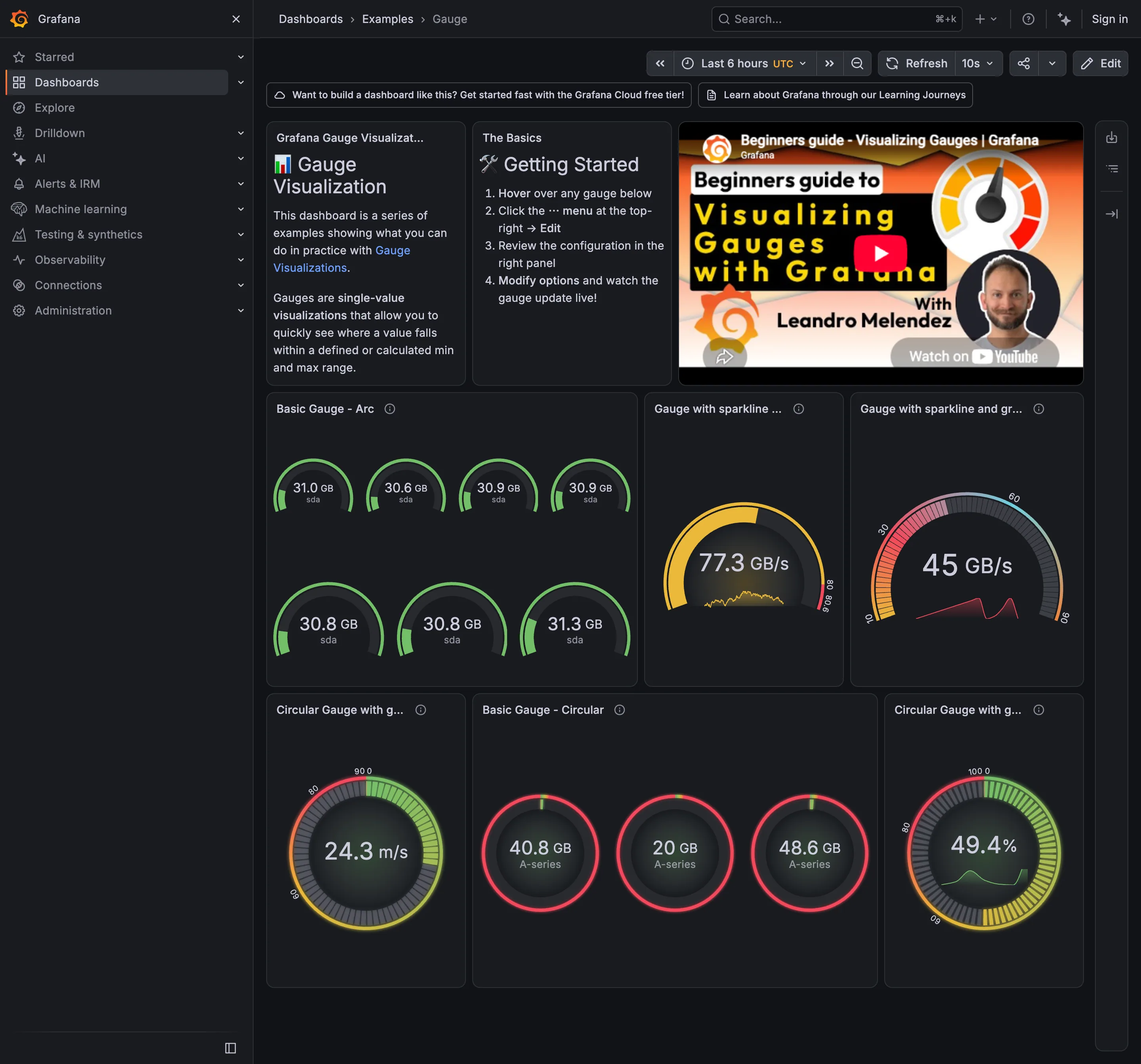
Semantic status color. 40.8, 20 and 48.6 all arc red. The threshold fires for everything, so it says nothing. Gauge and dial. Seven arcs to report that seven disks agree. This is the area argument in one panel. Sequential and diverging scales. The arc runs pink through green with no perceptual order, so position on it means nothing without the number. Sparkline. A sparkline inside the arc: the same series encoded twice in one square. Threshold line and region. The coloured band around the rim is the threshold, drawn as a region rather than a line.
- Gauge and dial Seven arcs to report that seven disks agree. This is the area argument in one panel.
- Sparkline A sparkline inside the arc: the same series encoded twice in one square.
- Sequential and diverging scales The arc runs pink through green with no perceptual order, so position on it means nothing without the number.
- Semantic status color 40.8, 20 and 48.6 all arc red. The threshold fires for everything, so it says nothing.
- Threshold line and region The coloured band around the rim is the threshold, drawn as a region rather than a line.
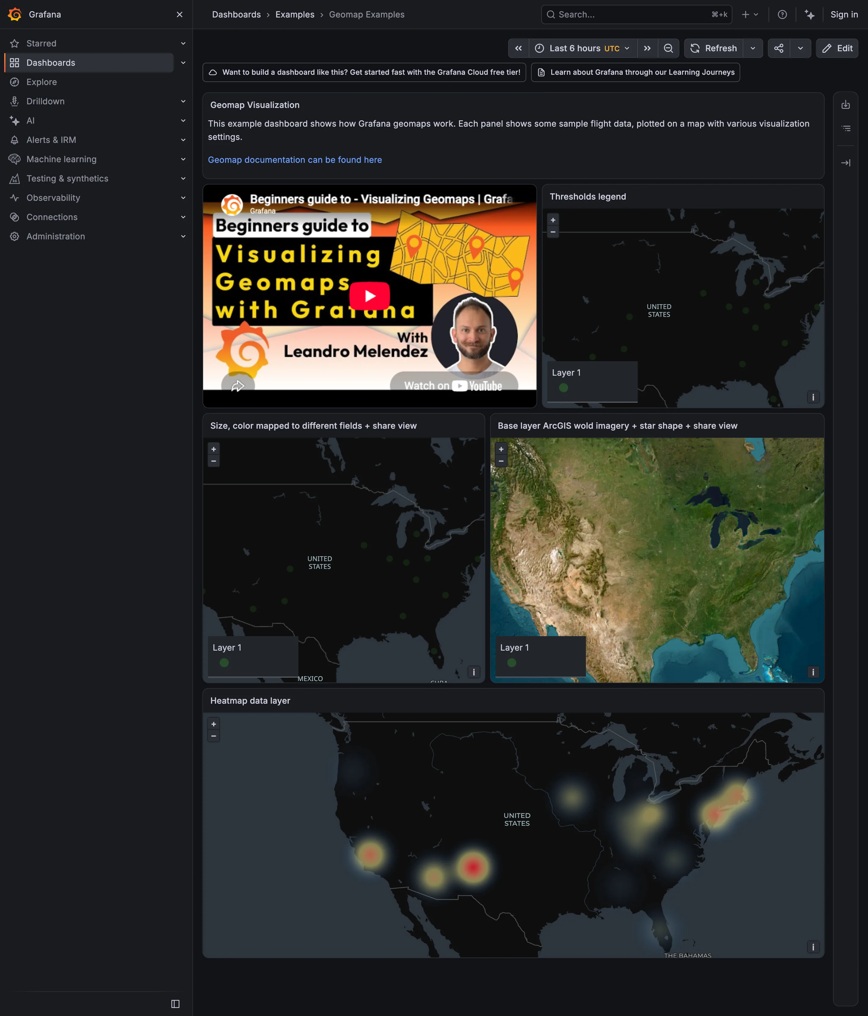
Sequential and diverging scales. Density, with a ramp whose radius parameter changes the apparent story and isn't shown. Geo map with markers. Satellite imagery under the same markers, competing with the data instead of receding. Legend and series toggle. A legend reading 'Layer 1'. It holds a corner of the panel and identifies nothing. Geo map with markers. Markers as small dots. Green on dark grey at four pixels is near the contrast floor.
- Geo map with markers Markers as small dots. Green on dark grey at four pixels is near the contrast floor.
- Geo map with markers Satellite imagery under the same markers, competing with the data instead of receding.
- Sequential and diverging scales Density, with a ramp whose radius parameter changes the apparent story and isn't shown.
- Legend and series toggle A legend reading 'Layer 1'. It holds a corner of the panel and identifies nothing.
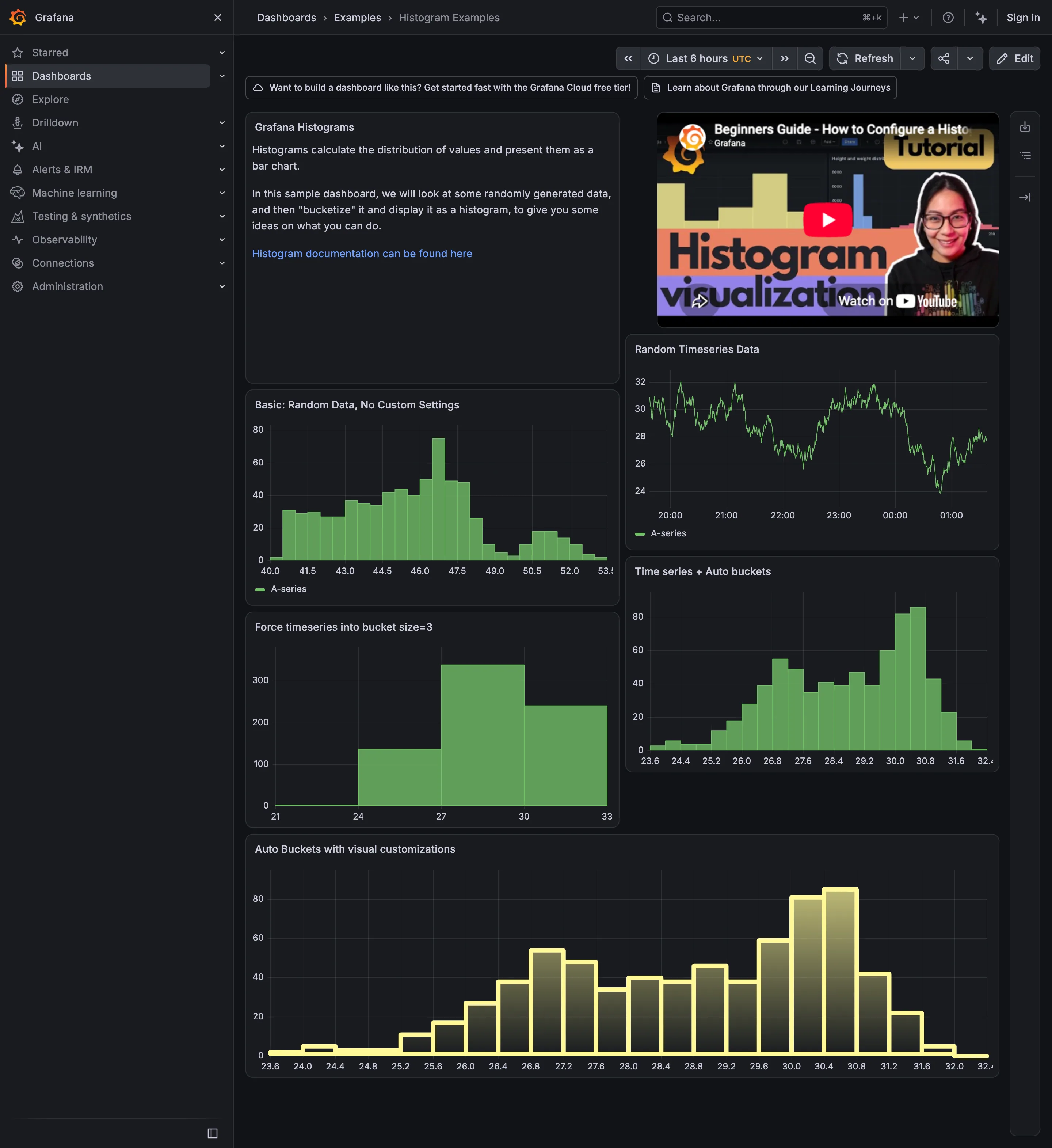
Sequential and diverging scales. A gradient fill down each bar, encoding nothing. The height already carried the count. Time series. The source series, before any bucketing. Two modes are not visible here either. Histogram and distribution. Automatic buckets on that series: clearly bimodal, humps at roughly 27 and 30.4. Histogram and distribution. The same data at bucket size 3. Four bars, one hump, and no sign that anything was lost. Histogram and distribution. A different series at the default count, showing a long left shoulder and a small second mode at 50.5.
- Time series The source series, before any bucketing. Two modes are not visible here either.
- Histogram and distribution Automatic buckets on that series: clearly bimodal, humps at roughly 27 and 30.4.
- Histogram and distribution The same data at bucket size 3. Four bars, one hump, and no sign that anything was lost.
- Histogram and distribution A different series at the default count, showing a long left shoulder and a small second mode at 50.5.
- Sequential and diverging scales A gradient fill down each bar, encoding nothing. The height already carried the count.
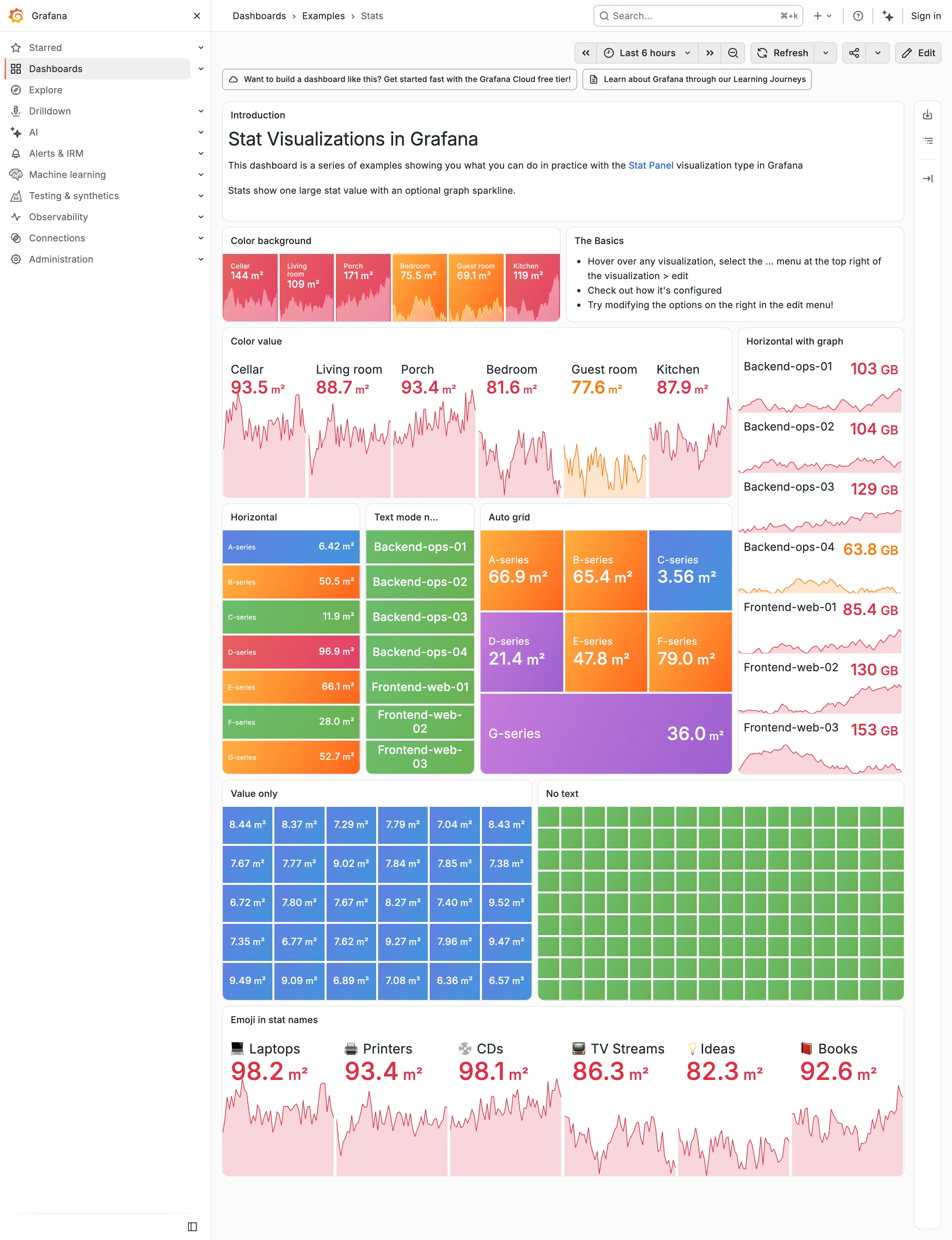
Sparkline. The area fills under each value drop to near-white here, so the shape that was legible on charcoal is a smudge. Dark-first data palette. The same six values as the dark capture. Bright-on-charcoal became pale-on-white, and the contrast went with it. Grayscale with alerts. Ninety green rectangles, identical in both themes. Nothing here can read as abnormal on either ground. Dark-first data palette. 63.8 GB in pale orange on white. On the dark version the identical colour was the readable one. Semantic status color. Whole-tile fills survive the switch, because the text sits on the colour rather than being the colour.
- Dark-first data palette The same six values as the dark capture. Bright-on-charcoal became pale-on-white, and the contrast went with it.
- Dark-first data palette 63.8 GB in pale orange on white. On the dark version the identical colour was the readable one.
- Semantic status color Whole-tile fills survive the switch, because the text sits on the colour rather than being the colour.
- Grayscale with alerts Ninety green rectangles, identical in both themes. Nothing here can read as abnormal on either ground.
- Sparkline The area fills under each value drop to near-white here, so the shape that was legible on charcoal is a smudge.
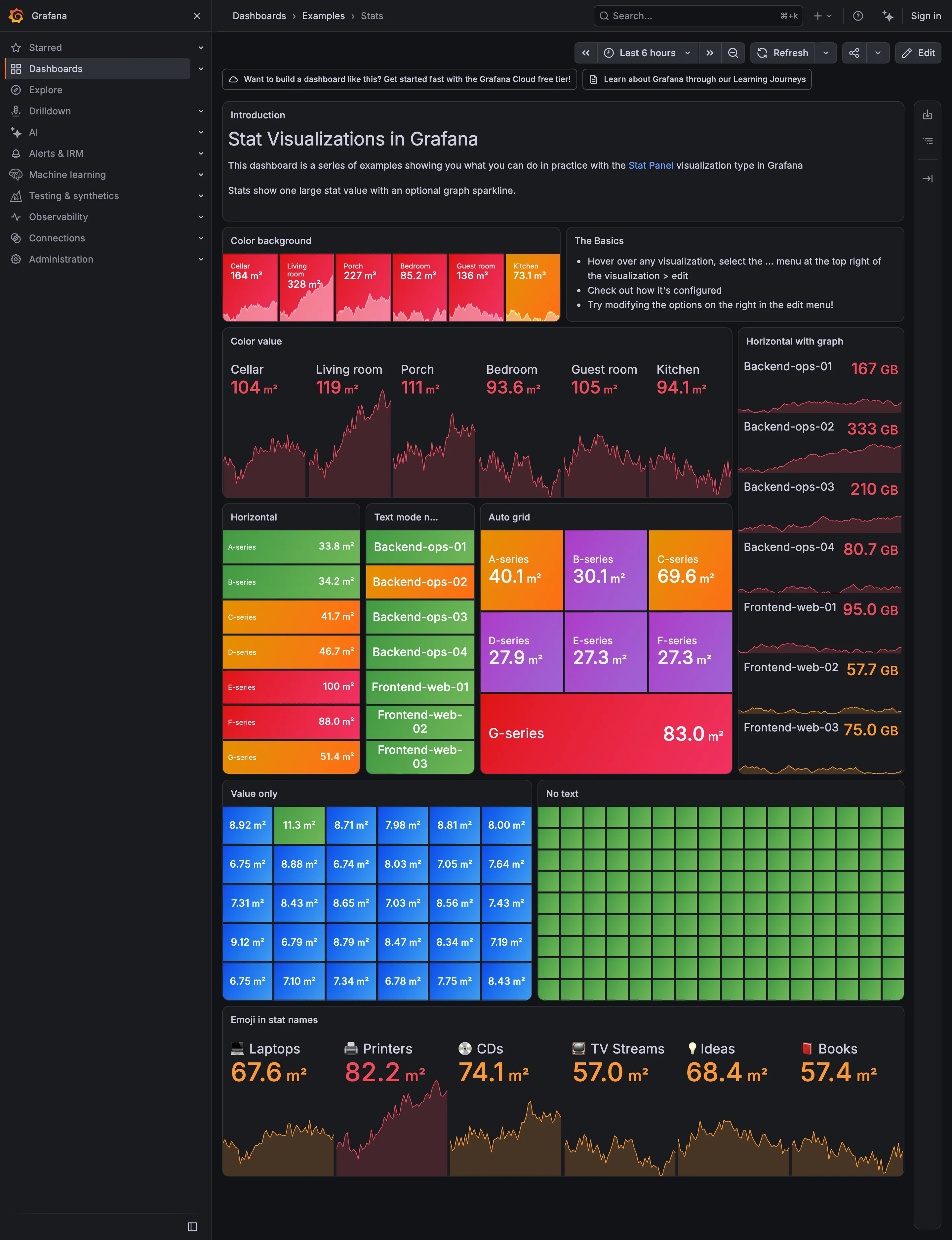
Header KPI strip. Six tiles sharing one anatomy, which is the arrangement that reads as a row rather than as six things. KPI tile. Label, value, unit and a sparkline behind it. No delta, no base, no window. Dark-first data palette. The dark half of the pair. The same six values in the light capture arrive as pale pink on white. Semantic status color. No text at all. Colour is the only carrier, which is the WCAG failure stated as a feature. Sparkline. A column of them, each scaled to its own series, which is the comparison Tufte warns the arrangement invites. KPI tile. Thirty numbers with no labels—the value with nothing attached to it. Grayscale with alerts. Seven rows, seven different colours, no resting state. Nothing here can read as abnormal. Semantic status color. Whole-tile background colour: the loudest channel available, spent on all six.
- KPI tile Label, value, unit and a sparkline behind it. No delta, no base, no window.
- Dark-first data palette The dark half of the pair. The same six values in the light capture arrive as pale pink on white.
- Sparkline A column of them, each scaled to its own series, which is the comparison Tufte warns the arrangement invites.
- Semantic status color Whole-tile background colour: the loudest channel available, spent on all six.
- Grayscale with alerts Seven rows, seven different colours, no resting state. Nothing here can read as abnormal.
- KPI tile Thirty numbers with no labels—the value with nothing attached to it.
- Semantic status color No text at all. Colour is the only carrier, which is the WCAG failure stated as a feature.
- Header KPI strip Six tiles sharing one anatomy, which is the arrangement that reads as a row rather than as six things.
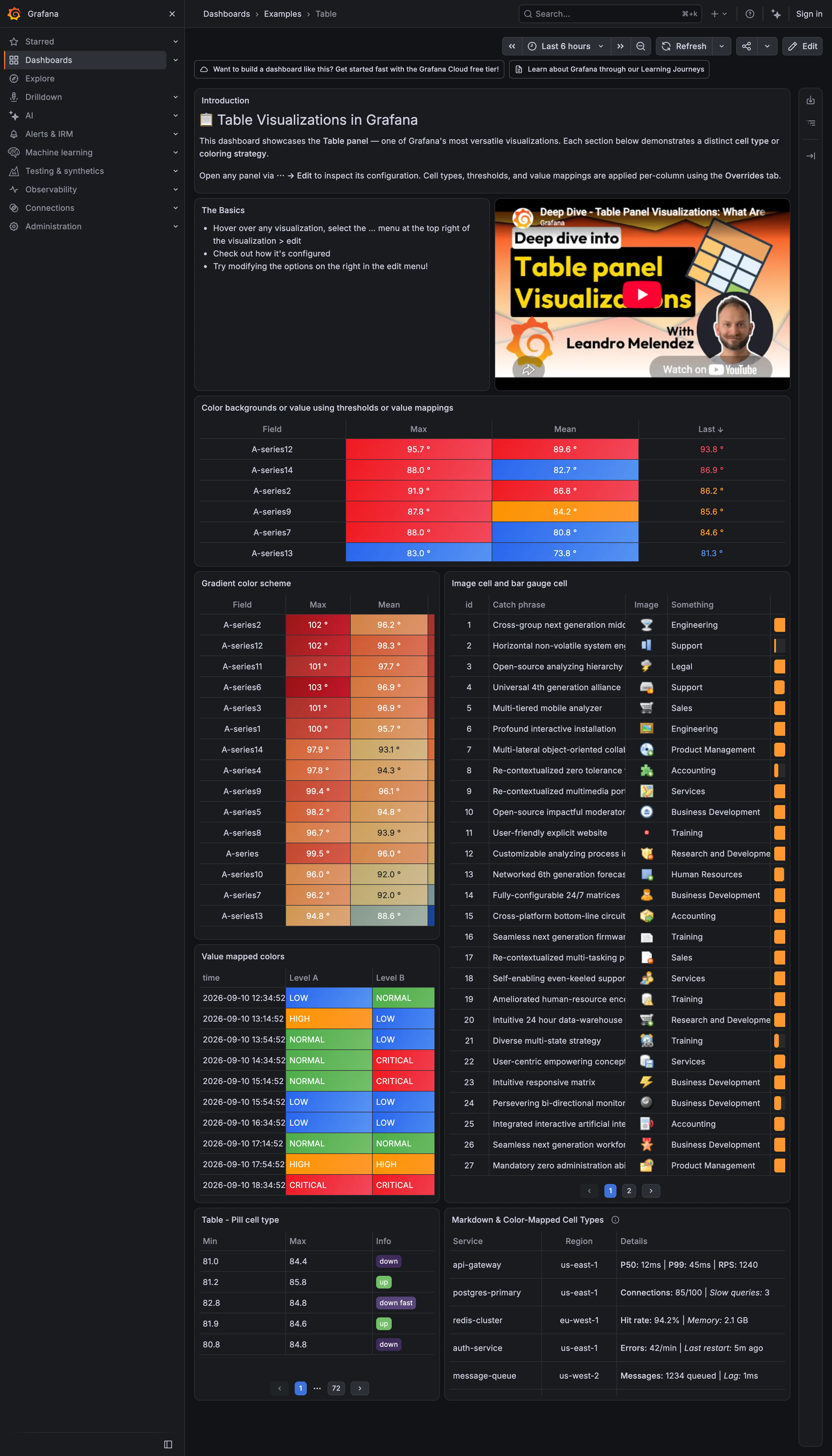
Data table. In-cell bar gauge clipped to a sliver, and text truncated mid-word with no escape to the full value. Data table. Threshold colour filling the cell, which makes a column scannable without being read. Sequential and diverging scales. A continuous ramp down a sorted column: the table doing a heatmap's job. Semantic status color. Value mappings turning raw levels into a closed set, each with its word in the cell. Delta indicator. Pills reading up, down and down fast: direction with no magnitude and no base. Also page 1 of 72.
- Data table Threshold colour filling the cell, which makes a column scannable without being read.
- Sequential and diverging scales A continuous ramp down a sorted column: the table doing a heatmap's job.
- Data table In-cell bar gauge clipped to a sliver, and text truncated mid-word with no escape to the full value.
- Semantic status color Value mappings turning raw levels into a closed set, each with its word in the cell.
- Delta indicator Pills reading up, down and down fast: direction with no magnitude and no base. Also page 1 of 72.
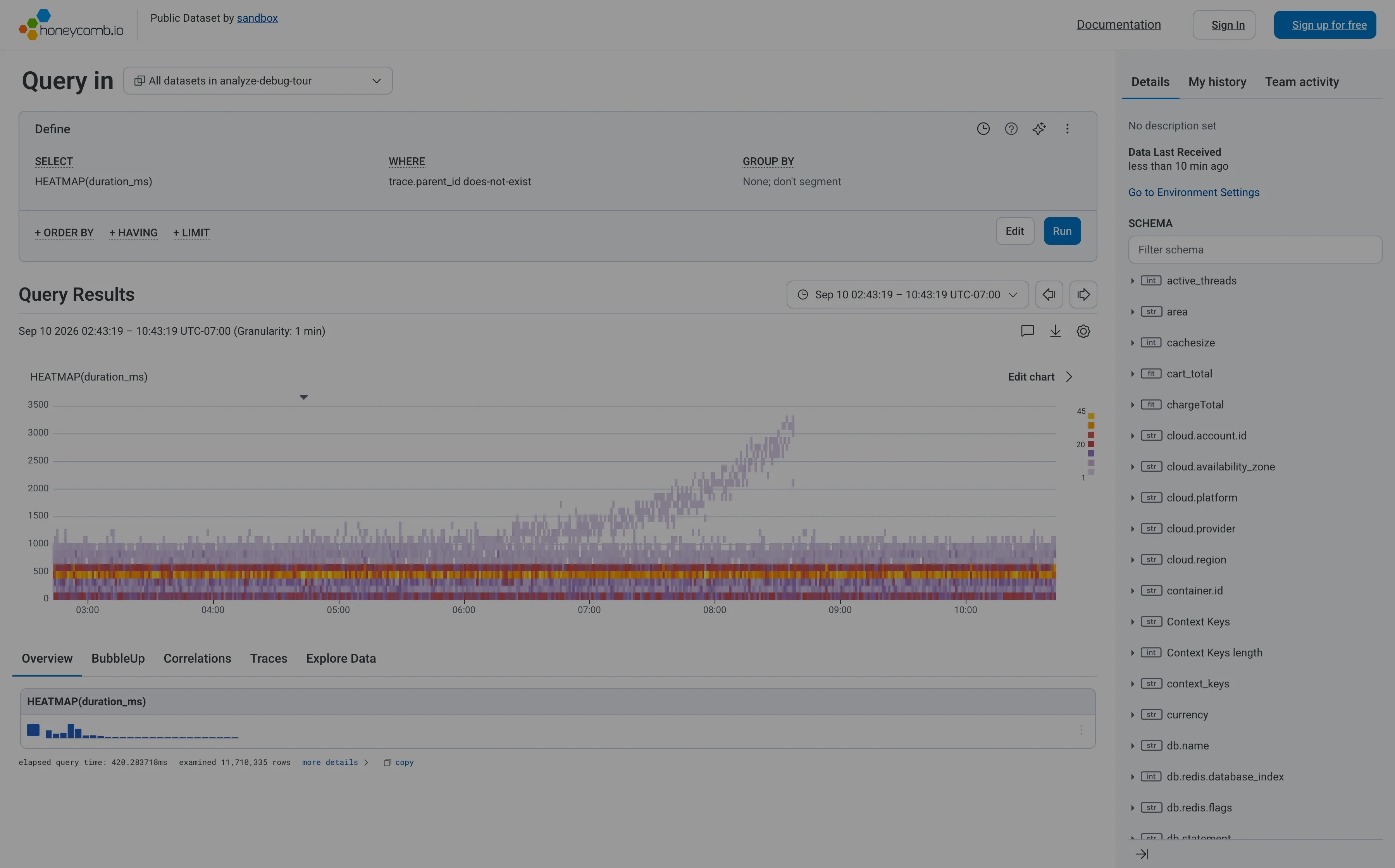
Heatmap. Linear y-axis, so the band holding most requests is six percent of the panel height and the empty top half gets the rest. Search across panels. The schema is the navigation, and it opens with a filter box rather than a tree you're expected to browse. Dashboard builder. No panel to configure—the query is the page. WHERE trace.parent_id does-not-exist is how you say root spans only. Tabs as genres. Five readings of one result: overview, BubbleUp, correlations, traces, raw. Each tab is a different question, not a different subject. Freshness indicator. When data last arrived, not when the page last ran. The one of the three ages that actually matters. Time-range picker. Absolute, with the granularity stated beside it, and arrows that step to the previous window rather than retyping it. Data source badge. Elapsed query time and 11,710,335 rows examined. The panel reporting its own cost and scope, which almost nothing else does.
- Heatmap Linear y-axis, so the band holding most requests is six percent of the panel height and the empty top half gets the rest.
- Dashboard builder No panel to configure—the query is the page. WHERE trace.parent_id does-not-exist is how you say root spans only.
- Tabs as genres Five readings of one result: overview, BubbleUp, correlations, traces, raw. Each tab is a different question, not a different subject.
- Search across panels The schema is the navigation, and it opens with a filter box rather than a tree you're expected to browse.
- Time-range picker Absolute, with the granularity stated beside it, and arrows that step to the previous window rather than retyping it.
- Data source badge Elapsed query time and 11,710,335 rows examined. The panel reporting its own cost and scope, which almost nothing else does.
- Freshness indicator When data last arrived, not when the page last ran. The one of the three ages that actually matters.
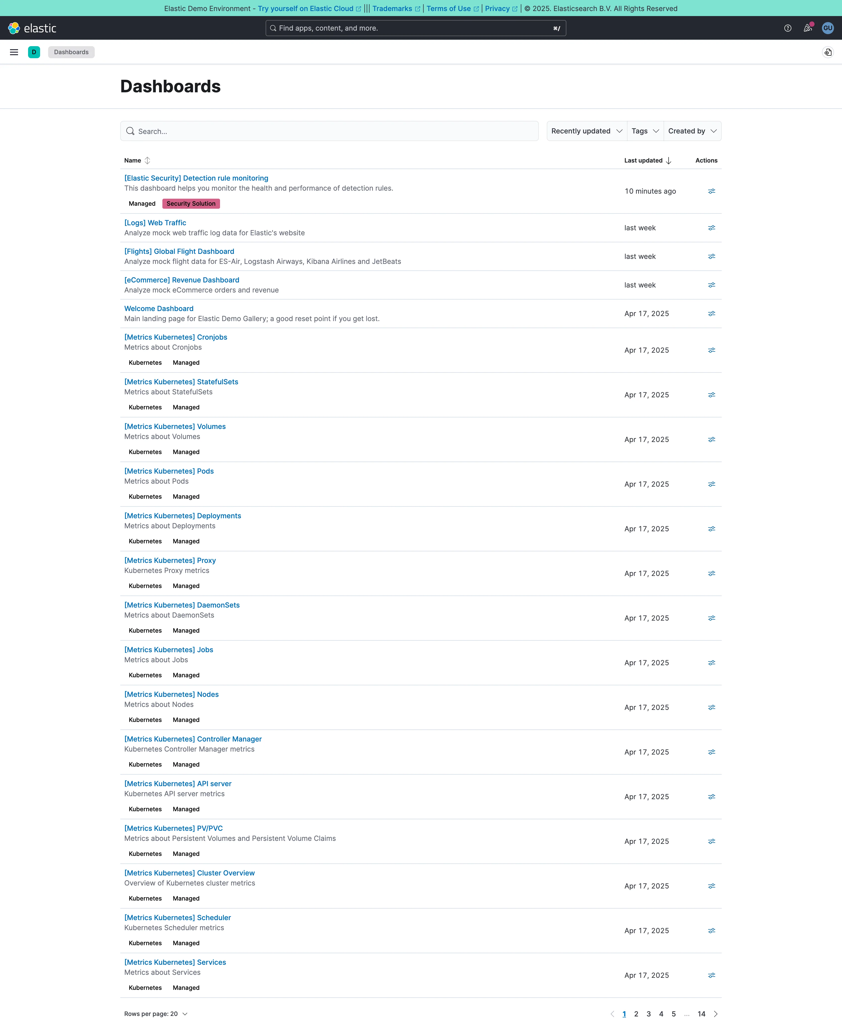
Multi-page dashboard. A set of peers with no landing page. Fourteen pages of them, and nothing says which is the one the team uses. Data table. Name, description, last updated, actions. The description column is what makes this a list you can read rather than scan. Search across panels. Past about fifty dashboards this is the navigation and the list below it is a filing system nobody browses. Semantic grouping. Tags and a bracket prefix standing in for folders, which is what keeps 250 generated pages out of the way.
- Multi-page dashboard A set of peers with no landing page. Fourteen pages of them, and nothing says which is the one the team uses.
- Search across panels Past about fifty dashboards this is the navigation and the list below it is a filing system nobody browses.
- Semantic grouping Tags and a bracket prefix standing in for folders, which is what keeps 250 generated pages out of the way.
- Data table Name, description, last updated, actions. The description column is what makes this a list you can read rather than scan.
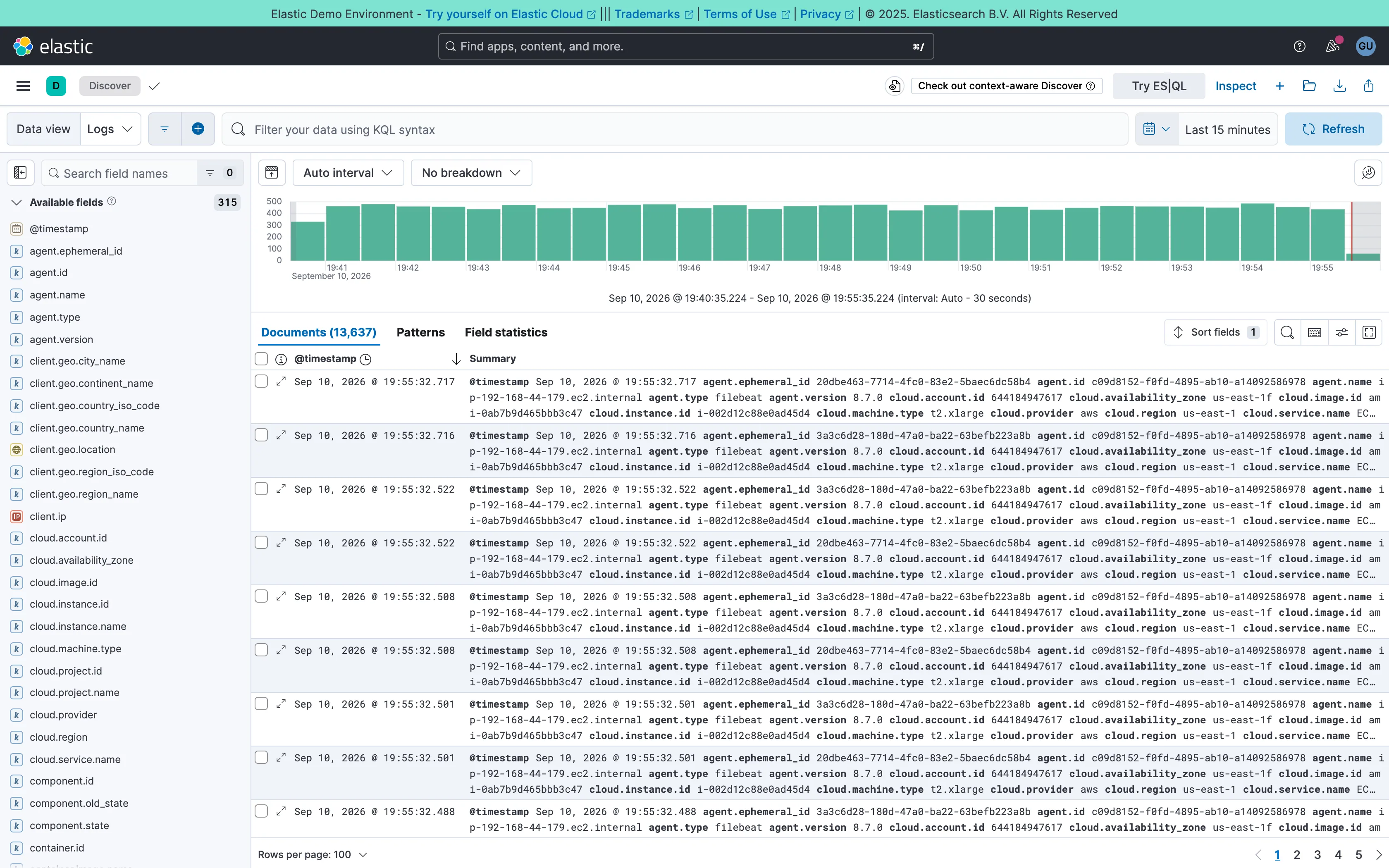
Two-pane list and detail. Fields on the left, records on the right, both on screen at once. The oldest working shape for a queue there is. Data table. One column called Summary holding every field on the record. Complete, and unreadable at a glance. Histogram and distribution. Volume over the window at a 30-second auto interval. The final bar is the bucket still filling, and it always reads low. Filter bar. A query language in the bar rather than chips. Powerful, and it hides what's applied from anyone who didn't type it. Detail on demand. An expander on every row. Inline rather than a side panel, so it pushes the rest of the list down. Time-range picker. Relative by default, with the refresh control beside it rather than buried in a settings menu. Search across panels. 315 fields, so the sidebar opens with a filter box. Past a certain count a tree is a filing system nobody browses.
- Two-pane list and detail Fields on the left, records on the right, both on screen at once. The oldest working shape for a queue there is.
- Detail on demand An expander on every row. Inline rather than a side panel, so it pushes the rest of the list down.
- Data table One column called Summary holding every field on the record. Complete, and unreadable at a glance.
- Search across panels 315 fields, so the sidebar opens with a filter box. Past a certain count a tree is a filing system nobody browses.
- Filter bar A query language in the bar rather than chips. Powerful, and it hides what's applied from anyone who didn't type it.
- Time-range picker Relative by default, with the refresh control beside it rather than buried in a settings menu.
- Histogram and distribution Volume over the window at a 30-second auto interval. The final bar is the bucket still filling, and it always reads low.
![Kibana — Dashboards / [Flights] Global Flight Dashboard](/captures/kibana/flights-dashboard-2026-09.webp)
Panel grid. Twelve columns, and the biggest panel is a table rather than the headline chart. Size isn't carrying priority here. Ratio and rate. Delay rates up to 100% with no denominator anywhere. One flight and a thousand flights render identically. Stacked composition. Stacked to 100%, so the total is discarded on purpose and only the mix of delay types remains. Annotation. Event markers along the top of the series, numbered and grouped, on the data's own axis. Header KPI strip. Five tiles in three different sizes and two different layouts, so the row reads as five things. Compare periods. "vs 1 week earlier, 76.9%"—the comparison base is named and the expression isn't. Filter bar. Declared controls under the query bar: two pickers and a price range. Both mechanisms on screen at once. Share and embed. Share, export and full-screen in the header. Whether the range and filters travel with them is the whole question.
- Ratio and rate Delay rates up to 100% with no denominator anywhere. One flight and a thousand flights render identically.
- Compare periods "vs 1 week earlier, 76.9%"—the comparison base is named and the expression isn't.
- Share and embed Share, export and full-screen in the header. Whether the range and filters travel with them is the whole question.
- Filter bar Declared controls under the query bar: two pickers and a price range. Both mechanisms on screen at once.
- Panel grid Twelve columns, and the biggest panel is a table rather than the headline chart. Size isn't carrying priority here.
- Stacked composition Stacked to 100%, so the total is discarded on purpose and only the mix of delay types remains.
- Annotation Event markers along the top of the series, numbered and grouped, on the data's own axis.
- Header KPI strip Five tiles in three different sizes and two different layouts, so the row reads as five things.
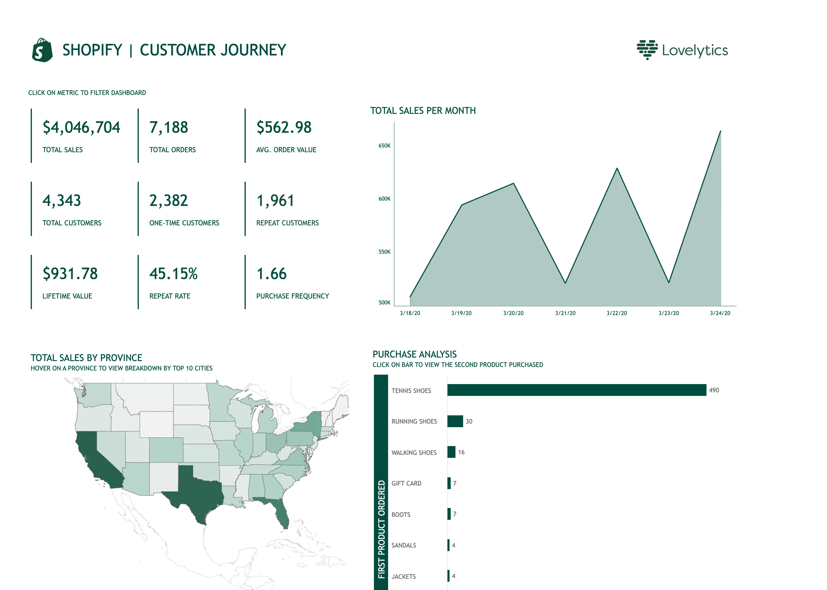
Ranked list. 490 against 30 for second place, so every bar below the first is a sliver and the ordering is all you get. Time series. Titled per month, plotting seven days, on an axis starting at 500K. A 25% spread rendered as a cliff. Geo map with markers. A choropleth of raw sales, unnormalised, so California and Texas lead partly by being large and populous. Header KPI strip. Nine values in a grid rather than four to six in a row, so there is no privileged place for the eye to start. Cross-filter. The tiles are the filter. It needed a line of instruction above it, because nothing about a number says it is clickable. Hover detail. The breakdown by city exists only on hover, so it is unavailable on touch and invisible in this screenshot.
- Cross-filter The tiles are the filter. It needed a line of instruction above it, because nothing about a number says it is clickable.
- Header KPI strip Nine values in a grid rather than four to six in a row, so there is no privileged place for the eye to start.
- Time series Titled per month, plotting seven days, on an axis starting at 500K. A 25% spread rendered as a cliff.
- Hover detail The breakdown by city exists only on hover, so it is unavailable on touch and invisible in this screenshot.
- Geo map with markers A choropleth of raw sales, unnormalised, so California and Texas lead partly by being large and populous.
- Ranked list 490 against 30 for second place, so every bar below the first is a sliver and the ordering is all you get.
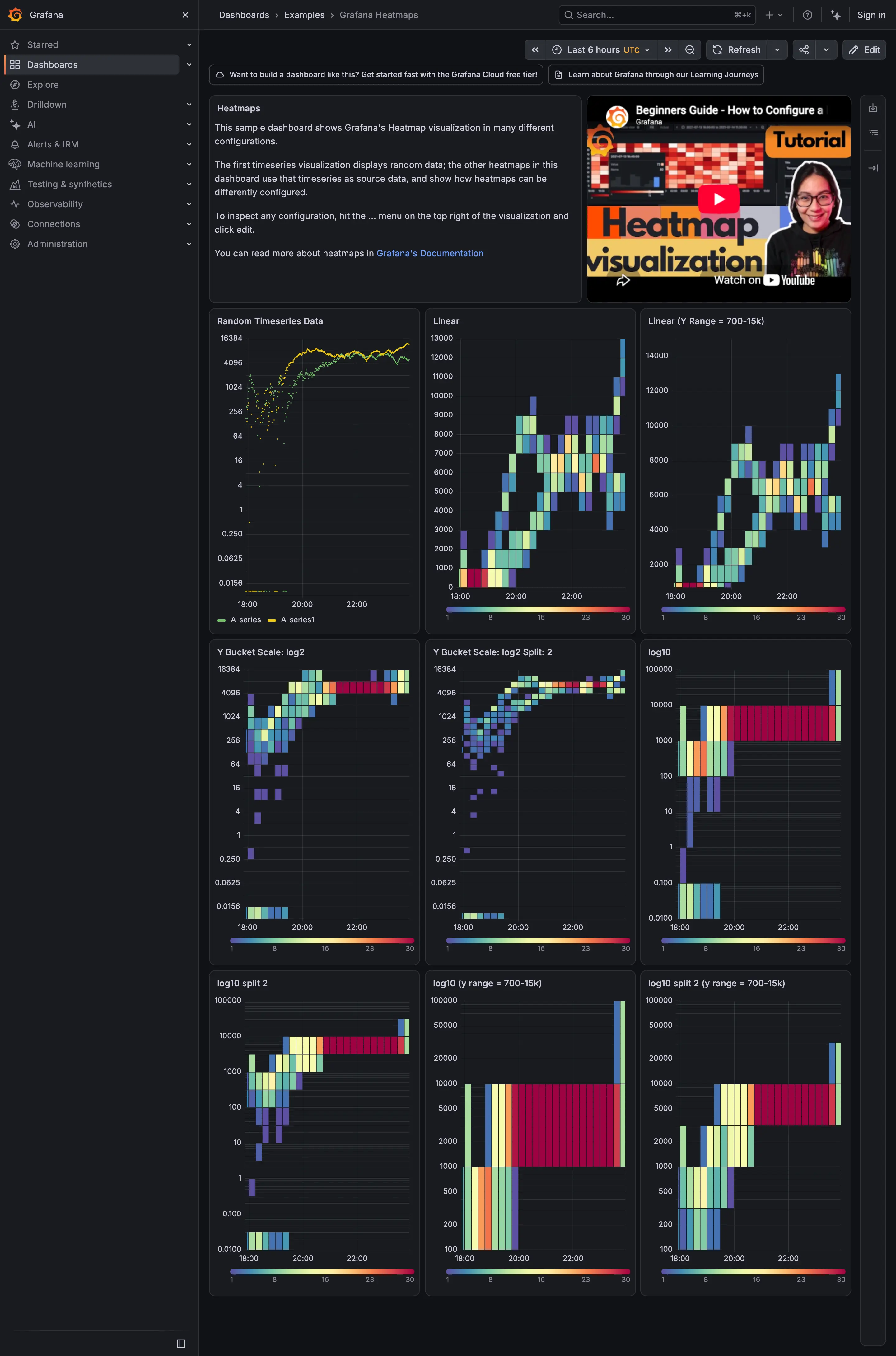
Small multiples. Nine panels, one variable changed. The comparison is the content. Time series. The source series. Every heatmap on the page is built from this. Heatmap. Linear y buckets, which is the default and the one that hides the low end. Sequential and diverging scales. Every panel carries its own ramp legend, 1 to 30, so the colour is readable per panel but not across them.
- Time series The source series. Every heatmap on the page is built from this.
- Heatmap Linear y buckets, which is the default and the one that hides the low end.
- Small multiples Nine panels, one variable changed. The comparison is the content.
- Sequential and diverging scales Every panel carries its own ramp legend, 1 to 30, so the colour is readable per panel but not across them.